Young Professional Auto Insurance Landing Page Template
Switch is a young professional auto insurance landing page template built for drivers aged 24 to 30 who just lost parental coverage and need a better rate fast. It leads with a 30-day money-back guarantee, proves value through a head-to-head comparison table, and drives visitors to a real-time quote engine with a single click.
by Rocket studio
Quick summary
Switch is a single-page auto insurance template designed for the 26-year-old staring at an overpriced renewal quote. The page opens with a bold guarantee, backs it with a structured comparison table, and closes with one clear call to action: see your real rate. No form fields, no friction, just a click to a live quoter.
Who this template is for
This template is built for insurtech brands, direct-to-consumer insurance startups, and independent agents targeting young drivers who recently aged off a parent's policy. It speaks directly to people who feel overcharged and under-respected by traditional carriers.
- First-year professionals including nurses, teachers, junior analysts, and apprentice tradespeople
- Budget-conscious drivers aged 24 to 30 with clean records and no loyalty to legacy insurers
- Insurance brands that want to compete on transparency and price, not on brand heritage
What problem this template solves
Young drivers face a specific frustration: they have clean records, steady jobs, and no accidents, yet their insurance quotes feel completely disconnected from their actual risk. Legacy carrier websites make the problem worse with cluttered layouts, jargon, and multi-step forms that feel designed to confuse rather than inform.
- No clear way to compare your current rate against a competitor's in a single view
- Guarantee-led messaging is rarely used in insurance, leaving trust gaps that kill conversions
- Most insurance landing pages ask for personal data before showing any value, which drives high bounce rates
What you get with this template
You get a fully structured, single-page layout that handles the entire persuasion sequence without a single form field. Every section earns the click that sends visitors to the quote engine.
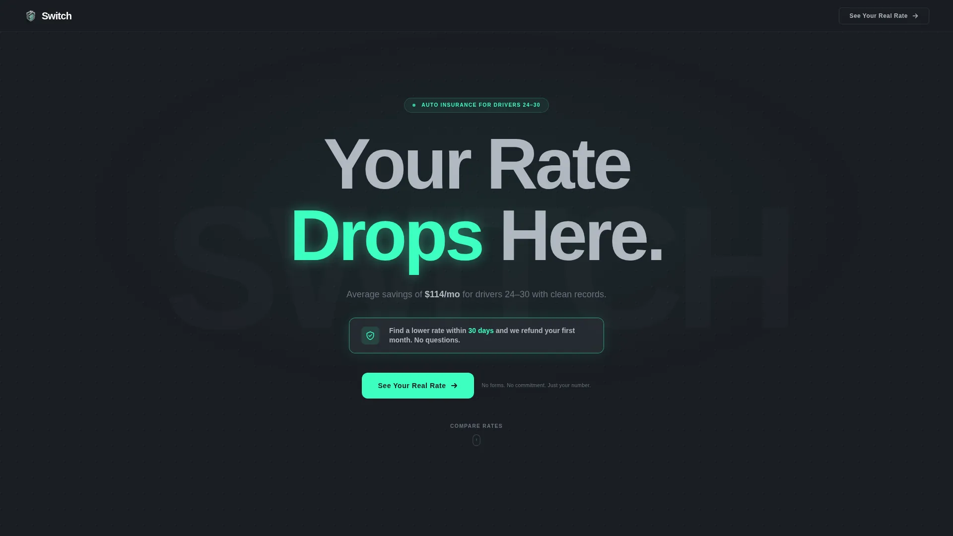
- A hero section with a guarantee badge, a bold headline, and a primary call to action
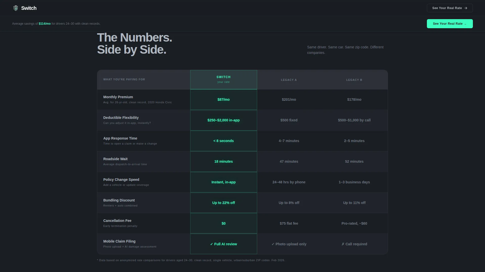
- A head-to-head comparison table pitting Switch against two unnamed legacy carriers across eight metrics
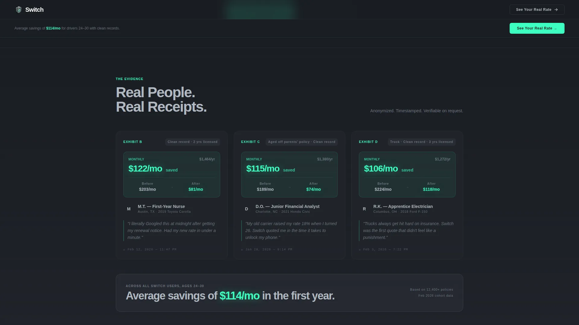
- Three anonymized case study cards with real savings figures, timestamps, and app screenshot placeholders
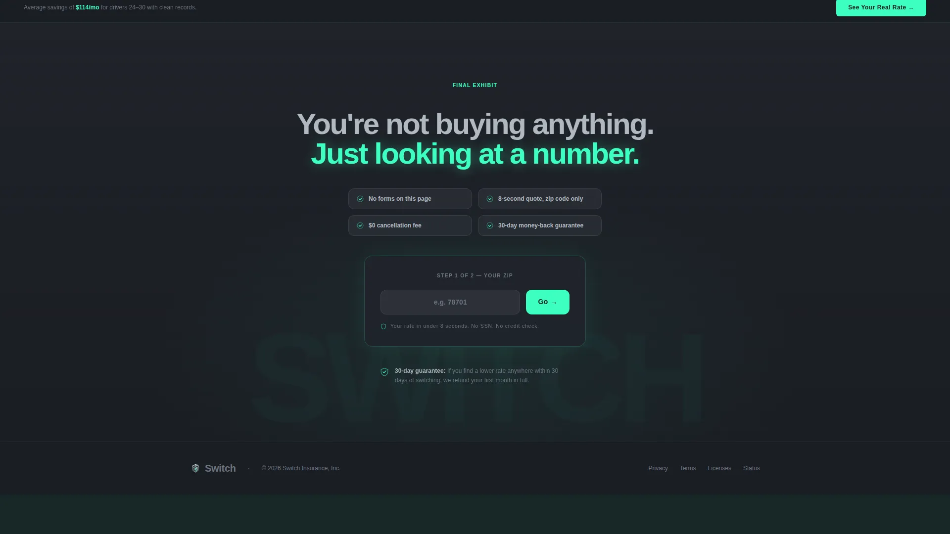
- A sticky call-to-action bar that pins after scroll and a risk-zero closing section anchored by the final "See Your Real Rate" button
Feature list
This template is built around a tight set of components, each chosen because it earns trust or reduces hesitation for a cost-sensitive young driver.
Guarantee-First Hero Section
The page opens on a matte graphite field with a single giant headline rendered in heavy grotesque type at roughly 9 viewport-width units. The word "Drops" glows in electric mint. A steel-bordered guarantee badge sits directly below, stating the 30-day refund promise before any product detail is shown.
Head-to-Head Comparison Table
An eight-row, three-column table compares Switch against two unnamed legacy carriers. Metrics include monthly premium, deductible flexibility, app response time, roadside wait, policy change speed, bundling discount, cancellation fee, and mobile claim filing. Switch cells are mint-bordered; competitor cells sit in flat charcoal.
Anonymized Case Study Cards
Three staggered reveal cards present real anonymized savings with dollar amounts, timestamps, and app screenshot placeholders. Each card functions as a supporting exhibit, reinforcing the guarantee claim with verifiable-feeling evidence rather than generic testimonials.
Triple-Placement Call to Action
The primary "See Your Real Rate" button appears in three positions: centered below the comparison table, anchoring the final section, and pinned in a slim sticky bar that activates after the visitor scrolls past the hero. No form fields appear anywhere on the page.
Dashboard Pro Visual System
The entire template uses a dark instrument-cluster aesthetic. Backgrounds are graphite-to-charcoal gradients. Interactive elements, call-to-action buttons, and key savings figures render exclusively in electric mint. Divider lines are barely visible, like seams in machined metal.
Scroll-Triggered Animations
A scan-line effect activates on the hero. Comparison table cells pulse with a mint glow on load. Case study cards reveal in a staggered sequence on scroll. These interactions reinforce the backlit dashboard feel without overwhelming the content.
Page sections overview
| Section | Purpose |
|---|---|
| Hero with Guarantee Badge | Opens with the rate-drop headline, guarantee pledge, and first call to action |
| Comparison Table | Proves value head-to-head across eight metrics against legacy carriers |
| Case Study Cards | Reinforces guarantee with anonymized savings, timestamps, and app screenshots |
| Final Call to Action | Risk-zero close anchored by the "See Your Real Rate" button |
| Sticky Call-to-Action Bar | Persists after scroll to keep the primary action always reachable |
| Minimal Footer | Single-row developer-minimal footer, Pattern 8 layout |
Design & branding system
The visual identity follows a Dashboard Pro theme using a Monochrome Steel color system. Every color choice references the instrument cluster of a car you can almost afford: dark, backlit, and precise.
- Background: deep graphite (#1A1D23) with graphite-to-charcoal gradient surfaces using panel-line charcoal (#2C3038)
- Text: brushed aluminum (#B0B8C1) for all body copy; electric mint (#3DFFC0) reserved exclusively for interactive elements, call-to-action buttons, and savings figures
- Typography: Manrope in heavy grotesque weight with tight tracking, scaled to roughly 9 viewport-width units for the hero headline
Mobile & speed optimization
The template is built mobile-first because the target user is most likely on their phone at midnight running an insurance comparison. The layout prioritizes fast visual scanning over dense information.
- Single-column stacking on smaller screens keeps the comparison table and case cards readable without horizontal scrolling
- The sticky call-to-action bar is designed to sit cleanly at the top of the viewport on mobile after the hero scrolls out of view
- Scroll-triggered animations use staggered reveals timed for thumb-scroll pacing, not mouse-wheel speed
How this template helps you convert
This template treats conversion as a legal case to be won, not a form to be filled. Every section adds another exhibit before the visitor reaches the closing call to action.
- The guarantee badge at the top eliminates the biggest objection first: perceived risk. Visitors know before they see a single data point that the offer is reversible.
- The comparison table replaces vague brand claims with side-by-side facts across eight real metrics, making it easy for a cost-conscious young driver to see exactly where the value comes from.
- The triple-placement call to action and zero form-field design mean the only action available is the one you want: a click to the real-time quote engine that returns a number in under eight seconds.
Other information about this template
This template is part of the Switch product line, a direct-to-consumer insurtech approach designed specifically around the young professional auto insurance market. A few additional details worth knowing before you build with it.
- The two-step quote flow (zip code then vehicle year) lives on the destination page, not this landing page; the template is purely a persuasion layer
- Localization is set for the United States market using US dollars and MM/DD/YYYY date formatting throughout the case study cards
- The footer uses a minimal single-row Pattern 8 layout, keeping the close clean and legally sufficient without visual noise
- Animation complexity is set at a medium level; the scan-line hero effect, mint cell pulse, and staggered card reveals are all included in the template build
Theme
Dashboard Pro
Creative direction
Guarantee-Led
Color system
Monochrome Steel
Style
Comparison Table
Direction
Click-Through
Page Sections
Guarantee-first Hero Section
Head-to-head Comparison Table
Anonymized Case Study Cards
Triple-placement Call to Action
Dashboard Pro Visual System
Scroll-triggered Animations
Related questions
Does this template include a quote form or data-capture fields?
Can I change the comparison table metrics to match my product?
Is this template suited for a mobile audience?
How many times does the call to action appear on the page?
Can I use this template for an insurance product other than auto insurance?



