Education Strategy Consultant Landing Page Template
Syllabus is an editorial-style landing page template built for education strategy consultants who work directly with school boards, charter networks, and university leadership. It pairs a commanding comparison table with human-centered proof sections, guiding visitors from credibility-building evidence toward a case study library or strategy session booking, all without a form on the page.
by Rocket studio
Quick summary
Syllabus is a single-page, click-through landing page template designed for senior education strategy consultants. It opens with an oversized serif headline, moves through a data-driven comparison table anchored by real district leaders and quotes, and closes with two deliberate calls to action. The layout reads like a long-form journal feature, not a sales brochure.
Who this template is for
This template is built for consultants whose clients sit at the top of institutional hierarchies. If your engagements involve multi-year strategic plans, accreditation cycles, or district-wide restructuring, this page speaks that language.
- Education strategy consultants advising superintendents, charter network founders, or university provosts
- Independent consultants or boutique firms who need a page that signals depth before asking for a meeting
- Practitioners who lead with evidence and want their landing page to reflect that standard
What problem this template solves
Most consultant landing pages either bury the proof or lead with a pitch. Neither approach works when the buyer is a superintendent under board pressure or a provost preparing for an accreditation review. Decision-makers at that level read carefully and distrust generic authority claims.
- Credibility is hard to establish quickly when your work spans complex, multi-year institutional engagements
- Visitors leave before they reach the call to action because the page gives them no reason to keep reading
- Generic consultant templates feel corporate and impersonal, undermining the human, relationship-led nature of real strategy work
What you get with this template
You get a fully structured, single-page layout that sequences evidence before the ask. Every section is designed to earn the reader's attention rather than demand it.
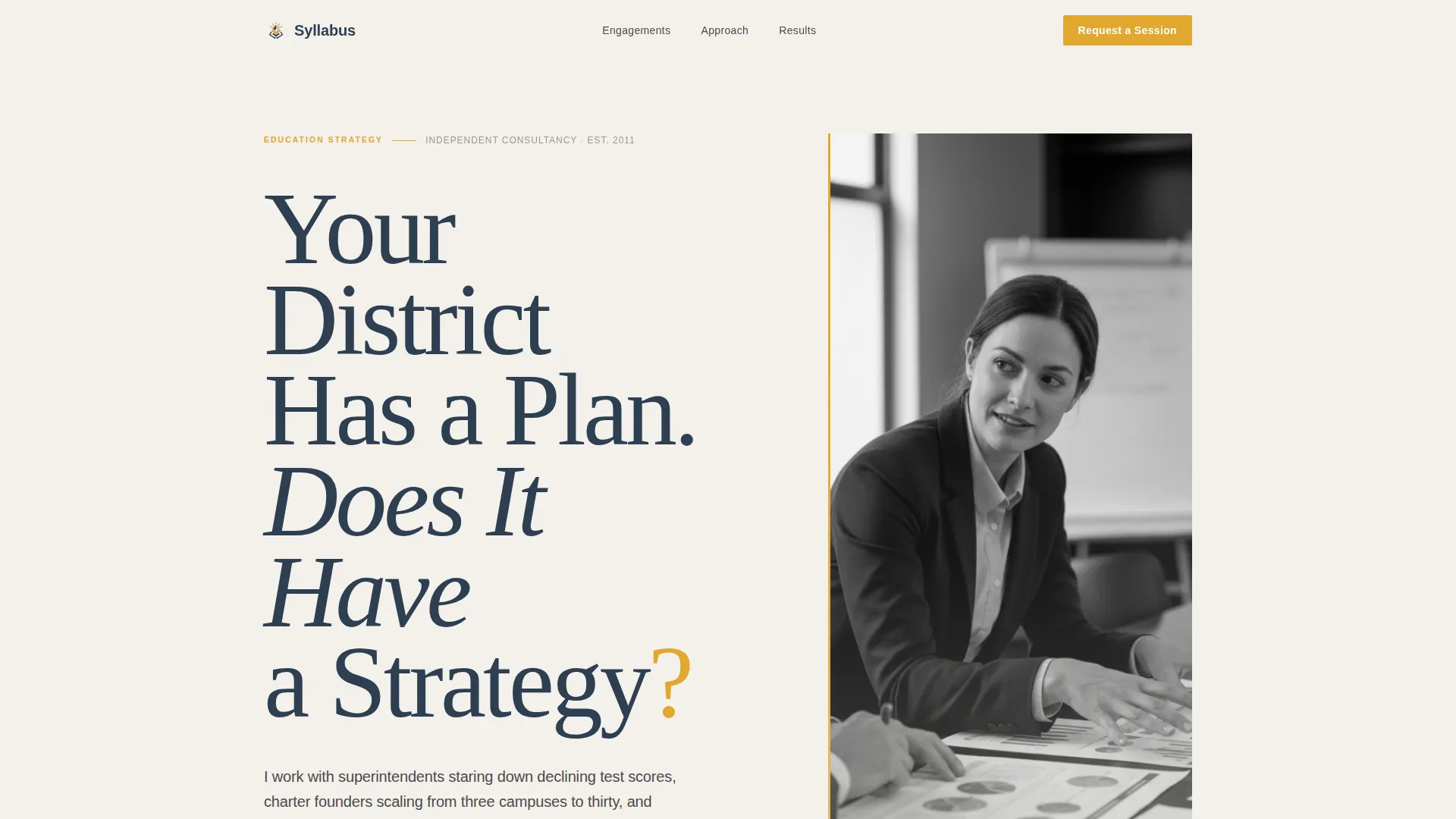
- A giant-headline header section with space for a candid editorial portrait and an arresting opening question
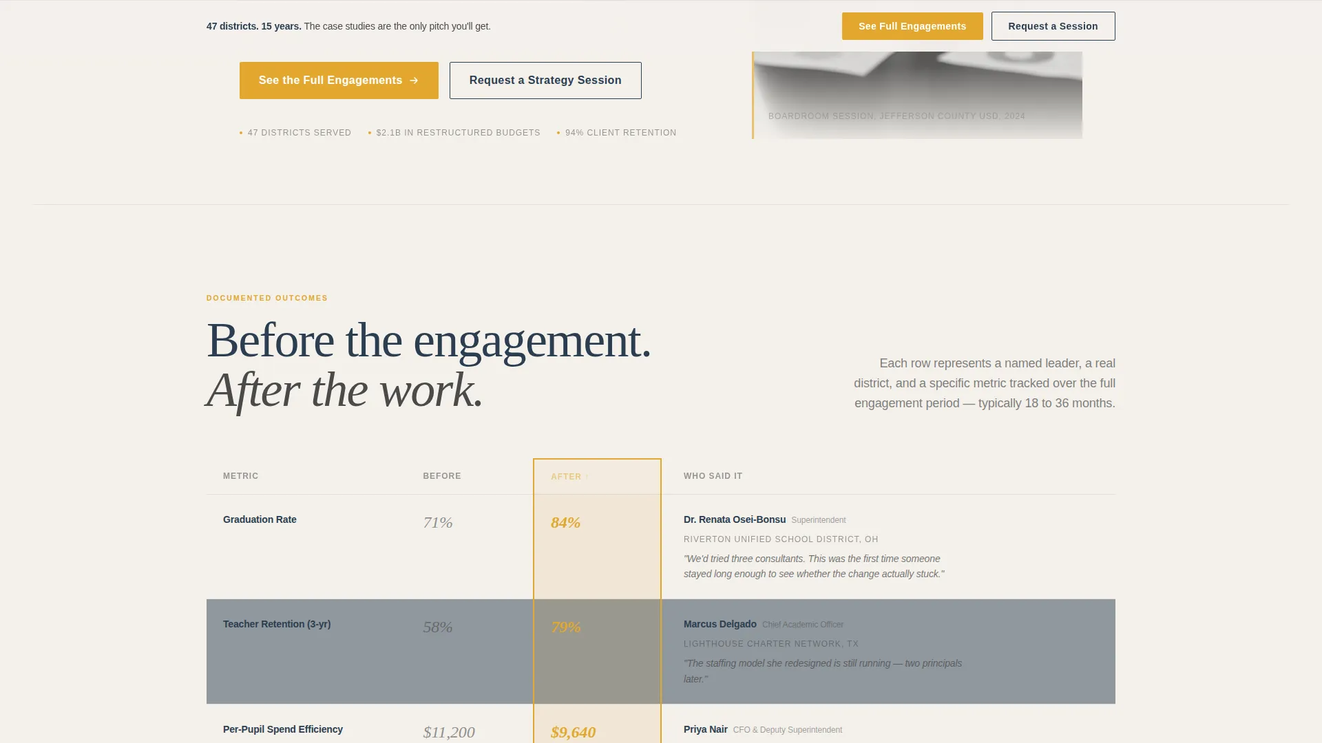
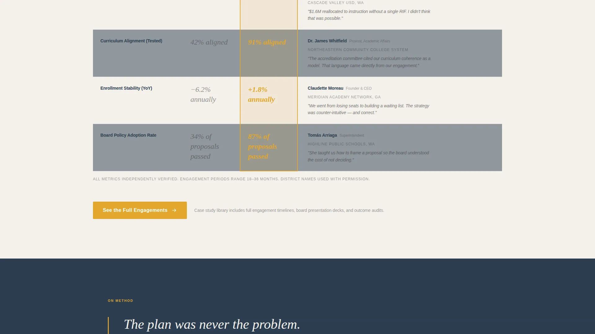
- A comparison table showing before-and-after engagement metrics, each row tied to a named district leader and a direct quote
- Two distinct call-to-action paths: a primary click toward case studies and a secondary booking path that appears only after the visitor has passed through the proof sections
Feature list
This section describes the core functional and design components built into the Syllabus template.
Giant Headline Left Header
The header opens with enormous serif type set flush-left in chalkboard slate. The headline reads like a provocation, "Your District Has a Plan. Does It Have a Strategy?", sized so the question mark alone anchors the lower portion of the viewport. A black-and-white editorial portrait sits to the right, showing the consultant mid-conversation at a boardroom table, lending the page immediate human credibility.
Before-and-After Comparison Table
The comparison table is the structural centerpiece of the page. It contrasts conditions across key metrics including graduation rate, teacher retention, and per-pupil spend. Each row is anchored by a named district leader and a one-sentence quote, so the data stays tethered to a real person and a real school.
People-Led Proof Sections
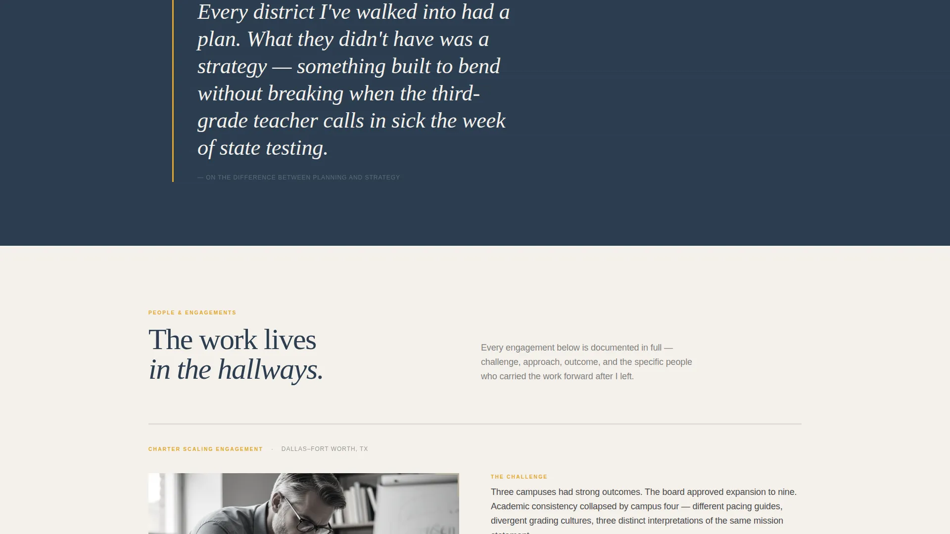
Scrolling past the table, the page introduces real engagements through the humans involved. Sections alternate between full-width typographic pull-quotes and tight two-column layouts, pacing the reader like chapters in a long-form magazine feature.
Two-Path Click-Through Strategy
The page carries two distinct calls to action. "See the Full Engagements" appears first beneath the comparison table, then again as a persistent bottom bar after approximately seventy percent scroll depth. "Request a Strategy Session" surfaces only after the visitor has moved through at least two people-driven proof sections, earning the ask by demonstrating depth first.
Editorial Magazine Visual System
The Cloud Canvas color system uses soft newsprint white, pencil-lead gray, chalkboard slate, and academic saffron. Saffron appears only in pull-quotes, table highlights, and call-to-action buttons. The palette and typography together feel like a printed quarterly journal, not a digital brochure.
No-Form Conversion Architecture
There is no form on this page. The conversion path is built entirely on clicks. Visitors move to a detailed case study library or a booking page, carrying conviction built by the evidence they just read.
Page sections overview
| Section | Purpose |
|---|---|
| Giant Headline Header | Opens with a bold serif question and editorial portrait to establish immediate authority |
| Comparison Table | Contrasts before-and-after engagement metrics, each row anchored by a named district leader and quote |
| Pull-Quote Break | Full-width typographic moment that slows the reader and reinforces a key insight |
| People Proof Section | Introduces a real engagement through the humans involved, building relational credibility |
| Primary call to action Block | "See the Full Engagements" button linking to the case study library |
| Second Proof Section | A second people-led engagement section that earns the secondary call to action |
| Secondary call to action Surface | "Request a Strategy Session" link that appears after two proof sections have been passed |
| Persistent Bottom Bar | Sticky bar with the primary call to action that activates after roughly seventy percent scroll depth |
Design & branding system
The template uses the Cloud Canvas color system, a palette drawn from the materials of academic life. Every color choice reinforces the editorial, unhurried authority the consultant's positioning requires.
- Newsprint white (#F4F1EC) for backgrounds, pencil-lead gray (#4A4A4A) for body type, and chalkboard slate (#2C3E50) for headlines and structural elements
- Academic saffron (#E2A72E) reserved exclusively for pull-quotes, table row highlights, and call-to-action buttons, so it always signals something worth annotating
- Editorial Magazine theme with large serif display type, tight two-column body layouts, and full-width typographic breaks that pace the page like a printed journal
Mobile & speed optimization
The layout is designed with a scroll-forward reading experience in mind. Long-form content and full-width sections need to reflow cleanly on smaller screens without losing the editorial pacing.
- The comparison table adapts for narrower viewports so metric rows and quotes remain readable without horizontal scrolling
- Full-width pull-quote sections and two-column layouts stack cleanly on mobile, preserving the chapter-like rhythm of the desktop experience
- The persistent bottom bar call to action is sized and positioned for thumb-reach on mobile devices
How this template helps you convert
The conversion strategy on this page is deliberate and sequenced. It never asks before it gives.
- The comparison table delivers concrete, named evidence before any call to action appears, so visitors arrive at the "See the Full Engagements" button already convinced the work is real.
- The secondary call to action, "Request a Strategy Session," is withheld until the visitor has passed through at least two people-driven proof sections, meaning the ask carries the weight of everything they have already read.
Other information about this template
The Syllabus template is suited to professionals working at the intersection of institutional leadership and long-cycle strategy consulting. It reflects a specific engagement model where trust is built over time and the landing page must do the same.
- The template is designed for a single-page, click-through flow with no embedded forms; all conversion paths are outbound clicks
- Portrait photography is intended to be candid and editorial in character, with visible grain and natural imperfection, rather than polished stock imagery
- The overall tone and layout are modeled on a long-form magazine feature, making it well suited for consultants in education strategy, curriculum consulting, and institutional planning roles
- The page structure supports a consulting practice serving clients such as public school districts, charter management organizations, and higher education institutions preparing for accreditation reviews
Theme
Editorial Magazine
Creative direction
Team & People
Color system
Cloud Canvas
Style
Comparison Table
Direction
Click-Through
Page Sections
Giant Headline Left Header
Before-and-after Comparison Table
People-led Proof Sections
Two-path Click-through Architecture
Cloud Canvas Editorial Color System
No-form Conversion Design
Related questions
Is this template suitable for a solo education strategy consultant?
Does this template include a contact form?
Can I update the comparison table with my own client data?
Why does the secondary call to action appear later on the page?
Can higher education consultants use this template?



