Education Marketing & Agency Education Website Template
Syllabus is a bold brutalist landing page template built for education content marketing agencies. It pairs an Ink and Paper color system with a collage-style header, editorial scroll sections, and a lead-generation form styled like a graded assignment sheet. The result feels like a well-annotated textbook: raw, authoritative, and impossible to ignore.
by Rocket studio
Quick summary
Syllabus is a full-width immersive landing page template designed for education content marketing agencies. It uses a Bold Brutalist visual theme, an Ink and Paper color palette, and a Collage/Scrapbook header to make deep subject-matter expertise feel as compelling as it actually is. Every section is built to earn trust and drive qualified lead generation.
Who this template is for
This template is built for agencies and specialists who market education products and services to institutional buyers. It speaks directly to the tension between having strong expertise and struggling to communicate it through content that moves decision-makers.
- EdTech founders whose competitors are dominating LinkedIn while their own content stays quiet
- University marketing directors navigating enrollment decline with limited content resources
- K-12 publishers and education service providers whose product is strong but whose content reads like it was written by committee
What problem this template solves
Education marketing operates on long sales cycles. District-level procurement can take eighteen months or more. Generic agency templates were not built for that reality. This template solves the credibility gap that education-focused agencies face when trying to speak to superintendents, department heads, and procurement committees at once.
- Most agency templates look polished but feel interchangeable, giving no signal that you understand education specifically
- Visitors from institutional buyers need to see evidence before they trust an agency with a high-stakes content brief
- Standard lead forms collect noise; this template uses a focused three-question intake to qualify leads before the first conversation
What you get with this template
You get a single-page layout built entirely around editorial impact and lead conversion. Every visual and structural decision in the template is backed by the source brief, from the collage header to the assignment-sheet form at the bottom.
- A full-viewport Collage/Scrapbook header with layered, overlapping content artifacts pinned like a corkboard
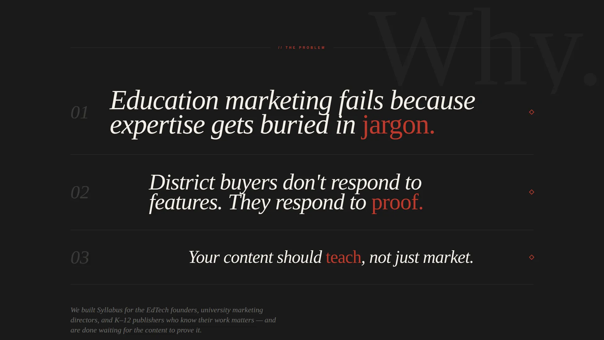
- A manifesto section where three sentences about education marketing failure each fill the full viewport width in decreasing type sizes
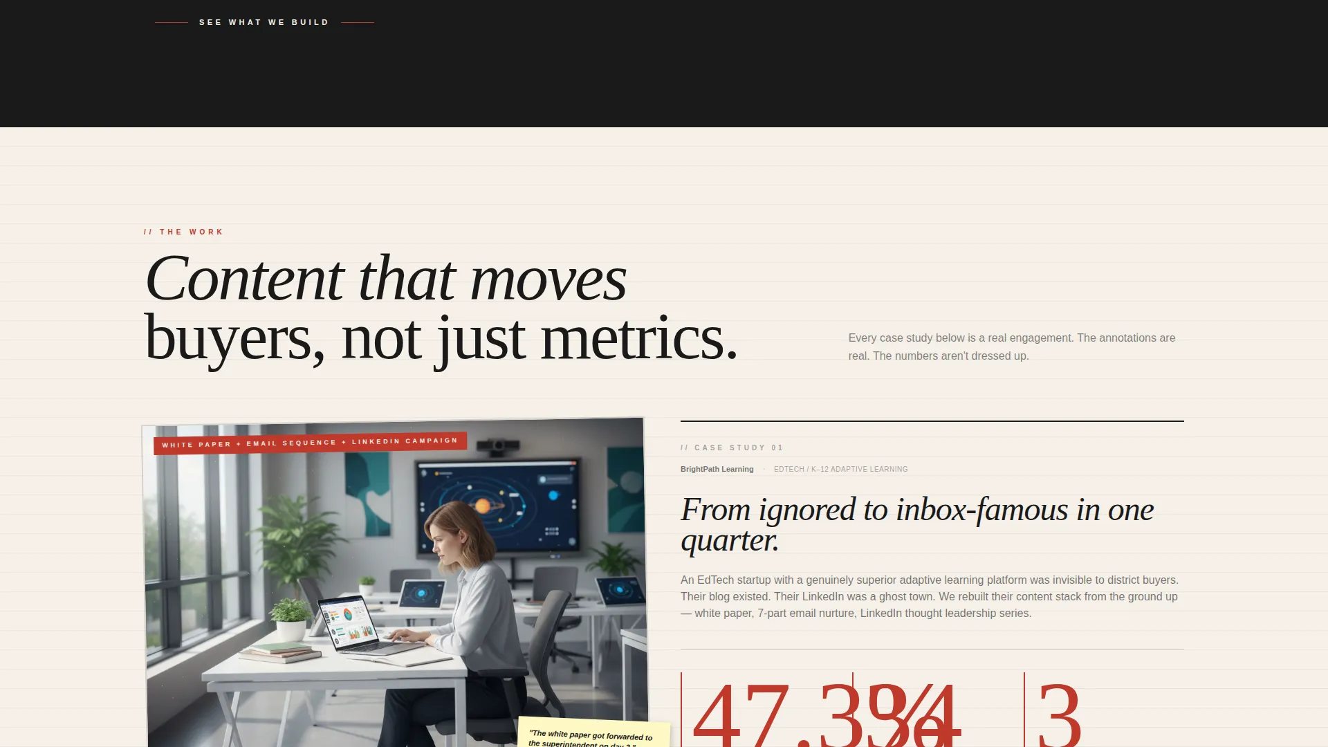
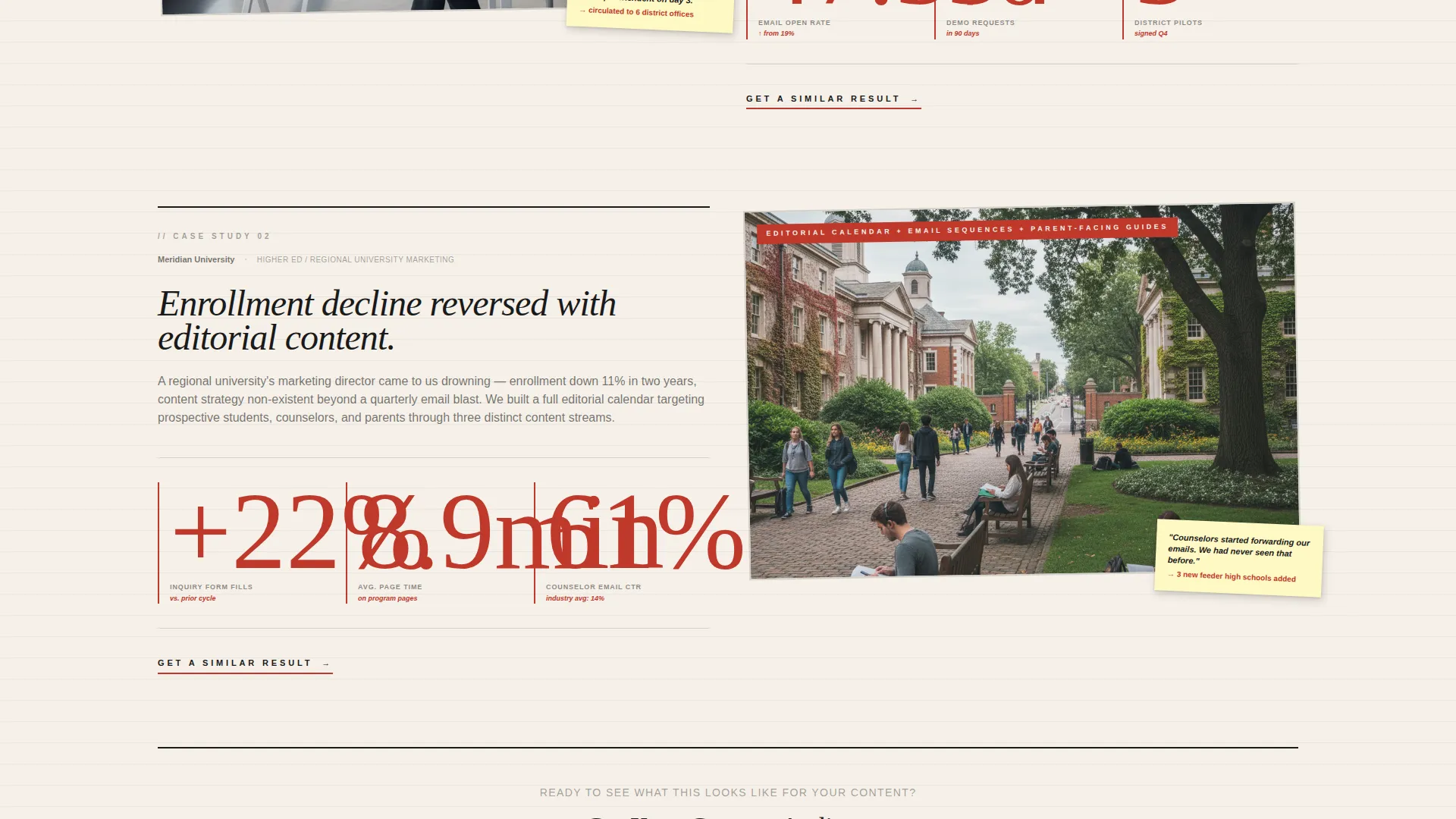
- Case study spreads styled as scrapbooked editorial pages with red-ink annotations and circled metrics
- A dual-path lead generation section featuring a primary content audit form and a secondary PDF download gated by email only
Feature list
The template delivers a set of carefully designed components that work together to build agency credibility and capture qualified education marketing leads.
Collage/Scrapbook Header
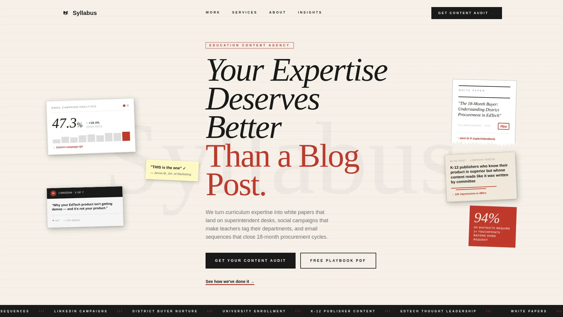
The header fills the full viewport with intentionally layered content artifacts: a torn-edge white paper cover, a social media carousel, an email open-rate dashboard screenshot showing 47.3%, a handwritten sticky note, and a red-pen-circled blog headline. Elements are slightly rotated with subtle drop shadows as if pinned to a corkboard. Nothing is centered. Everything looks curated by hand.
Brutalist Manifesto Section
After the header, the page snaps to a stark black-on-cream section where three sentences about why education marketing fails each occupy the full viewport width in decreasing type sizes. The format forces the reader to absorb each idea before scrolling further, mimicking the experience of being taught rather than sold to.
Annotated Case Study Spreads
Case studies arrive as scrapbooked editorial spreads with real content samples pinned, marked up, and annotated. Metrics are scrawled large, circled in red, and connected to the content that produced them with hand-drawn arrows. This approach makes results feel earned rather than curated.
Post-it Testimonial Stack
Testimonials from marketing directors are stacked visually like Post-it notes on a shared wall. The format builds social proof through accumulation and texture rather than through clean quote cards, keeping the raw and deliberate tone of the overall page consistent.
Graded Assignment Lead Form
The primary lead generation form at the bottom of the page is styled like a graded assignment sheet. It asks three focused questions in sequence: what the visitor sells to educators, where their content currently lives, and what their monthly content budget range is. No phone field. No filler questions.
Dual-Path Conversion System
A red-underlined text link mid-page offers the primary call to action after case studies build credibility. A secondary path offers a downloadable PDF gated behind email only. This catches visitors who are not ready to book a conversation but are willing to be nurtured through a content sequence.
Page sections overview
| Section | Purpose |
|---|---|
| Collage header | Establish agency identity with layered editorial artifacts and bold headline |
| Manifesto block | Confront the core failure of education marketing in three full-width sentences |
| Case study spreads | Show annotated evidence of content work with circled metrics in red ink |
| Testimonial stack | Stack Post-it-style quotes from marketing directors to build social proof |
| Mid-page call to action | Red-underlined text link prompts qualified visitors to request a content audit |
| Lead generation form | Three-question assignment-sheet form captures and qualifies inbound leads |
| PDF download gate | Email-only secondary offer nurtures visitors not yet ready for direct contact |
Design & branding system
The template uses an Ink and Paper color system anchored in four deliberate choices. The palette feels like a photocopied zine assembled by the sharpest person in the teachers' lounge: raw, authoritative, and deliberately unpolished.
- Unbleached stock cream (#F5F0E8) as the base, permanent marker black (#1A1A1A) dominating headlines in oversized heavy-weight type, and red grading pen (#C0392B) used to circle statistics, highlight metrics, and underline calls to action
- Institutional chalkboard green (#2C3E2D) appearing sparingly on hover states and section dividers, like chalk dust on a sleeve
- Typography crowds the edges of its containers; black type is intentionally oversized, breathing room comes from cream backgrounds rather than generous line spacing
Mobile & speed optimization
The full-width immersive layout is structured for clarity across screen sizes. The editorial spreads and collage compositions are designed to translate their intentional chaos into readable hierarchy at smaller viewports.
- Oversized headline type scales down gracefully to maintain brutalist weight without overwhelming narrow screens
- The sequential three-question lead form keeps the mobile conversion path short and focused, reducing friction for visitors on phones or tablets
How this template helps you convert
Every design and structural decision in this template is pointed toward turning a skeptical institutional buyer into a qualified lead.
- The collage header establishes credibility through visual evidence before the visitor reads a single word, making the agency feel like a practiced insider rather than a generic vendor
- The annotated case study spreads show results in context, giving procurement-minded buyers the proof they need to justify a discovery conversation
- The dual-path conversion system ensures that visitors at every stage of a long procurement cycle have a natural next step, whether that is booking an audit or downloading the education content playbook
Other information about this template
This template was designed specifically for the education marketing niche, where content decisions are often made by committees and evaluated against institutional credibility rather than brand aesthetics alone. The following details are worth noting for anyone evaluating it for their agency or client work.
- The template style is Full-Width Immersive, meaning every section is built as a full-bleed editorial spread rather than a boxed or card-based layout
- The header concept is Collage/Scrapbook, which is a deliberate creative direction choice suited to agencies that want to demonstrate content craft visually before asking visitors to read
- The Bold Brutalist theme is a specific design language: heavy type, raw texture, and intentional asymmetry used to signal authority rather than approachability
- This landing page template fits the Portfolio and Agency category with a focused subcategory alignment to education marketing and agency positioning
- The page is suited for agencies serving EdTech, higher education, and K-12 publisher clients who operate on long procurement cycles and need content that speaks to institutional decision-makers
Theme
Bold Brutalist
Creative direction
Immersive Visual
Color system
Ink & Paper
Style
Full-Width Immersive
Direction
Lead Generation
Page Sections
Collage/scrapbook Header
Brutalist Manifesto Section
Annotated Case Study Spreads
Post-it Testimonial Wall
Graded Assignment Lead Form
Dual-path Conversion System
Related questions
Who is this landing page template designed for?
What does the lead generation form collect?
Is there a secondary conversion option for visitors not ready to book?
Can I adapt the color palette to match my own agency brand?
What makes this different from a general agency landing page template?



