Education Department Fundraising Landing Page Template
The Syllabus Education Department landing page is a hub-and-spoke fundraising page built for K-12 curriculum departments. It guides donors from problem awareness to confident giving through four narrative chapters: The Need, The Plan, The Impact, and Your Role. A sticky "Fund a Classroom" button, tiered giving levels, and a three-step donation form make every dollar feel specific and traceable.
by Rocket studio
Quick summary
Syllabus is a single-page fundraising template designed for education departments that need to turn community goodwill into classroom resources. It follows a chapter-by-chapter narrative structure, moving visitors from resource gaps to specific giving outcomes. A half-page hero, anchor navigation, and a three-step donation form work together to make giving feel immediate and meaningful.
Who this template is for
This template is built for curriculum departments, district education offices, and school-adjacent nonprofits that run community fundraising campaigns. It speaks directly to an audience that already cares about local schools and needs a clear reason to act.
- School board alumni, parents, and community members who want to see dollars reach classrooms
- Local business owners who see K-12 education as a workforce investment
- Education department staff who need a ready-to-launch fundraising page without building from scratch
What problem this template solves
Most education department fundraising pages either bury the ask in policy language or make giving feel abstract. Donors want to know their contribution does something real. This template closes that gap by pairing every giving level with a tangible classroom outcome.
- Outdated materials and overcrowded classrooms are shown honestly, not glossed over
- Vague donation forms are replaced with tiered choices tied to named programs and timelines
- Visitors who need proof before giving have a clear path to student outcomes and before-and-after evidence
What you get with this template
You get a fully structured, single-page fundraising layout that handles the entire donor journey from first impression to completed gift. Every section is purposefully ordered and pre-designed so your department can focus on filling in real data, not building from scratch.
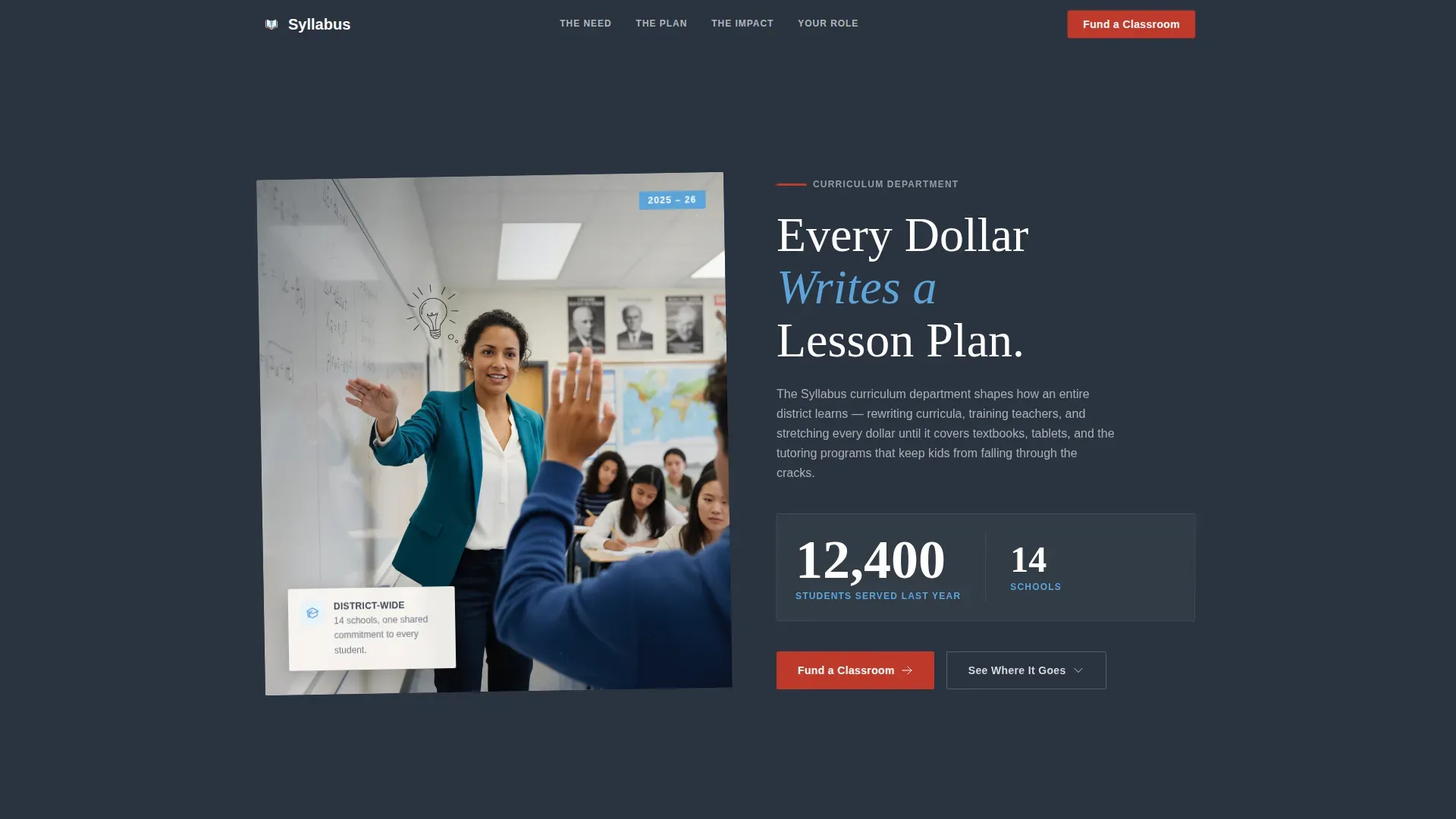
- A half-page hero with a classroom photograph, a bold headline, and a student-count stat displayed at scoreboard scale
- Four narrative spoke sections with chapter markers, scroll-linked reveals, and staggered entries
- A three-step donation form with giving levels, donor details collection, and payment handling
Feature list
This template includes the following built-in capabilities:
Hub-and-Spoke Anchor Navigation
A top navigation bar reads like a curriculum outline: The Need, The Plan, The Impact, Your Role. Each label anchors directly to its section, letting donors jump to the content they care about most without scrolling blindly.
Tiered Giving Levels with Outcomes
The donation form opens with step one: a giving-level selector where each amount is tied to a specific result. Fifty dollars supplies one science kit. Two hundred fifty dollars sponsors a semester of after-school tutoring. One thousand dollars equips a computer station. The specificity removes hesitation.
Sticky "Fund a Classroom" Call to Action
The primary call-to-action button appears in the hero and follows the visitor as a sticky element throughout the scroll. It stays visible so the path to giving is never more than one click away, regardless of where a donor is on the page.
Three-Step Donation Form
The form is broken into three clear steps: select a giving level, enter name and email, and complete payment. The step-by-step structure reduces form anxiety and keeps completion rates higher than a single long form would.
Scroll-Linked Section Reveals
Each chapter section enters the viewport with a staggered animation triggered by scroll position. The numbered chapter markers in the margin reinforce the lesson-plan narrative and give the page a sense of forward momentum.
Social Proof Integration Points
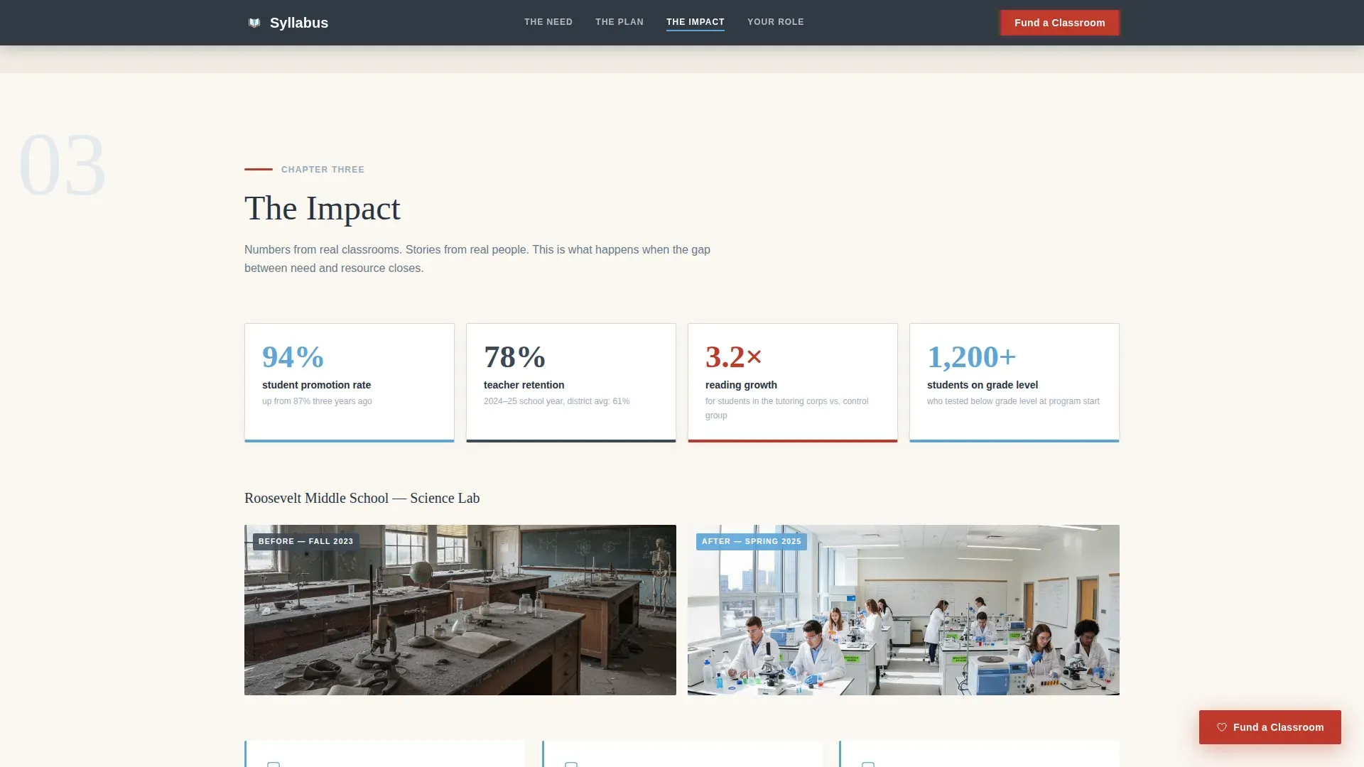
Dedicated layout areas hold student outcome statistics, teacher testimonials, before-and-after classroom photos, and a donor count display. These proof elements appear inside the Impact spoke where trust-building matters most.
Page sections overview
| Section | Purpose |
|---|---|
| Hero Header | Introduce the cause with a classroom photo, headline, and student stat |
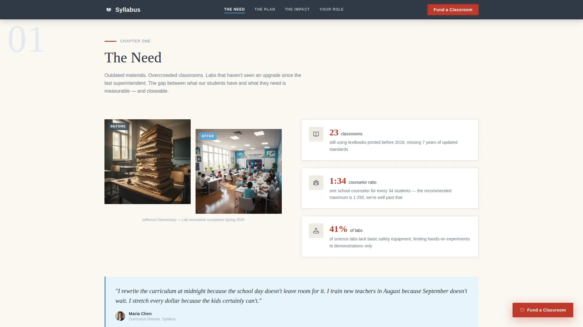
| The Need | Show resource gaps with statistics and before-state imagery |
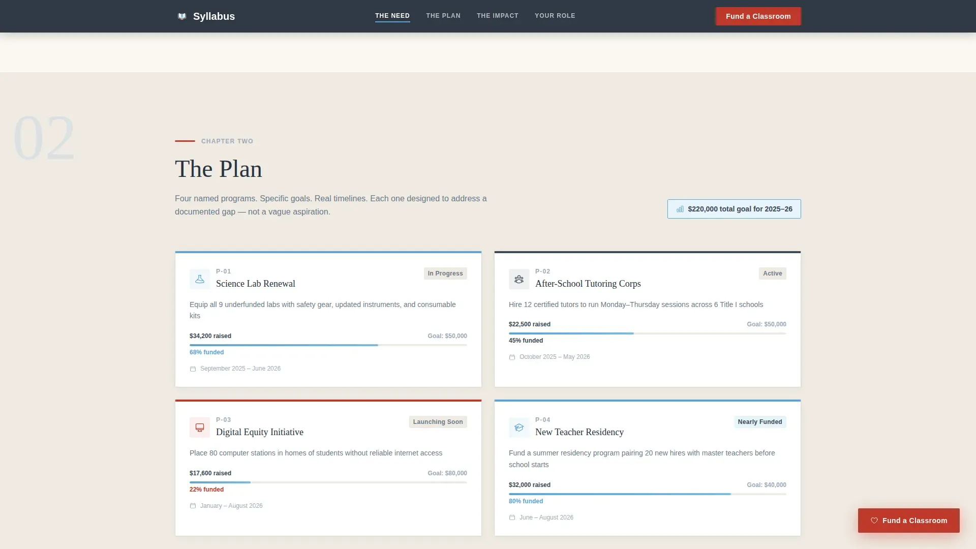
| The Plan | Present named programs with goals, timelines, and funding progress |
| The Impact | Deliver proof through student outcomes, retention data, and before/after photos |
| Your Role | Host the three-step donation form with tiered giving levels |
| Footer | Provide contact and organizational details in a single linear row |
Design & branding system
The visual identity follows an Educational Guide theme. Every color and type choice is grounded in the lesson-planner aesthetic described in the brief: structured, warm, and built for readers who trust process.
- Chalkboard slate (#3B4856) anchors headers and navigation; ruled-paper cream (#FAF7F2) fills content wells for easy reading; morning sky blue (#5DA4D9) marks active nav items and hover states; red-pencil accent (#C0392B) is reserved for calls to action and progress indicators
- Fraunces serif typeface is used for headlines to carry editorial weight; DM Sans handles body text and interface elements for clarity at every size
- The overall feel is a well-loved lesson planner: tabbed sections, highlighted margins, and a warmth that signals care rather than bureaucracy
Mobile & speed optimization
The template is built desktop-first, reflecting the reality that donors making financial decisions are most often on a laptop or desktop screen. Full mobile responsiveness ensures the page holds together for any visitor who arrives on a phone.
- Static sections use server-rendered components to keep initial load times fast; the interactive form and anchor navigation are handled client-side
- The sticky call-to-action button adapts to mobile viewports so the giving path stays accessible at every screen size
- Scroll-linked animations are scoped to content reveals and do not block interactivity or delay form access
How this template helps you convert
Every structural and design decision in this template is aimed at moving a hesitant visitor toward a completed donation. The narrative arc does the persuasion work so your copy does not have to.
- The hero establishes credibility immediately with a real classroom photograph, a human headline, and a student-count stat that makes the scale of impact concrete before the visitor reads a single paragraph.
- The "See Where It Goes" secondary path anchors skeptical visitors directly to the Impact section, giving proof-seekers the evidence they need before the ask ever appears.
- Tiered giving levels with named outcomes reduce the mental cost of deciding how much to give, making it easier to say yes to a specific, small-feeling amount right now.
Other information about this template
This template sits within the Government and Public category under the Government Agency and Department subcategory, specifically targeting the Education Department niche. It is designed for English-language campaigns using United States dollar amounts and standard United States date formatting.
- The footer follows a linear single-row pattern, keeping organizational information accessible without distracting from the donation flow
- The page style is classified as a Hub and Spoke layout with anchor navigation, making it well-suited for departments that need to tell a multi-chapter story inside a single scrolling page
- Animation intensity is set to medium: scroll-linked reveals and staggered section entries add life without overwhelming visitors or slowing the giving path
Theme
Educational Guide
Creative direction
Step-by-Step Guide
Color system
Slate & Sky
Style
Hub & Spoke (Anchor Nav)
Direction
Donation/Fundraising
Page Sections
Hub-and-spoke Anchor Navigation
Tiered Giving Levels with Outcomes
Sticky Fund a Classroom Button
Three-step Donation Form
Scroll-linked Chapter Reveals
Social Proof Layout Areas
Related questions
Who is this landing page template designed for?
Can I customize the giving levels and program names?
How does the three-step donation form work?
What sections are included in the anchor navigation?
Is this template suitable for a small department with limited content?