Education Facility Portfolio Landing Page Template
Syllabus is a precision-built education facility portfolio landing page for architecture firms that design schools, universities, and campus buildings. The overlap and layered layout stacks glass-card project entries with scroll-driven depth, animated blueprint illustrations, and a structured lead capture form, all styled in a Monochrome Steel palette with cyan accents.
by Rocket studio
Quick summary
Syllabus is a single-page portfolio landing page built for education facility architects. It opens with a self-constructing campus illustration, guides visitors through layered project showcases, and closes with a focused lead generation module. The design speaks directly to school district directors, university administrators, and charter school founders who need to evaluate a firm before committing to a conversation.
Who this template is for
This template is designed for architecture and design firms that specialize in education facilities. The content and visual language are calibrated for the decision-makers these firms need to reach.
- School district facilities directors managing bond-measure budgets and multi-campus planning
- University provosts and administrators evaluating firms for STEM building expansions
- Charter school network founders opening third or fourth campuses who have specific, experienced requirements
What problem this template solves
Education facility clients are sophisticated. They arrive with bond documents, student capacity targets, and board accountability. A generic portfolio page does not earn their trust. They need to see real project data before they will fill out a form.
- Most portfolio pages lead with the firm, not the buildings, losing the client before the work is shown
- Visitors cannot easily scan project specs like square footage, student capacity, or sustainability ratings at a glance
- Generic contact forms feel mismatched to clients with complex, multi-phase project requirements
What you get with this template
This template delivers a fully structured, single-page education architecture portfolio with layered visual depth and a purpose-built lead capture system. Every section is designed to move a qualified visitor toward a conversation.
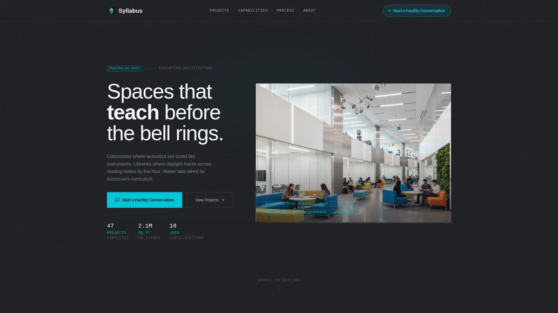
- An animated header illustration that constructs a line-drawn campus in real time before dissolving into a photograph
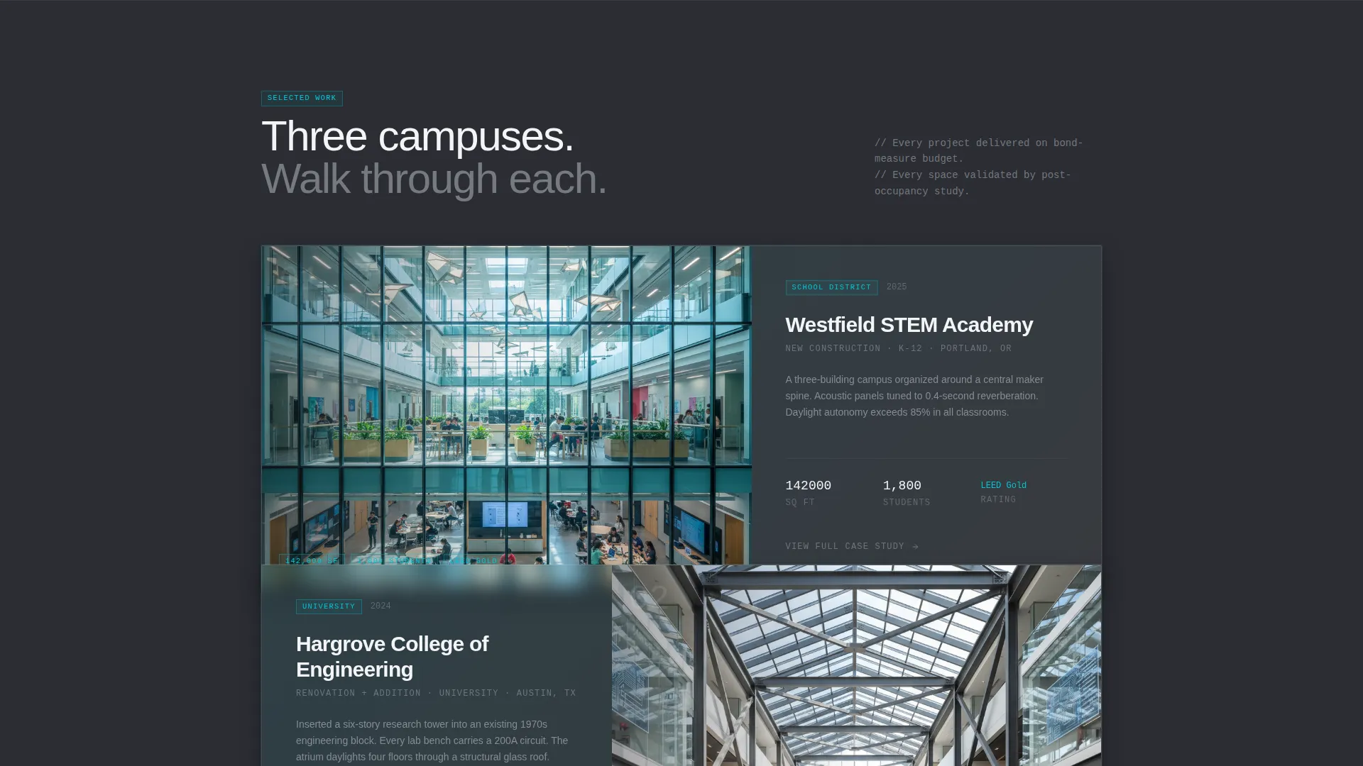
- A scroll-driven project gallery using overlapping glass cards with data overlays showing project specifications
- A layered glass modal lead capture form and a secondary gated PDF case study download for lower-commitment conversion
Feature list
This template includes a cohesive set of purpose-built features. Each one is grounded in the specific needs of education facility portfolio marketing.
Animated Blueprint Header
The header opens with a line-drawn campus that builds itself over five seconds. Steel beams rise, glass walls slide into place, and interior details populate the frame. The illustration then dissolves into a photograph of the completed building, connecting the architectural process to the finished result.
Overlapping Glass Card Project Gallery
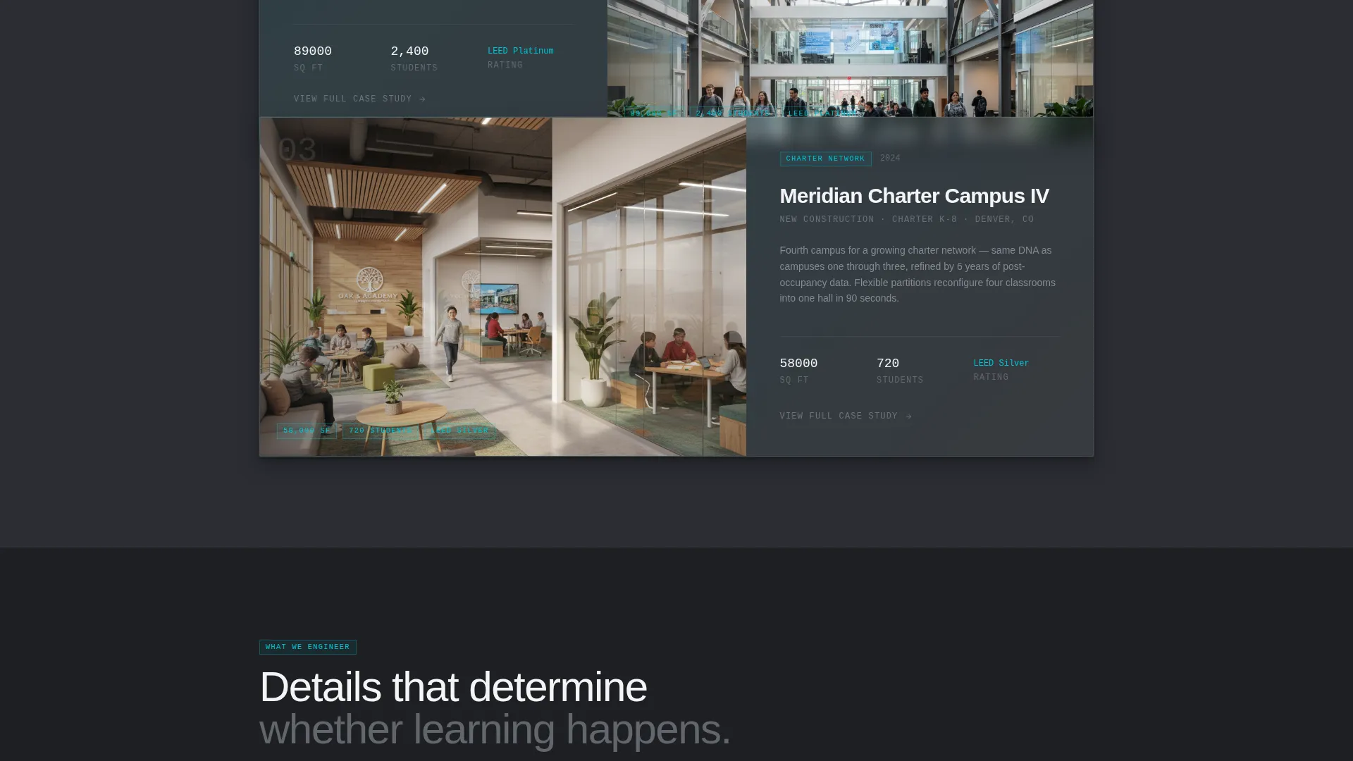
Each project entry is presented as a translucent glass card that physically overlaps the one above it. The layered stack creates a sense of depth similar to flipping through acetate sheets, guiding the visitor through multiple completed campuses before the primary call to action appears.
Scroll-Triggered Data Overlays
As visitors scroll through project cards, specification data appears directly on the images. Square footage, student capacity, and sustainability rating figures are typeset in thin monospaced numerals styled like annotations on a construction document.
Parallax Interior and Exterior Photography
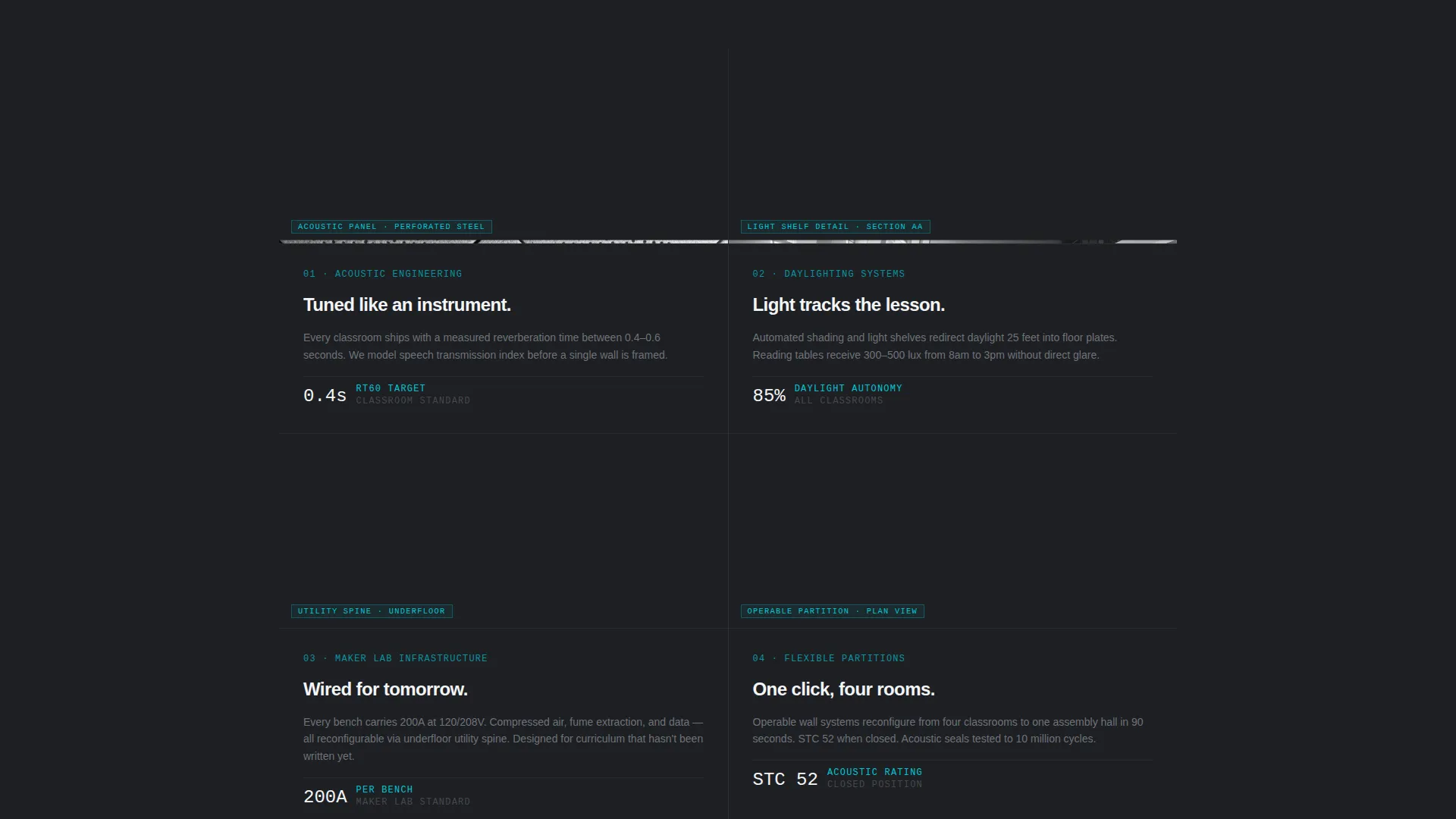
Every third section introduces a parallax shift where the building exterior drifts behind its own interior shot. Photography moves from wide aerial site views to close details, acoustic panel grain, partition hardware, light across a terrazzo corridor, building a tactile sense of the spaces.
Layered Glass Modal Lead Form
The primary call to action opens a modal form consistent with the page's glass-and-depth visual language. It collects institution name, project type, target student capacity range, a freeform project context field, and an optional file upload for site plans or bond documents.
Gated PDF Case Study Download
A secondary conversion path offers a downloadable case study PDF gated behind an email address. This lower-commitment option feeds the same nurture sequence as the primary form while reaching visitors who are not yet ready to start a direct conversation.
Page sections overview
| Section | Purpose |
|---|---|
| Animated Header | Introduces the firm with a self-building campus illustration that dissolves into real photography |
| Fixed Nav Pill | Keeps the primary call to action visible as visitors scroll through the full page |
| Project Gallery | Showcases completed education facilities as layered glass cards with specification overlays |
| Mid-Page call to action | Full-width lead generation module placed after the third project to capture engaged visitors |
| Glass Modal Form | Collects detailed project context through a structured, multi-field intake form |
| PDF Case Study | Provides a gated downloadable asset for visitors who prefer a lower-commitment first step |
Design & branding system
The visual identity follows a Tech Glass theme built on a Monochrome Steel color system. Every surface, shadow, and typographic choice reinforces a sense of precision, transparency, and structural confidence.
- Core palette: structural charcoal (#2B2D33) for backgrounds, brushed aluminum (#A8ADB5) for secondary panels, polished white (#F4F5F7) for floating content surfaces, and illuminated cyan (#00C6D7) reserved exclusively for interactive triggers and hover states
- The blueprint illustration uses white lines on charcoal with cyan pulses tracing each new element as it appears, maintaining visual consistency between the animated header and the rest of the page
- Project data overlays use thin monospaced numerals styled like construction document annotations, reinforcing the architectural identity throughout the scroll experience
Mobile & speed optimization
The layered visual system is designed to translate clearly across screen sizes. The depth and glass effects scale with the layout so the portfolio reads as well on a tablet or phone as it does on a wide desktop monitor.
- Overlapping glass cards and parallax shifts are structured to maintain visual clarity at smaller viewport widths
- The fixed nav pill remains accessible on mobile so the primary call to action is never out of reach
- The modal form is structured to be navigable on touch devices, with clearly separated input fields for each data point
How this template helps you convert
The page is built to earn the click before asking for it. By the time a visitor sees the primary call to action, they have already walked through three completed campuses and absorbed the numbers that matter to their board.
- The fixed nav pill keeps "Start a Facility Conversation" visible throughout the entire scroll, creating a persistent low-pressure entry point without interrupting the portfolio experience
- The mid-page full-width call to action module appears after the third project, placed precisely when visitor engagement is highest and project credibility is fully established
- The gated PDF case study offers a secondary conversion path for visitors who need more information before committing, capturing their email address and keeping them in the firm's pipeline
Other information about this template
This template is built specifically for the education facility architecture niche, where the sales cycle is long and the decision-makers are experienced. A few additional details worth noting:
- The template style is Overlap and Layered, meaning sections visually stack rather than sit side by side, creating a physical sense of browsing through a project portfolio
- The header concept is an Animated Illustration, a technique that communicates the architectural process before the finished building is ever shown
- The creative direction is Immersive Visual, using photography transitions, parallax shifts, and scroll-triggered effects to hold attention through a long-form page
- The lead generation direction means every design decision, from the fixed pill to the modal form structure, is oriented toward capturing qualified project inquiries
- The template title "Syllabus" reflects the education niche focus and signals that every element of the page has been intentionally structured, like a course outline for a firm's body of work
Theme
Tech Glass
Creative direction
Immersive Visual
Color system
Monochrome Steel
Style
Overlap/Layered
Direction
Lead Generation
Page Sections
Animated Blueprint Header
Overlapping Glass Card Gallery
Scroll-triggered Data Overlays
Parallax Photography Transitions
Layered Glass Modal Lead Form
Gated PDF Case Study Download
Related questions
Who is this landing page template designed for?
What does the animated header actually show?
How does the secondary conversion path work?
What makes the lead form different from a standard contact form?
Can the project gallery show different types of education facilities?



