Music School Marketing FAQ & Common Questions Website Template
Cadence is a single-column editorial landing page built for neighborhood music schools running seasonal promotions. It leads with bold enrollment statistics, guides visitors through FAQ-driven editorial blocks that dissolve hesitation, and drives bookings through a persistent sky blue call-to-action bar. The design feels clean and authoritative, like a well-organized music binder with one confident accent color.
by Rocket studio
Quick summary
Cadence is a music school promotional landing page that earns trust through numbers before it asks for anything. Bold enrollment stats open the page, honest FAQ editorial blocks guide every scroll section, and a "Book a Trial Lesson" prompt reappears at the right moments. The result is a page that feels less like a sales pitch and more like an open studio door.
Who this template is for
This template is designed for music schools and independent music educators who need a polished, conversion-focused landing page for seasonal promotions, enrollment drives, or new program launches. It works equally well for established schools with strong retention numbers and newer schools building credibility fast.
- Parents researching summer music camps who want clear, trustworthy information before committing
- Adult beginners who have delayed starting and need honest reassurance that it is not too late
- High school students building audition portfolios who need to act quickly and book efficiently
What problem this template solves
Most music school pages either bury the booking form behind too much marketing fluff or drop it on the visitor before answering a single real question. Cadence flips that pattern entirely. It leads with proof, then speaks directly to every doubt a prospective student or parent carries at 11 p.m. when they are finally researching.
- Visitors leave because the page never addresses their specific hesitation or timing concern
- Undecided visitors have no low-friction entry point before they are asked to commit
- Schools struggle to communicate genuine quality and full enrollment without feeling like they are boasting
What you get with this template
Cadence delivers a complete single-page promotional layout structured around real conversion logic. Every section has a clear job, and together they move a skeptical visitor from "maybe someday" to "I'll book a trial lesson" without a single wasted scroll.
- A stats-led header with oversized editorial typography built to establish immediate credibility
- A full FAQ-driven editorial body with pull quote blocks and recurring scheduling prompts
- An inline booking flow with instrument selection, age range, and day preference fields, plus a secondary instrument match quiz path
Feature list
A paragraph introduces the feature inventory: Cadence is built around a tight set of purposeful layout components. Each one has a specific role in moving the visitor toward a booking, and none of them are decorative filler.
Stats-Led Editorial Header
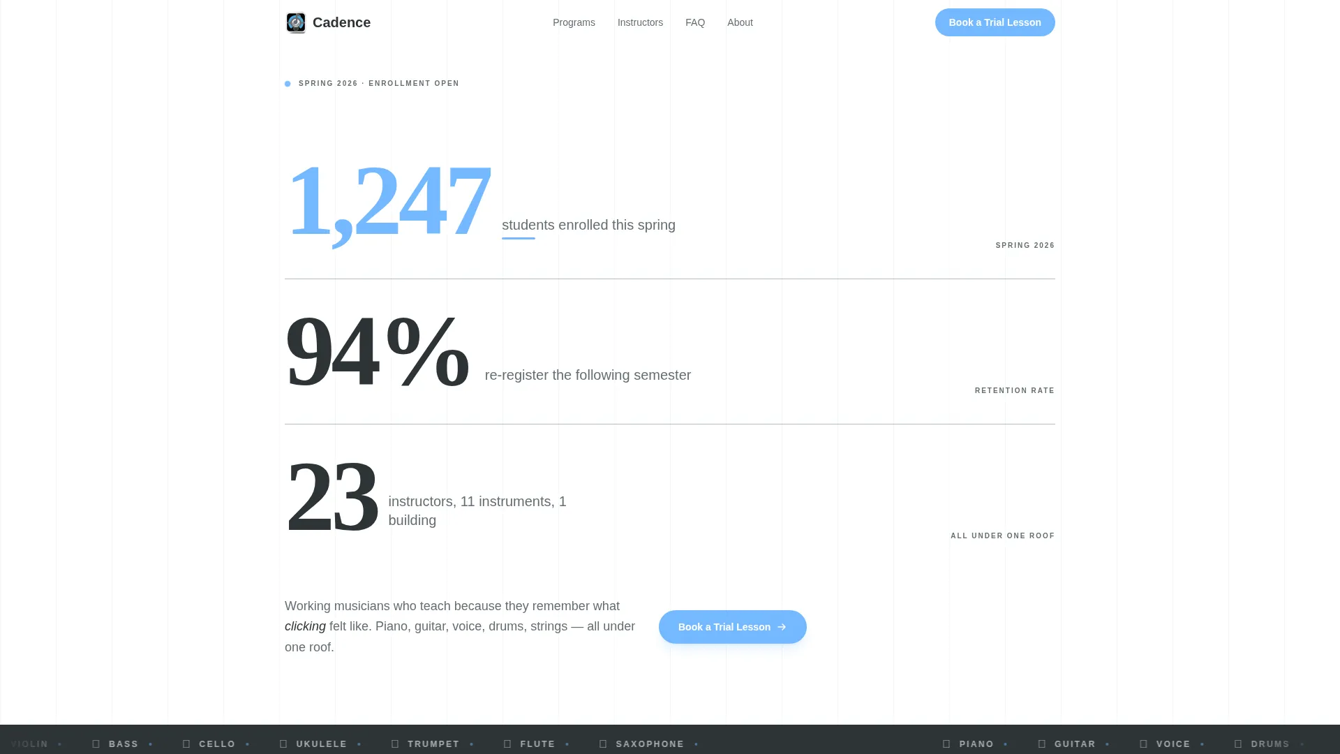
The header opens with three stacked enrollment metrics in oversized slate typography. No hero image is needed. The numbers themselves carry visual weight and authority, making the page feel like a magazine cover story the moment it loads.
FAQ-Driven Scroll Architecture
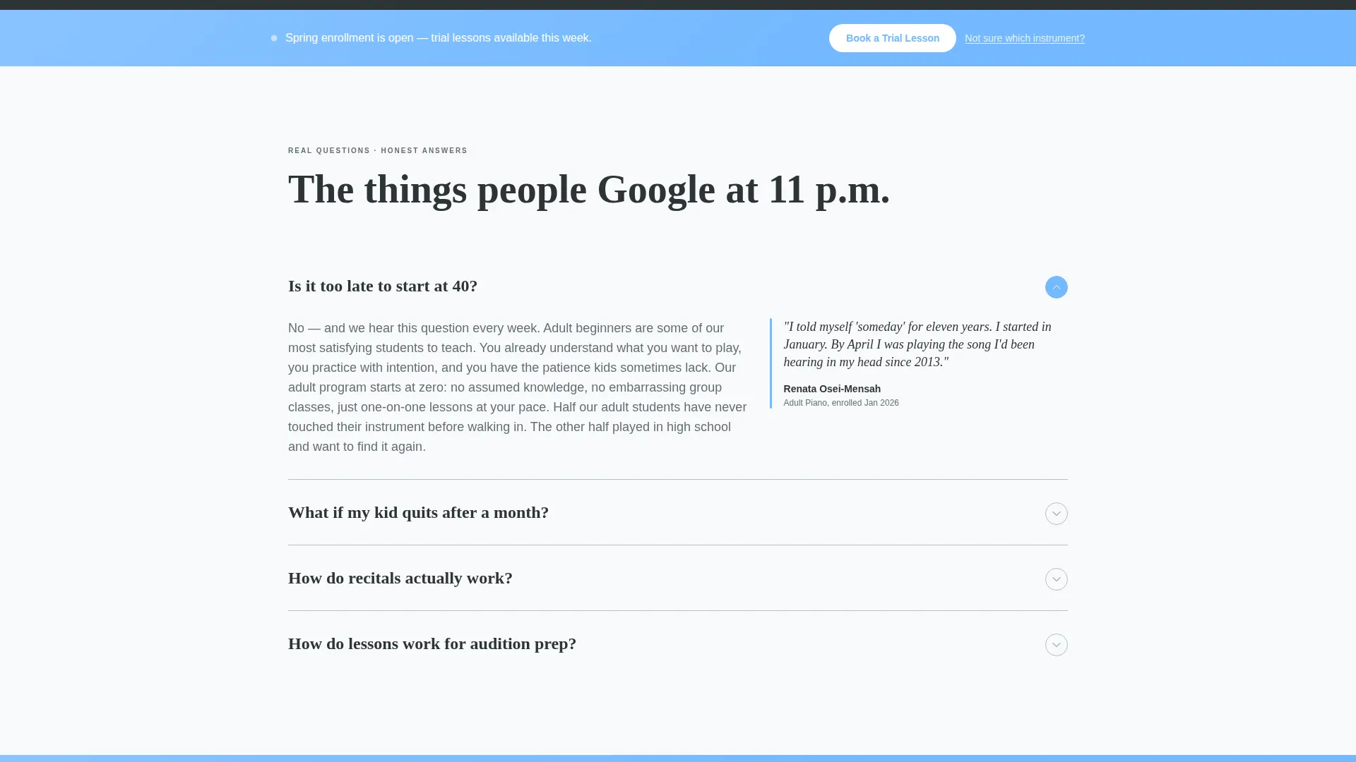
Every scroll section is anchored by a real question a parent or student searches at night. Each block pairs a short, honest answer with an instructor or student pull quote and a subtle scheduling nudge. Hesitation dissolves one answered doubt at a time.
Persistent Booking Call to Action
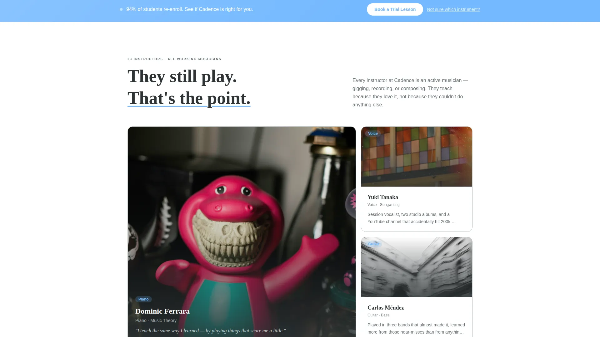
A sky blue accent bar carries the "Book a Trial Lesson" prompt at the top of the page and recurs automatically after every third FAQ block. The primary call to action never disappears far from view regardless of where the visitor is scrolling.
Inline Scheduling Form
Clicking the booking prompt opens an inline scheduler directly on the page. Visitors select their instrument of interest, their age range (under 12, teen, or adult), and their preferred day and time window. No redirect, no friction, no separate page.
Instrument Match Quiz Path
Visitors who are not sure which instrument to try can follow a secondary path: a two-minute instrument match quiz. It ends with a recommendation and pre-fills the booking form with that suggestion, keeping undecided visitors moving toward a lesson instead of bouncing.
Single-Column Scrollable Layout
The template uses a clean single-column flow that keeps the reader focused and the content scannable. There are no competing sidebars or distracting panels. The editorial rhythm guides the eye naturally from question to answer to call to action.
Page sections overview
| Section | Purpose |
|---|---|
| Stats header block | Opens with enrollment metrics to establish instant credibility |
| Primary booking bar | Pins the trial lesson call to action immediately below the header |
| FAQ editorial block 1 | Answers the first hesitation with a pull quote and scheduling prompt |
| FAQ editorial block 2 | Addresses the second common doubt with an honest, practical answer |
| Mid-page booking bar | Repeats the booking call to action after the third FAQ block |
| FAQ editorial block 3 | Handles objections around recitals, progress, and commitment |
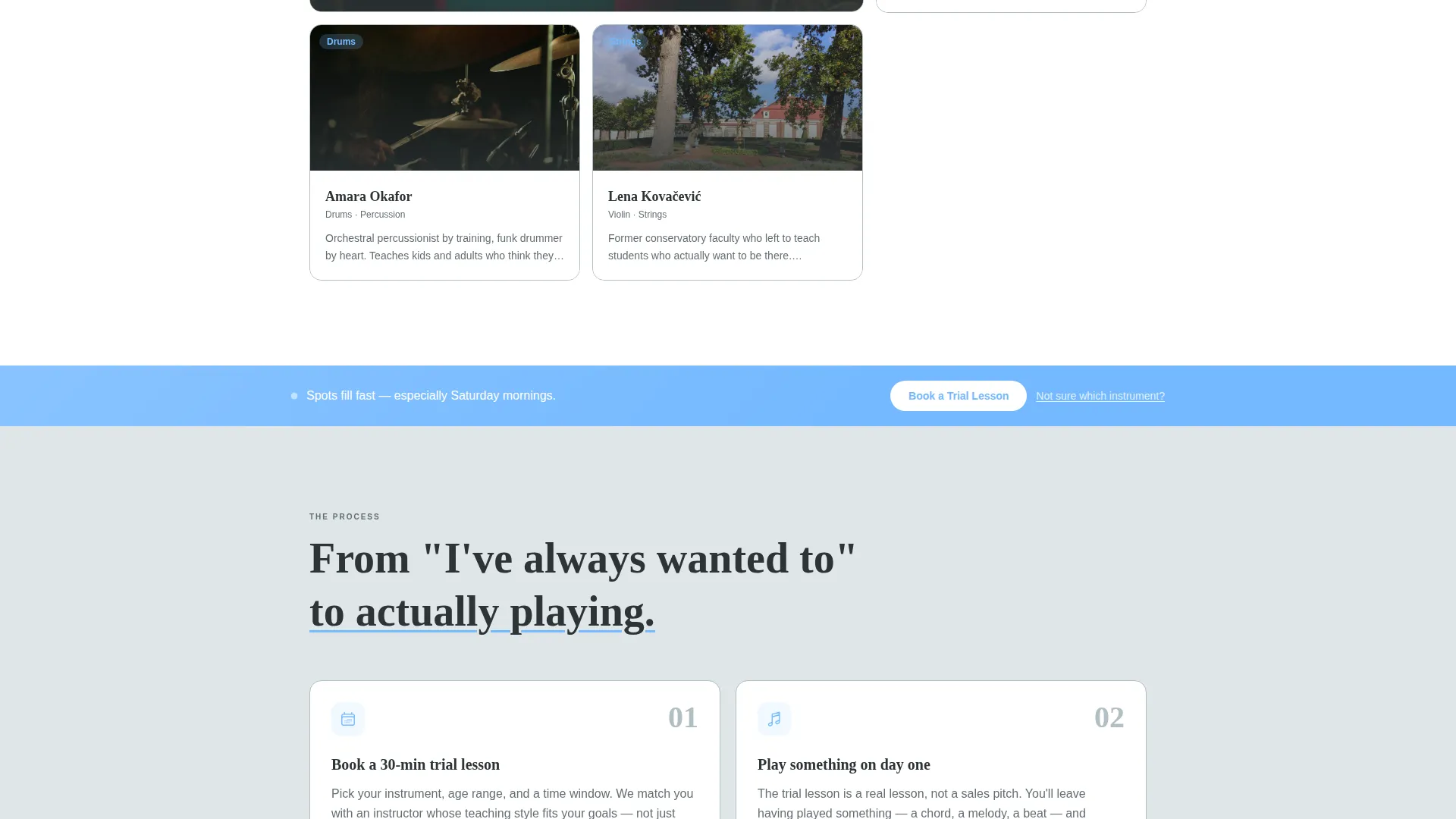
| Instrument match quiz | Captures undecided visitors with a two-minute guided path |
| Final booking section | Closes the page with the inline scheduling form fully visible |
Design & branding system
The visual identity follows a Service Utility theme built around a Slate and Sky color system. The palette is deliberately restrained, like a well-organized music binder where every element is exactly where the eye expects it. The single sky blue accent works like a teacher's pencil mark circling the one passage you need to practice.
- Deep charcoal slate (#2D3436) for body text and grounding headers, mid-tone graphite (#636E72) for secondary details, and soft cloud white (#DFE6E9) across section backgrounds
- Open sky blue (#74B9FF) reserved for primary buttons, the recurring booking bar, and the accent underline beneath the most important metric in the header
- Bold editorial typography stacked vertically in the header, with a clean readable type scale used throughout the FAQ body sections
Mobile & speed optimization
The single-column layout is inherently well-suited to narrow screens. Every section stacks naturally without reorganization, and the persistent booking bar remains visible and tappable at key scroll points on a phone. The inline scheduler is designed to work within the page flow without requiring a separate screen or modal window.
- The FAQ editorial blocks reflow cleanly at small viewport widths, keeping pull quotes and answers readable without horizontal scrolling
- The instrument match quiz and booking form fields are sized for comfortable touch interaction on both phone and tablet screens
How this template helps you convert
Cadence is not a typical music school page that leads with a hero image and hopes the visitor scrolls. Every structural decision is made to reduce the distance between a first visit and a booked trial lesson.
- The stats header establishes proof before asking for attention, so the visitor arrives at the FAQ body already trusting the school rather than evaluating it
- The FAQ editorial architecture meets every documented visitor hesitation with a direct, honest answer and a low-pressure scheduling prompt, so the booking call to action never feels sudden or premature
- The instrument match quiz creates a second entry point for undecided visitors, pre-fills the booking form, and eliminates the single most common reason an interested person leaves without acting
Other information about this template
Cadence is designed specifically for the music school marketing category, where seasonal enrollment windows are short and the decision to book is emotional as much as practical. The template is built for lead generation, meaning every design choice prioritizes capturing a booking over communicating brand story.
- The template fits the music school promotional landing page use case, where prospects need reassurance and a clear next step rather than an extensive course catalog
- The FAQ-driven editorial format is well aligned with the kinds of questions prospective students and parents type into search engines during active research sessions, making the page feel relevant to real decision-making moments
- The data storytelling header concept borrows from magazine editorial conventions, giving even a small neighborhood school the visual authority of an established institution
- The corporate precision theme and single-column flow keep the layout clean and professional without feeling cold or corporate in its written voice
- This template is well suited for music school coupon and discount promotions, where a limited-time trial lesson offer can be dropped into the existing booking bar without any layout changes
Theme
Corporate Precision
Creative direction
Expert Panel
Color system
Charcoal & Amber
Style
Single Column Flow
Direction
Lead Generation
Page Sections
Stats-led Editorial Header
Faq-driven Scroll Architecture
Persistent Booking Call to Action
Inline Scheduling Form
Instrument Match Quiz Path
Single-column Editorial Layout
Related questions
Can I customize the enrollment statistics shown in the header?
Does the inline booking form connect to a calendar or scheduling service?
Can I use this template if my school only teaches one or two instruments?
Is the instrument match quiz a separate page or does it stay on the landing page?
How many times does the booking call to action appear on the page?



