Neurology Medicine Reviews Website Template
A hub-and-spoke neurology telemedicine landing page built for patients who've been dismissed, waitlisted, or misdiagnosed. The page opens with a patient testimonial card, guides visitors through a self-assessment checklist, and leads them into a five-question neuro-screening quiz. Every section is designed to feel like a real consultation already in progress.
by Rocket studio
Quick summary
This is a single-page neurology telemedicine landing page built around empathy and action. It opens with one powerful patient quote, then walks visitors through a symptom-checklist scroll before inviting them to take a guided five-question neuro-screening quiz. The design is soft but clinical, built mobile-first for patients searching for answers late at night.
Who this template is for
This template is built for neurology telemedicine practices that need to reach patients before those patients give up. It works especially well for services connecting board-certified neurologists with patients via video, often within the same week.
- Chronic migraine and headache disorder clinics offering remote consultations
- Neurology practices serving patients with undiagnosed symptoms or long referral waitlists
- Healthcare teams supporting families managing a loved one's cognitive decline or seizure history
What problem this template solves
Most patients with neurological symptoms wait months for a specialist appointment. By the time they find this page, they've often seen multiple primary care physicians without a clear answer. The template addresses that exhaustion directly, making the visitor feel heard before a single form field is filled.
- Long specialist waitlists that leave patients without guidance for six months or more
- Patients dismissed with vague explanations like stress or anxiety who need real clinical engagement
- Families searching at 2 a.m. who need a page that feels calm, credible, and immediately actionable
What you get with this template
You get a fully structured, interactive landing page with six distinct sections, each serving a specific conversion role. The page is ready to present as a cohesive clinical product without requiring additional layout decisions.
- A testimonial-led hero section, a scrolling conditions ticker, a four-checkpoint symptom audit, a provider card section, a five-question quiz, and a footer
- An anchor navigation bar that lets visitors jump to any section while keeping the quiz call to action always visible
- A floating chat prompt for visitors who prefer guided conversation over self-assessment
Feature list
This template includes the following built-in components and interaction patterns.
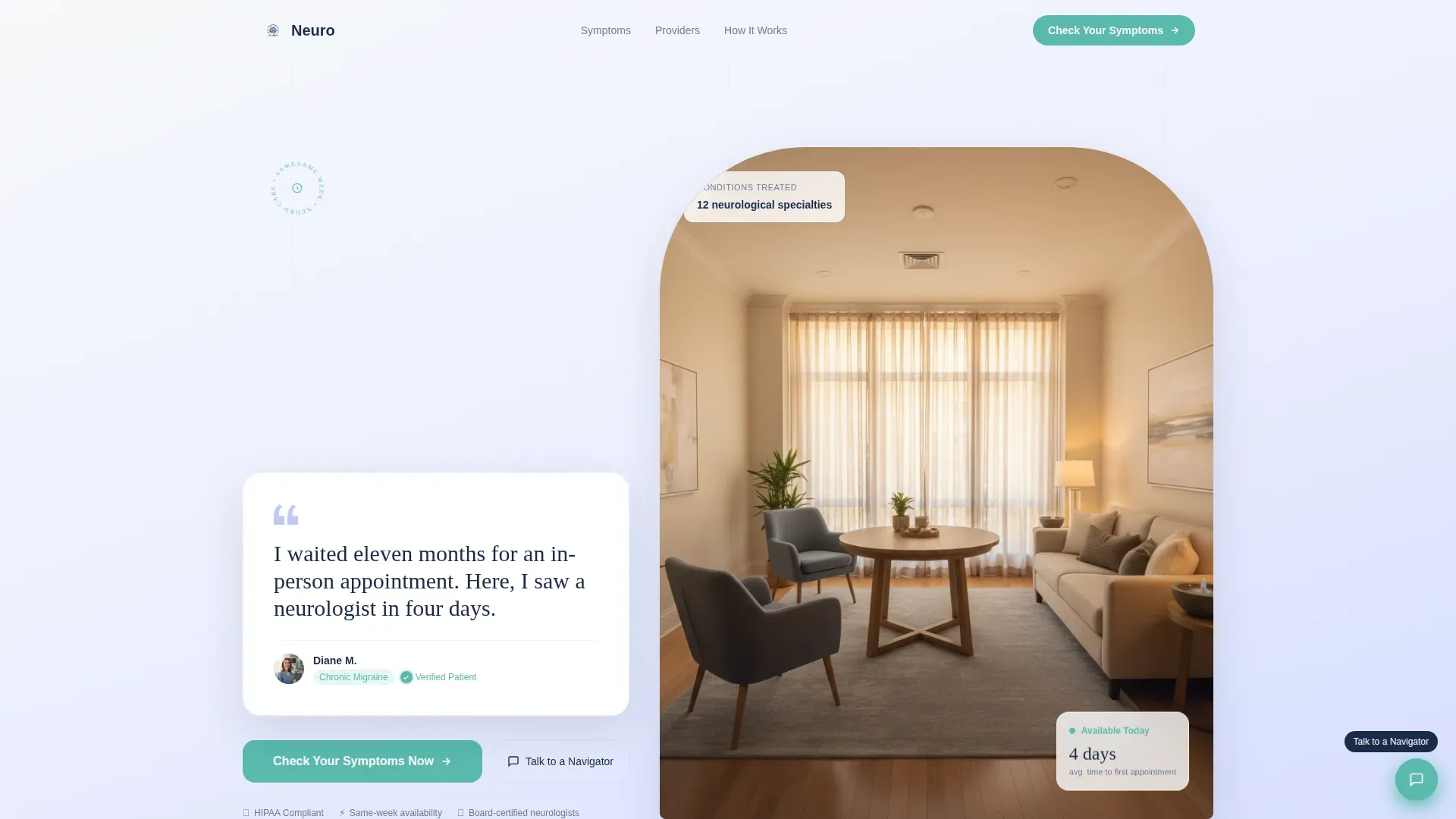
Testimonial Card Hero
The page opens with a single oversized card floating against a snow-to-lavender gradient. It displays a real patient quote in large serif type, paired with a name, a condition tag, and a verified-patient badge. No stock photography. Just one human sentence doing the work of an entire headline.
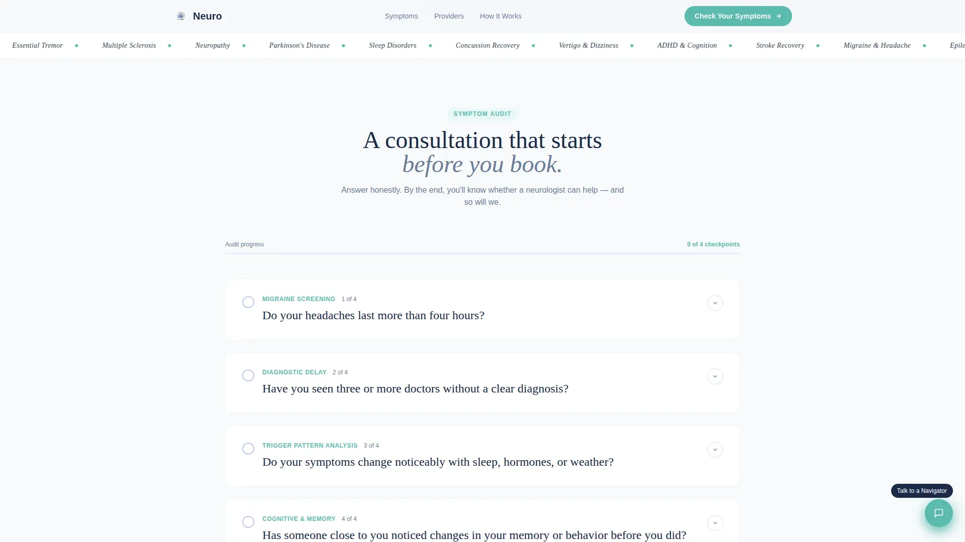
Symptom Checklist Audit
Four scroll-triggered checkpoint sections each open with a yes-or-no clinical question. Each checkpoint unfolds into a brief explanation of what that symptom pattern might indicate. A progress bar tracks how far the visitor has traveled through the audit, making the scroll feel like an active consultation.
Five-Question Neuro-Screening Quiz
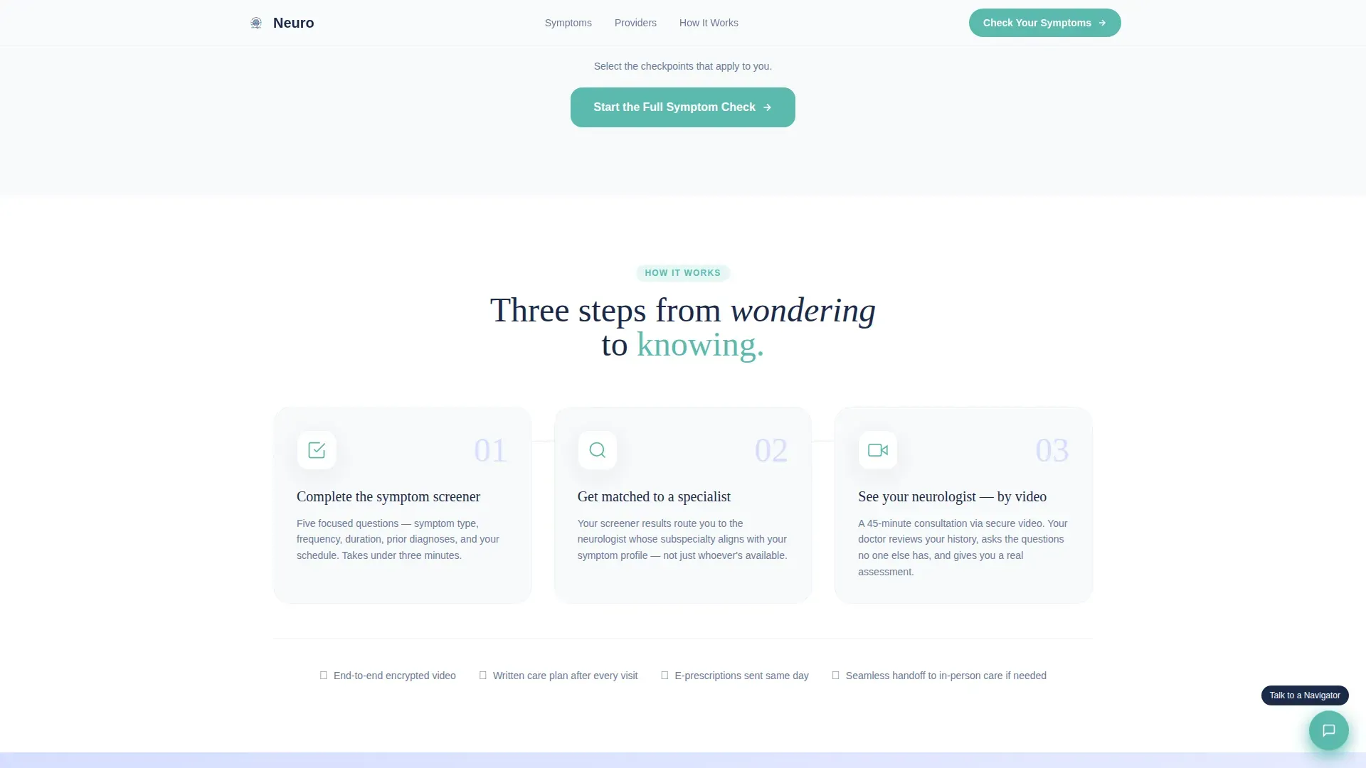
The primary conversion path is a guided quiz that reveals one question at a time on its own card. Questions cover symptom type, frequency, duration, previous diagnoses, and preferred appointment window. Soft card transitions reduce cognitive load and keep the experience calm and focused.
Anchor Navigation Bar
A persistent anchor nav sits at the top of the page. It links to every hub section and keeps the primary call-to-action button visible at all times. The teal button color ensures the interactive element stands out cleanly against the lavender and snow backgrounds.
Scrolling Conditions Ticker
A marquee-style ticker scrolls through the full range of conditions treated, giving visitors a fast visual confirmation that their specific symptom category is covered. It appears between the hero and the checklist sections to maintain momentum.
Floating Navigator Chat Prompt
A secondary conversion path floats persistently on the page. Visitors who are not ready to take the quiz can tap this prompt to speak with a patient navigator. It provides an alternative entry point without disrupting the primary quiz flow.
Page sections overview
| Section | Purpose |
|---|---|
| Hero Testimonial Card | Opens with a verified patient quote to build immediate trust |
| Conditions Marquee Ticker | Shows the breadth of treated conditions in a scannable scroll |
| Symptom Checklist Audit | Guides visitors through four clinical checkpoints with a progress bar |
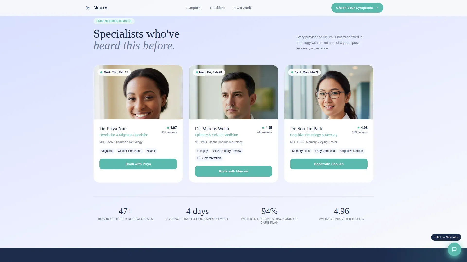
| Provider Cards | Displays board-certified neurologist profiles with specializations |
| Neuro-Screening Quiz | Captures visitor intent through a five-question guided assessment |
| Footer | Closes the page with a horizontal flow layout and supporting links |
Design & branding system
The visual identity uses an Arctic White color system with a soft gradient theme. Every color has a specific role, keeping the interface clean and purposeful without feeling sterile or cold.
- Clinical snow (#F8FAFB) and soft cerebral lavender (#D6DEFF) alternate as background gradients across sections
- Deep neuronal navy (#1B2A4A) anchors all body text and headings for strong legibility
- Calm teal (#5ABAAE) appears exclusively on buttons, progress indicators, and interactive states so every clickable element reads clearly
Mobile & speed optimization
The template is built mobile-first, reflecting the reality that most visitors arrive on a phone late at night when symptoms are worst. Layout decisions, font sizes, and interactive elements are all prioritized for small-screen use.
- Single-column card layouts and large tap targets make the quiz and checklist comfortable to use on any phone screen
- Medium animation weight keeps scroll reveals and quiz card transitions smooth without relying on heavy libraries
- The marquee, anchor nav, and chat prompt are all designed to perform in a compact mobile viewport
How this template helps you convert
The page is structured so that visitors feel understood before they are asked to do anything. Each section earns the next click rather than demanding it.
- The testimonial card opens with a specific, human quote that validates the visitor's experience, establishing trust before any service claim is made.
- The checklist audit builds investment across four scroll-triggered checkpoints, so by the time the visitor reaches the quiz, they have already engaged clinically with their own symptoms.
- The persistent teal call-to-action button and the floating navigator chat prompt give visitors two clear paths forward, reducing friction for both decisive and hesitant visitors.
Other information about this template
This template is designed for the United States market, with English copy, USD pricing context, and US date formatting in mind. The typography pairing uses Fraunces for serif headings and DM Sans for body text, creating a tone that feels both clinical and approachable. The Vercel Horizontal Flow footer pattern is included as section six. Animation is set to a medium intensity level, covering marquee motion, scroll reveals on checklist sections, and card transition effects inside the quiz. The hub-and-spoke structure means each symptom checkpoint acts as a spoke feeding back to the central quiz conversion goal.
- Designed for B2C healthcare in the United States, optimized for late-night mobile search behavior
- Typography: Fraunces (serif) for headings, DM Sans (sans-serif) for body copy
- Footer follows the Vercel Horizontal Flow pattern for clean, scannable link organization
Theme
Soft Gradient
Creative direction
Checklist & Audit
Color system
Arctic White
Style
Hub & Spoke (Anchor Nav)
Direction
Quiz/Assessment
Page Sections
Testimonial Card Hero Section
Four-checkpoint Symptom Audit
Guided Five-question Quiz
Persistent Anchor Navigation
Scrolling Conditions Marquee
Floating Navigator Chat Prompt
Related questions
What sections are included in this landing page?
Who is the target audience for this template?
Can the quiz and checklist sections be customized for different conditions?
What makes this design feel trustworthy for a medical audience?
Is this template built for mobile users?



