Neurology Medicine Professional Website Template
Synapse is a single-column neurology support community landing page built for patients, caregivers, and family members navigating neurological conditions. It combines a Stats-First Impact creative direction with a Soft Mist color system to deliver clinical credibility and genuine warmth. The page guides visitors from an emotional hero section through evidence-backed community proof toward two clear actions: joining a Support Circle or browsing the Resource Library.
by Rocket studio
Quick summary
Synapse is a neurology support community landing page that pairs clinical precision with human warmth. It uses large-set statistics, line art illustration, and layered social proof to build trust before asking anything of the visitor. The result is a page that feels like a safe first step for anyone living with, or caring for someone with, a neurological condition.
Who this template is for
This template is built for healthcare peer-support communities, neurology-focused nonprofits, and social-impact organizations that serve people affected by neurological conditions. If your organization needs to earn trust quickly and convert visitors through genuine value, this structure is designed for that purpose.
- Newly diagnosed patients looking for peer support and clinician-reviewed resources
- Long-term caregivers who need practical information and a sense of community
- Adult children navigating a parent's neurological diagnosis for the first time
What problem this template solves
People affected by neurological conditions often encounter cold, clinical websites that feel transactional rather than supportive. They leave without connecting, without resources, and without a reason to return. This template addresses that gap directly.
- The Stats-First layout builds credibility before any form or sign-up is presented
- Ungated resources and a low-friction join form remove common barriers to engagement
- The visual and copy rhythm signals: "you are understood here" before asking for anything in return
What you get with this template
You get a fully structured, single-column landing page with six distinct sections, each designed to move a first-time visitor from uncertainty toward confident action. The layout is honest about what the community offers and deliberate about when it asks for a commitment.
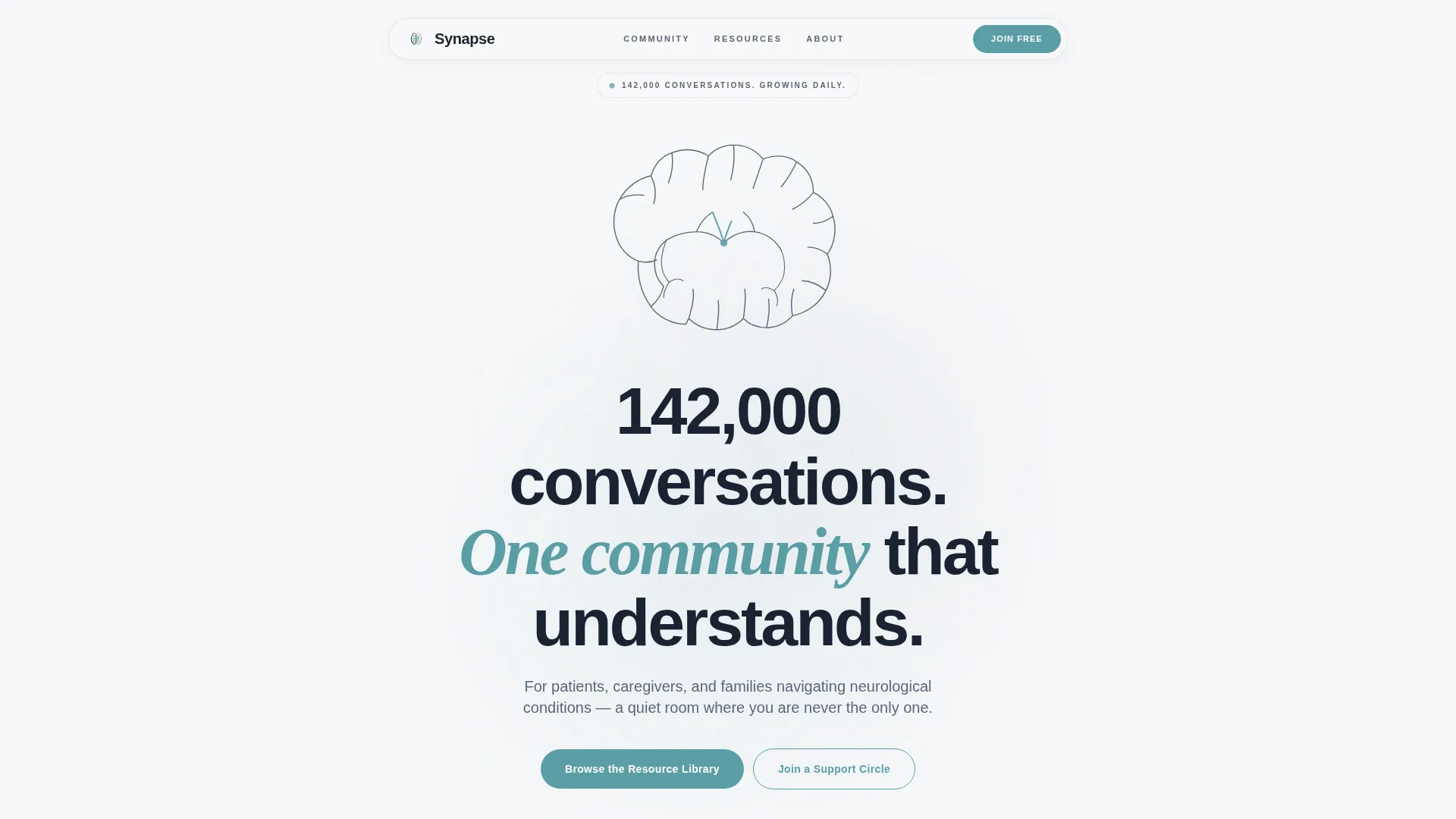
- A hero section with line art illustration, animated headline, and parallax depth
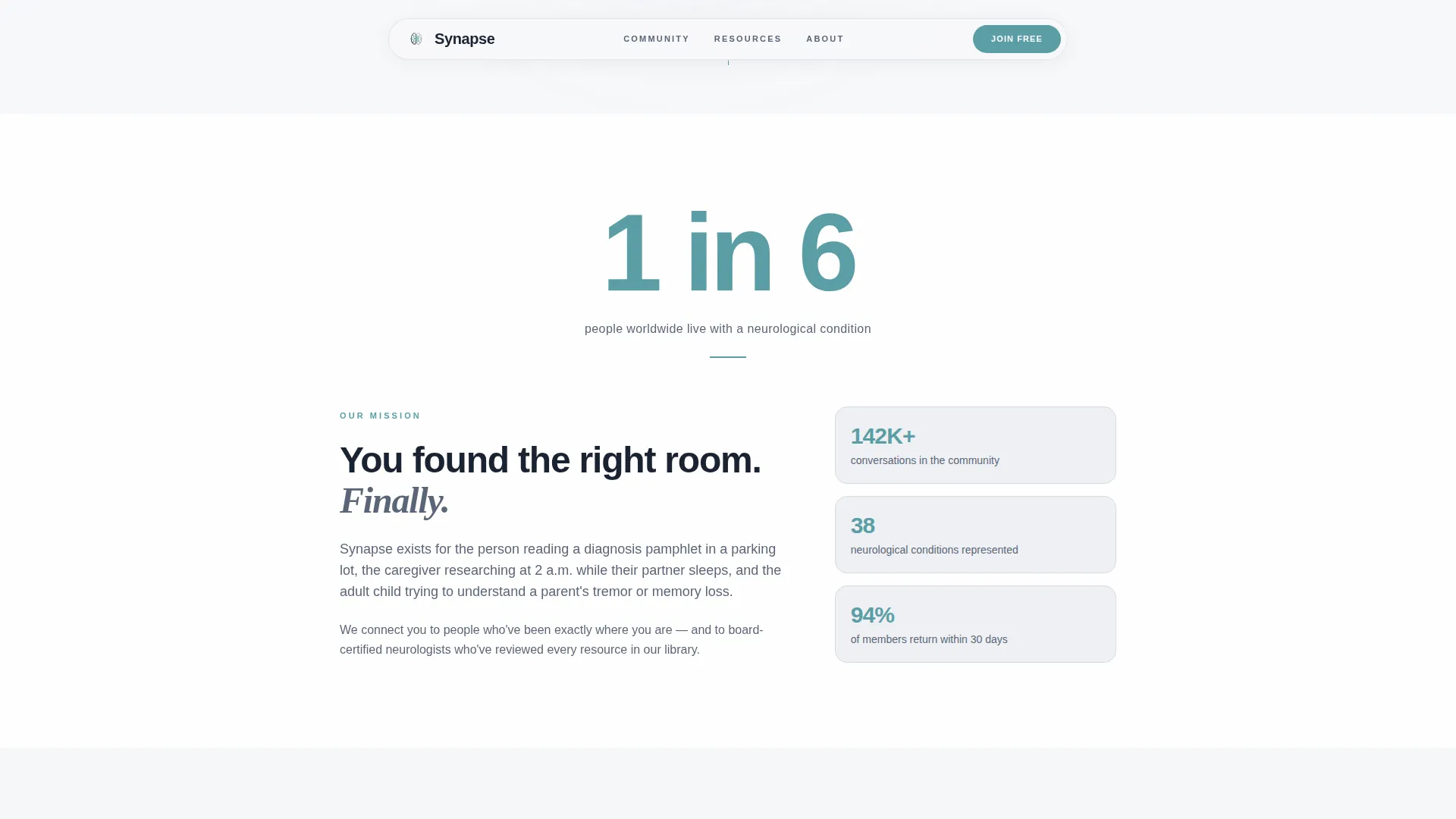
- Three stat-anchored content sections covering mission, community proof, and the resource library
- A low-friction Support Circle sign-up form and a soft email digest capture in the footer
Feature list
This template includes a carefully considered set of built-in components and layout decisions. Each one serves the specific emotional and informational needs of a neurology support audience.
Line Art Hero Illustration
The hero features a continuous single-stroke SVG illustration of a brain that also reveals two faces in conversation. Rendered in calm slate on clinical white, with a single teal accent at the point where the two interpretations meet, it signals intelligence and connection without any photography or stock imagery.
Stats-First Impact Sections
Each content section opens with one large-set statistic displayed in teal before the supporting narrative unfolds. The rhythm of number then story repeats across three sections, building cumulative evidence that earns visitor trust before any call to action appears.
GSAP and Scroll-Reveal Animations
The hero entrance uses GSAP animation with cursor parallax. Statistics reveal on scroll using CSS scroll-reveal, and testimonial cards use staggered entrance animations. The motion feels considered and calm, not distracting.
Testimonial Card Grid
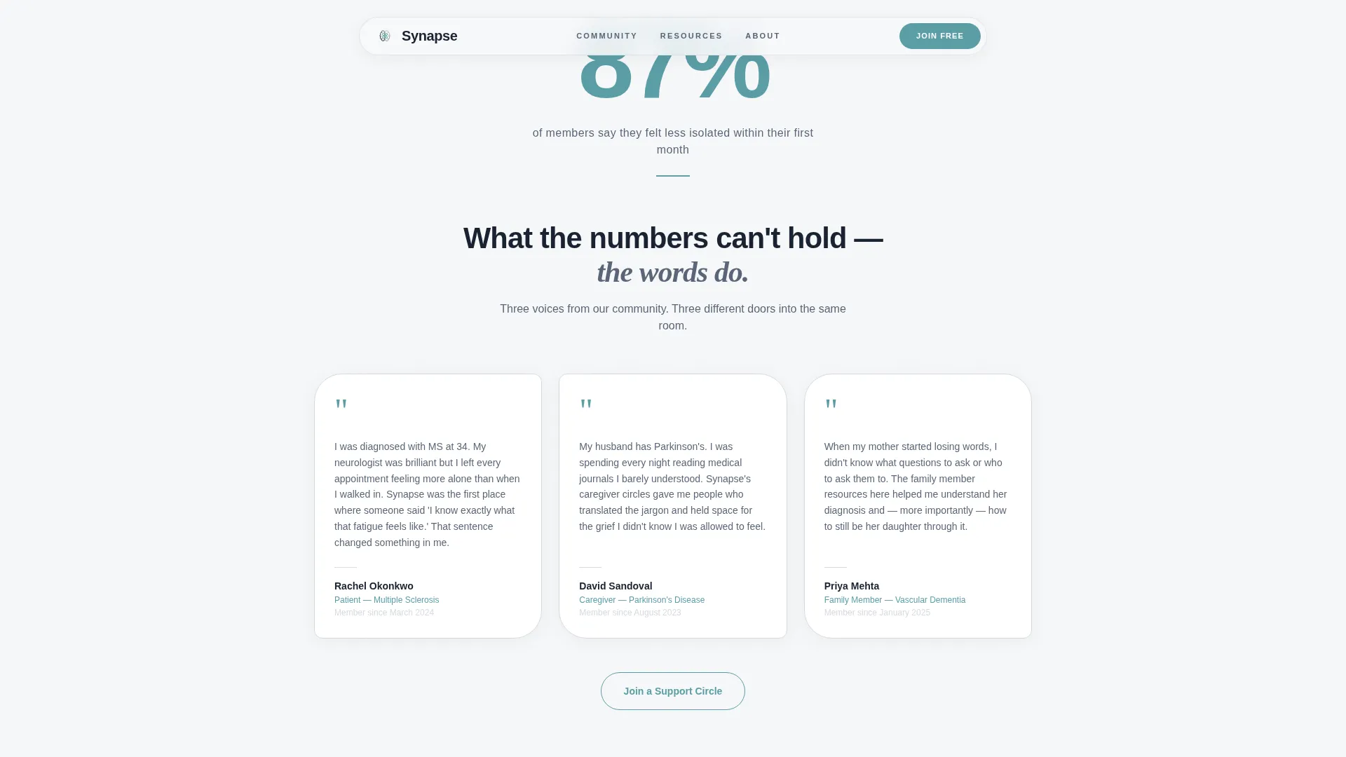
Three testimonial cards use organic rounded shapes and represent three distinct voices: a patient, a caregiver, and an adult child. Each card is anchored by the "87% of members felt less isolated within their first month" community proof statistic.
Low-Friction Support Circle Form
The join form asks for only three fields: first name, condition or role (patient, caregiver, or family member), and preferred format (virtual, in-person, or text-based). The magnetic call-to-action button and minimal field count reduce drop-off at the moment of commitment.
Ungated Resource Library Preview
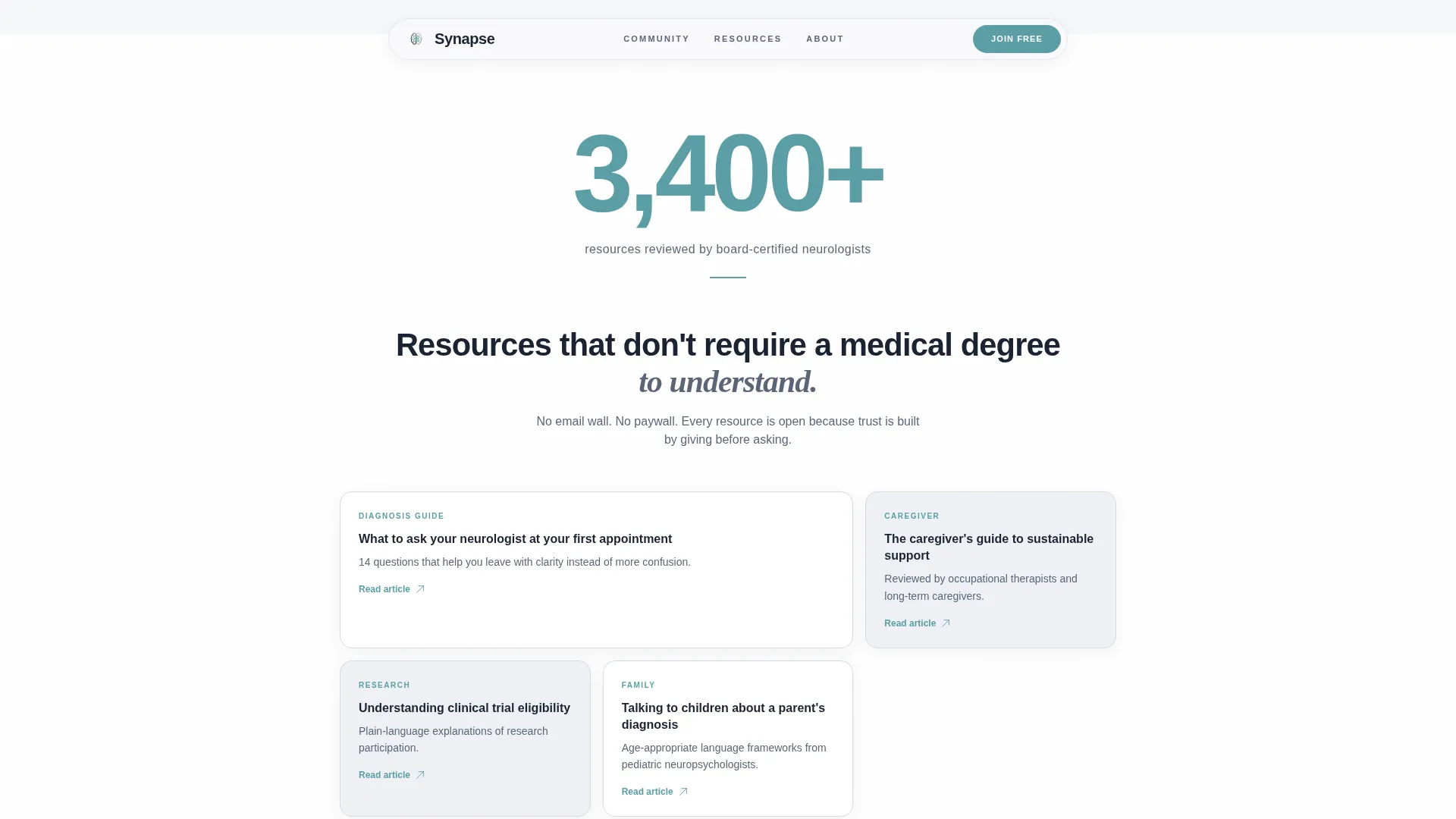
The resource library section uses an asymmetric bento grid layout anchored by the "3,400+ resources reviewed by board-certified neurologists" statistic. Resources are fully ungated. The primary call-to-action button, "Browse the Resource Library," appears here after trust has been established across earlier sections.
Page sections overview
| Section | Purpose |
|---|---|
| Hero | Introduce community identity with line art, animated headline, and parallax depth |
| Mission Stats | Establish credibility with the "1 in 6" statistic and mission prose |
| Community Proof | Build trust with the "87%" stat and three organic testimonial cards |
| Resource Library | Showcase the "3,400+" stat, bento grid preview, and primary call to action |
| Support Circle Form | Convert visitors with a three-field low-friction join form |
| Footer | Deliver marquee strip, Arc Browser Split layout, and soft email digest capture |
Design & branding system
The visual identity follows a Corporate Precision theme with the Soft Mist color system. The palette sits between clinical and welcoming, like a hospital corridor filled with natural light rather than fluorescent overhead tubes.
- Colors: clinical white (#F7F8FA) backgrounds, morning fog gray (#D6DAE0) for section alternation, calm slate (#5A6678) for body text, and a single reassuring teal (#5B9EA6) reserved for links, buttons, and statistical highlights
- Typography: Plus Jakarta Sans for all body copy and interface elements, paired with Instrument Serif italic for accent headlines that carry emotional weight
- Visual restraint: no photography, no stock imagery; line art and whitespace carry the visual story, keeping the design precise and trustworthy
Mobile & speed optimization
Caregivers research at all hours, often on a phone in a low-light room. This template treats mobile and desktop as equally important experiences, not an afterthought. The layout adapts cleanly across screen sizes without sacrificing the emotional tone of the design.
- Static sections are built as Server Components for lean rendering, while the hero animations and support form run as Client Components
- The single-column flow collapses naturally for mobile without requiring separate layout logic
- Touch-friendly call-to-action buttons and a minimal form field count keep the mobile experience low-friction
How this template helps you convert
Conversion here is not about pressure. It is about giving enough before asking. The page is structured so that visitors receive value at every stage before encountering any invitation to act.
- The ungated resource library establishes that the community gives freely, which builds the goodwill needed for the Support Circle form to feel safe rather than transactional
- The primary call to action ("Browse the Resource Library") appears only after three stat-anchored sections have delivered proof, so the click feels earned rather than forced
- The footer email digest capture offers a specific, low-commitment promise: one article, one community story, and one research update per month, nothing more
Other information about this template
This template is designed with a clear content and resource destination intent. It is built for organizations that value trust as the primary conversion mechanism. A few additional details worth noting:
- The template uses Plus Jakarta Sans and Instrument Serif, both available as web fonts, to maintain typographic consistency across browsers
- The footer uses a Pattern 7 Arc Browser Split layout alongside a marquee strip for brand motion and visual interest
- The Soft Mist color system uses a near-black (#1A2332) for maximum-contrast type where needed, such as hero headlines and section labels
- The page is structured for English (United States) audiences with no currency or localization variables required
Theme
Corporate Precision
Creative direction
Stats-First Impact
Color system
Soft Mist
Style
Single Column Flow
Direction
Content/Resource
Page Sections
Line Art Hero with SVG Illustration
Stats-first Impact Content Flow
GSAP Hero Animation and Scroll Reveals
Organic Testimonial Card Grid
Ungated Bento Grid Resource Preview
Low-friction Three-field Join Form
Related questions
Can I replace the statistics and testimonials with my own community data?
Is the resource library connected to a live content database?
Does the Support Circle form send data to a backend system?
Can I adapt this template for a specific neurological condition?
How does this template handle mobile visitors?



