Neurology Medicine Professional Website Template
Synapse is a hub and spoke anchor-nav landing page template built for neurology research centers. It walks visitors through a five-stage diagnostic pipeline using animated stat counters, scroll-linked gradient transitions, and dual calls to action for patients and referring neurologists. The Cloud Canvas color system and Fraunces serif typography create a clinically precise, quietly calming first impression.
by Rocket studio
Quick summary
Synapse is a single-page, anchor-nav landing page template for a neurology research center. It opens with three animated metric counters on a pearl-to-lavender gradient, then guides visitors through five research spokes, from referral intake to longitudinal monitoring. The design is hushed and clinical, built to earn trust before asking for a click.
Who this template is for
This template is built for neurological research centers that serve complex, treatment-resistant cases. It works equally well for the patient-facing and physician-facing sides of a specialist referral practice.
- Neurology research centers presenting a multi-stage diagnostic pipeline to new patients and families
- Medical practices targeting frustrated referring neurologists as a primary referral source
- Research institutions that lead with published data and biomarker discovery rather than general wellness messaging
What problem this template solves
Families and neurologists arriving at a specialist center often carry months of disappointment. A generic medical website does nothing to rebuild that trust. This template solves the credibility gap by leading with real, published numbers and then walking every visitor through the exact process they are about to enter.
- Most medical landing pages bury their proof points or skip them entirely, leaving hesitant visitors with no reason to stay
- Patients and families researching complex neurological conditions need emotional permission before they will submit a screening form
- Referring neurologists need a fast, professional path to initiate a referral without navigating a general-purpose contact page
What you get with this template
You get a fully structured, single-page layout with a fixed anchor navigation bar, five spoke sections, animated counters, and two distinct calls to action routed to different audience paths. Every design and interaction decision in the template flows from the source brief.
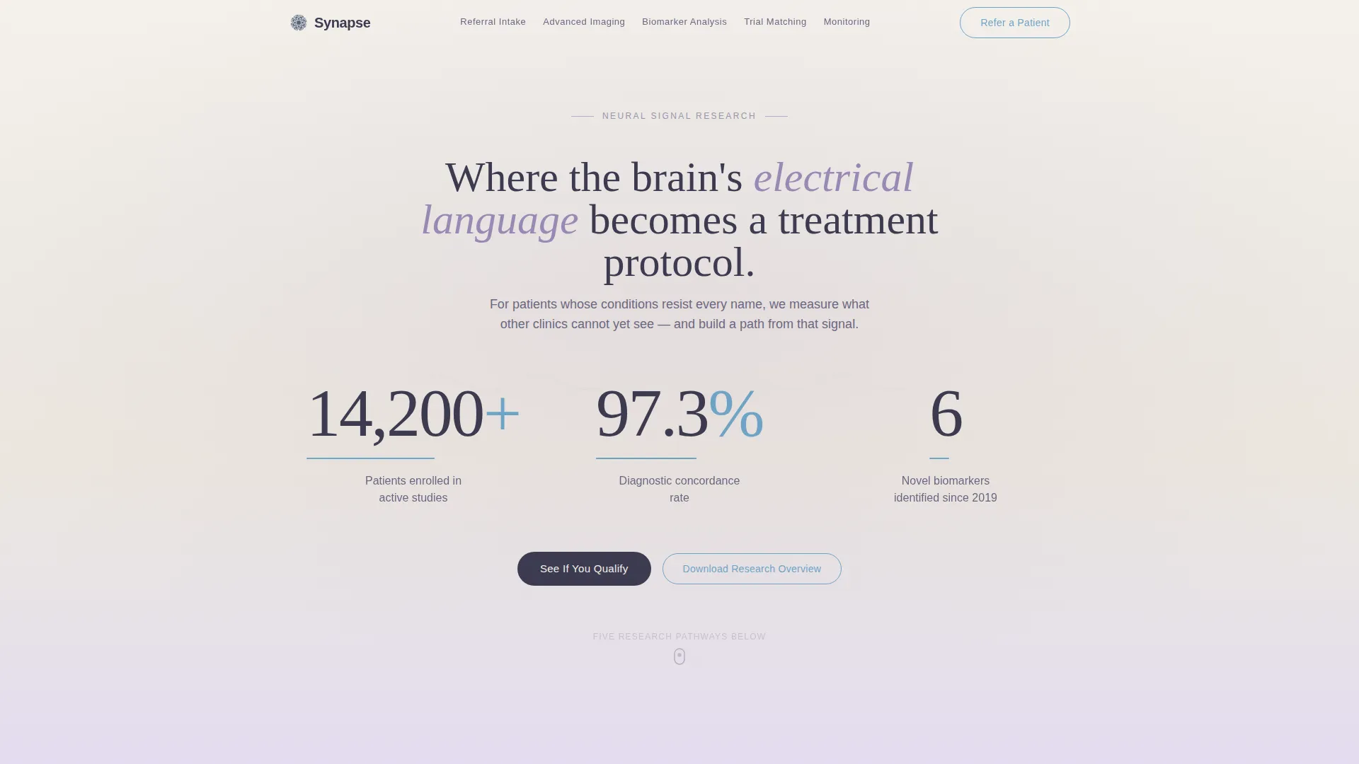
- Animated header metrics (14,200+ patients enrolled, 97.3% diagnostic concordance rate, 6 novel biomarkers identified since 2019) rendered against a pearl-to-lavender gradient
- Five spoke sections covering referral intake, advanced imaging, biomarker analysis, clinical trial matching, and longitudinal monitoring, each closing with a repeated primary call to action
- A persistent "Refer a Patient" secondary call to action fixed inside the anchor navigation bar for neurologist visitors
Feature list
This template is built around a specific set of interactive and structural features. Each one is described below exactly as it appears in the source brief.
Animated Metric Counters
Three large counters rise on page load against the pearl-to-lavender gradient header. They display 14,200+ patients enrolled, a 97.3% diagnostic concordance rate, and 6 novel biomarkers identified since 2019. Each counter includes a quiet signal-blue underline that pulses once, simulating a neural firing, then settles.
Hub and Spoke Anchor Navigation
A translucent navigation bar fixes below the header and lists each of the five research pathway spokes. Visitors can jump directly to any stage of the diagnostic pipeline. A persistent "Refer a Patient" link sits inside this bar for neurologist visitors at all times.
Scroll-Linked Gradient Transitions
As visitors scroll deeper into each spoke section, the background gradient shifts slightly cooler and typography tightens. This scroll-linked visual progression reinforces the sense of moving further into the diagnostic process, turning a static page into a guided corridor.
Five-Stage Diagnostic Pipeline Layout
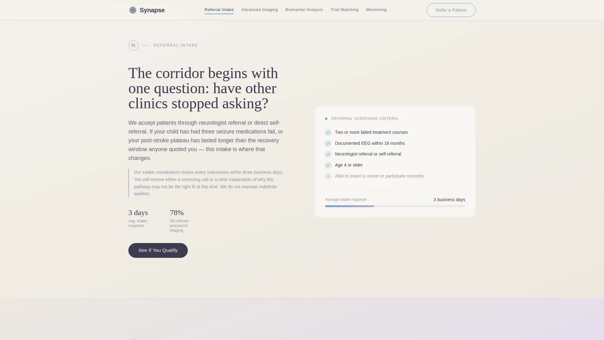
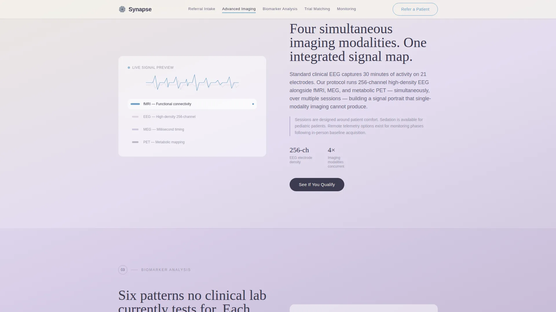
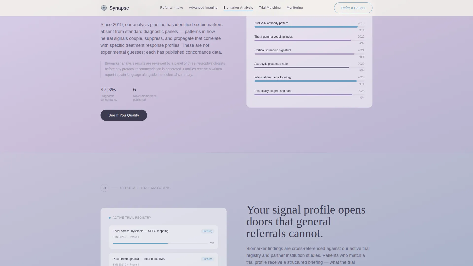
Each spoke section covers one stage of the patient journey: referral intake, advanced imaging, biomarker analysis, clinical trial matching, and longitudinal monitoring. Every section is self-contained, answers the question raised by the previous section, and closes with the primary call to action.
Dual Call-to-Action Architecture
The primary call to action, "See If You Qualify," appears first beneath the header metrics and recurs at the close of each spoke. A secondary path, "Refer a Patient," is fixed in the anchor nav. The two paths serve two distinct audiences without competing for the same space.
IntersectionObserver Reveal Animations
Content blocks animate into view as visitors scroll to them. This staggered reveal keeps the page feeling active without overwhelming the hushed clinical atmosphere. The effect is driven by IntersectionObserver, with static content rendered server-side for performance.
Page sections overview
| Section | Purpose |
|---|---|
| Header Metrics Display | Opens with animated counters and sets immediate credibility |
| Fixed Anchor Nav | Lets visitors jump to any spoke or trigger the referral path |
| Referral Intake Spoke | Explains who qualifies and provides emotional permission to proceed |
| Advanced Imaging Spoke | Describes diagnostic technology and what gets measured |
| Biomarker Analysis Spoke | Communicates the science behind neural signal mapping |
| Clinical Trial Matching Spoke | Shows how findings translate into treatment paths |
| Longitudinal Monitoring Spoke | Covers ongoing tracking and outcome data |
| Linear Footer | Single-row footer closing the page cleanly |
Design & branding system
The Cloud Canvas color system defines the entire visual identity. Every color choice connects to the clinical, hushed atmosphere described in the brief, nothing is decorative for its own sake.
- Pearl white (#F4F1EB) as the primary background, cognitive lavender (#B8A9C9) for section transitions, deep cerebral slate (#3D3B50) for body text and navigation, and quiet signal blue (#6FA3C7) for interactive anchors and hover states
- Fraunces serif for all headings and DM Sans for body copy and interface labels, pairing warmth with clinical legibility
- No stock photography anywhere on the page; credibility comes entirely from data, typography, and gradient atmosphere
Mobile & speed optimization
The template is built desktop-first, reflecting the primary audience of neurologists who review referral destinations on desktop workstations. Full mobile support is included so patients and families browsing on phones receive a complete experience.
- Counter animations, scroll-linked gradient shifts, and IntersectionObserver reveals are handled client-side, while static content uses server components to keep initial load lean
- The anchor navigation and spoke sections reflow cleanly for smaller screens, keeping the five-stage pipeline readable without horizontal scrolling
How this template helps you convert
The page is structured as a deliberate credibility build. Each section prepares the visitor emotionally and informationally for the next, so the call to action at the end of each spoke feels earned rather than forced.
- The header metrics establish authority immediately. Visitors see published numbers before they read a single sentence of body copy, which resets the skepticism carried over from previous clinical disappointments.
- The step-by-step spoke structure answers questions in sequence, so by the time a visitor reaches the final section, they understand the process well enough to feel safe clicking "See If You Qualify" or submitting a referral.
Other information about this template
This template is a strong fit for neurology research landing pages that need to serve two audiences simultaneously without diluting the message for either one. A few additional details worth noting before you start customizing.
- The footer uses a linear single-row pattern, keeping the close of the page clean and focused rather than expanding into a large multi-column footer block
- Localization defaults are set for English, United States dollar conventions, and USA-standard contact formatting
- The page is designed with a desktop-first priority but ships with full mobile layout support, consistent with the neurologist-referrer audience who primarily use desktop workstations
- Animation intensity is set to high in the brief, covering counter animations, pulse effects, scroll-linked gradient shifts, and staggered IntersectionObserver content reveals
- The template carries no hero photograph or stock imagery anywhere in the layout; the data and gradient system carry the entire visual weight of the first impression
Theme
Soft Gradient
Creative direction
Step-by-Step Guide
Color system
Cloud Canvas
Style
Hub & Spoke (Anchor Nav)
Direction
Click-Through
Page Sections
Animated Header Metric Counters
Hub and Spoke Anchor Navigation
Scroll-linked Gradient Transitions
Five-stage Diagnostic Pipeline
Dual Call-to-action Architecture
Intersectionobserver Reveal Animations
Related questions
Can I change the animated counter numbers to match my center's actual published data?
Is the template usable if my center does not offer all five pipeline stages?
How does the dual call-to-action setup serve two different audiences on one page?
Does this template include any stock photography?
Can the Cloud Canvas color palette be customized?



