Millennial Checking Account Landing Page Template
Ledger is a dark-mode financial dashboard landing page built for millennial checking account brands. It pairs an interactive savings calculator with animated dashboard modules, a progressive three-step sign-up form, and a trust-badge hero section. The design uses a charcoal and amber color system to present account data, spending charts, and fee comparisons in a premium fintech terminal style.
by Rocket studio
Quick summary
Ledger is a single-page financial dashboard landing page template designed for millennial-focused checking account products. It opens with a trust-badge ribbon and a live-data hero, drops visitors into an interactive savings calculator, then walks them through animated dashboard modules before capturing leads through a smooth three-step form. Every section feels like demoing the product, not reading about it.
Who this template is for
This dashboard template speaks directly to fintech brands and product builders targeting millennials who are frustrated with legacy bank fees. It is equally useful for anyone who needs a high-converting, data-forward landing page in the consumer finance space.
- Fintech startups and challenger bank teams launching a zero-fee checking account product
- Finance teams and product teams building conversion-focused pages for millennial audiences
- Small business owners and freelancers who want a transparent, dashboard-style app page that communicates value instantly
What problem this template solves
Legacy bank landing pages hide fees in footnotes and bury the product behind stock photography. Millennial users want to see real account data, real cost analysis, and a clear reason to switch, all above the fold. This template solves the trust and clarity gap that kills fintech conversions.
- Visitors arrive skeptical; the hero section answers their primary objections immediately with visible trust badges and live dashboard data
- The fee cost analysis calculator quantifies exactly how much a user saves annually, removing the guesswork that stalls decisions
- The progressive sign-up form reduces friction by breaking account creation into three focused steps rather than one overwhelming page
What you get with this template
You get a fully structured, single-page landing page built around a Dashboard Pro theme. Every section is a self-contained dashboard module. The page integrates interactive elements, animated data panels, and a conversion-optimized form flow into one cohesive fintech experience.
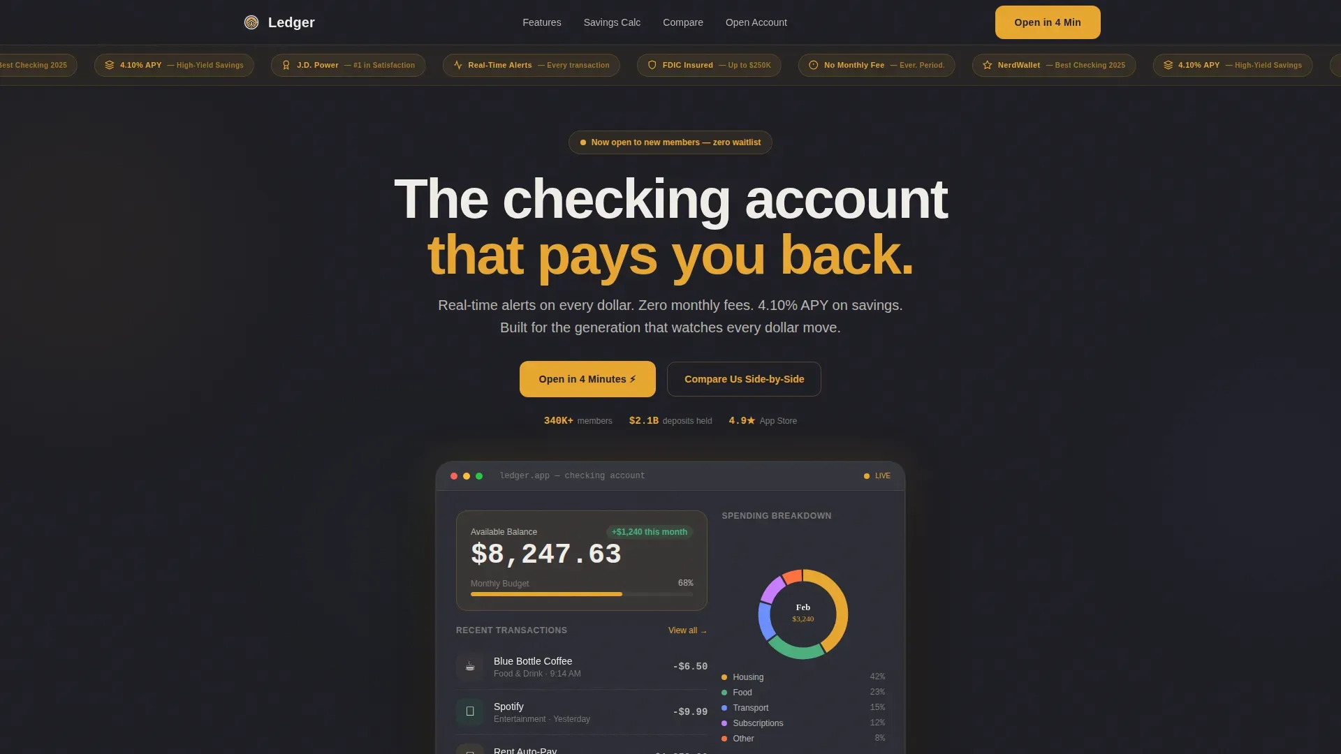
- A hero section with an award badge ribbon, a live account dashboard mockup showing balance, a spending donut chart, and three recent transactions
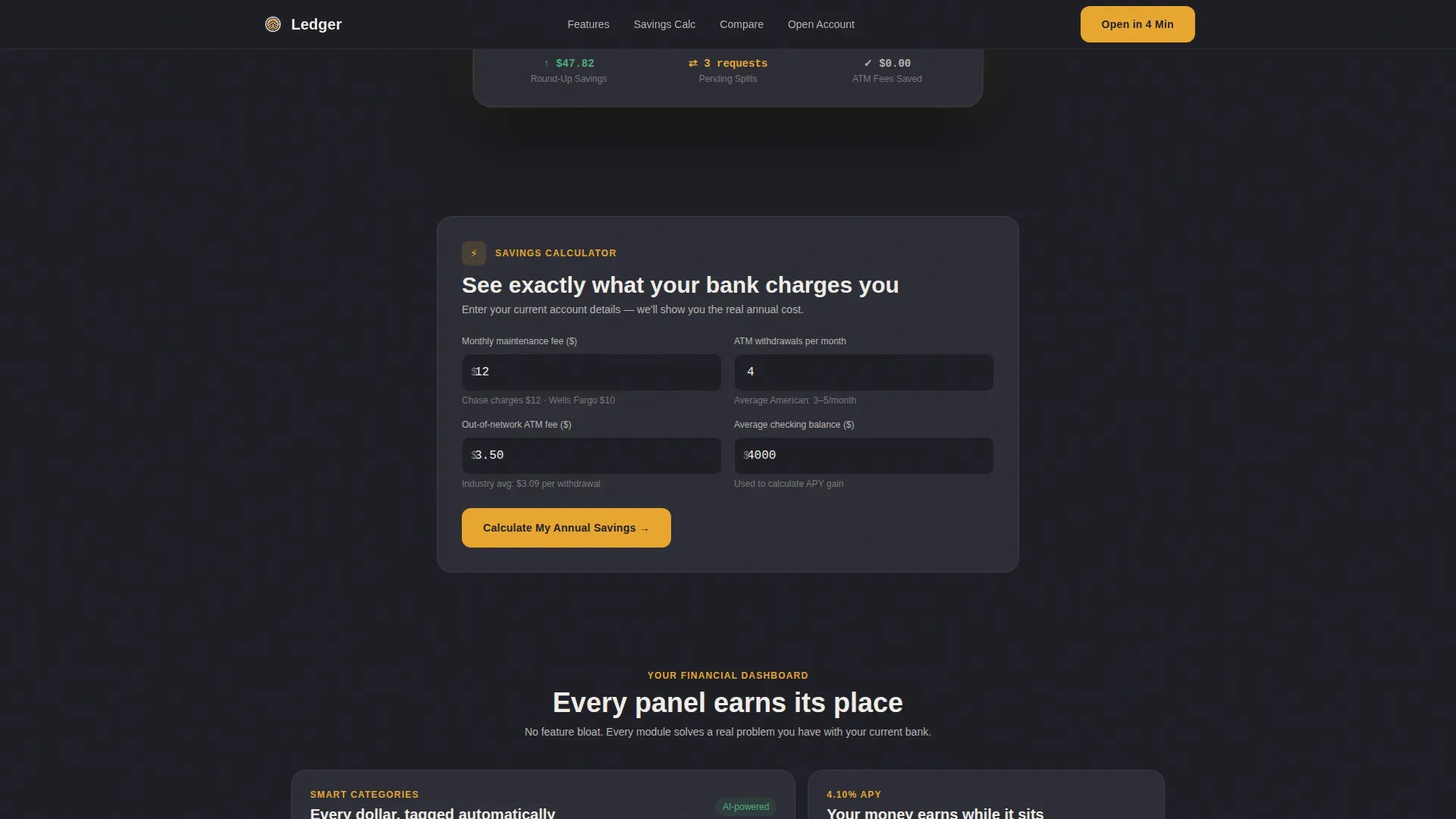
- An embedded savings calculator that accepts fee inputs and returns an annual savings figure, plus a fee comparison modal that stacks this account against competitor bank products
- A three-step progressive lead capture form covering email and phone, employment type and estimated deposits, and a soft credit-check consent toggle
Feature list
This dashboard template is built around interactive data display and lead generation functions. Each feature below is grounded in the source brief and reflects what the page actually delivers.
Interactive Savings Calculator
The savings calculator is the centerpiece of this landing page. Visitors input their current monthly bank fees, number of ATM withdrawals, and average account balance. The calculator returns a detailed annual savings figure in real time. This handy tool does the persuading before the sign-up form ever appears, and a floating call-to-action button pins itself to the screen once the result is displayed.
Live Dashboard Hero Module
The hero section presents a fully rendered account dashboard mockup. It displays a sample balance of $8,247.63, a spending breakdown donut chart, and three recent transactions. Every payment and transfer detail appears instantly in the mock interface, eliminating mental math for users who want to understand what the product looks like before they commit. The dashboard serves as the hub for financial health visualization, showcasing more than just a list of transactions.
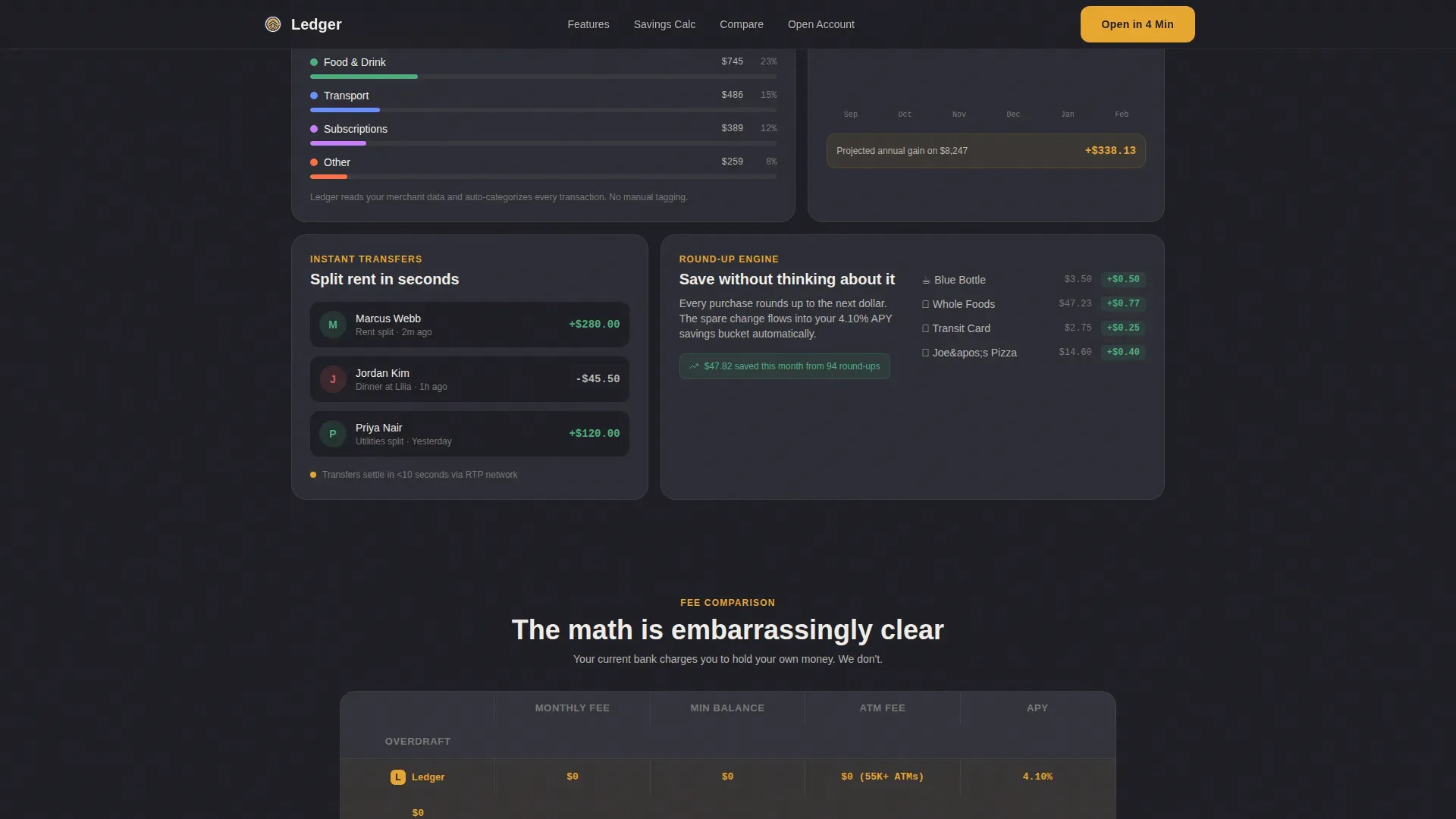
Animated Feature Dashboard Modules
Below the calculator, the page unfolds as a series of bento-grid dashboard modules. Each module covers a distinct financial topic: a fee comparison table, an APY growth chart, a spending categories breakdown, and a peer-to-peer transfer panel. Count-up number animations and chart animations trigger as each panel enters the viewport. Color coding in amber highlights positive metrics and critical trends, helping users quickly analyze their potential financial picture.
Award Badge Trust Ribbon
The header carries a horizontal ribbon of trust badges rendered in amber on charcoal. Badges include an FDIC-insured shield, a no-monthly-fee guarantee, a best checking account recognition mark, a 4.10% APY callout, and a consumer satisfaction recognition mark. These badges are visible above the fold, addressing the visible security requirement that is critical for millennial users who are skeptical of new financial institutions. Trust signals also appear near call-to-action buttons throughout the page.
Progressive Three-Step Sign-Up Form
The lead capture form breaks account opening into three clear steps. Step one collects email and phone. Step two asks for employment type (salaried, freelance, or both) and estimated monthly deposits. Step three presents a soft credit-check consent toggle. The form flow catches the momentum that the calculator builds, turning data-driven curiosity into a completed application in roughly four minutes.
Fee Comparison Modal
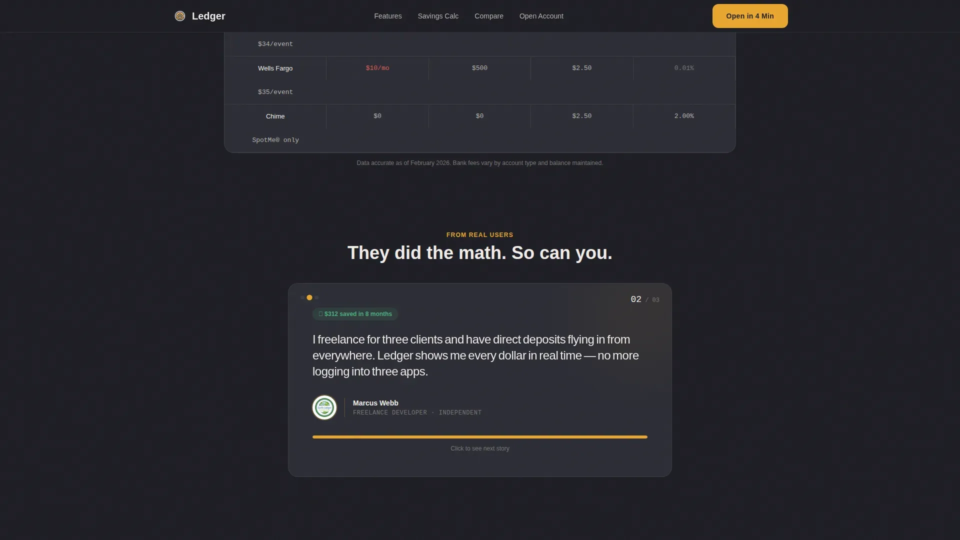
A secondary conversion path labeled "Compare Us Side-by-Side" opens a modal that places this account's fee structure next to competitor bank products. The modal captures email on exit, creating a second opportunity to collect a lead even if the visitor is not yet ready to open an account. This comparison panel helps users evaluate the real cost difference and assess the value of switching.
Page sections overview
| Section | Purpose |
|---|---|
| Trust Badge Ribbon | Display compliance and award badges above the fold |
| Live Dashboard Hero | Show sample account data to build product desire |
| Savings Calculator | Quantify annual savings from switching accounts |
| Floating Call to Action | Pin the primary sign-up prompt after calculator result |
| Feature Dashboard Modules | Animate fee, APY, spending, and transfer panels |
| Testimonials Row | Present three user quotes with role and savings amount |
| Progressive Sign-Up Form | Capture leads across three focused form steps |
| Fee Comparison Modal | Compare account costs and collect exit-intent email |
| Single-Row Footer | Provide minimal links in a linear footer pattern |
Design & branding system
The visual identity follows a Dashboard Pro theme built on a charcoal and amber color system. The palette feels like a premium trading terminal, serious about money but never sterile. Every amber glow functions as a small reward signal that reinforces healthy financial status.
- Deep charcoal (#1E1E24) as the primary background, soft graphite (#2C2D35) for card surfaces and data panels, warm amber (#E8A630) for buttons, notification pings, and positive balance indicators, and chalk white (#F0EDE8) for primary text and numerical readouts
- DM Sans for headings and body text, paired with JetBrains Mono for all numbers, data readouts, and financial metrics, which gives every figure a crisp terminal-screen quality
- Minimalist banking user interface layout with a clean visual hierarchy, aggressive use of negative space to reduce cognitive load, and color-coded charts that highlight trends and anomalies at a glance
Mobile & speed optimization
This template is built mobile-first. The target audience lives on their phones, and the design reflects that priority. Every tap target and scroll interaction is sized for thumb-friendly navigation on small screens.
- Layouts stack and reflow cleanly from wide desktop dashboard views down to compact mobile screens, preserving the legibility of all data panels, charts, and form steps
- Interactive components, including the calculator, the animated dashboard modules, and the comparison modal, are structured as client-side components to keep static pages fast while isolating interactive rendering
- The hero section and badge ribbon load as static content first, giving visitors immediate visual feedback on cellular networks before heavier chart animations initialize
How this template helps you convert
This landing page is engineered around a single insight: visitors convert when they understand the exact financial value of switching before they are asked to sign up. The page sequences that understanding deliberately.
- The trust badge ribbon and live dashboard hero section address objections and build desire in the first scroll position, communicating safety before value and simplicity before features, which is the proven order for high-converting fintech pages.
- The interactive savings calculator delivers a personalized annual savings figure that gives each visitor a specific, data-backed reason to act, and the floating call-to-action button appears at the exact moment motivation peaks.
- The progressive three-step form and the exit-intent comparison modal create two distinct conversion paths so that visitors who are not yet ready to open an account are still captured as leads for follow-up.
Other information about this template
This template is designed for the specific intersection of financial dashboard design and millennial consumer banking. It draws on dashboard examples and patterns from fintech SaaS landing page conventions to create a page that feels like using the product rather than reading a brochure. The sections below cover additional context relevant to buyers evaluating this template.
- The financial dashboard layout in this template reflects best practices from financial dashboard examples used in consumer banking apps, where the dashboard is the primary hub for account health and spending analysis
- The dashboard template structure is compatible with the kind of financial reporting context that finance teams and CFO dashboard users would recognize, even though the primary audience here is individual account holders rather than enterprise finance teams
- The page functions as a saas landing page for fintech products, and the creative direction (Calculator/Tool First) aligns with saas landing page norms where demonstrating value before asking for a sign-up is a critical conversion principle
- Financial kpis such as APY, monthly fee cost, and annual savings are surfaced as clear metrics rather than buried in fine print, which supports the radical fee transparency that millennial users demand
- The dashboard template can be adapted for multi currency contexts if the product expands beyond US dollar accounts, as the layout separates currency display from structural components
- The financial reporting visual style borrows from CFO dashboard conventions, using charts, data grids, and key performance indicators to make the account's financial story legible at a glance
- Dashboard examples used in the design reference the kind of real time data display found in consumer banking apps, where every payment appears instantly and automated categorization removes the need for manual tracking
- The page is built for a single country (United States) with USD, US date formatting (MM/DD/YYYY), and US-centric compliance language, but the layout can be repurposed for other markets with localization updates
- The ledger real time dashboard millennial checking account landing page template is specifically optimized for the 28 to 38 age segment juggling multiple income sources, making it a more focused tool than a generic financial dashboard template
- The template's bento-grid feature modules can help product teams present spending categories, revenue streams from multiple income sources, equity in savings goals, and assets growth in a visually consistent format
- Finance teams evaluating this template as a reference for financial reporting page design will find the fee comparison table and APY growth chart useful dashboard examples to adapt for their own reporting contexts
- The page's visual system uses color to protect clarity: amber for positive status and growth metrics, charcoal for neutral backgrounds, and chalk white to ensure all detailed information remains readable in low-light conditions
Theme
Dashboard Pro
Creative direction
Calculator/Tool First
Color system
Charcoal & Amber
Style
Dashboard/Data Grid
Direction
Lead Generation
Page Sections
Interactive Savings Calculator with Floating Call to Action
Live Account Dashboard Hero Section
Animated Bento-grid Dashboard Modules
Award Badge Trust Ribbon
Progressive Three-step Lead Capture Form
Exit-intent Fee Comparison Modal
Related questions
What kind of business is this template built for?
Can I use this template for a different type of bank account product?
Does the savings calculator pull real account data?
How does the three-step form reduce sign-up drop-off?
Is this template suitable as a SaaS landing page for non-banking fintech products?


