Specialist Writing & Content Portfolio Pre-Launch & Coming Soon Website Template
Syntax is a precision-crafted landing page template built for independent technical writers. It uses a layered overlap layout, an Obsidian and Gold color system, and a waitlist-first conversion flow. The design guides visitors through before-and-after documentation reveals, building trust before asking for commitment. One field at a time, the form earns each detail from the right prospects.
by Rocket studio
Quick summary
Syntax is a single-page template designed for a one-person technical writing studio. It combines a Lens and Frame visual theme with an Interactive Explorer scroll experience. Visitors move through layered before-and-after documentation reveals before reaching a waitlist form. The result is a landing page that demonstrates your craft while it captures leads.
Who this template is for
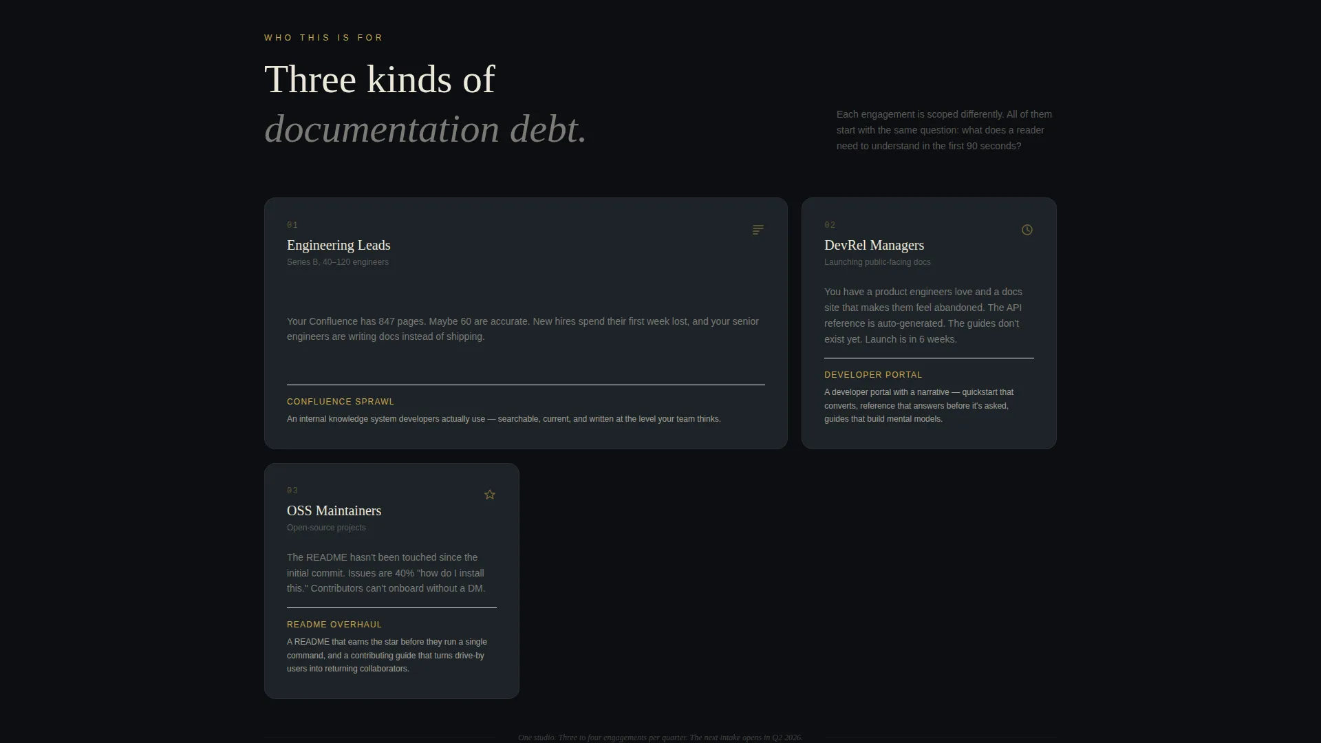
This template is built for independent technical writers who serve engineering-heavy clients. It speaks directly to the challenges of positioning a solo studio against enterprise-scale documentation problems.
- Freelance technical writers launching or repositioning their studio online
- Developer relations managers and open-source maintainers looking for a clean intake page
- Technical writing consultants targeting Series B engineering teams with complex documentation debt
What problem this template solves
Most technical writers struggle to show their value before a discovery call. A plain portfolio page lists projects but never demonstrates transformation. This template solves that gap.
- It replaces static case studies with a layered before-and-after reveal that makes the transformation visible
- It captures waitlist leads progressively, asking only for a work email first so the friction stays low
- It positions scarcity honestly, using a live spot counter to give the intake queue real weight
What you get with this template
You get a fully structured landing page built around a single, coherent argument: documentation done right changes how a product is understood. Every section is arranged to carry that argument forward.
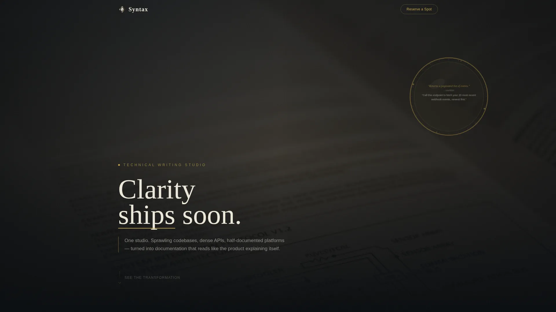
- A full-bleed photo header with a delayed headline animation and a gold-rimmed lens overlay element
- Three-layer interactive project vignettes that show messy docs, restructured docs, and annotated editorial choices
- A progressive waitlist form, a persistent mobile bottom bar call to action, and a lead-capture modal gallery
Feature list
This section covers the core functional and design capabilities built into the Syntax template.
Layered Overlap Scroll Experience
Each section is a translucent card that slides forward from beneath the one above it. The stacking creates a physical sense of depth, like lifting pages off a lightbox. Cards overlap more aggressively as the visitor scrolls deeper, building momentum toward the final call to action.
Full-Bleed Photo Header with Animation
The header uses a macro, shallow-depth-of-field documentation photograph under warm directional light. A gold-rimmed circular lens element floats over the image. The headline "Clarity ships soon" eases into frame after a two-second delay, typeset in bone white with a gold underline.
Three-Layer Before and After Project Reveals
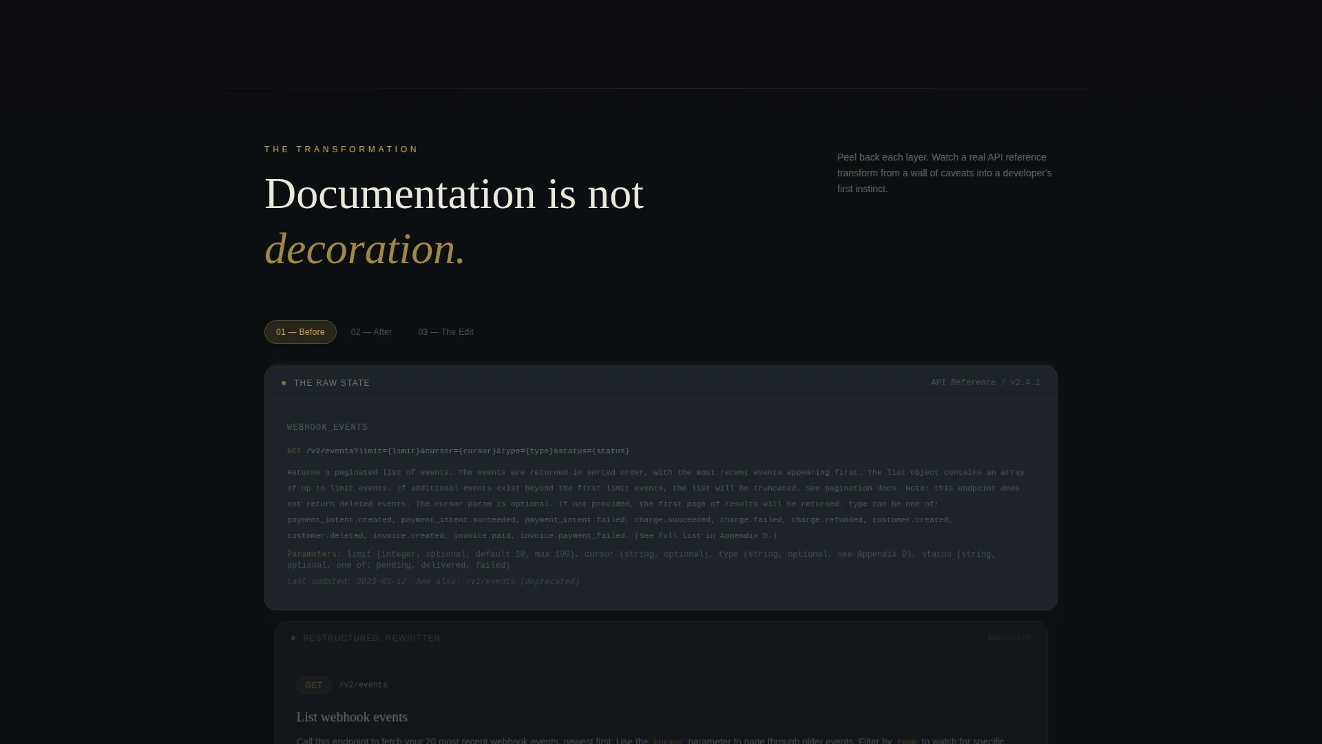
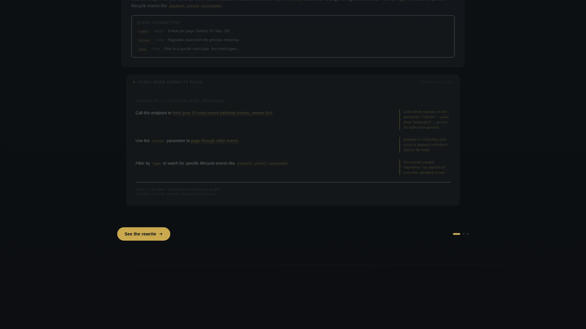
Each project vignette cycles through three states. The first layer shows a redacted but recognizable screenshot of disorganized documentation. The second layer slides over it with the same content restructured and rewritten. The third layer zooms into a single sentence and highlights editorial choices using gold marginalia annotations.
Progressive Waitlist Form
The form opens with a single field: work email. After entry, it expands to reveal a project-type dropdown covering API documentation, developer portals, internal knowledge bases, and open-source READMEs. A free-text field then asks visitors to describe their documentation problem in one sentence.
Lead Capture Modal Gallery
A secondary call to action labeled "See the Before and After Library" opens a modal gallery. The first two examples are freely visible. The third example requires an email address to unlock, capturing leads who are curious but not yet ready to book a spot.
Scarcity-Triggered call to action Pulse
A live counter displays remaining spots for the next quarterly intake. The gold accent on the primary call to action begins pulsing only after the visitor has scrolled past at least one full before-and-after reveal. The ask is earned, not front-loaded.
Page sections overview
| Section | Purpose |
|---|---|
| Full-Bleed Header | Sets the visual tone and introduces the delayed headline animation |
| Lens Overlay Element | Draws the eye to a rewritten sentence as a proof-of-craft moment |
| First Project Reveal | Shows the chaotic before state of a real documentation example |
| Restructured Layer | Slides over the before state with a clean, rewritten version |
| Annotated Editorial Layer | Zooms into one sentence and highlights decisions in gold marginalia |
| Second Project Reveal | Repeats the three-layer cycle with a different client documentation type |
| Waitlist Form Section | Captures work email then progressively reveals project type and pain field |
| Before and After Modal | Offers a secondary lead path gated behind email after example two |
| Scarcity Counter Block | Displays remaining intake spots and activates the pulsing call to action |
| Persistent Mobile Bar | Keeps the primary call to action visible as a bottom bar on mobile viewports |
| Final Statement Block | Delivers a single gold-on-black closing line floating above all layers |
Design & branding system
The Obsidian and Gold palette gives the template a quietly authoritative presence. Every color choice is purposeful, and the system is easy to adapt to your own studio identity.
- Deep obsidian black (#0B0E11) for the primary background, polished graphite (#1E2328) for layered card surfaces, warm archival gold (#C9A84C) for highlights and interactive elements, and clean bone white (#EDE8D9) for body text
- Gold appears only where the eye should land next: on the call to action button, on marginalia annotations, on the headline underline, and on the pulsing spot counter
- The Lens and Frame theme carries through every section via the circular lens motif, shallow-depth photography, and the metaphor of bringing blurred text into sharp focus
Mobile & speed optimization
The template is structured to perform clearly on mobile viewports without losing the layered depth that makes the desktop experience compelling.
- The persistent bottom bar keeps "Reserve Your Spot in the Queue" visible throughout the mobile scroll without interrupting the before-and-after reveal flow
- The progressive form collapses to a single email field on small screens, reducing visible friction at the point of first commitment
- The layered card transitions are designed to communicate depth on touch-scroll devices, preserving the sense of lifting through pages even on a smaller display
How this template helps you convert
The conversion architecture in this template is built on demonstration before solicitation. Every step earns the next ask.
- The before-and-after reveal builds belief in your process before any call to action appears, so the visitor already trusts the outcome when the waitlist form arrives
- The progressive form reduces drop-off by starting with one low-friction field and expanding only after the visitor has already invested their email address
- The modal gallery captures a second tier of leads by offering more proof content behind a lightweight email gate, turning curious browsers into qualified prospects
Other information about this template
This template is part of the Portfolio and Agency category, specifically within the Writing and Content Portfolio subcategory. It is designed for the technical writer niche and carries an Intersection Match Score of 13, indicating a strong alignment between the template style and the target audience's needs.
- The template style is Overlap and Layered, the header concept is Full-Bleed Photo, and the creative direction is Interactive Explorer
- The landing page direction is Waitlist and Coming Soon, making it well suited for studios preparing to launch or managing intake capacity
- The theme is Lens and Frame, a visual metaphor grounded in precision optics that reinforces the core promise of clarity in technical communication
Theme
Lens & Frame
Creative direction
Interactive Explorer
Color system
Obsidian & Gold
Style
Overlap/Layered
Direction
Waitlist/Coming Soon
Page Sections
Layered Overlap Scroll Layout
Animated Full-bleed Header
Three-layer Project Vignettes
Progressive Waitlist Form
Email-gated Modal Gallery
Scarcity Counter and Pulsing Call to Action
Related questions
Can I customize the color palette to match my own studio branding?
How does the waitlist form work in practice?
What types of documentation projects does the dropdown cover?
Do I need multiple pages to use this template?
What happens when the intake spots run out?



