Japan Travel Advanced Booking Website Template
Tabi is an immersive Japan tour operator landing page built for storytelling and bookings. It uses a full-page storybook layout with seasonal spreads, a dramatic macro close-up header, and a guided three-step booking modal. The design pulls visitors through four seasons of Japan, turning scroll depth into anticipation and that anticipation into consultation requests.
by Rocket studio
Quick summary
Tabi is a single-page, full-bleed landing page for a Japan tour operator specializing in unscripted travel moments. It leads with an extreme close-up header, then unfolds four seasonal spreads that expand from intimate detail shots into full regional itineraries. A three-step booking modal and a secondary email capture path work together to convert curious visitors into booked consultations.
Who this template is for
This template is built for independent Japan tour operators who lead with experience over logistics. It suits businesses whose clients want curated, off-the-beaten-path travel rather than packaged group tours.
- Boutique operators selling milestone anniversary trips and solo adventure itineraries
- Small-group travel planners who need a page that reads like a travel magazine, not a brochure
- Japan travel specialists whose audience needs to feel the destination before they book
What problem this template solves
Generic travel pages list destinations and prices. They rarely make a visitor feel anything. Tabi solves the emotional gap between browsing and booking for a high-consideration trip like Japan.
- Visitors leave most tour pages without a clear next step or emotional pull to act
- Operators lose warm leads because their site offers no middle-ground option between "book now" and "bounce"
- Seasonal and regional richness gets buried in walls of text instead of being shown through visual storytelling
What you get with this template
You get a complete, ready-to-adapt storybook landing page built around four seasonal content spreads, a conversion-focused booking flow, and a secondary lead capture path. Every section is designed with a specific visual and functional role.
- A full-viewport macro close-up header with a delayed text reveal and no navigational clutter
- Four seasonal full-page spreads that each open on a single frozen moment and expand into itinerary detail as the visitor scrolls
- A three-step booking modal covering season selection, travel style, and consultation scheduling, plus a single-field email capture for a downloadable PDF lookbook
Feature list
The template ships with a tightly sequenced set of components, each serving both the visual story and the conversion goal.
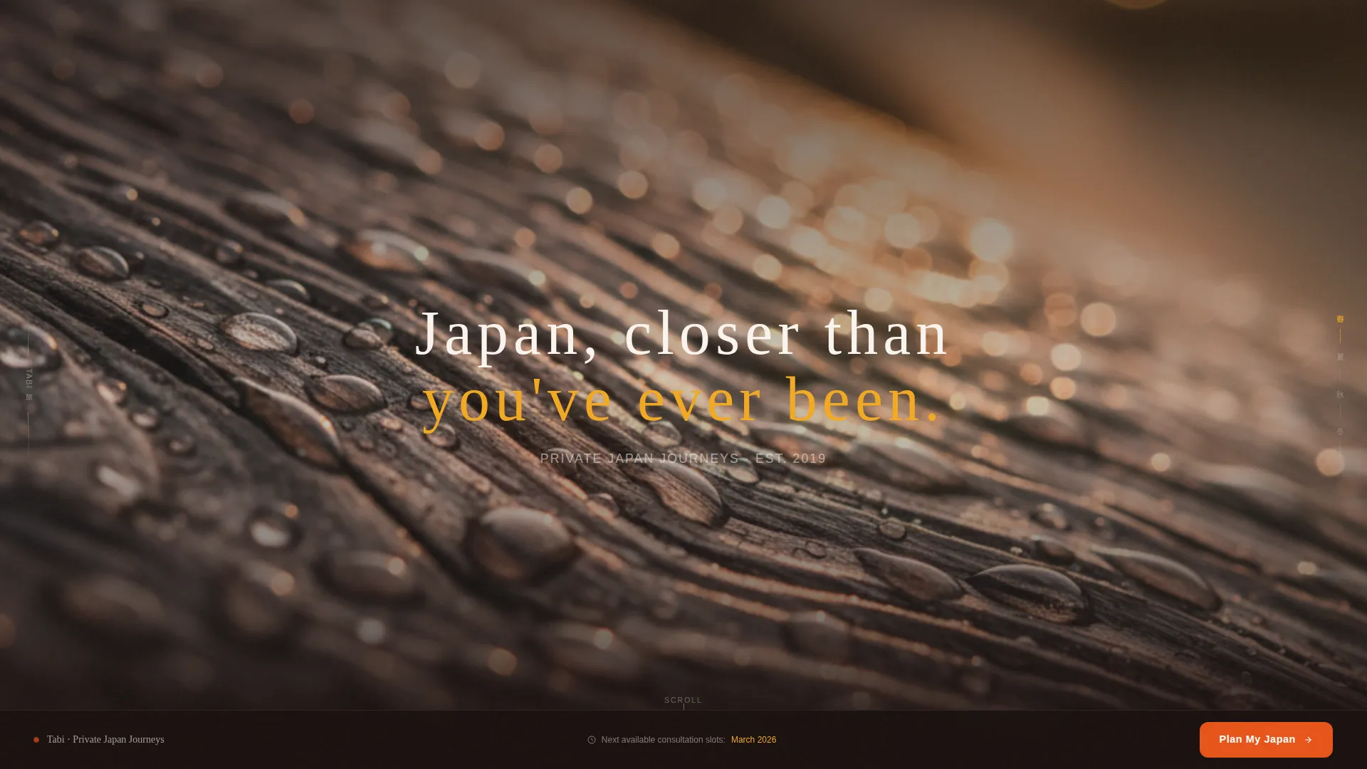
Macro Close-Up Immersive Header
The opening viewport fills entirely with an extreme detail shot, raw hinoki cypress, rain beads, shallow depth of field dissolving into warm amber bokeh. After a two-second hold, the line "Japan, closer than you've ever been." emerges from the grain. No logo, no navigation. Just texture and promise.
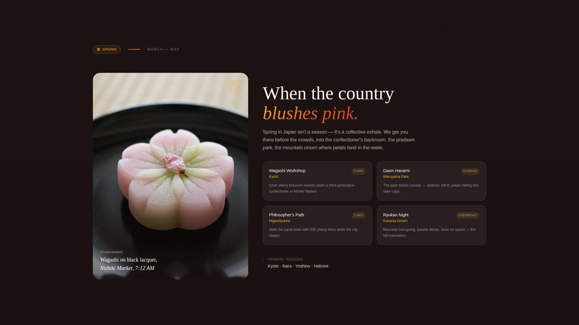
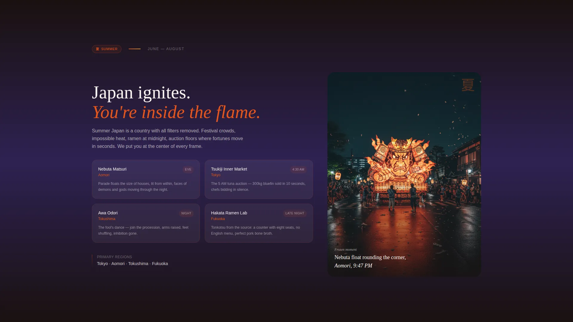
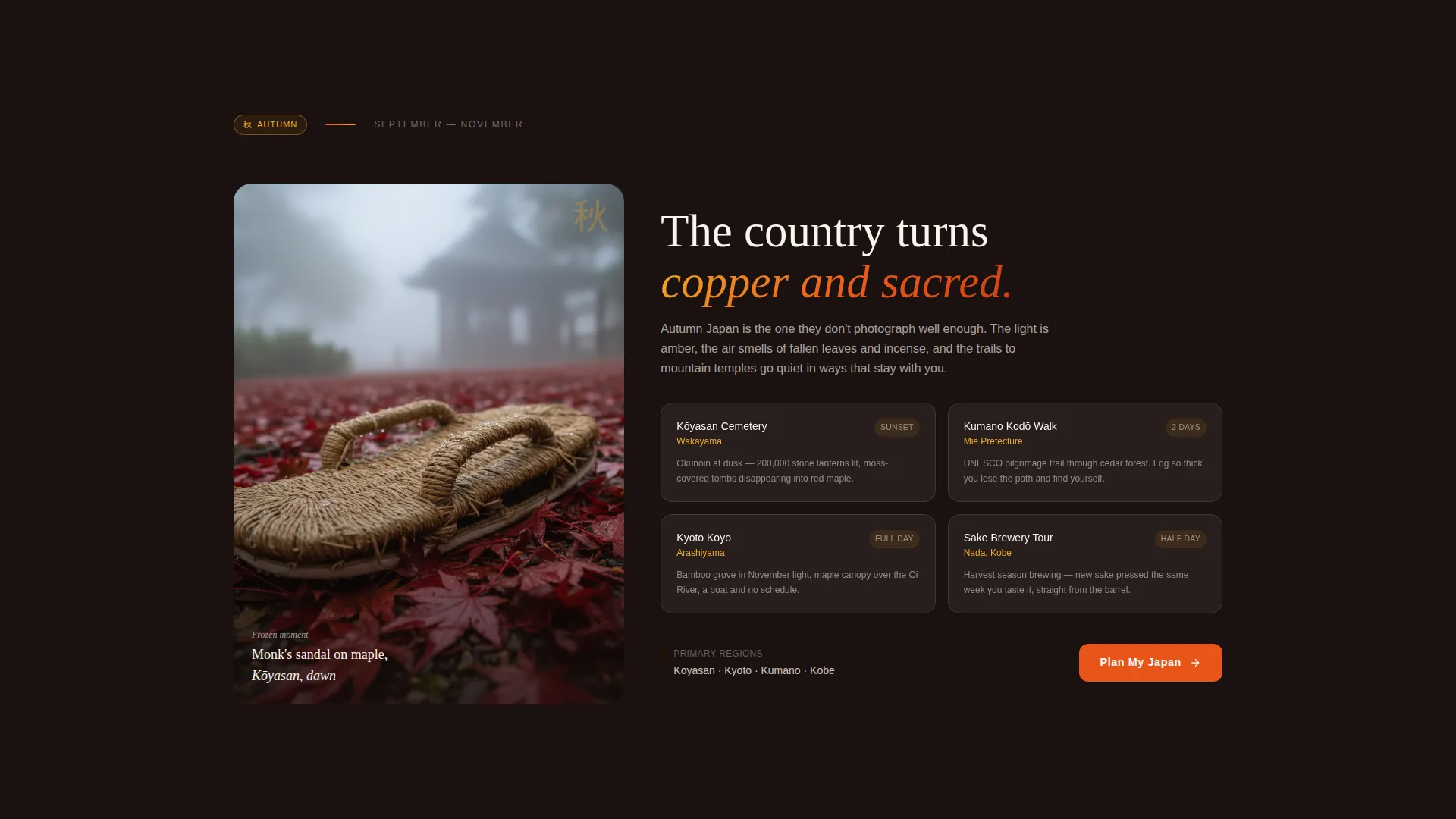
Four Seasonal Story Spreads
Each full-page spread represents one season: spring, summer, autumn, and winter. Every spread opens on a single frozen close-up moment, a wagashi sweet, a festival lantern, a monk's straw sandal, a snow monkey in steam. As the visitor scrolls, the frame expands outward to reveal the region, itinerary highlights, and available experiences for that season.
Three-Step Booking Modal
The primary call to action, "Plan My Japan," triggers a focused three-step modal. Step one presents the four seasonal visual cards already seen while scrolling. Step two lets visitors choose a travel style (Solo Explorer, Couple's Journey, or Friends' Adventure) and set a trip length using a slider from seven to twenty-one days. Step three shows an embedded calendar for selecting a consultation slot with the operator's Japan-based team.
Persistent Booking Bar
From the third seasonal spread onward, a bottom bar stays fixed on screen showing the "Plan My Japan" call to action. It keeps the booking path visible without interrupting the scroll experience.
Secondary Email Capture Path
A "Send Me the Seasonal Guide" option accepts a single email field. It gives visitors who are not yet ready to book a low-friction way to stay connected, receiving a PDF lookbook that mirrors the page's own photography and seasonal structure.
Sunset Gradient Visual System
The color palette cycles through deep volcanic black, persimmon blaze for accents and hover states, molten gold for highlights and progress indicators, and twilight indigo for transitions between spreads. Rice-paper white carries body text and overlay panels. The effect mirrors the sky above Mount Fuji at sunset, cycling from gold to copper to bruised purple.
Page sections overview
| Section | Purpose |
|---|---|
| Macro header viewport | Opens the page with an immersive, full-bleed texture shot and delayed tagline reveal |
| Spring seasonal spread | Introduces the spring itinerary through a wagashi close-up expanding into cherry blossom regions |
| Summer seasonal spread | Draws visitors into summer experiences through a Nebuta festival lantern freeze-frame |
| First call to action placement | Presents "Plan My Japan" as the primary action after the second seasonal spread |
| Autumn seasonal spread | Unfolds autumn routes from a monk's sandal on wet Kōyasan maple leaves |
| Winter seasonal spread | Opens the winter section with steam rising from a Jigokudani snow monkey |
| Persistent booking bar | Anchors the booking call to action as a fixed bottom bar from the third spread onward |
| Email capture section | Offers the seasonal PDF lookbook download for visitors not yet ready to consult |
| Three-step booking modal | Guides visitors through season, travel style, and consultation date selection |
Design & branding system
The visual identity follows an Adventure Terrain theme expressed through a Sunset Gradient color system. Every color decision references a specific emotional state tied to being in Japan.
- Deep volcanic black (#1A1110) sets the primary background; persimmon blaze (#E8541A) handles accents and hover states; molten gold (#F2A922) marks progress indicators and secondary highlights; twilight indigo (#2E2252) separates full-page spread transitions
- Soft rice-paper white (#FAF5EF) carries all body text and overlay panels, keeping legibility high against dark, textured backgrounds
- The scroll experience is designed like a photographer's contact sheet, each frame pulling the visitor deeper with a Seasonal/Moment creative direction
Mobile & speed optimization
The storybook layout is designed to translate across screen sizes without losing its atmosphere. Large visual spreads are paired with focused, minimal text blocks that remain readable at any viewport width.
- Full-bleed seasonal spreads reflow gracefully so focal close-up moments stay centered and impactful on smaller screens
- The three-step booking modal and persistent bottom bar are sized and spaced for comfortable touch interaction
- The single-field email capture section remains prominent and easy to use regardless of device size
How this template helps you convert
Tabi is structured so conversion pressure builds naturally through the scroll experience rather than appearing all at once. Every design and copy decision serves the booking goal.
- The macro header creates immediate emotional investment before any offer or call to action appears, raising the chance that visitors stay long enough to encounter the booking flow.
- The "Plan My Japan" modal uses three focused steps, seasonal visual cards the visitor has already seen, and a consultation calendar to reduce friction and make scheduling feel personal rather than transactional.
- The secondary email capture path retains leads who are still researching, keeping them inside the operator's audience through the seasonal PDF lookbook.
Other information about this template
This template is built under the Storybook/Full-Page template style, optimized for the Booking and Scheduling landing page direction. It sits within the Travel and Hospitality category, specifically designed for the Japan tour operator niche.
- The template is suited for operators whose clients include milestone anniversary couples, solo adventurers seeking powder days in Niseko or ramen culture in Hakata, and small impulsive groups needing a coherent two-week narrative
- The header concept follows a Macro Close-Up approach, a deliberate departure from wide-angle destination photography that most travel pages default to
- The Seasonal/Moment creative direction means content is organized by time of year rather than by geography, making it easy for operators to align page messaging with seasonal promotions or availability windows
Theme
Adventure Terrain
Creative direction
Seasonal/Moment
Color system
Sunset Gradient
Style
Storybook/Full-Page
Direction
Booking/Scheduling
Page Sections
Immersive Macro Close-up Header
Four Expanding Seasonal Spreads
Three-step Booking Modal
Persistent Bottom Booking Bar
Single-field Email Lead Capture
Sunset Gradient Color System
Related questions
Can I change the seasonal spreads to match my own itineraries?
How does the three-step booking modal work?
Is the email lead capture section included in the template?
Who is this landing page template best suited for?
Can I use this template if my tours are not divided by season?


