Disability-Owned Business Professional Website Template
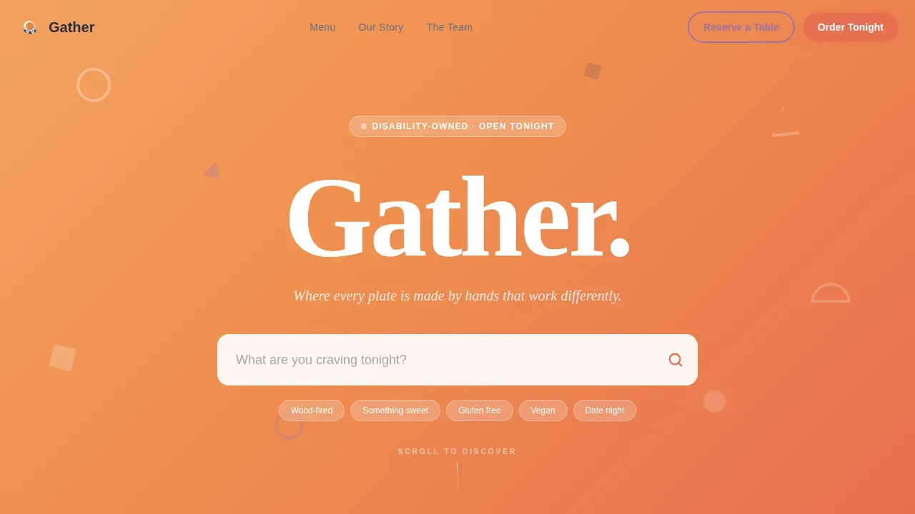
The Gather playful geometric disability owned restaurant landing page template is a scroll-reveal, single-page design built for a neighborhood food business that leads with culinary excellence. Warm sunset gradients, bold geometric shapes, a live search header, and a sticky "Order for Tonight" call to action work together to turn curious visitors into committed diners and online orders.
by Rocket studio
Quick summary
Gather is a restaurant landing page template designed around a simple truth: great food earns its own reputation. The page opens with an oversized search field set against a peach-to-saffron gradient, letting visitors explore the menu before a single scroll. Progressive scroll reveals build the full story, from team to testimonials, while a sticky saffron button keeps the order path clear at every moment.
Who this template is for
This template is for food-forward restaurant owners who want a website that converts discovery into orders. It suits disability-owned restaurants that want their culinary identity front and center, not their charity story. It also works for any neighborhood food business that relies on direct sales and dine-in reservations.
- Restaurant owners and operators building a direct-sales website without a development team
- Disability-owned food businesses that want bold, accessible design paired with inclusive, clear messaging
- Cafes, bistros, and neighborhood restaurants targeting local diners, young families, remote workers, and date-night couples discovered through social media
What problem this template solves
Most restaurant landing page designs fall into two traps. They either bury the menu behind a hero image, or they force visitors through several screens before showing a single food item. For a disability-owned restaurant, the challenge is even more specific: the page has to dismantle the "charity dining" assumption before a visitor decides to click away.
Gather fixes this by leading with desire, not explanation.
- Visitors land on a live search field and immediately explore food options by craving, dietary need, or dish name, removing the friction that leads to drop-off
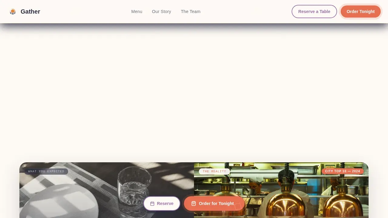
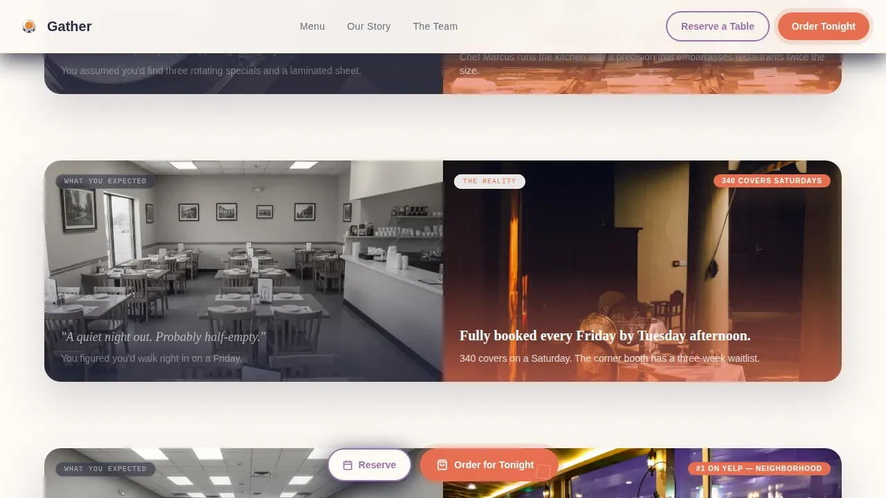
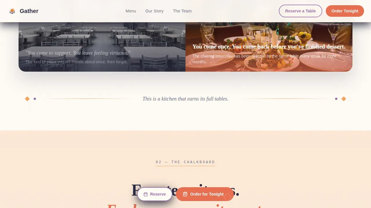
- The Comparison Journey scroll structure replaces expected assumptions with vibrant, saturated reality, showing awards, packed Friday nights, and a rotating chalkboard menu rather than a feel-good stock-photo narrative
- A sticky "Order for Tonight" button remains active throughout every section, so the path to commitment is never more than one tap away
What you get with this template
This restaurant landing page template delivers a complete, scroll-led visual experience with every section pre-built and ready to customize. The design fabric is consistent from top to footer: warm peach backgrounds shift to deep saffron, lavender geometric accents frame food photography, and charcoal type keeps every description grounded and readable.
- A hero section with a live search field, floating geometric shapes, and a massive wordmark that sets the tone before a single scroll
- Six structured page sections covering search, comparison, menu, team, testimonials, and footer, each with scroll-reveal animations and stagger-card transitions
- A three-step order flow with toggleable dietary filter chips, a sticky call-to-action button, and a secondary "Reserve a Table" path in lavender outline style
Feature list
This section highlights the core built-in capabilities that make this restaurant landing page template function as a direct-sales tool for food businesses.
Live Search Header with Real-Time Menu Filter
The hero section replaces a static image with an oversized search field centered on a peach-to-saffron gradient background. As visitors type a craving, a dish name, or a dietary term, menu items appear in real time below the field, each with a thumbnail, price, and a one-tap add-to-cart option. This interaction treats visitors as people who have already decided to eat here, turning the first moment on the page into a tasting session.
Comparison Journey Scroll Structure
Each scroll-revealed section pairs a muted assumption on the left with a full-color reality on the right. A geometric divider splits the frame, and the right side reveals in vivid, saturated detail what the restaurant actually offers: rotating chalkboard items, award callouts, a packed dining room. This design process builds trust progressively, section by section, so that by the time a visitor reaches the testimonials, the case for a reservation is already made.
Sticky Direct-Sales Call to Action
A saffron button labeled "Order for Tonight" follows the scroll across every section of the page. When idle, it pulses gently with a geometric rotation animation that draws attention without disrupting the reading experience. Interactive elements on the page are designed to avoid auto-playing features that could cause sensory overload, keeping the pulse animation subtle and optional.
Three-Step Order Flow with Dietary Chips
After tapping the sticky button, visitors move through a simple, clear three-step sequence: choose delivery or pickup, confirm address or location, then land on the live menu. Dietary filters, including vegan, nut-free, and halal options, display as toggleable geometric chips. The clean layout of this flow means users are never forced to navigate away or fill a lengthy form to place an order.
Team Section with Personality-Led Storytelling
The kitchen crew section presents each team member with character and depth, not just a job title. A brief description of each person highlights their individual skill and role. Visual storytelling here can include photos with clear alt-text descriptions for screen readers, ensuring the section remains accessible to all users. This approach emphasizes inclusion and a unique perspective on what it means to run a food business.
Scroll-Reveal Animation System
The full page uses GSAP-powered scroll reveals and CSS animations to progressively display each section as the visitor moves down. Cards stagger in, geometric shapes drift like confetti frozen mid-fall, and the background transitions from peach to saffron with depth as the scroll deepens. Smooth animations for text and images enhance the user experience without relying on auto-playing video or audio that might force discomfort on some visitors.
Page sections overview
| Section | Purpose |
|---|---|
| Hero Search Field | Invite visitors to explore food by craving, dish, or dietary need before scrolling |
| Comparison Journey | Dismantle charity-dining assumptions with side-by-side scroll-reveal splits |
| Featured Menu | Display food photography, pricing, and dietary chip filters in a card layout |
| Team and Kitchen | Introduce the crew with personality-led descriptions and accessible alt-text images |
| Testimonials and Social Proof | Build trust with guest quotes, award callouts, and packed-house highlights |
| Footer Pattern | Present hours, location links, and accessibility information in a clean horizontal layout |
Design & branding system
The Gather restaurant landing page template uses a Sunset Gradient color system that feels like the last forty-five minutes of sunlight hitting a patio with paper lanterns. The palette is warm enough to make food photography glow and electric enough to feel like somewhere worth visiting on a Friday night.
- Four-color palette: warm peach (#F4A261), deep saffron (#E76F51), soft lavender dusk (#9B72AA), and grounding charcoal (#2B2D42) for text and structural elements, maintaining strong color contrast throughout to support readability for all users
- Bold geometric shapes including triangles, half-circles, and offset squares appear as accent art framing food images and hover states, with the geometry of each shape reinforcing the playful, warm editorial character of the brand
- Typography pairs DM Sans for body and user interface elements with Fraunces for display and editorial headings, combining a simple sans-serif for clear readability with an expressive serif that adds warmth and depth to section titles
Mobile & speed optimization
Over sixty percent of all digital restaurant orders happen on mobile smartphones and tablets, so this restaurant landing page template is built mobile-first. Every section, from the search header to the footer, adapts to smaller screens without losing the visual fabric of the design. The sticky call-to-action button remains reachable and clearly visible on all screen sizes.
- CSS animations handle the majority of motion effects, with GSAP reserved for scroll-reveal sequences, keeping the page light and responsive on mobile devices without sacrificing the visual detail that set this template apart
- The menu section displays food images, prices, and dietary chips in a stacked card format on smaller screens, allowing users to browse and filter without horizontal scrolling or pinching
- Interactive elements including search, dietary chip toggles, and the order flow are reachable via the Tab key with a visible focus indicator, supporting users who navigate with a keyboard or assistive technology
How this template helps you convert
The restaurant landing page template is structured to move visitors from curiosity to commitment in as few steps as possible. Every design and interaction decision is made in service of one goal: getting the visitor to place an order or book a table.
- The live search field lets visitors build half a mental cart before ever seeing the sticky call-to-action button, so by the time they tap "Order for Tonight," they already know what they want. The search section also feeds into the three-step order flow, making the transition from browse to purchase feel effortless.
- The Comparison Journey scroll structure earns trust progressively. Each section reveals more of the kitchen, the team, the packed dining room, and the awards, replacing any expected hesitation with enthusiasm and desire. By the section that displays testimonials, visitors have been shown the evidence, not just told about it.
- The secondary "Reserve a Table" path in lavender outline style gives dine-in visitors a clear, descriptive alternative to the order flow. Both paths are always visible, and neither competes with the other, allowing users to self-select their preferred way to visit without friction.
Other information about this template
This template was built specifically for the Retail and E-Commerce category, under the Disability-Owned Business subcategory. It is designed for the disability-owned restaurant niche and represents a practical tool for any food business ready to launch a direct-sales website with a strong visual identity and an accessible digital menu.
- The Gather playful geometric disability owned restaurant landing page template is a single-page, scroll-reveal design compatible across all devices and browsers, making it a great starting point for restaurant owners creating a new web presence
- All food images on the website should carry descriptive ALT text for screen readers, and the digital menu is structured in HTML format with properly labeled headings for each section, helping screen reader users navigate the content with ease
- A minimum contrast ratio of 4.5:1 is recommended for text against its background throughout the site, protecting users with low vision or color blindness and ensuring the page passes standard color contrast tests
- The digital menu can include all items listed on the current print menu, including separate drink or dessert menus, displayed using geometric card layouts rather than a simple list
- Accessibility information on the site should detail accessible parking, restrooms, and sensory-friendly options, and a quick info grid can display hours, location, and a link to the Accessibility Statement in a simple, structured format
- A "Skip to Content" button at the top of the page supports screen reader optimization, and all interactive elements including the search field, dietary chips, and order flow steps are designed to be reachable via the Tab key
- No-code tools and AI-powered platforms allow restaurant owners to create production-ready restaurant websites from natural language prompts, streamlining the process for owners who want to customize this template to match their brand without needing technical skills
- Testing the accessibility of the menu with customers who have disabilities can provide valuable feedback for improvements, and the template's structure makes it straightforward to iterate on sections based on that feedback
- The Gatherer template, a Bootstrap 5 design built specifically for restaurants, cafes, and food-related businesses, shares a similar section set covering About, Kitchen, Food, Testimonials, and Contact, and serves as a useful reference point for understanding how structured restaurant landing page templates are organized in the broader market
- Inclusive restaurant design enhances the dining experience for individuals with disabilities, and creating an accessible environment, both physical and digital, can attract a wider customer base and help restaurants reach new places in their local community
- The page footer follows a horizontal flow pattern and can surface links to the restaurant's map and address, making it easy for visitors to locate the space before they visit
Theme
Playful Geometric
Creative direction
Comparison Journey
Color system
Sunset Gradient
Style
Scroll Reveal (Progressive)
Direction
Direct Sales
Page Sections
Live Search Header with Real-time Menu Filter
Comparison Journey Scroll Structure
Sticky Direct-sales Call to Action
Three-step Order Flow with Dietary Chips
Team Section with Personality-led Storytelling
GSAP Scroll-reveal Animation System
Related questions
Can I customize the colors and fonts in this template?
Is the live search feature already built into the template?
Does the template support accessible digital menus?
How does the three-step order flow work?
Can this template be used for a restaurant that also takes dine-in reservations?



