Subscription Box Professional Website Template
Tackle is a modular card-grid landing page built for fishing tackle subscription boxes. It guides existing subscribers toward upgrading their plan or adding a one-time seasonal drop. With a sunset-inspired color palette, Before/After card reveals, and a sticky upgrade bar, the template turns casual browsers into committed anglers ready to level up their gear.
by Rocket studio
Quick summary
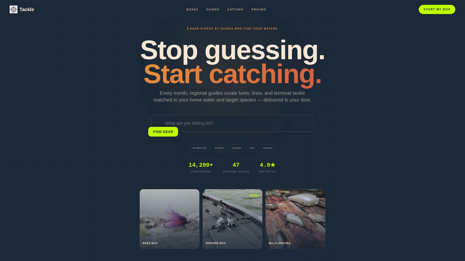
Tackle is a single-page subscription upgrade experience designed for fishing tackle box brands. It opens with a search-driven hero, flows through a modular card grid with Before/After reveals, and closes the loop with real subscriber catch photos. Every section is built to move current subscribers up a tier or add a seasonal specialty drop to their order.
Who this template is for
This template is built for fishing tackle subscription brands that already have an active subscriber base. It works best when your primary goal is revenue growth through plan upgrades and add-on purchases rather than cold acquisition.
- Subscription box operators who want to upsell existing customers from a targeted email or in-app link
- Brands serving weekend bass anglers, tournament competitors, and families who fish together from the dock
- Teams who want a visually rich, content-led page without building one from scratch
What problem this template solves
Most subscription upgrade pages are flat comparison tables that feel like a spreadsheet, not a reason to spend more. Anglers are visual buyers. They need to see the gear, feel the quality gap, and understand exactly what they missed by staying on their current plan.
- Subscribers do not upgrade because they cannot picture the difference between tiers
- Generic store pages fail to connect curated tackle quality to real fishing outcomes
- One-time seasonal add-ons get buried and never purchased because there is no dedicated moment to discover them
What you get with this template
You get a fully structured, single-page layout with every section already in place. The design system, card grid, and interactive components are defined and ready to populate with your own product photography and copy.
- A search-driven hero section with autocomplete-style input and a sunset gradient background
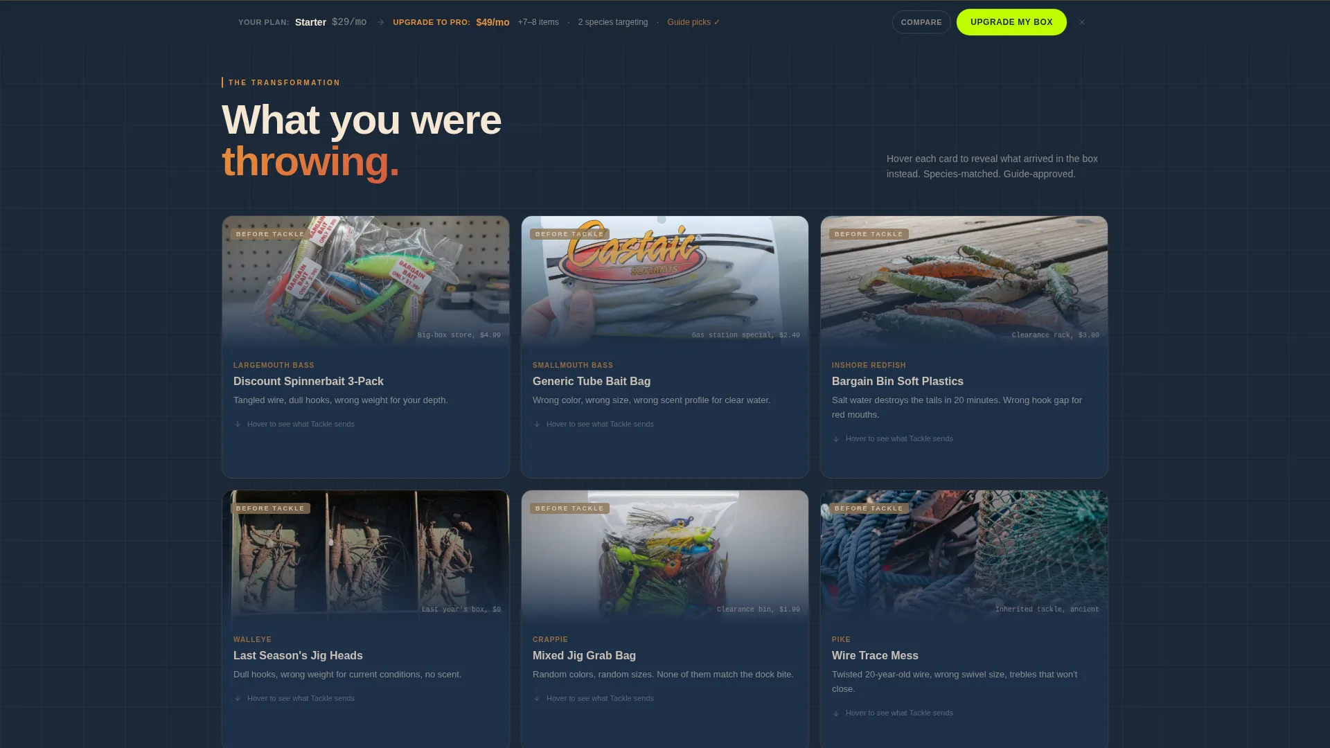
- A modular Before/After card grid that flips between generic gear and premium box contents, plus full-box unboxing and subscriber catch photo sections
- A sticky bottom upgrade bar with a tier comparison toggle, a primary "Upgrade Your Box" call to action, and a secondary "Add a One-Time Drop" path
Feature list
This section walks through the functional building blocks included in the Tackle template.
Search-Driven Hero Header
The hero centers a styled search input over a soft-focus sunset gradient. The placeholder text reads "What are you fishing for?" and the field is designed to support autocomplete suggestions such as "smallmouth," "late fall crankbaits," and "inshore redfish." It immediately signals that this experience is personalized to how the subscriber actually fishes.
Before/After Card Grid
Each card in the modular grid is built with a flip or slide reveal mechanic. One face shows what subscribers were using before, such as generic store-bought packs or tangled discount spinnerbaits. The other face reveals what arrived in the Tackle box, including premium jigs matched to a home lake and pre-cut fluorocarbon leader. The grid transitions as the visitor scrolls from individual product cards into full unboxing shots and then into subscriber catch photos.
Sticky Upgrade Bar
A persistent bottom bar stays visible as subscribers scroll. It displays their current plan tier alongside the next tier so the comparison is always in frame. The bar holds the primary chartreuse "Upgrade Your Box" call to action and never leaves the screen, reducing friction at the moment of decision.
Tier Comparison Toggle
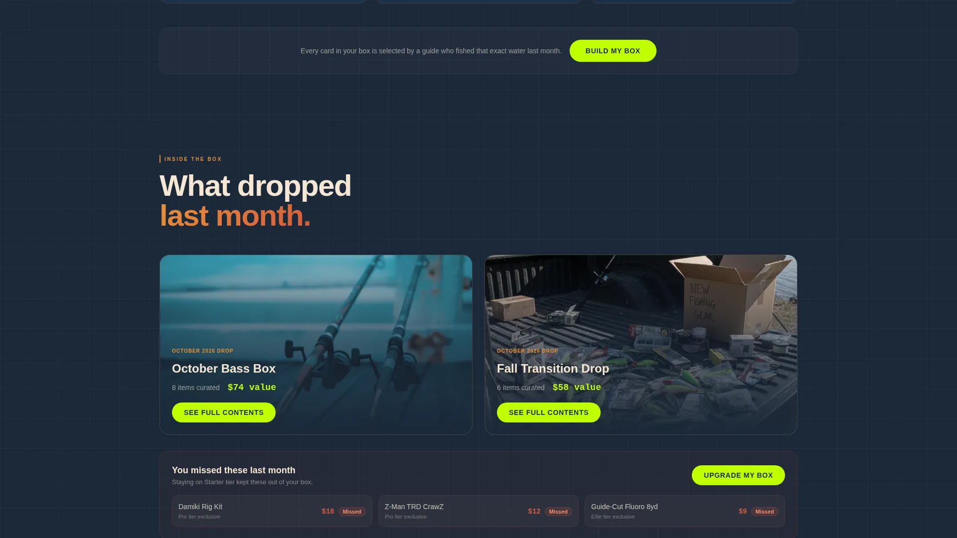
A built-in toggle lets visitors compare subscription tiers side by side. The comparison covers item counts, species targeting options, and guide-pick exclusives. This component also surfaces which specific lures a subscriber missed last month by staying on their current plan, making the upgrade feel concrete rather than abstract.
One-Time Drop Add-On Cards
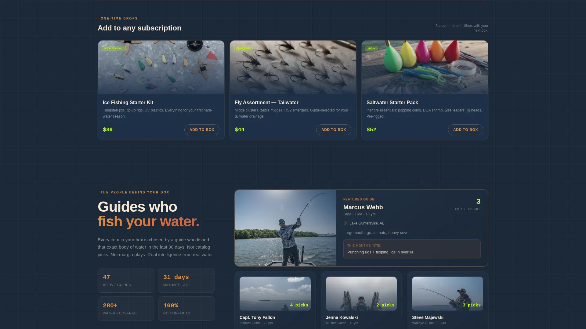
Separate specialty cards sit outside the main subscription flow. These represent seasonal add-ons such as ice fishing kits, fly assortments, and saltwater starter packs. Subscribers can purchase any of these without changing their existing plan, giving the brand a low-commitment upsell path for every season.
Sunset Gradient Visual System
The color system is built around deep lake navy for backgrounds, warm amber bleeding into burnt coral for card borders and hover states, pale sandbar for card faces, and chartreuse reserved exclusively for calls to action and price callouts. All photography guidelines call for overhead, catalog-flat product shots on weathered dock wood with wet, glistening lures.
Page sections overview
| Section | Purpose |
|---|---|
| Search Hero Header | Drops visitors into a personalized search experience over the sunset gradient |
| Before/After Grid | Reveals quality gap between generic gear and curated box contents card by card |
| Full Box Reveals | Unboxing shots showing complete box contents spilled across a tailgate surface |
| Subscriber Catch Photos | Social proof closing the loop from gear quality to real fish caught |
| Sticky Upgrade Bar | Persistent tier comparison and primary upgrade call to action |
| One-Time Drop Cards | Seasonal specialty add-ons purchasable without a subscription change |
Design & branding system
The visual identity is built to evoke the last fifteen minutes of fishable light, when the water surface turns copper and every cast feels urgent. Every color and composition choice serves that emotional mood.
- Color palette: deep lake navy (#1B2838) for backgrounds, warm amber (#E8913A) into burnt coral (#D45A3C) for card borders and hover states, pale sandbar (#F5E6D3) for card faces, and chartreuse (#BFFF00) exclusively for calls to action and price callouts
- Photography style: overhead catalog-flat shots on weathered dock wood, lures wet and glistening, full-box unboxing spreads on a tailgate, and grip-and-grin catch photos from real subscribers
Mobile & speed optimization
The modular card grid is built on a responsive layout so the Before/After reveal and the sticky upgrade bar adapt cleanly across screen sizes. Anglers frequently browse from their phones while on the water or at the boat ramp, so mobile readability is a core design consideration.
- Card grid snaps into a single-column stack on smaller screens without losing the flip or slide reveal mechanic
- Sticky bottom bar remains accessible on mobile, keeping the upgrade call to action within thumb reach at all times
How this template helps you convert
The page is structured as a trust-building scroll that moves the subscriber from doubt to decision in three clear phases.
- The Before/After card grid shows the quality gap visually and specifically, so subscribers understand what they are missing on their current plan rather than reading about it in a feature table.
- The tier comparison toggle and missed-lure callout make the upgrade feel personal and urgent, reducing the mental effort required to say yes to a higher plan.
- The One-Time Drop add-on path captures revenue from subscribers who are not ready to upgrade their plan but will buy a single seasonal specialty card when it is presented clearly and separately.
Other information about this template
The Tackle template sits in the Retail and E-Commerce category under Subscription Box Services. It is designed as a single-page layout optimized for warm traffic arriving from email campaigns or in-app upgrade prompts rather than cold search traffic.
- Template style follows a modular card-grid (Marketplace/Multi direction) with a layered composition approach
- The sunset gradient color system and dock-wood photography direction are pre-specified and ready to guide your creative production
- Seasonal add-on cards make the template reusable across the fishing calendar, from open-water bass season through ice fishing and fly assortment drops
- The page structure supports both an upsell journey for long-term subscribers and a one-time purchase path for more casual buyers
Theme
Neo-Retro
Creative direction
Curated Collection
Color system
Lavender Dream
Style
Overlap/Layered
Direction
Marketplace/Multi
Page Sections
Search-driven Hero with Autocomplete
Before/after Modular Card Grid
Sticky Tier Upgrade Bar
Side-by-side Tier Comparison Toggle
One-time Drop Add-on Section
Sunset Gradient Color and Photography System
Related questions
Who is the primary audience for this template?
Can I use this template to sign up brand-new customers?
What photography do I need to produce for this template?
How do the One-Time Drop cards differ from the main subscription upgrade path?
Does the sticky upgrade bar remain visible on smaller screens?



