Missiongrade Marketing Landing Page Template
A bento grid landing page built for a veteran-owned marketing agency. The template uses a Cloud Canvas color system with signal-flare coral accents, a hero device mockup showing a live campaign dashboard, and a scroll-reveal bento layout. Every section is designed to move DTC founders, franchise owners, and government contractors toward a capabilities deck click-through.
by Rocket studio
Quick summary
A single-page, click-through landing page template for a veteran-owned marketing agency. The layout uses a bento grid structure with scroll-triggered card reveals, a hero device frame showing campaign metrics, and three coral call-to-action placements. The design language draws from vintage field manuals and modern confidence in equal measure.
Who this template is for
This template is built for veteran-owned marketing agencies that need a polished, conversion-focused landing page without starting from scratch. It suits founders who want their brand story and service capabilities to land with precision.
- Direct-to-consumer (DTC) brand founders who need a clear, no-clutter agency pitch page
- Franchise operators and government contractors looking for an agency that already speaks their language
- Veteran entrepreneurs launching or refreshing an agency presence with strong visual identity
What problem this template solves
Most agency landing pages bury the lead. They show too much at once, dilute the offer, and lose the visitor before a single click. This template solves that by rationing information across a layered bento grid, so each scroll feels earned.
- Visitors get overwhelmed by dense, wall-of-text agency pages that fail to build trust quickly
- Generic templates do not reflect the discipline and credibility that a veteran-led team brings to the table
- Click-through pages without a clear visual hierarchy send traffic to a capabilities deck before the visitor is ready
What you get with this template
The template delivers a fully structured single-page layout with distinct sections, a defined color system, and call to action placement built into the design from the start. Nothing requires rearranging from scratch.
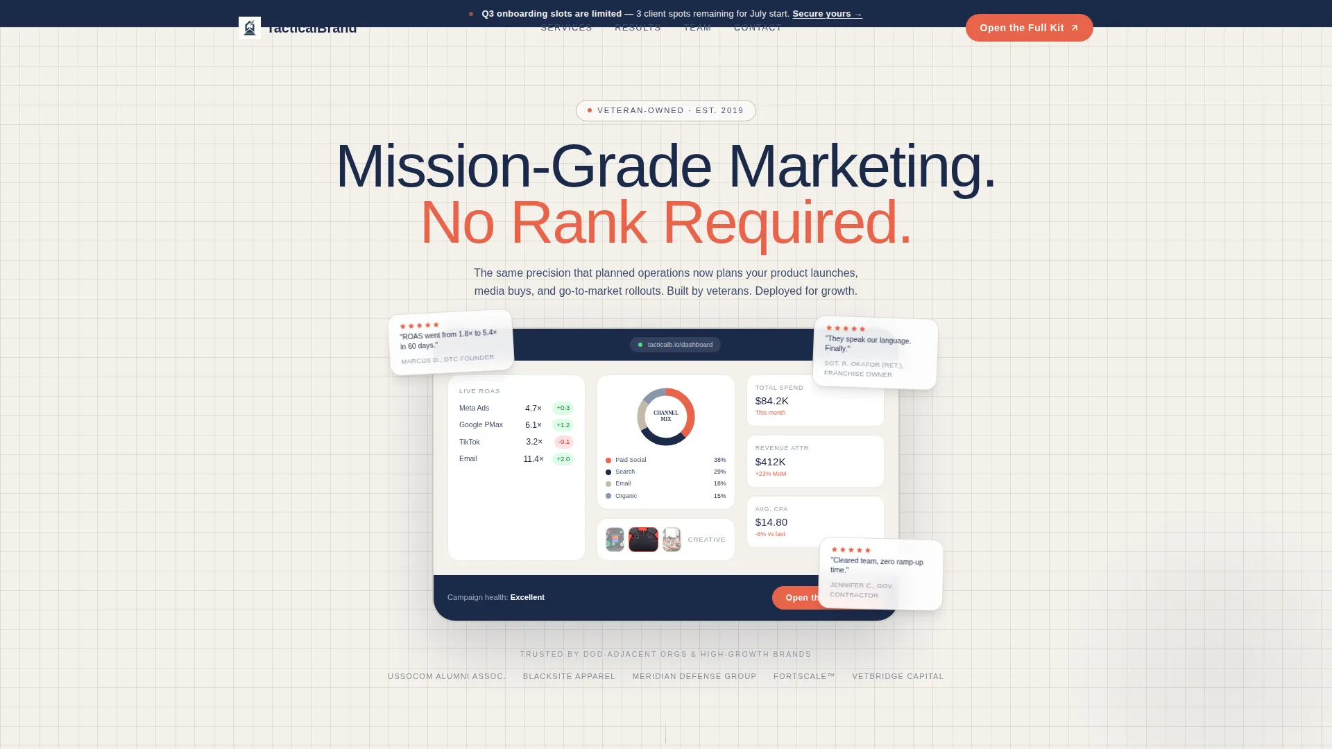
- A hero section with an App Store Preview-style device mockup displaying dashboard metrics, five-star review badges, and a bold condensed tagline
- A three-row bento grid with flip-on-scroll service cards, an animated case study row, and a team row with client social proof
- Three coral call-to-action placements: inside the hero mockup, as a persistent button after row two, and as a full-width closing bar
Feature list
This section covers the core built-in components and design decisions that make the template work.
Hero Device Mockup Frame
The header is staged as an App Store Preview. A hero-sized device frame displays a simulated campaign dashboard with return-on-ad-spend (ROAS) tickers, rotating creative thumbnails, and a channel-mix donut chart. Five-star review badges and a heavy condensed tagline surround the frame.
Scroll-Reveal Bento Grid
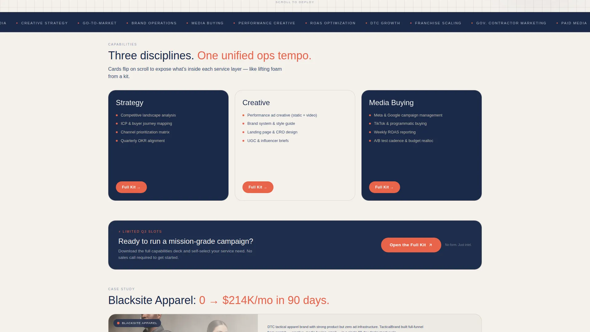
Three rows of bento cards reveal agency capabilities one layer at a time as the visitor scrolls. The first row holds three square service cards that flip to expose Strategy, Creative, and Media Buying with short motion loops. Each card behaves like lifting a layer of foam from a kit.
Animated Case Study Row
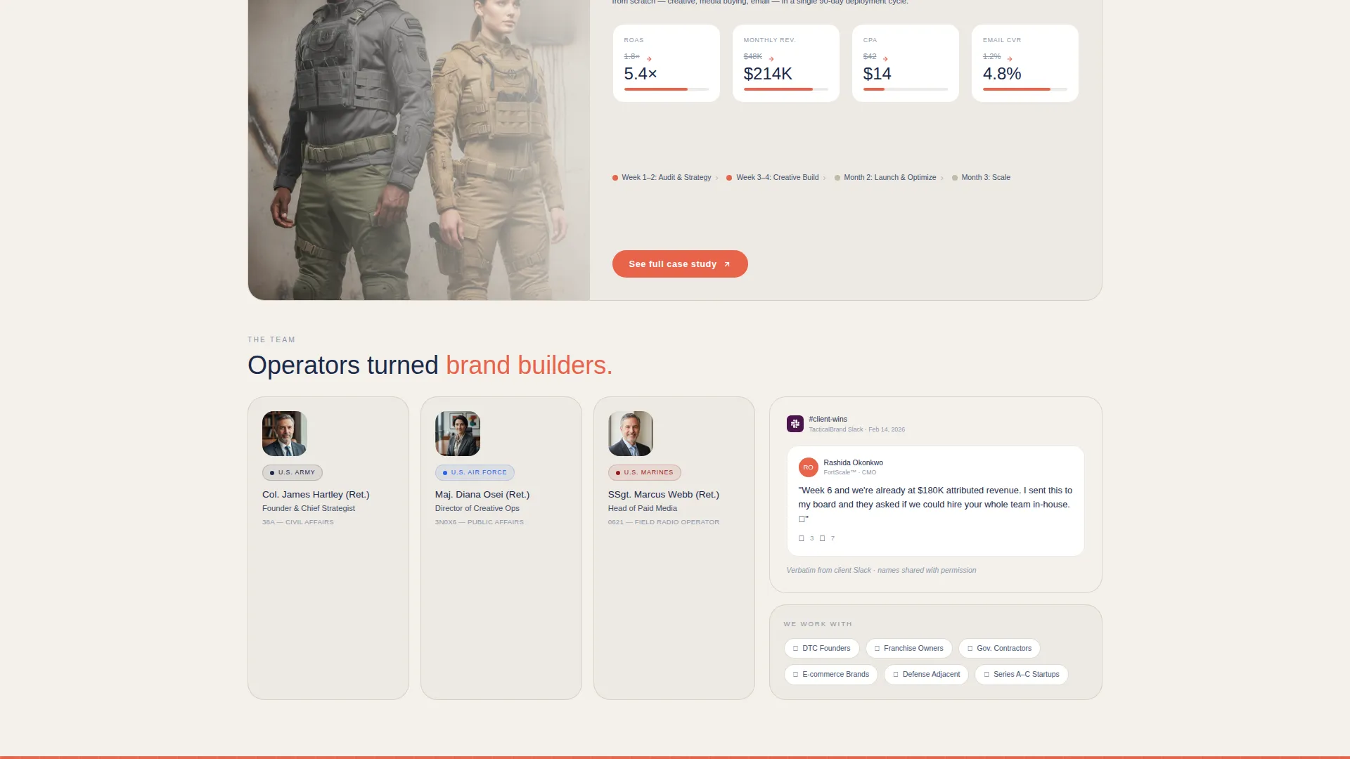
The second bento row spans the full grid width and presents a real client case study. Before-and-after metrics animate on entry, giving visitors a concrete proof point without requiring them to navigate elsewhere.
Team and Social Proof Row
The third bento row pairs headshots overlaid with service branch insignia alongside a narrow cell quoting a verbatim client message. This combination grounds the agency's credibility in real people and real words.
Three-Placement call to action System
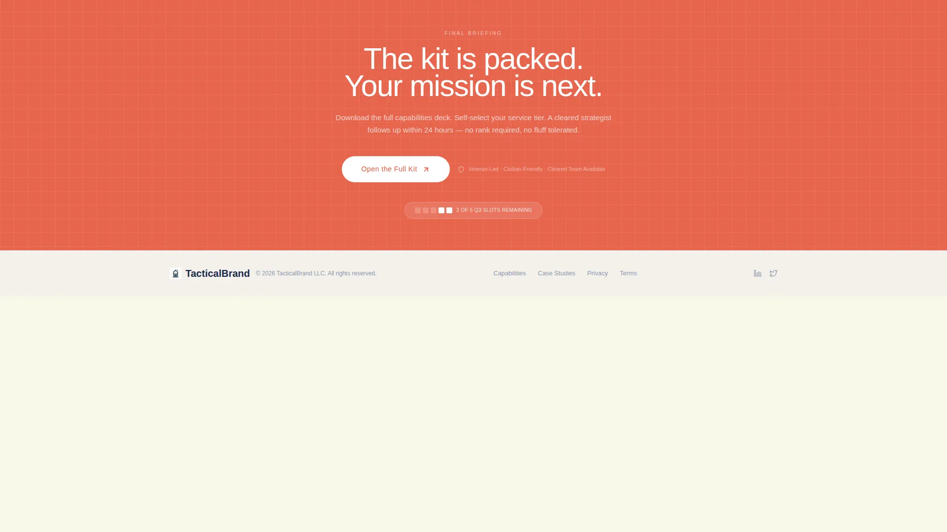
The primary call to action, labeled "Open the Full Kit," appears three times: inside the hero device mockup, as a persistent coral button after the second bento row, and as a full-width closing bar. Each placement catches visitors at a different stage of scroll engagement.
Trust and Urgency Layer
A subtle banner communicates limited Q3 onboarding availability. Department of Defense-adjacent client logos and a "Veteran-Led, Civilian-Friendly" trust badge are anchored to the bottom-right corner of every viewport section, maintaining credibility throughout the scroll.
Page sections overview
| Section | Purpose |
|---|---|
| Hero Device Header | Showcases live campaign dashboard mockup with tagline and review badges |
| Urgency Banner | Signals limited Q3 onboarding slots to prompt timely action |
| Service Cards Row | Flip-reveal bento cells for Strategy, Creative, and Media Buying |
| Case Study Row | Full-width animated before-and-after client metrics |
| Team and Testimonial Row | Headshots with insignia and a verbatim client Slack quote |
| Persistent call to action Button | Coral button anchored after second bento row |
| Full-Width Closing Bar | Final call-to-action bar routing visitors to the capabilities deck |
| Trust Badge Anchor | Veteran-Led badge and client logos fixed per viewport |
Design & branding system
The Cloud Canvas color system gives the page a warm, structured feel that reads like a vintage recruiting poster printed on matte museum stock. Every color has a specific role and stays in its lane.
- Soft cumulus white (#F4F1EC) covers the primary background, and faded field-manual khaki (#C2B9A7) surfaces every card
- Signal-flare coral (#E8634A) is reserved exclusively for interactive accents, call-to-action buttons, and focal points where the eye needs direction
- Deep dress-blue ink (#1B2A4A) handles all typography, and a faint khaki grid behind the hero frame evokes graph paper from a field planning notebook
Mobile & speed optimization
The bento grid layout is structured to adapt cleanly across screen sizes, keeping the card-reveal experience intact on smaller viewports. The design avoids heavy decorative layers that would slow the scroll or clutter a phone screen.
- Card cells restack vertically on mobile without breaking the sequential reveal logic or disrupting the reading order
- The persistent coral call to action button remains visible and tappable at every scroll depth on touch devices
- Motion loops inside service cards are contained within their bento cells so they do not affect layout stability during scroll
How this template helps you convert
The template is built around a single conversion goal: routing warm visitors to an interactive capabilities deck. Every design and layout decision supports that one action.
- The hero device mockup builds immediate credibility by showing a functioning campaign dashboard before the visitor reads a single line of body copy, priming them to trust the agency's output.
- The bento grid's layered reveal keeps visitors scrolling by rationing information one card at a time, so engagement builds naturally toward the closing call to action bar rather than dropping off mid-page.
- The three-placement call to action system ensures the "Open the Full Kit" action is always one tap or click away, regardless of where the visitor pauses in the scroll journey.
Other information about this template
This template is categorized under Retail and E-Commerce, specifically within the Veteran-Owned Business subcategory. It is designed as a Neo-Retro themed single-page experience and pairs naturally with a capabilities deck or service detail page that handles visitor self-selection.
- The template follows a Neo-Retro visual theme, blending warm analog nostalgia with sharp, modern layout confidence
- No form fields appear on this page by design; the click-through model routes all conversion intent to a separate interactive capabilities page
- The "Veteran-Led, Civilian-Friendly" trust badge is a fixed user interface element designed to reassure non-military clients throughout the entire scroll experience
Theme
Neo-Retro
Creative direction
Curated Collection
Color system
Sunset Gradient
Style
Gallery + Detail
Direction
Quiz/Assessment
Page Sections
Hero Device Mockup with Dashboard Preview
Scroll-triggered Bento Grid Layout
Animated Before-and-after Case Study
Team Row with Social Proof Cell
Three-placement Call to Action Architecture
Trust Badge and Urgency Banner
Related questions
Does this template include a contact form or lead capture?
Can I adapt the bento grid cards for a different set of services?
What makes the Cloud Canvas color system distinctive?
How many times does the primary call to action appear on the page?
Is this template suitable for a non-veteran-owned marketing agency?



