Airport Operations Management Landing Page Template
Tarmac is a hero-dominant landing page template built for airport operations management platforms. It uses a draggable split-video header, stat-first dual-column sections, and a dark instrument-panel aesthetic to show operations directors exactly how the platform cuts average departure delay from 23 minutes to 6. The template converts through cumulative data pressure, not marketing language.
by Rocket studio
Quick summary
Tarmac is a single-page, hero-dominant landing page template designed for airport operations management platforms. It opens with a draggable split-video comparison, escalates through stat-first content sections, and closes with a dual-conversion engine. The entire layout speaks the language of ops directors, station managers, and ground handling coordinators who measure every minute.
Who this template is for
This template is built for B2B enterprise aviation software teams who need to convince operational decision-makers, not marketing audiences. The copy structure, data hierarchy, and visual tone all target people who live by movement counts and on-time performance scores.
- Airport operations directors managing 400 or more daily movements and accountable to delay KPIs
- Airline station managers whose performance bonuses depend on on-time departure rates
- Ground handling coordinators who lose revenue every minute an aircraft sits idle at a gate
What problem this template solves
Airport operations teams are hard to convince with generic software marketing. They need proof, not promises. A standard landing page with feature bullets and a contact form will not move an ops director who has seen every vendor deck. This template solves the credibility gap by leading with operational math and making the visitor's own inefficiency visible before asking for anything.
- Delayed departures and gate conflicts are shown as a measurable cost, not a vague pain point
- Legacy versus platform comparisons appear in persistent dual-column framing throughout every section
- The conversion ask comes only after the visitor has processed cumulative benchmark data
What you get with this template
You get a fully structured, single-page layout with five distinct content sections, a high-interactivity hero, and a dual call-to-action engine. Every section is designed to escalate operational scale, moving from turnaround efficiency through to system-wide delay cascade reduction.
- Draggable split-video hero with floating delay metrics on each side of the comparison bar
- Four stat-first content sections covering turnaround time, gate utilization, runway throughput, and delay reduction
- A dual conversion section with a live simulation input and a two-field benchmark download gate
Feature list
This template delivers a tightly scoped set of purpose-built components drawn directly from the brief. Each one serves the airport operations audience and the comparison-versus conversion strategy.
Draggable Split-Video Hero
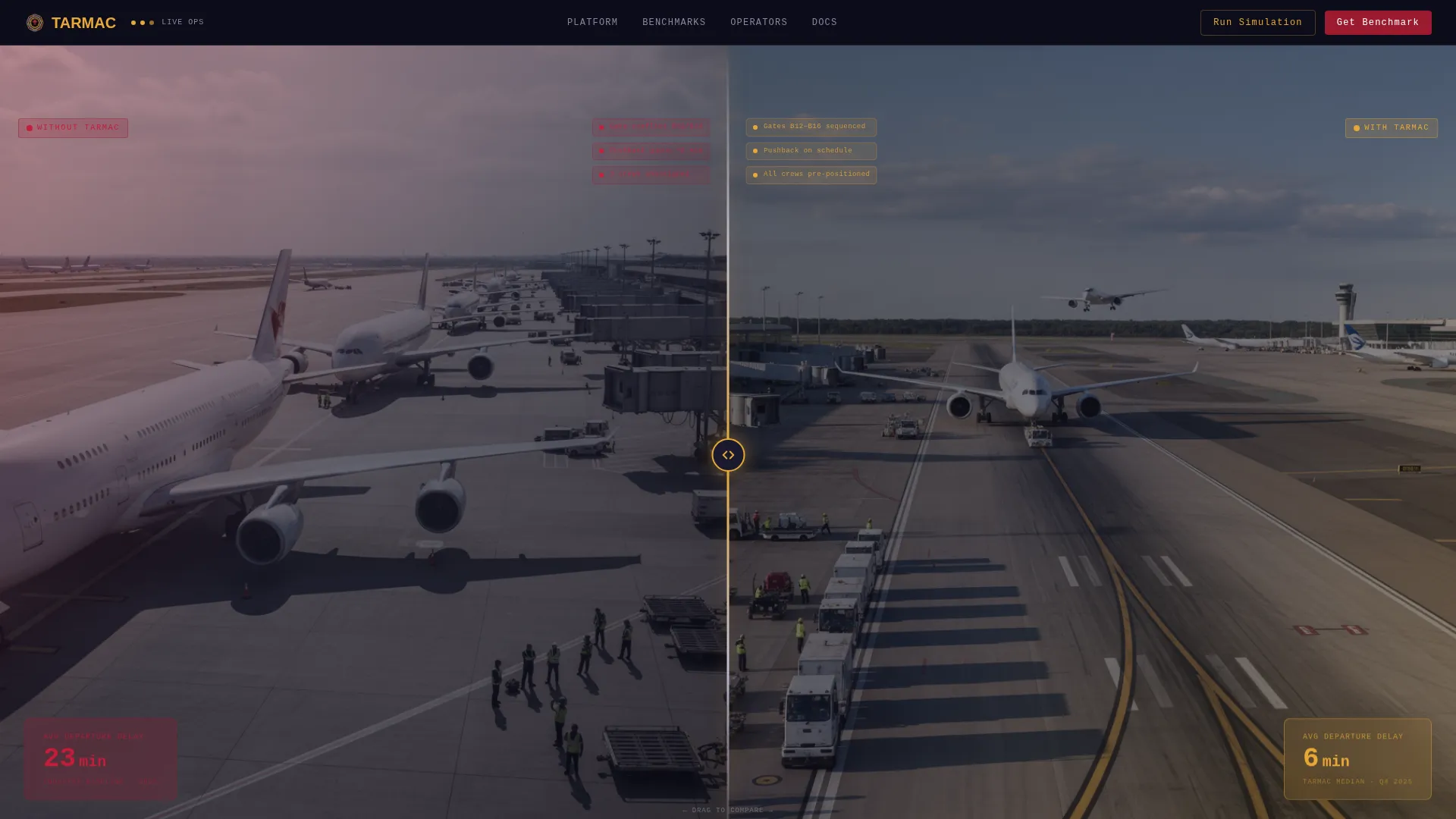
The viewport divides into two live video panels separated by a draggable center bar. The left side shows chaotic ramp conditions; the right shows the platform running smoothly. A floating metric sits over each side: "23 min avg delay" on the left and "6 min avg delay" on the right. The contrast is immediate and requires no text to interpret.
Stat-First Dual-Column Sections
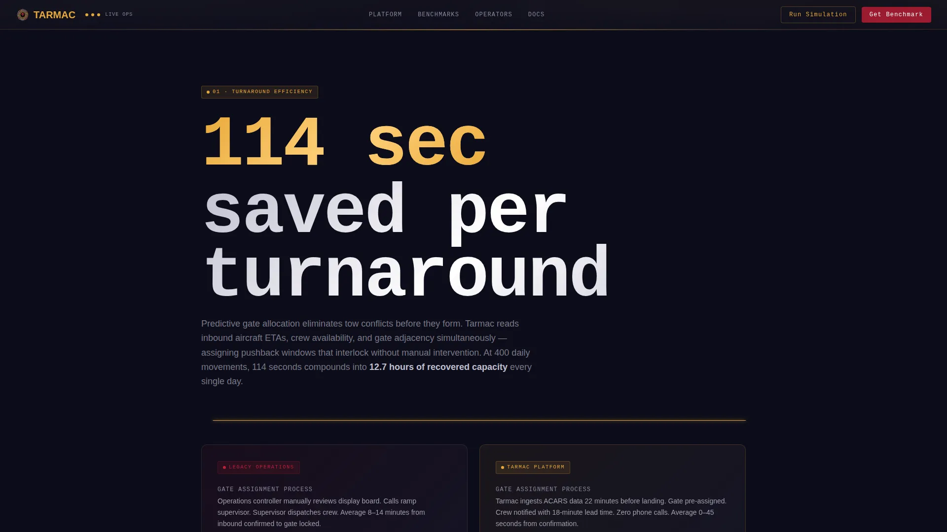
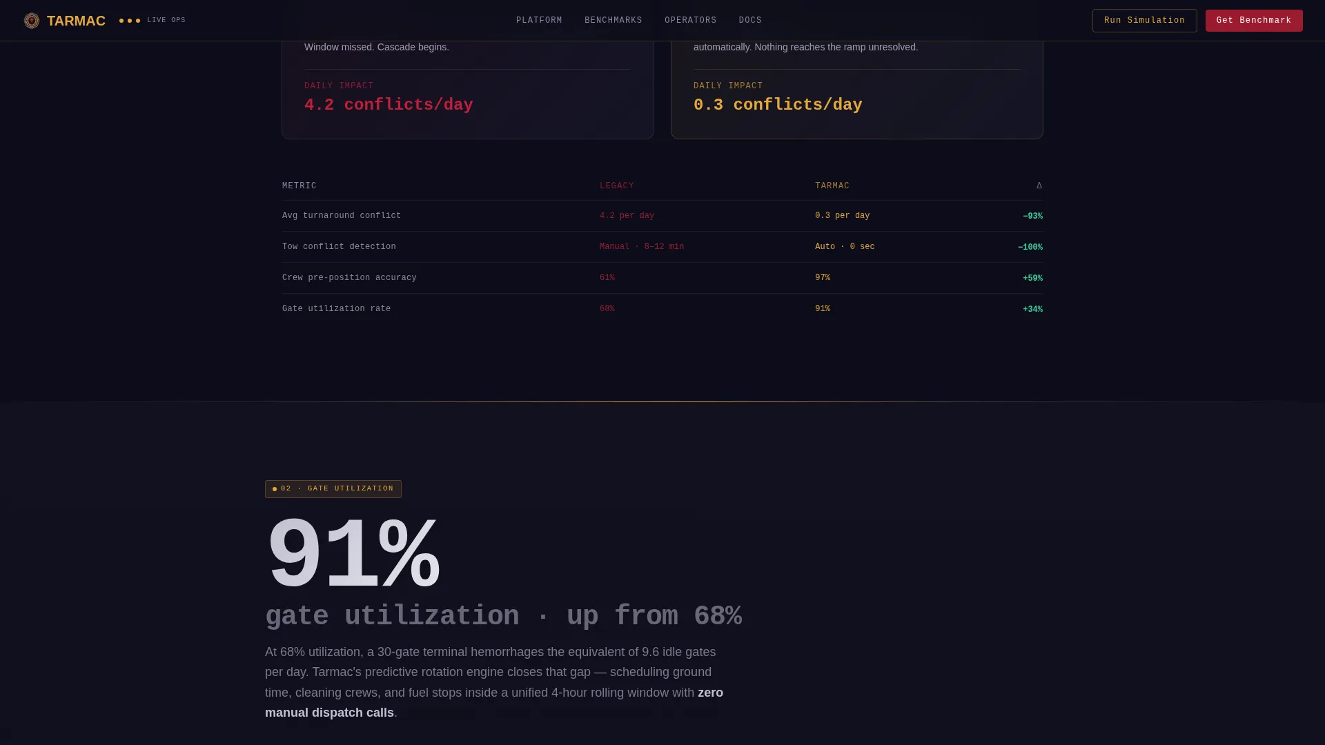
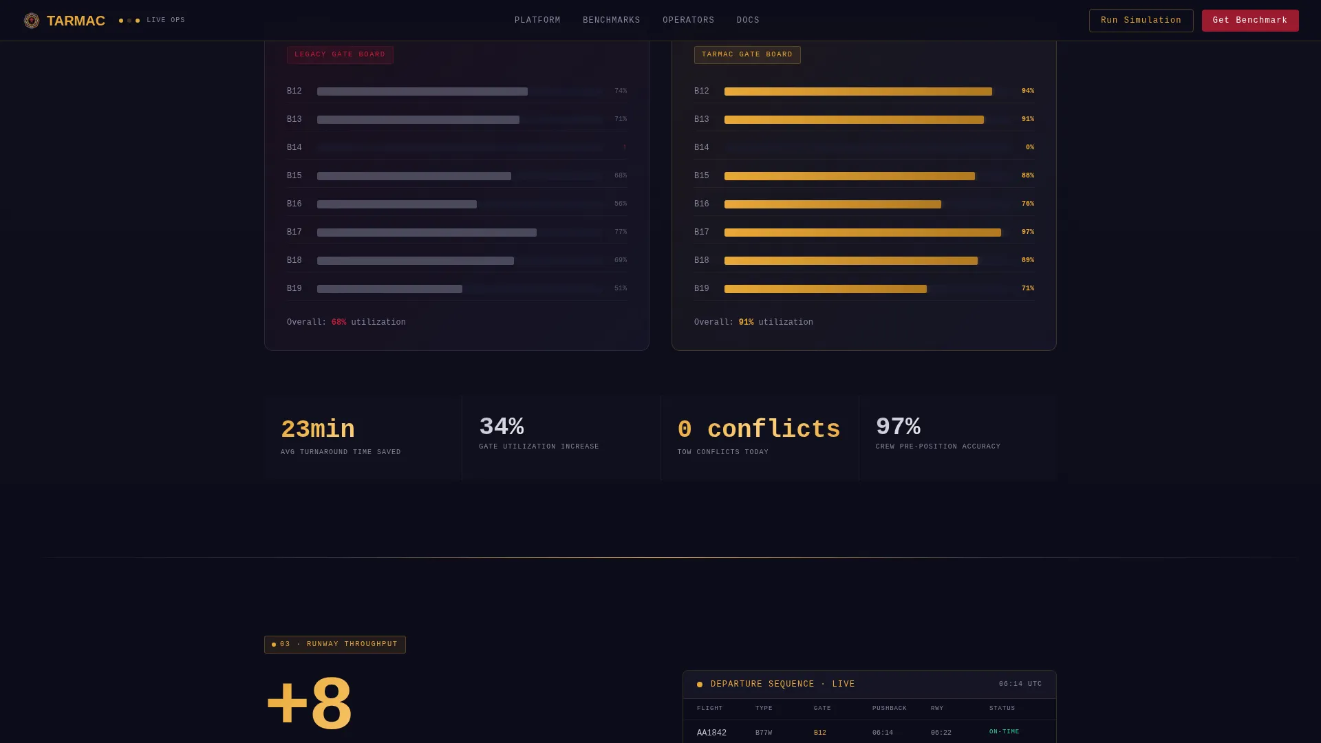
Each content section leads with a bold operational statistic before any explanatory paragraph appears. The layout uses persistent dual-column framing to place legacy figures alongside platform figures at every scroll depth. This structure builds the argument through math before it makes a request.
IATA Simulation Input
The primary call-to-action section invites operations directors to input their IATA airport code and run a modeled delay-reduction simulation. This interactive element makes the value proposition personally relevant by connecting the visitor's own airport data to the platform's benchmarks.
Benchmark Download Gate
A secondary conversion path offers a full benchmark report behind a two-field form requiring a work email and airport code. The gate is intentionally minimal, placed after the visitor has absorbed the full data argument across all preceding sections.
GSAP Scroll Animation System
The template uses GSAP scroll triggers, stat count-up animations, and staggered section reveals throughout. Animations are tied to IntersectionObserver events so they fire accurately at each scroll depth. The draggable split bar is also animated and fully interactive on load.
Dark Instrument-Panel Layout
The base layout uses a deep runway black background with chrome silver text, ruby alert red for critical indicators, and taxiway marking amber for interactive highlights. Typography combines Manrope for headings with JetBrains Mono for all statistics and data labels, giving every number the visual weight of an instrument readout.
Page sections overview
| Section | Purpose |
|---|---|
| Split-Video Hero | Show chaos versus platform in real time with floating delay metrics |
| Turnaround Efficiency | Lead with "114 seconds saved per turnaround" before explaining predictive gate allocation |
| Gate Utilization | Present predictive allocation stats and tow conflict elimination in dual-column format |
| Runway Throughput | Display sequence optimization data and departure rate metrics side by side |
| Dual call to action Engine | Offer simulation input and benchmark download as two parallel conversion paths |
| Developer Minimal Footer | Dark surface footer using the GitHub Developer Minimal pattern |
Design & branding system
The visual identity follows a Dynamic Motion theme styled after the instrument panel of a widebody aircraft at night. Dark surfaces dominate, critical color is used only for indicators and interactive elements, and every typographic decision prioritizes zero-ambiguity readability at speed.
- Color palette: deep runway black (#1A1A2E) as the base, polished chrome silver (#C0C0D0) for body text, ruby alert red (#9B1B30) for critical indicators, and taxiway marking amber (#E8A838) for interactive highlights
- Typography: Manrope for all headings and navigation, JetBrains Mono for statistics, data labels, and the 24-hour time format used throughout aviation-standard displays
- Animation approach: high-intensity GSAP scroll triggers, draggable split-bar interaction, stat count-up reveals, and scroll-linked depth transitions throughout
Mobile & speed optimization
The template is built desktop-first, reflecting the real working environment of its primary audience. Operations directors and station managers use large monitors in tower cabs and operations centers, so the desktop experience receives the highest design priority.
- GPU-accelerated CSS transforms are used exclusively for all animated elements, keeping rendering smooth across high-resolution displays
- IntersectionObserver drives stat count-up triggers, so animations fire only when the relevant element enters the viewport rather than on page load
How this template helps you convert
The conversion strategy is built on cumulative data pressure. The template earns the click by making the visitor's own operational inefficiency undeniable before any form or call-to-action appears.
- The hero section delivers an immediate visual argument through the split-video comparison, anchoring the 23-minute versus 6-minute delay contrast before the visitor reads a single line of body copy.
- Each subsequent section escalates the operational scale and adds another data layer, so by the time the visitor reaches the dual call-to-action engine, the case has already been made through math rather than marketing claims.
Other information about this template
This template sits within the Automotive & Transport category under the Aviation & Flight subcategory, with a niche focus on airport management platforms. It is suited for SaaS teams building B2B enterprise sales funnels for aviation infrastructure products.
- The hero-dominant layout allocates roughly 90 percent of visual weight to the hero section, with the remaining 10 percent distributed across supporting content
- The footer uses Pattern 8, a GitHub Developer Minimal dark-surface design, keeping the bottom of the page clean and professional without distraction
- Localization defaults to English with 24-hour time format throughout, consistent with international aviation communication standards
- The template is classified under the Comparison/Versus landing page direction, making it well-suited for any platform that needs to prove performance improvement against a legacy baseline
Theme
Dynamic Motion
Creative direction
Stats-First Impact
Color system
Ruby & Chrome
Style
Hero-Dominant (90/10)
Direction
Comparison/Versus
Page Sections
Draggable Split-video Hero
Stat-first Dual-column Layout
IATA Simulation Input
Two-field Benchmark Download Gate
GSAP Scroll Animation System
Dark Instrument-panel Design System
Related questions
Who is this landing page template designed for?
What makes the hero section different from a standard video header?
What interactive elements are included in this template?
Can this template work for a different aviation software product?
Is this template suitable for mobile use?