Greek Dining Booking Website Template
Tavrna is a neo-retro Greek pop-up restaurant landing page template built to drive seat bookings and SMS sign-ups. It pairs a hand-illustrated octopus mascot, a sensory food gallery with slide-open dish detail panels, and a pinned blood-orange booking bar into one focused, mobile-first page that turns curious scrollers into confirmed diners.
by Rocket studio
Quick summary
Tavrna is a gallery-plus-detail landing page designed for a weekend-only Greek pop-up restaurant. The page opens with an animated mascot hero, dives into a steamy, click-through food gallery, moves through an editorial experience section and social proof slider, then pins a booking form to the viewport bottom. Every scroll section is built to make the food feel real before a visitor ever taps "Grab a Seat at the Next One."
Who this template is for
This template is a perfect fit for any food-forward operator who runs events rather than a fixed address. It is designed for people who need to convert discovery-mode visitors into booked diners fast, before the next location drop sells out.
- Pop-up and supper-club operators who serve rotating venues each week and need a page that communicates urgency without feeling chaotic
- Food bloggers or creative chefs launching a fresh concept who want a striking first impression that locals and out-of-towners alike will stop and share
- Greek diaspora restaurateurs who want a page that carries the soul of authentic Mediterranean cooking while looking unmistakably modern
What problem this template solves
A pop-up restaurant lives or dies by how quickly it can convert curiosity into a confirmed booking. Most generic restaurant pages are designed for fixed addresses, static menus, and walk-in traffic. They create wrong expectations and frustrate mobile users who just want to know where to show up and how to grab a spot.
- Visitors land, feel confused about the concept, and leave without booking, which raises acquisition costs and lowers conversion quality for every event
- A static menu in PDF format buried behind a link is hard to open on a phone, easy to ignore, and impossible to update week to week
- No pinned call-to-action means interested visitors scroll to the bottom and find nothing to act on, so the moment of intent passes and seats go missed
What you get with this template
You get a fully designed, single-page booking experience built specifically for experience-driven food concepts. The layout connects message, proof, offer, and action into a flow that feels obvious to the buyer from the very first screen.
- An animated mascot hero section with a hand-lettered headline, a cinematic food slideshow, and a clear primary call-to-action above the fold
- An interactive sensory gallery where users can tap or click any food image to open a sliding detail panel with the dish name in Greek script, a one-line origin story, and its defining ingredient
- A pinned bottom booking bar with a compact form for party size, upcoming pop-up dates with neighborhood names, and an SMS sign-up path for future location drops
Feature list
Animated Mascot Hero with Cinematic Slideshow
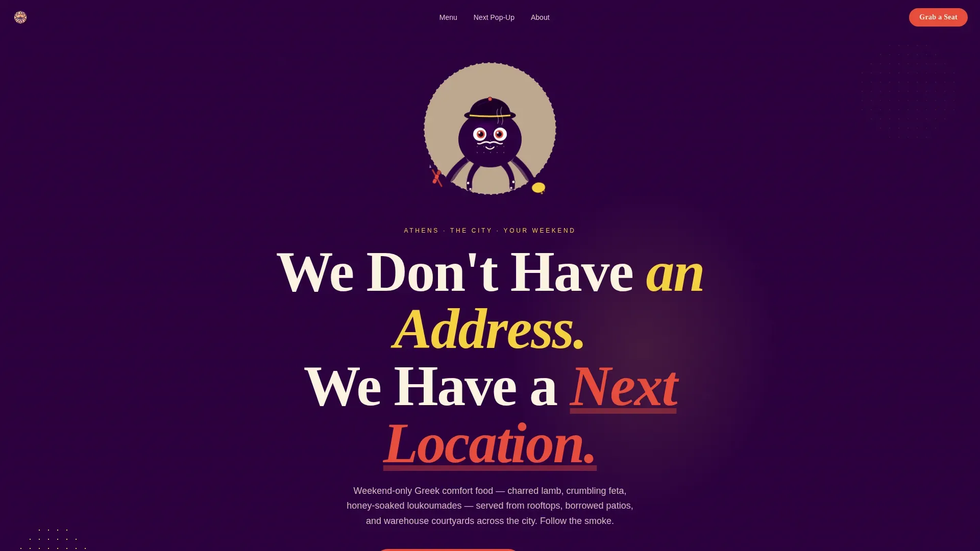
The hero section centers a hand-illustrated octopus mascot rendered in thick ink lines with retro halftone shading. A subtle tentacle-wave animation plays on load. Behind him, a cinematic food slideshow cycles through hero imagery, and below the character a hand-lettered headline reads "We Don't Have an Address. We Have a Next Location." The design confirms relevance in the first screen so users know exactly what kind of food experience to expect.
Interactive Sensory Gallery with Dish Detail Panels
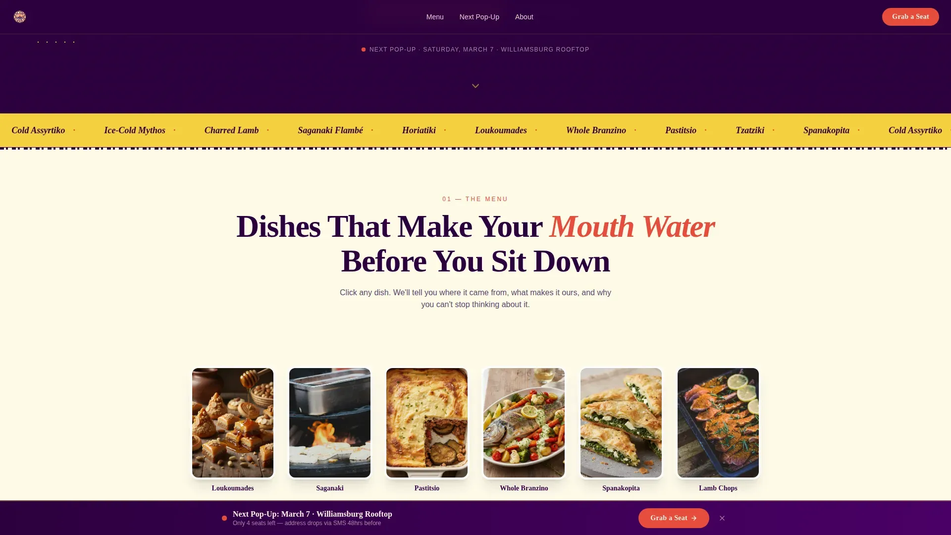
The gallery grid is built for food photography that smells like the real thing. Close-up shots of honey dripping off loukoumades, feta crumbling under a fork, and smoke curling off a whole branzino fill a rotated photo grid. Tapping or clicking any image slides open a detail panel showing the dish name in Greek script, a short origin story such as "Crete, 1940s, fisherman's breakfast," and the single ingredient that makes it theirs. Each scroll section also targets a different sense: a looping audio clip of sizzling saganaki, visceral smell copy, and macro texture photography where you can count the phyllo layers.
Pinned Booking Bar and Compact Reservation Form
After the first scroll, a blood-orange booking bar pins to the bottom of the viewport and stays there. Tapping it opens a compact form: a party-size selector using illustrated tentacle icons for groups of one to six, the next three pop-up dates with neighborhood names and a map pin, and a phone number field for SMS confirmation. The form is intentionally short and simple so mobile users can complete it without friction.
SMS Subscriber Sign-Up Path
A secondary conversion path lets visitors "Follow the Octopus" by entering their phone number to receive location drops via text forty-eight hours before each event. This captures demand even when every seat is already taken, building a warm audience for the next week's event without requiring an email address or any extra steps.
Social Proof Testimonial Slider
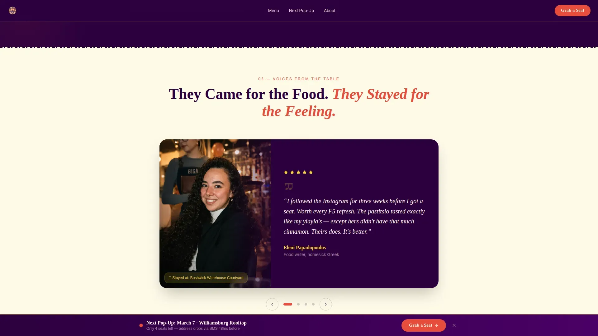
A dedicated testimonial slider displays guest quotes styled as Instagram-style quote cards, each tagged with the location name where the diner ate. Trust cues are distributed close to the booking call-to-action so confidence is highest exactly when the decision is being made. Featuring two to three real guest reviews near the booking section reduces commitment anxiety and improves follow-through.
Editorial Experience Section
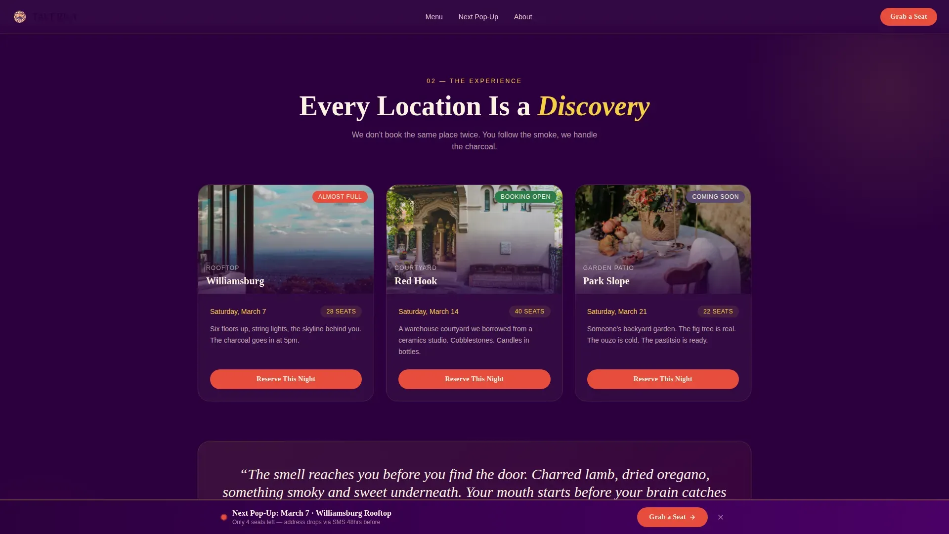
A split editorial layout pairs venue photography with atmosphere copy. It explains the neo-retro concept, nods to the inspiration behind the rotating-location model, and gives first-time visitors the brief "About" story they need before they feel comfortable booking. The section is designed to identify the brand's personality clearly without overwhelming the page with text.
Page sections overview
| Section | Purpose |
|---|---|
| Mascot Hero | Introduce brand character, headline, and primary call-to-action above the fold |
| Sensory Food Gallery | Drive craving and curiosity through click-open dish detail panels |
| Experience Editorial | Show venues and atmosphere through a split layout with brand story copy |
| Social Proof Slider | Display guest testimonials as quote cards near the booking moment |
| Booking Call-to-Action | Pinned bottom bar with party-size form, upcoming dates, and map pins |
| SMS Subscriber Path | Secondary sign-up form to capture location-drop subscribers via text |
| Footer | Horizontal flow footer with contact and social links |
Design & branding system
The Citrus Burst color system draws its warmth from a 1970s Athens Kodachrome palette. Every color choice is intentional: it creates an immediate emotional connection between the brand and the lived memory of Mediterranean summer eating.
- Lemon yellow (#F4D03F) dominates section backgrounds in washed-out tints, blood orange (#E74C3C) fires on hover states and all call-to-action buttons, deep kalamata purple (#2C003E) anchors headlines and navigation, and chalky taverna white (#FAF3E0) breathes between the dense photography
- Typography pairs Fraunces, an elegant serif headline face with retro-inspired character, alongside Manrope, a modern high-contrast sans-serif for body copy and form labels, so legibility stays clear at every screen size
- Subtle film-grain textures and grainy overlays on food photography reinforce a neo-nostalgia feel across the gallery and hero sections, giving the page visual depth without slowing the scroll
Mobile & speed optimization
Discovery happens on phones. Booking happens on phones. This template is built mobile-first from the ground up so that the page performs where the audience actually lives. Landing pages that create friction on mobile lose visitors fast, and for a pop-up with limited seats, every missed tap is a missed booking.
- The pinned booking bar stays fixed to the bottom of the mobile viewport after the first scroll, keeping the primary call-to-action reachable without requiring users to hunt for it
- Lazy loading is applied to the image-heavy gallery so the page can open quickly even on photo-dense pages, keeping the experience smooth for mobile users arriving from an Instagram post or a location-drop text
- The booking form uses large tap targets so users can select party size, choose a date, and enter a phone number without zooming in or making input errors on a small screen
How this template helps you convert
High-performing landing pages connect message, proof, offer, and action into a flow that feels obvious to the buyer. This template is designed around exactly that principle: every section does one job and passes the visitor forward to the next.
- The mascot hero confirms brand identity and communicates the pop-up concept in under five seconds, so users who find the page from a food blog post, a social share, or a location-drop text immediately know they are in the right place and feel the pull to scroll
- The sensory gallery and editorial experience section build desire and trust before the ask, distributing social proof and brand story across the page so that by the time the visitor reaches the pinned booking bar, clicking "Grab a Seat at the Next One" feels like relief rather than a risk
- The SMS subscriber path extends the conversion window beyond a single sold-out event, turning visitors who missed this week's seating into warm leads who will book the next one the moment the location drops
Other information about this template
This template is a natural fit for any food related business that runs on discovery, scarcity, and word-of-mouth. It is not limited to Greek cuisine. The structure and conversion logic apply equally to any rotating pop-up concept: a wood-fired pizza night, a smoked meat supper club, a fresh pasta kitchen, a cocktails-and-mussels harbour dinner, or a prosciutto and cheese tasting series. The page can serve any niche where the experience is the product and the location is the surprise.
The Tavrna Neo Retro Greek Pop Up Restaurant Landing Page Template is the specific version shipped here. It is a purpose-built reference for the Taverna CMS Webflow template family and demonstrates how to apply a Citrus Burst color system and Sensory Appeal creative direction to a Booking/Scheduling landing-page model.
The template is built inside a Taverna CMS Webflow template architecture. That means users can customize every color, typeface, photo, and copy block without touching code. The Webflow platform allows you to remove optional sections you do not need, such as the audio clip or the SMS path, so the final page matches your exact concept. Users can also integrate this into an existing project if they already have a Webflow site and simply want to add a pop-up event page to their presence.
A clean, scannable HTML-based menu is displayed inline on the page rather than as a PDF link. This makes the food content easy to read on a phone and keeps the page content indexable. The template uses one primary page goal throughout: get the visitor to book a seat or sign up for the next location drop. Navigation is minimal and distraction-free by design.
The booking form included in the template can be connected to a reservation platform of your choice. The form fields are intentionally kept to a small number so users complete the action rather than abandon it. Upcoming dates with neighborhood names and map pins are displayed directly inside the expanded form so visitors do not need to leave the page to orient themselves.
Social proof is placed close to the decision moment. Guest reviews, testimonials with location tags, and Instagram-style quote cards are positioned just before the booking call-to-action so the evidence of a great experience arrives exactly when the visitor needs it most. You can add two to three real guest reviews quickly by editing the testimonial slider content blocks.
The template is built to reflect the truth of a pop-up concept: limited seats, surprise locations, and an audience that loves the hunt as much as the food. Design details like the countdown-style urgency framing in the booking section, the "Next Location" headline, and the SMS subscriber path all reinforce scarcity and exclusivity without resorting to heavy-handed pressure tactics.
- This structure works for any food related business running event-based dining from july through october or across any month of the year
- The gallery and detail panel model can be extended to document new dishes as the menu rotates, keeping content fresh each week without redesigning pages
- Built-in proof sections, clear calls-to-action, and a simple one-goal form model make this template a practical guide for operators who want to improve booking rates from their first event post to their tenth
Theme
Neo-Retro
Creative direction
Sensory Appeal
Color system
Citrus Burst
Style
Gallery + Detail
Direction
Booking/Scheduling
Page Sections
Animated Mascot Hero with Food Slideshow
Click-open Sensory Dish Detail Panels
Pinned Viewport Booking Bar
SMS Location-drop Subscriber Form
Social Proof Testimonial Slider
Editorial Experience and Brand Story Section
Related questions
Can I use this template for a food concept that is not Greek?
Does the template display the menu inline rather than as a PDF?
How does the pinned booking bar work on mobile?
Can I remove sections I do not need?
Where does social proof appear in the template?