Teen (13-18) Products & Specialist Professional Website Template
The Teen Modern 1318 landing page template is built for a teen clothing brand that wins over both kids and parents. It pairs a dopamine-pop color system with a masonry layout, shoppable flip cards, a "Build My Fit" style quiz, and a sticky chartreuse call-to-action button, turning casual browsing into confident, purchase-ready clicks.
by Rocket studio
Quick summary
This landing page template is designed for a teen clothing brand that speaks directly to two audiences at once: the teen who lives on TikTok and the parent holding the credit card. Bold colors, an interactive masonry feed, and a built-in style quiz make the page feel like self-expression rather than a catalog. It ends with intent already built before the visitor ever taps "Shop the Wall."
Who this template is for
This template suits direct-to-consumer brands that sell clothing to teens aged 12 to 17 and need to earn trust from parents at the same time. It works best when your brand has a clear visual identity and wants to turn browsing into a playful, interactive experience.
- Teen and youth clothing brands targeting the 12 to 17 age group
- Parent-aware brands that want to reassure caregivers while still feeling cool to kids
- D2C e-commerce shops that need a single high-converting landing page to drive traffic into a full store
What problem this template solves
Most teen clothing pages look like a standard product grid. They feel flat. They do not speak to the teen scrolling on their phone, and they do not give a parent any reason to feel good about what is in the cart. This template closes that gap by making the page itself a destination.
- Teens disengage from static catalogs that feel like every other shop
- Parents hesitate at checkout without any signal that the brand understands their concerns
- Brands lose the sale because they never built enough desire before asking for the click
What you get with this template
You get a fully structured, single-page layout that blends discovery, play, and shopping into one scroll. Every section is intentional, from the cursor-reactive header mosaic down to the footer ticker.
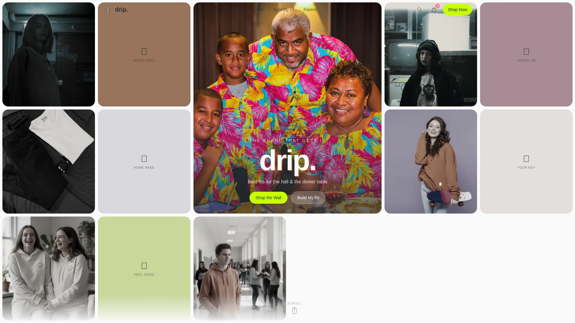
- An Icon Grid hero that fills the viewport with desaturated tiles that bloom into full color on hover
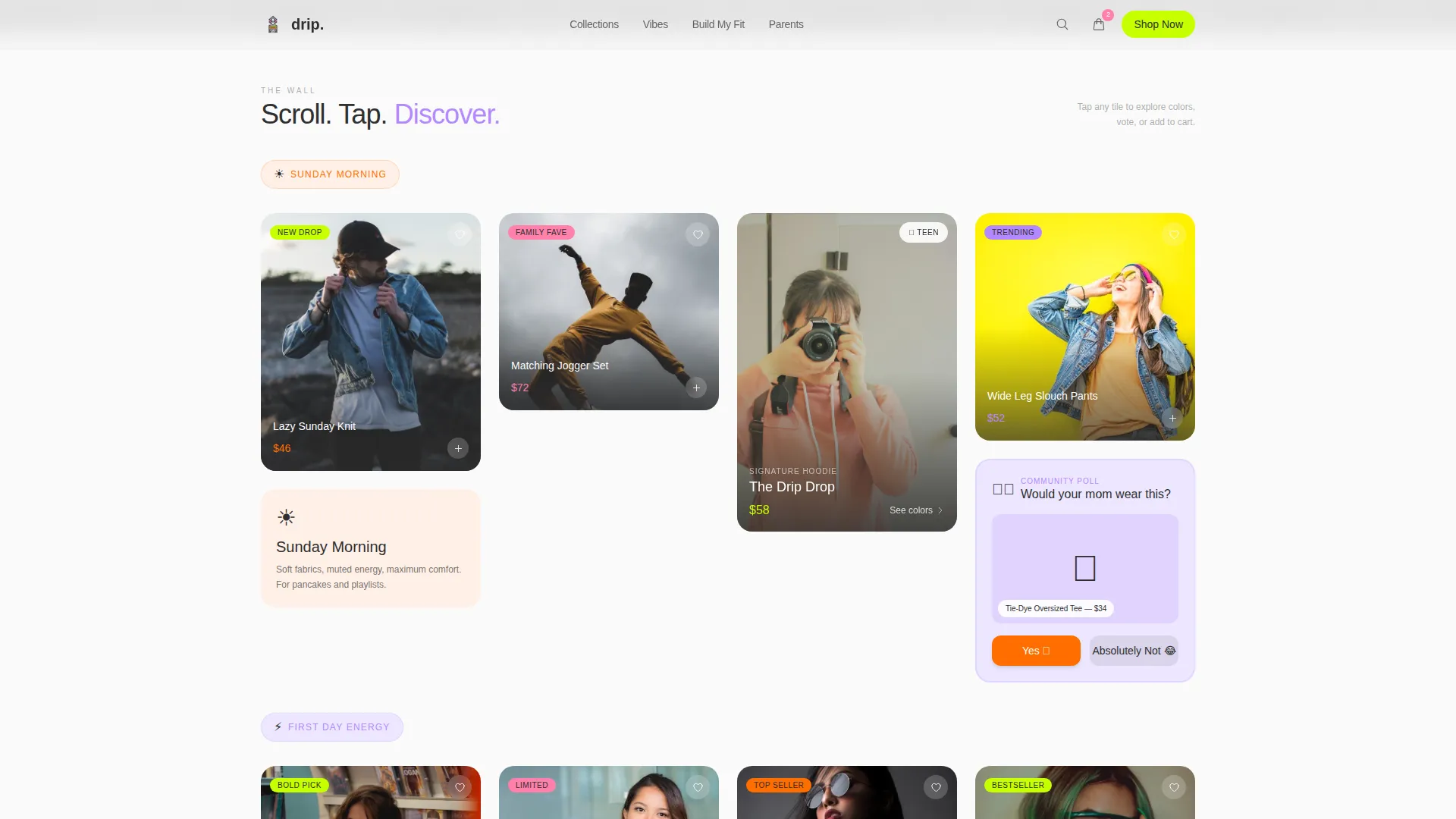
- A masonry shoppable feed with flip cards, a colorway fan, a live poll tile, and a "Parent Preview" toggle
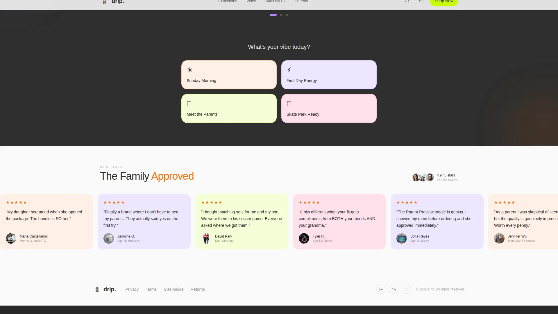
- A "Build My Fit" three-step style quiz that routes visitors to a curated collection link
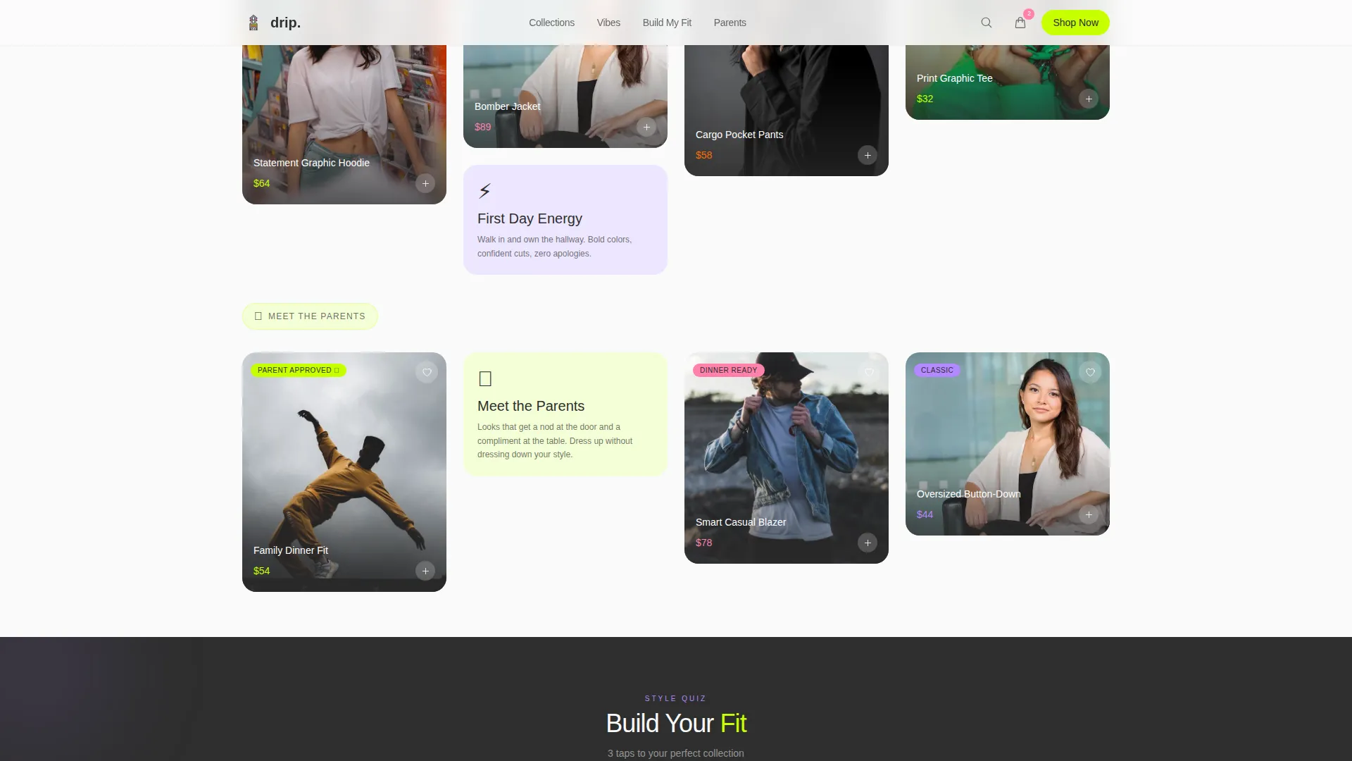
- Vibe-based collection clusters ("Sunday Morning," "First Day Energy," "Meet the Parents") with shifting accent backgrounds
- A sticky chartreuse pill button that pulses after three tile interactions
- A social strip with a marquee ticker, micro-testimonials, and TikTok-style screenshot tiles
Feature list
This template includes several interactive and visual components built specifically for a teen audience with parent co-decision in mind.
Icon Grid Header with Cursor Bloom
The header fills the full viewport with a tight mosaic of flat-lay clothing shots, lifestyle photos, and illustrated icons. Each tile sits desaturated until the cursor hovers over it, at which point it expands into full dopamine color. The center tile is larger and holds the brand wordmark in hand-drawn type over a mid-laugh family photo.
Masonry Shoppable Feed
The main feed is a masonry layout where every tile is interactive. Clicking a hoodie tile fans out three colorways and reveals a "Parent Preview" toggle that swaps between a teen mirror selfie and a family brunch scene. A poll tile asks a playful question and animates results in real time as visitors engage.
Vibe-Based Collection Clusters
Products are grouped not by season or gender but by mood: "Sunday Morning," "First Day Energy," and "Meet the Parents." Each cluster subtly shifts the page's background accent color, creating a natural breathing rhythm between tangerine warmth and lilac cool as the visitor scrolls.
Build My Fit Style Quiz
A three-step quiz walks visitors through vibe pick, color preference, and size. At the end, it delivers a curated collection link matched to their choices. This converts casual browsers into visitors who already know what they want before they reach the store.
Sticky Pulsing Call-to-Action Button
The primary "Shop the Wall" button floats as a pill-shaped sticky element in chartreuse at the bottom of the viewport. It begins to pulse gently once a visitor has interacted with three or more masonry tiles, rewarding engagement with a timely, natural prompt to convert.
Social Strip and Footer
A marquee ticker runs across the social section alongside micro-testimonials from both teens and parents. TikTok-style screenshot tiles reinforce social proof. The footer follows a horizontal flow pattern that keeps the page visually consistent to the final scroll.
Page sections overview
| Section | Purpose |
|---|---|
| Icon Grid Hero | Fills viewport with cursor-bloom tile mosaic and brand wordmark |
| Masonry Shoppable Feed | Interactive flip cards, colorway fan, poll tile, Parent Preview toggle |
| Vibe Collection Clusters | Groups products by mood with shifting accent background colors |
| Build My Fit Quiz | Three-step quiz that routes visitors to a curated collection link |
| Social Proof Strip | Marquee ticker, micro-testimonials, TikTok-style screenshot tiles |
| Footer | Horizontal flow pattern with structural brand close |
Design & branding system
The visual system is built on a Dopamine Pop palette that feels energetic but stays organized. Warm charcoal and generous white breathing room keep the chaos readable. Typography pairs Plus Jakarta Sans for display headings with DM Sans for body copy, creating a modern and approachable contrast.
- Colors: electric lilac (#B388FF), serotonin tangerine (#FF6D00), gen-Z chartreuse (#C6FF00), warm charcoal (#2E2E2E), bubblegum gloss (#FF80AB) for hover states and cart icons, and off-white (#FAFAFA) for tile backgrounds
- Typography: Plus Jakarta Sans handles bold display moments; DM Sans carries readable body text at all sizes
- Visual mood: organized chaos on white, like candy on a clean comforter, anchored by charcoal structure and generous spacing between tiles
Mobile & speed optimization
This template is built mobile-first, reflecting the reality that teens are primary users scrolling on their phones. The desktop experience adds a delight layer on top of the same strong mobile foundation.
- Animations use CSS transforms only, with Intersection Observer to trigger effects at scroll entry rather than on page load
- The masonry layout, cursor bloom, card flips, and poll interactions are all handled without heavy third-party libraries
- The sticky pill button and quiz flow are designed for thumb-friendly tap targets and smooth single-column scroll on small screens
How this template helps you convert
The page is structured as a click-through landing page. Its job is to build desire and intent before pushing visitors into the full shop. Every design and interaction choice points toward that goal.
- The masonry feed turns passive scrolling into active play, so visitors invest emotionally in the brand before they see a price tag
- The "Parent Preview" toggle and vibe-based collection names speak directly to parent concerns, reducing hesitation at the checkout moment
- The "Shop the Wall" button pulses only after meaningful engagement, making the call to action feel earned and well-timed rather than pushy
Other information about this template
This template sits inside the Kids and Family category, specifically aligned with the Teen (13 to 18) Products and Services subcategory and the Teen Clothing Brand niche. It carries a Family First theme, meaning every design decision acknowledges the dual-audience dynamic of teen desire and parent approval.
- Template style: Masonry and Pinterest-inspired layout
- Creative direction: Interactive Explorer, meaning the feed itself is the experience
- Header concept: Icon Grid, a viewport-filling mosaic with cursor-activated bloom states
- Landing page direction: Click-Through, optimized to push visitors into the full shop with intent already built
- Color system label: Dopamine Pop, a named system pairing electric accent colors with structured white space
- Localization: English language, United States market, USD pricing context
Theme
Family First
Creative direction
Interactive Explorer
Color system
Dopamine Pop
Style
Masonry/Pinterest
Direction
Click-Through
Page Sections
Icon Grid Hero with Cursor Bloom
Masonry Shoppable Feed
Live Poll Tile
Vibe Collection Clusters
Build My Fit Style Quiz
Sticky Pulsing Call to Action Button
Related questions
Who is this landing page template designed for?
Can I rename the vibe collection clusters to match my brand?
What makes this different from a standard product grid page?
Is this template suitable for mobile users?
Does the Build My Fit quiz connect to an external store?