Modern & Landing Page Template
Equity is a single-column landing page template built for a teen mortgage education platform. It combines an auto-animating amortization graph, three interactive comparison simulations, and a trust-badge hero to turn complex housing economics into something a sixteen-year-old can grasp and enjoy. The freemium signup flow makes converting visitors effortless.
by Rocket studio
Quick summary
Equity is a high-interactivity landing page template for a teen and youth mortgage education platform. It opens with a trust-badge hero and an auto-animating amortization graph, then guides visitors through three hands-on comparison simulations covering fixed versus variable rates, 15-year versus 30-year loans, and renting versus buying. A coral call-to-action (call to action) and a single-field signup close the conversion loop.
Who this template is for
This template is designed for EdTech and financial literacy products targeting teenagers and the adults who support them. It works equally well for direct-to-student products and classroom-facing tools.
- Sixteen-year-old honors students building personal finance portfolios for class
- High school economics teachers looking for an interactive mortgage simulator
- Parents of college-bound teens who want their kids fluent in housing economics
What problem this template solves
Mortgage math is abstract and intimidating for most adults, let alone teenagers. Standard finance resources either talk down to young readers or assume knowledge they do not yet have. This template solves that gap by making the product sell itself through live interactivity before any signup is required.
- Visitors struggle to trust an unfamiliar finance tool before committing an email address
- Complex concepts like amortization, debt-to-income ratios, and interest rate impacts need to feel intuitive, not academic
- Teachers and parents need a credible, classroom-ready tool they can recommend with confidence
What you get with this template
You get a complete, single-column landing page built around a Comparison Journey creative direction. Every section earns the next scroll by giving the visitor something to do and something to learn.
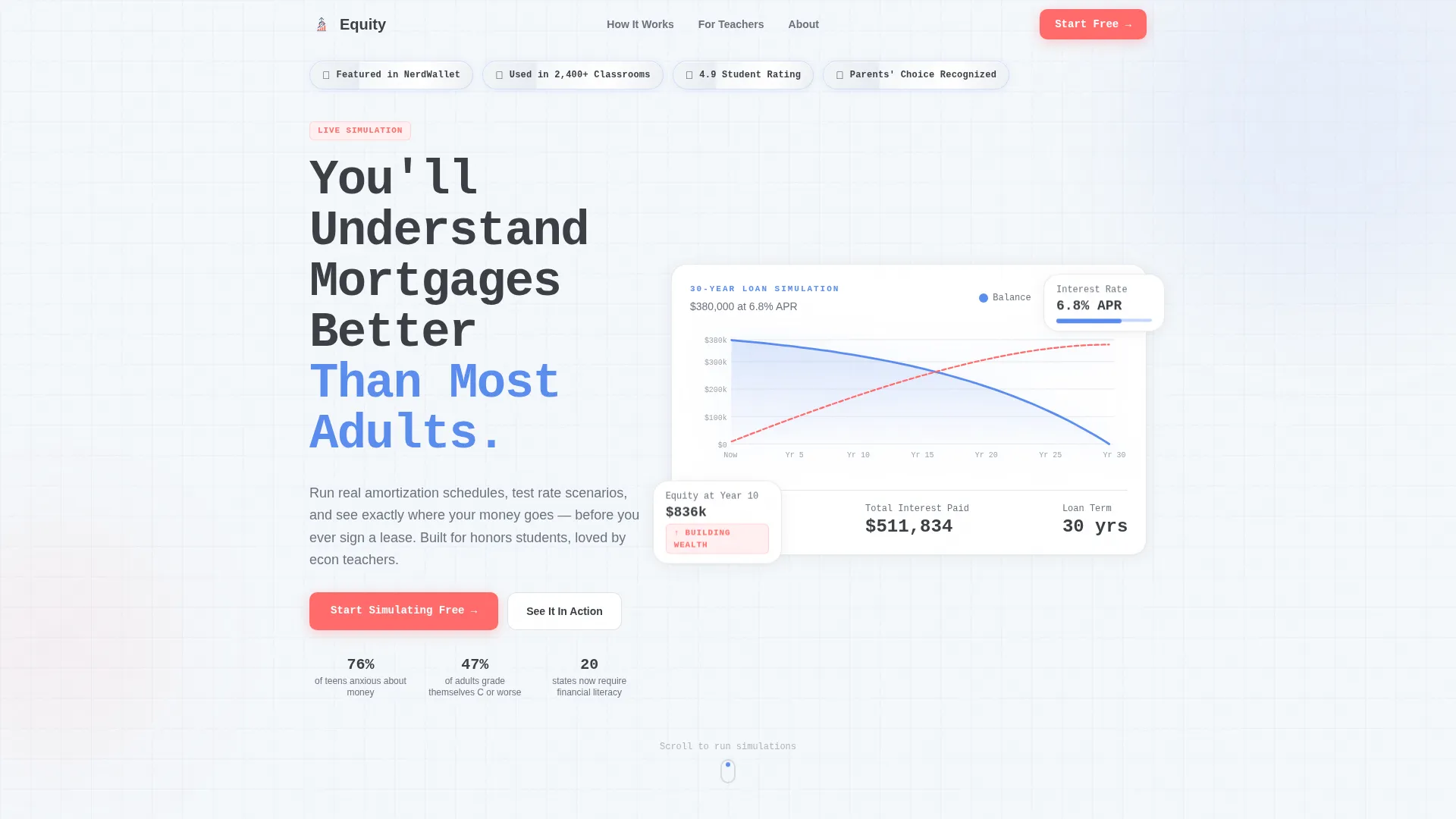
- A hero section with award-badge trust markers, a bold monospaced headline, and an auto-animating 30-year amortization graph
- Three interactive comparison modules covering rate type, loan term, and rent-versus-buy decisions
- A freemium conversion section with a coral call to action, a single-field email signup, Google and Apple single sign-on (SSO) buttons, and a classroom invite viral loop
Feature list
This section highlights the core capabilities built into the Equity landing page template.
Auto-Animating Amortization Hero
The hero graph plots a 30-year loan in roughly three seconds. Numbers tick upward like a stock ticker, giving first-time visitors an instant proof of concept before they read a single line of body copy.
Interactive Rate Comparison Module
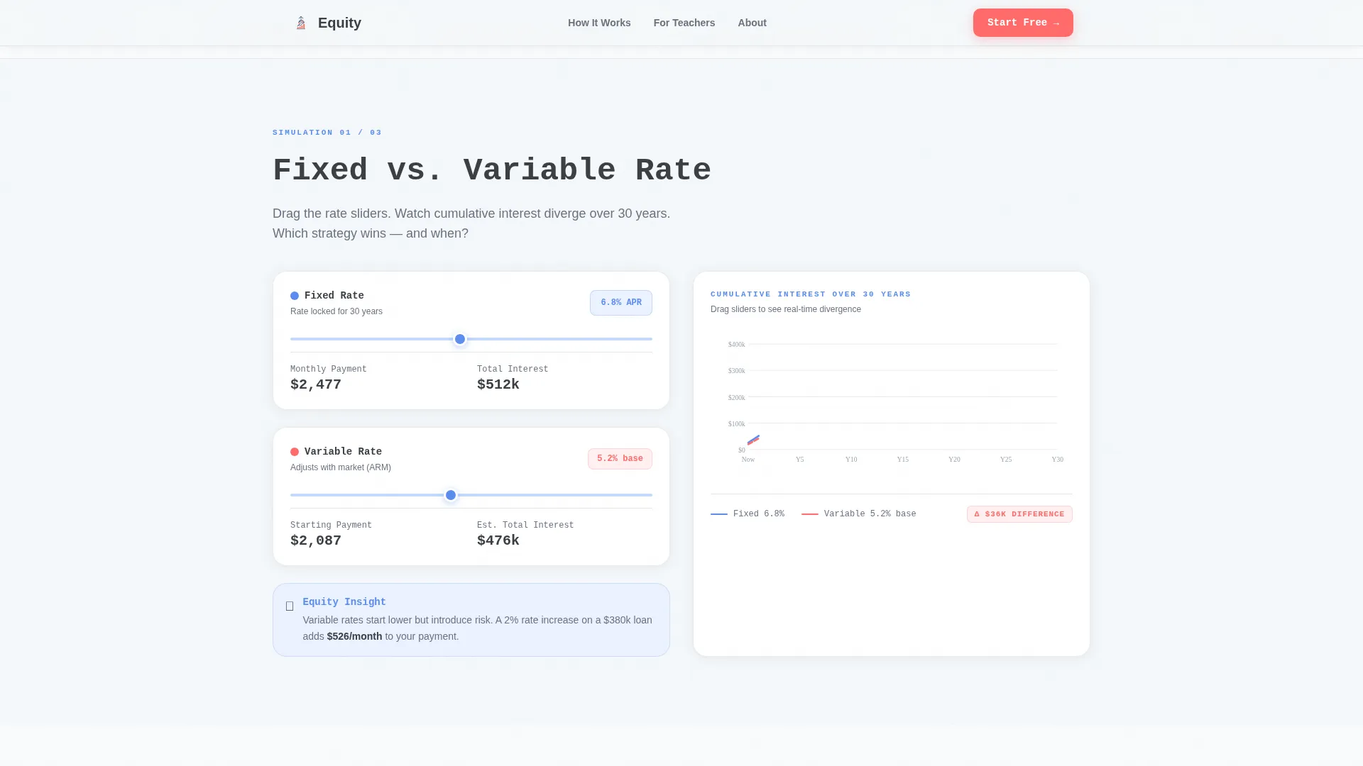
A two-column divergence graph lets visitors compare fixed and variable mortgage rates side by side. The columns animate toward each other and then split, making the long-term cost difference visceral and easy to grasp.
Draggable Loan Term Timeline
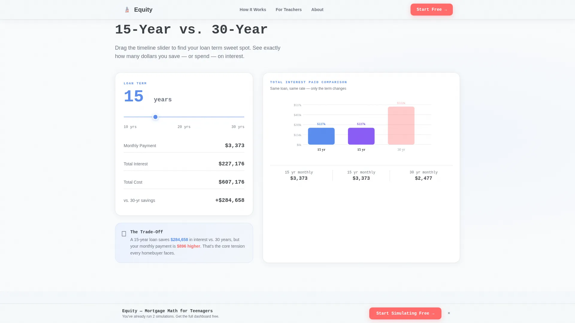
A draggable timeline lets visitors scrub between a 15-year and a 30-year loan. Total interest paid updates live as the handle moves, turning an abstract number into a felt experience.
Rent versus. Buy Cost Counter
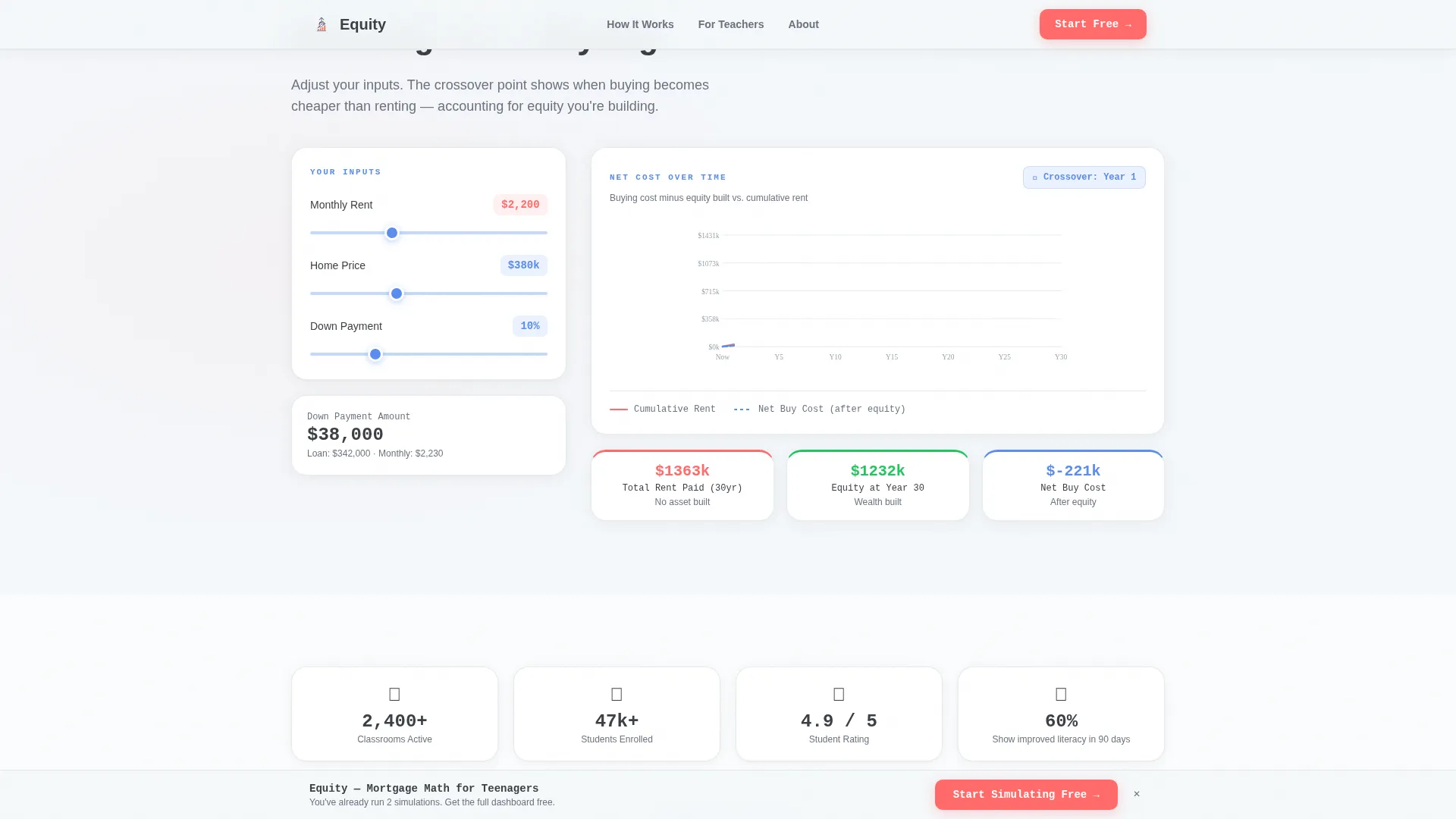
A running cost counter tracks cumulative rent payments against cumulative buying costs. The crossover point appears as a visual marker, showing visitors exactly when ownership starts to make financial sense.
Trust Badge Constellation Header
Metallic-edged shield icons display social proof markers at the very top of the page. The badges are rendered in a horizontal row that establishes authority before the visitor reads the headline.
Classroom Invite Viral Loop
A secondary call to action labeled "Share With Your Teacher" generates a shareable classroom invite link. This path unlocks organic growth by routing new users in from existing ones.
Page sections overview
| Section | Purpose |
|---|---|
| Hero with Badges | Establish trust and animate a 30-year loan graph |
| Fixed versus. Variable | Compare rate types with a live divergence graph |
| 15-Year versus. 30-Year | Reveal total interest via a draggable timeline |
| Rent versus. Buy Counter | Show cost crossover with a running live counter |
| Social Proof | Display student ratings and teacher testimonials |
| Freemium Signup | Convert visitors with a single-field email gate |
| Footer Flow | Close the page with a horizontal footer pattern |
Design & branding system
The visual identity follows a Data Command theme built on a Cloud Canvas color system. The aesthetic is a clean whiteboard in a Silicon Valley classroom: airy enough to read quickly, structured enough to feel trustworthy, with deliberate pops of color that direct attention to what matters.
- Vapor white (#F4F7FA) as the primary background, graphite pencil (#3B3F45) for body text and data labels, and notebook-blue (#5B8DEF) on interactive chart elements and progress indicators
- Highlighter coral (#FF6B6B) reserved for call to action buttons and alert states, ensuring the primary action always stands out
- JetBrains Mono for headlines and data displays, paired with DM Sans for body copy to balance technical precision with everyday readability
Mobile & speed optimization
The template is built desktop-first with strong mobile parity. Teens use both devices, and the interactive modules are designed to function well on touch screens as well as mouse-driven desktops.
- Interactive client components handle sliders, draggable timelines, and live counters, while static trust and social sections use lighter server rendering
- Scroll-triggered animations activate as each comparison section enters the viewport, keeping the experience smooth across device sizes
How this template helps you convert
The conversion strategy is built around giving value before asking for anything. By the time the primary call to action appears, the visitor has already used the simulator three times and learned something real.
- The freemium call to action labeled "Start Simulating Free" appears first after the second comparison module and stays pinned to the bottom of the viewport, ensuring it is always one tap away without interrupting the learning flow.
- A single-field signup form asks only for an email address, with Google and Apple SSO options flanking it to reduce friction for teen users who prefer not to type passwords.
- The "Share With Your Teacher" secondary call to action creates a classroom invite link, turning every engaged student into a distribution channel for new signups.
Other information about this template
This template is categorized under Finance and Insurance, in the Teen and Youth Finance subcategory, with a specific niche focus on teen and youth mortgage education. It is built for the United States market using English copy and USD figures. The template style is Single Column Flow, and the landing page direction follows a Freemium and Trial conversion model.
- The header concept uses Award Badges as trust anchors, specifically referencing a NerdWallet feature mention, a 2,400-plus classroom usage badge, a 4.9 student rating, and a Parents' Choice seal
- The creative direction is a Comparison Journey, meaning each scroll depth presents a new binary scenario that builds on the previous one, escalating from simple to complex
- Animation intensity is high throughout: the hero graph auto-plays on load, comparison modules are scroll-triggered, counters run live, and the timeline is draggable
Theme
Data Command
Creative direction
Comparison Journey
Color system
Cloud Canvas
Style
Single Column Flow
Direction
Freemium/Trial
Page Sections
Auto-animating Amortization Hero Graph
Interactive Rate Divergence Chart
Draggable Loan Term Timeline
Rent Versus. Buy Running Cost Counter
Trust Badge Constellation Header
Freemium Signup with Classroom Invite Loop
Related questions
Who is this landing page template designed for?
What interactive elements are included in this template?
How does the freemium signup flow work?
Can teachers share this tool with their students?
Is this template built as a single-page layout?



