Family Medicine Medicine Booking Website Template
This family medicine telemedicine landing page template uses a clean split-screen layout to build trust before asking for a booking. A giant centered headline, clinical Arctic White palette, and transparent process panels walk first-time patients through every step of a virtual visit. Physician-written care guides and an email-gated starter kit make this template ideal for content-driven patient acquisition.
by Rocket studio
Quick summary
This landing page template is built for a family medicine telemedicine service. It uses a 50/50 split-screen layout, a clinical Arctic White color system, and a transparent process structure to convert anxious first-time patients. The page earns trust through physician-written content before presenting any booking call to action.
Who this template is for
This template is designed for healthcare practices and telemedicine providers who serve general family medicine patients in the United States. It works especially well when the practice needs to lower the barrier for first-time virtual visits.
- Family medicine providers offering video consultations to new or existing patients
- Telemedicine services targeting new parents, remote workers, and adult caregivers booking on behalf of others
- Practices that want to lead with clinical content and physician credentials before asking for a sign-up
What problem this template solves
First-time telemedicine patients hesitate. They worry about whether the process is legitimate, whether a prescription will actually reach their pharmacy, and whether the doctor they see is truly qualified. A generic landing page does nothing to answer these concerns. This template is built to address every anxious question in the order a real patient thinks of it.
- Patients do not know how a video visit actually works, step by step
- New patients question whether board-certified physicians are available quickly
- First-time users need reassurance about prescriptions, follow-up messaging, and medical records before they book
What you get with this template
You get a fully structured single-page layout with distinct sections that guide the visitor from awareness to action. Each section is purposefully sequenced so that trust compounds as the user scrolls.
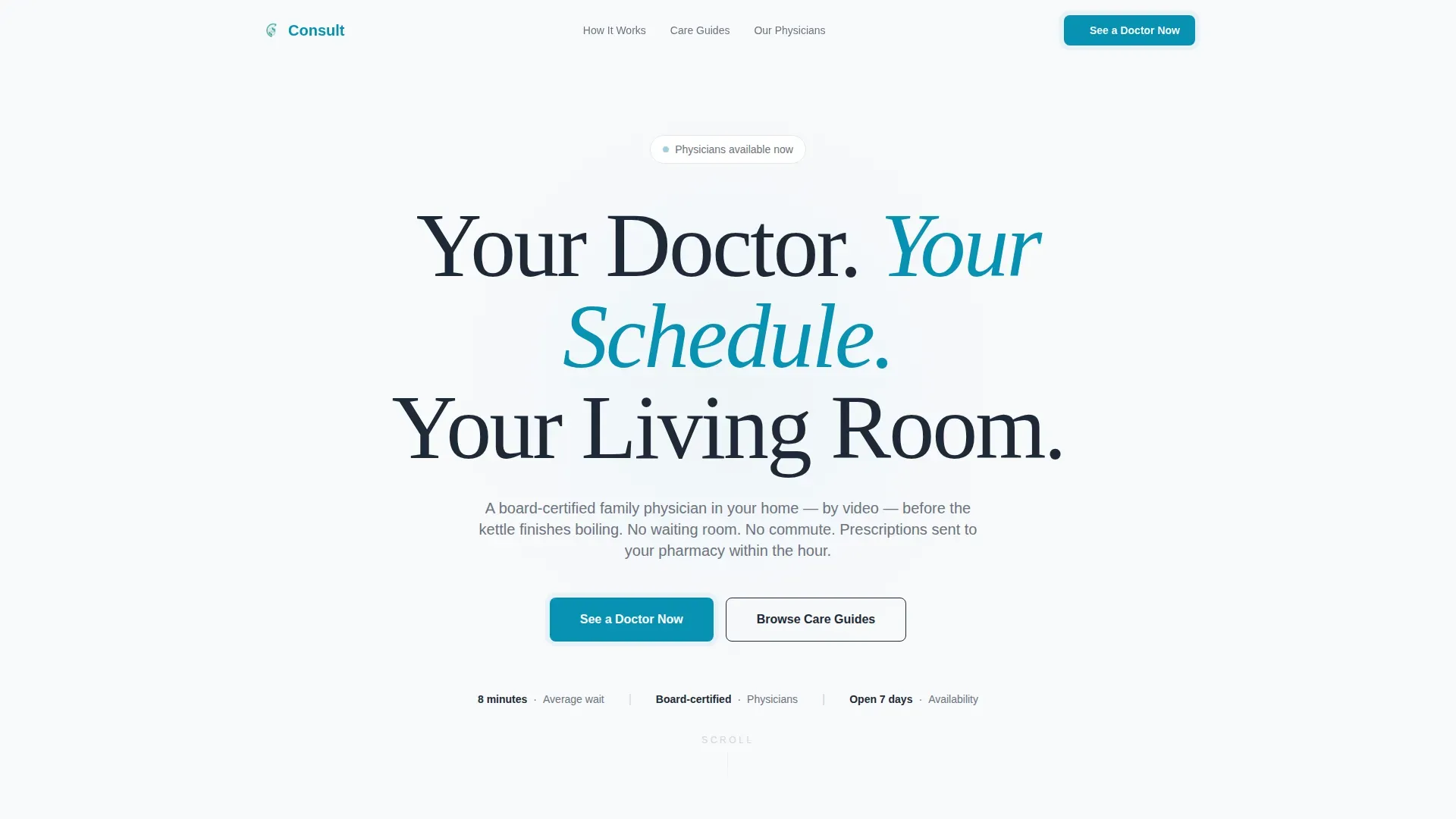
- A hero section with an oversized centered headline, a teal primary call-to-action button, and a proof micro-line showing average wait time and board-certification status
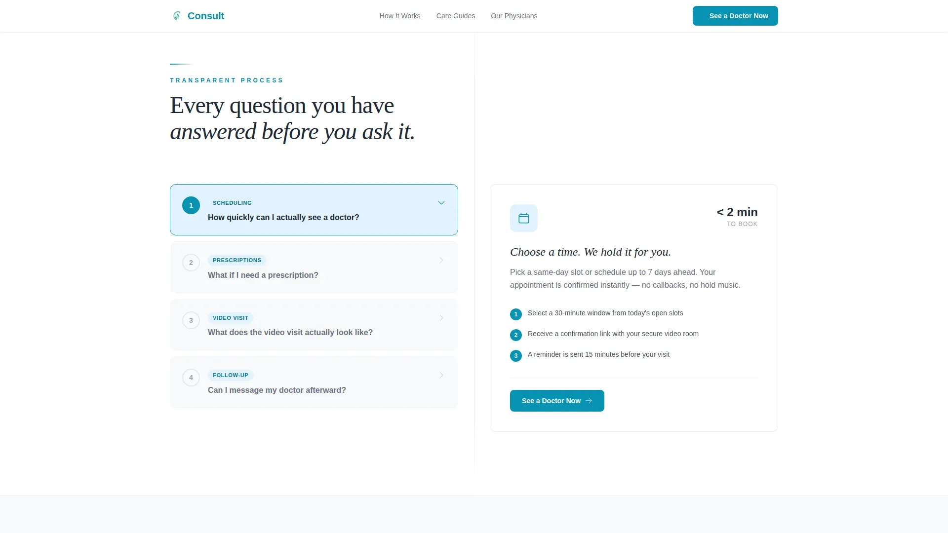
- A split-screen transparent process section using accordion-style question-and-answer panels that reveal how scheduling, video visits, prescriptions, and follow-up messaging work
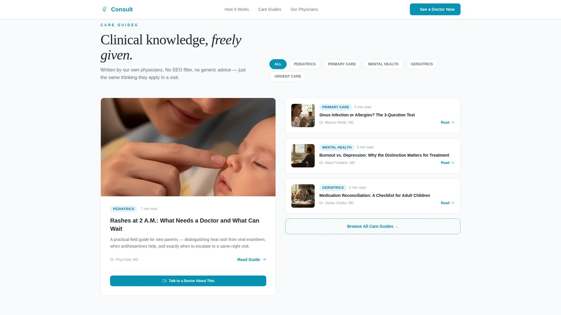
- A physician-written care guides library, a physician credentials section with board-certification badges, and an email-gated downloadable starter kit with a pharmacy zip code field
Feature list
This template ships with six tightly scoped components, each serving a specific role in the patient conversion journey.
Giant Centered Hero Headline
The hero opens with oversized display-scale typography reading "Your Doctor. Your Schedule. Your Living Room." set in deep charcoal against a stark white viewport. A single teal "See a Doctor Now" button sits below the headline, paired with a proof micro-line showing average wait time, board-certification status, and seven-day availability. Negative space does the design work.
Transparent Process Split Panels
Each scroll section pairs a patient question on the left panel with a step-by-step visual answer on the right. Topics covered include scheduling flow, the video room interface, e-prescription delivery, follow-up messaging, and medical records access. Accordion interactivity lets users expand only the questions they care about most.
Physician-Written Care Guides Library
A searchable library of condition-specific articles written by the practice's own physicians sits at the center of the content strategy. Each article ends with a contextual "Talk to a Doctor About This" button, turning passive reading into an active booking path. A care guide filter helps users find relevant topics quickly.
Email-Gated Starter Kit Download
A secondary conversion path offers a free downloadable PDF called "The Family Telemedicine Starter Kit." Visitors unlock it by entering their email address and preferred pharmacy zip code. This approach captures intent from visitors who are not ready to book but want to learn more.
Physician Credentials Section
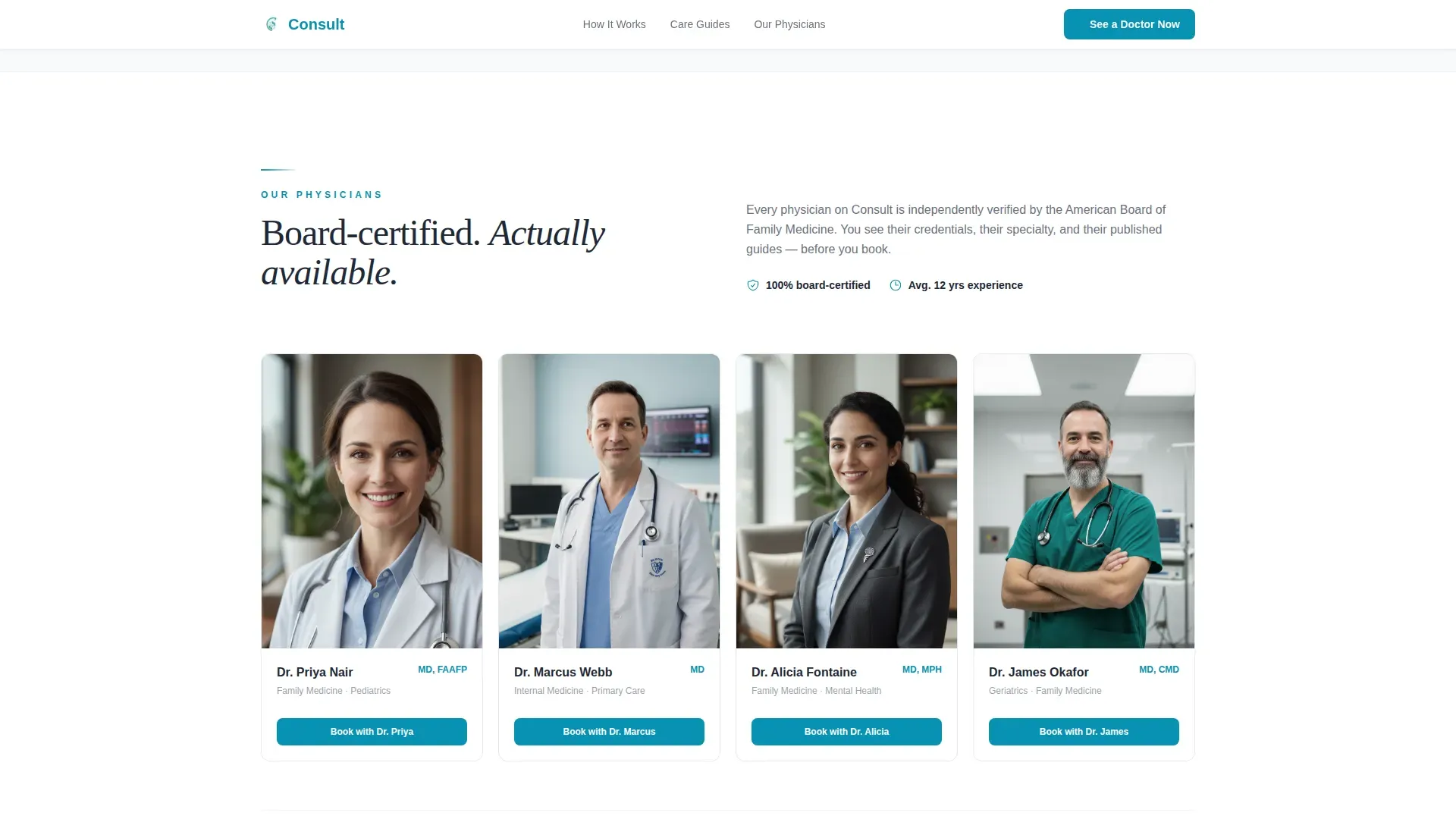
This section displays board-certification badges, physician headshots, and credential details that reinforce clinical authority. Social proof elements are placed here to answer the implicit question every new patient asks: "Is this doctor actually qualified?" The visual treatment follows the same clean Arctic White design system used throughout the page.
Linear Single-Row Footer
The footer uses a Pattern 1 linear single-row layout that keeps the bottom of the page clean and uncluttered. It contains only the essential links and information needed to close the visit without distraction.
Page sections overview
| Section | Purpose |
|---|---|
| Hero Headline | Establish brand promise and present the primary call to action with proof |
| Split Process Panels | Answer patient questions step by step through paired Q&A panels |
| Care Guides Library | Deliver physician-written content with contextual booking prompts |
| Physician Credentials | Build clinical trust with board-certification badges and headshots |
| Starter Kit Download | Capture leads through an email-gated PDF with pharmacy zip code field |
| Single-Row Footer | Close the page cleanly with essential links in a linear layout |
Design & branding system
The visual identity follows a Corporate Precision theme. Every color and type choice communicates clinical cleanliness and calm competence before a single word is read.
- Color palette: clinical white (#F8F9FB) as the primary background, instrument-tray silver (#D1D5DB) for structural dividers, deep charcoal (#1F2937) for all body text, and vital-sign teal (#0891B2) used exclusively for buttons, links, and status indicators
- Typography: Plus Jakarta Sans for body and navigation text, Fraunces serif display for headline moments that need emotional warmth and authority
- Spacing and layout: generous negative space throughout, a 50/50 split-screen grid for process sections, and a stark open viewport in the hero that communicates respect for the patient's time
Mobile & speed optimization
The template is built mobile-first because its primary audience, including new parents searching at 2 a.m., arrives on phones. Desktop polish is layered on top of a solid small-screen foundation.
- Server Components handle all static sections such as the hero, credentials block, and footer to keep initial load lean
- Interactive elements including the accordion panels, care guide filter, and email gate form use Client Components so interactivity loads only where needed
- GSAP scroll reveals, staggered section entrances, and a word-by-word headline animation add medium-level motion that feels considered rather than heavy
How this template helps you convert
The conversion architecture is built on a content-first trust sequence. The page gives clinical knowledge away before it asks for anything in return.
- The hero earns immediate attention with a bold, specific headline and a proof micro-line that answers the first three questions a new patient has, all above the fold
- The transparent process panels remove doubt systematically, making the booking feel like an obvious next step rather than a leap of faith
- The care guides library and starter kit PDF create two distinct conversion paths, one for patients ready to book now and one for visitors who need more time before committing
Other information about this template
This template is a strong fit for US-based telemedicine practices operating in the family medicine space. It is designed for English-language audiences with USD pricing, MM/DD/YYYY date formatting, and US-centric details such as pharmacy zip code fields and board-certification references.
- Animation level is set to medium, using GSAP for scroll reveals and staggered section entrances so the page feels alive without being distracting
- The template supports high interactivity including accordion question-and-answer panels, a care guide filter, and a gated email form
- Localization defaults are US English, making it immediately usable for domestic family medicine and telemedicine providers without additional configuration
Theme
Corporate Precision
Creative direction
Transparent Process
Color system
Arctic White
Style
Split Screen (50/50)
Direction
Content/Resource
Page Sections
Giant Centered Hero with Proof Line
Transparent Process Split Panels
Physician-written Care Guides Library
Email-gated Starter Kit Download
Physician Credentials Block
GSAP Scroll Animations
Related questions
Who is this landing page template designed for?
What sections are included in this template?
How does the email-gated starter kit work?
Is this template suitable for mobile users?
What level of interactivity does this template include?



