Home Care Agency Booking Website Template
A warm, unhurried landing page built for telehealth services targeting adults 65 and older. The zigzag layout introduces board-certified physicians and care staff one by one, building trust through faces and first-person bios before asking for anything. A coral booking module collects just three details to schedule a first visit.
by Rocket studio
Quick summary
This single-page template helps telehealth providers connect with seniors and their families. It pairs a half-page hero photo with a calm, serif headline, then walks visitors through a series of alternating provider sections. Each section builds trust gradually before presenting a simple three-step scheduling form as the primary conversion point.
Who this template is for
This template suits telehealth clinics, independent physician practices, and senior care organizations that want to convert website visitors into booked appointments. It also speaks directly to adult children researching care options on behalf of a parent.
- Telehealth providers serving adults 65 and older with chronic conditions, medication reviews, or post-surgical follow-ups
- Practices that want to lead with provider faces and stories before presenting a form
- Care teams that prefer phone confirmation over email, reflecting the communication preferences of older patients
What problem this template solves
Many seniors and their families distrust cold, clinical websites. A page that opens with a dense form or unfamiliar jargon loses the visitor immediately. This template removes that friction by building familiarity first and asking for information only after trust has been established.
- Seniors hesitate to book online when they cannot see who they are talking to or what the process involves
- Adult children need reassurance that the care team is real, warm, and personally attentive before they recommend a service to a parent
- Standard scheduling pages ask too much too soon, causing drop-off before any appointment is made
What you get with this template
You get a complete, single-page layout designed around one goal: getting a senior or their family member to book a first visit. Every section is pre-structured and ready to receive your own provider photos, bios, and scheduling details.
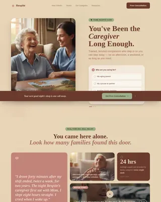
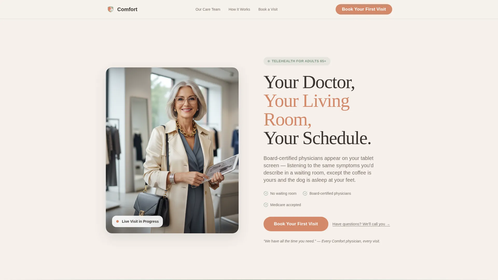
- A hero section with a half-page photo and text split, a serif headline, and a coral call-to-action button
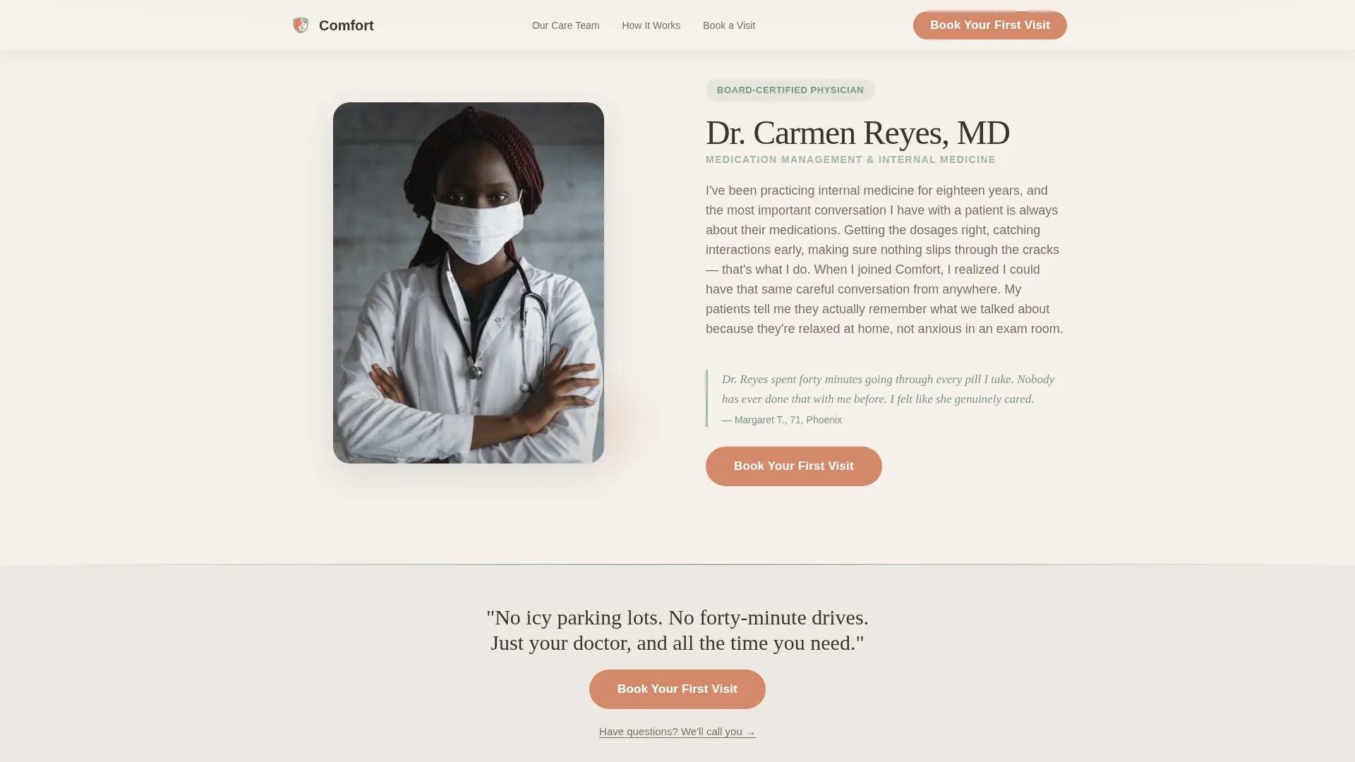
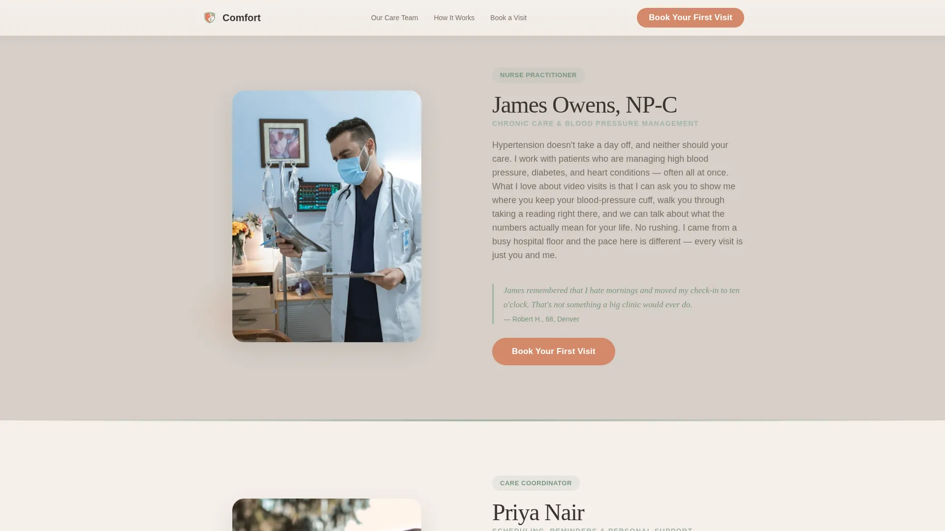
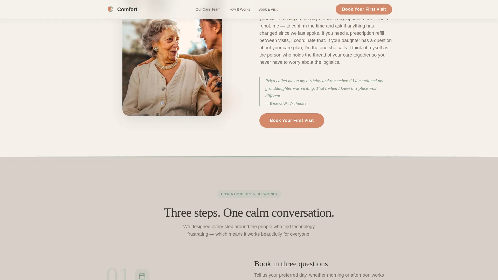
- Three alternating zigzag provider sections, each with a photo, a first-person bio, and a patient quote in sage italic
- An inline three-step booking module and a secondary "Have Questions? We'll Call You" path for visitors who are not yet ready to commit
Feature list
A brief paragraph introduces the feature set: every element of this template is chosen to serve a senior-focused telehealth audience, where warmth, clarity, and a gentle pace matter more than visual complexity.
Zigzag Provider Layout
Each provider section alternates between left-image/right-text and right-image/left-text. The rhythm creates a sense of being personally introduced to each care team member one at a time, which feels natural rather than overwhelming.
Half-Page Hero Split
The header divides the screen between an intimate lifestyle photo on the left and a large serif headline with a coral booking button on the right. The composition is shot at eye level to feel personal and unhurried from the very first moment.
Inline Three-Step Booking Form
The scheduling module asks only three questions in sequence: preferred day of the week, morning or afternoon, and a phone number for confirmation. Keeping the form short reduces hesitation and matches the preferences of an audience that trusts a phone call over an email.
Secondary Call Path
A text link reading "Have Questions? We'll Call You" appears beneath every primary call-to-action button. It collects only a first name and phone number, giving cautious visitors a lower-commitment way to start a conversation.
Patient Quotes and Social Proof
Each provider section closes with a short patient quote displayed in sage italic type. These quotes act as peer validation, offering the kind of reassurance that senior audiences and their families rely on before making a healthcare decision.
Scroll Animations and Staggered Entrances
Sections reveal with a blur-on-scroll effect and staggered entrance timing. The pacing feels calm and deliberate, matching the overall tone of the template without distracting from the content.
Page sections overview
| Section | Purpose |
|---|---|
| Hero Photo Split | Introduce the service with a warm, eye-level photo and a clear headline |
| Dr. Reyes Section | Present the medication management specialist with a first-person bio |
| NP Owens Section | Introduce the blood-pressure and chronic care provider |
| Care Coordinator Priya | Show how personal scheduling and pre-visit reminders work |
| Inline Booking Module | Convert engaged visitors with a simple three-step scheduling form |
| Page Footer | Provide a clean single-row footer with essential links |
Design & branding system
The visual identity follows a Healing Space theme built around the Soft Mist color system. Every color and typeface choice is made to feel domestic and calming, removing all clinical associations from the page.
- Four-color palette: morning fog white (#F5F0EB) for primary backgrounds, washed linen gray (#D6CFC7) for alternating section backgrounds, quiet sage (#A3B5A6) for dividers and iconography, and warm coral (#D4896A) used exclusively for buttons and interactive highlights
- Typography pairs Fraunces, a warm serif, for all headlines with DM Sans for body text and form labels, keeping the reading experience familiar and easy on the eyes
- Backgrounds alternate between fog white and linen gray to reinforce the zigzag visual rhythm without adding visual noise
Mobile & speed optimization
The template is built desktop-first but thoughtfully adapted for smaller screens. Senior users and adult children often browse from phones, so touch-friendly sizing is a core part of the layout decisions.
- Large touch targets on all buttons and form inputs make the booking flow easy to complete on a phone without pinching or zooming
- Server Components handle all static content sections, keeping the JavaScript footprint small and page loads responsive
- Smooth transitions and blur-reveal animations are implemented with performance in mind, avoiding heavy scripts that could slow the experience on older devices
How this template helps you convert
The entire page is structured around one conversion goal: booking a first telehealth visit. Every layout decision reduces hesitation and moves the visitor toward that single action.
- Trust is built before any form appears. Visitors meet real provider faces and read first-person bios across multiple sections before they ever see a booking field, which lowers psychological resistance significantly.
- The coral call-to-action button resurfaces after every second provider section, so a visitor who is ready to book at any point in their scroll does not need to hunt for the next step.
- The secondary "Have Questions? We'll Call You" path catches visitors who are not yet ready to book, collecting a name and phone number so the care team can follow up by voice rather than leaving the visitor to leave quietly.
Other information about this template
This template is built for the telehealth for seniors niche within the broader elderly care and senior living category. It sits specifically within the home care and support subcategory, making it a focused tool for providers who serve patients in their own homes via video.
- The localization is set for the United States, using English, USD pricing references, and a 12-hour time format throughout the scheduling module
- The booking module is designed as an inline, embedded component rather than a pop-up or redirect, keeping the visitor on the page and reducing drop-off
- Animation intensity is set to medium, with blur-reveal scroll effects and staggered section entrances that feel gentle rather than flashy
- The footer follows a linear single-row pattern, keeping the bottom of the page clean and uncluttered
- This template is a strong starting point for any senior-focused telehealth provider that wants a ready-made, conversion-oriented landing page without building from scratch
Theme
Healing Space
Creative direction
Team & People
Color system
Soft Mist
Style
Zigzag/Alternating
Direction
Booking/Scheduling
Page Sections
Zigzag Alternating Provider Layout
Half-page Hero Photo and Text Split
Inline Three-step Scheduling Form
Secondary Call-me Path
First-person Bios and Patient Quotes
Scroll Animations and Staggered Entrances
Related questions
Who is the primary audience for this template?
Can I replace the provider photos and bios with my own team?
How does the inline booking form work?
Is this template suitable for a small or solo telehealth practice?
Does the template include a way to capture visitors who are not ready to book?