Luxe Omakase Reservation Landing Page Template
Tempura is a Luxe Minimal landing page template built for omakase tempura restaurants that rely on reservations. It pairs a nine-tile Photo Grid Mosaic header with interactive before-and-after ingredient reveals, guiding visitors through the full omakase progression before they reach a focused booking form. The Parchment and Rust color system and Fraunces serif typography communicate ceremony without a single wasted word.
by Rocket studio
Quick summary
Tempura is a single-page, reservation-driven landing page template designed for high-end tempura omakase restaurants. The page opens with a nine-tile asymmetric mosaic, leads visitors through a sequence of raw-to-fried ingredient reveals, and closes with a focused booking form. Every design choice reinforces the intimacy of a twelve-seat counter where the chef controls every moment of the dinner.
Who this template is for
This template fits any fine-dining restaurant operator, creative director, or web professional building a landing page for a luxury omakase or tempura counter. It is especially well-suited for restaurants that rely on advance reservations, limit party sizes, and want the landing page itself to function as the first course of the dining experience.
- Omakase restaurant owners who need a landing page that converts serious diners rather than casual browsers
- Web designers and studio teams building reservation-first landing pages for high-end Japanese cuisine restaurant clients
- Food and beverage entrepreneurs launching a new tempura counter who want a refined, ceremony-driven page design from day one
What problem this template solves
Most restaurant landing page templates are built for volume. They are designed for burger joints, fast food chains, pizza counters, and comfort food spots where the call to action is impulsive. A luxury omakase restaurant needs the opposite: a landing page that slows the visitor down, communicates rarity, and converts only the right kind of guest. High-intent diners plan their dinner weeks or months in advance. They research. They read. They want to feel the experience before they arrive. A generic page design fails them entirely.
- Standard restaurant templates do not communicate the ceremony, seasonality, or chef-driven specificity that omakase guests expect before committing to a reservation
- Most booking-focused landing pages bury the reservation form or make it easy to leave without acting, losing high-intent visitors who needed one more sensory nudge
- Comfort food and fast food page layouts feel out of place for a restaurant whose entire value is restraint, precision, and ritual
What you get with this template
You get a fully structured, single-page landing page template that takes visitors from first impression to confirmed reservation in a deliberately paced, visually immersive sequence. Every section is built to carry both narrative and conversion weight. The page design balances minimalist Japanese aesthetics with high-functionality booking features, making it easy for a high-intent visitor to commit without friction.
- A nine-tile Photo Grid Mosaic header, six interactive before-and-after ingredient reveal sections across the vegetable and seafood courses, a pinned reservation form, a kakiage finale with seasonal menu modal, and a minimal footer
- The full Parchment and Rust color system, Fraunces display serif and DM Sans body typography, and all component-level design tokens ready to apply
- Drag-slider interactivity on every reveal section, a seasonal menu modal with its own reservation path, and a sticky "Reserve Your Seat" call to action pinned after the third reveal and again at the page base
Feature list
This landing page template includes the following built-in features and design components, each grounded in the source brief.
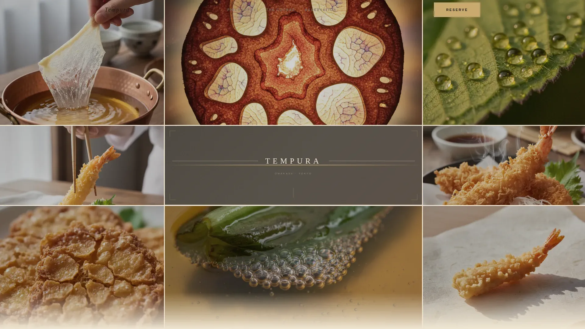
Nine-Tile Photo Grid Mosaic Header
The header fills the entire viewport with nine asymmetric image tiles. Each tile shows a tightly cropped moment: fingers pinching batter above a copper pot, a lotus root cross-section backlit against warm light, steam curling off a freshly fried prawn. No tile reveals a full plate. The restaurant name appears as a single line of thin serif type centered across the middle tile. This page design approach is standard practice for high-end sushi and omakase restaurant landing pages that need to communicate refinement before a single word of copy is read.
Before-and-After Ingredient Reveal Sliders
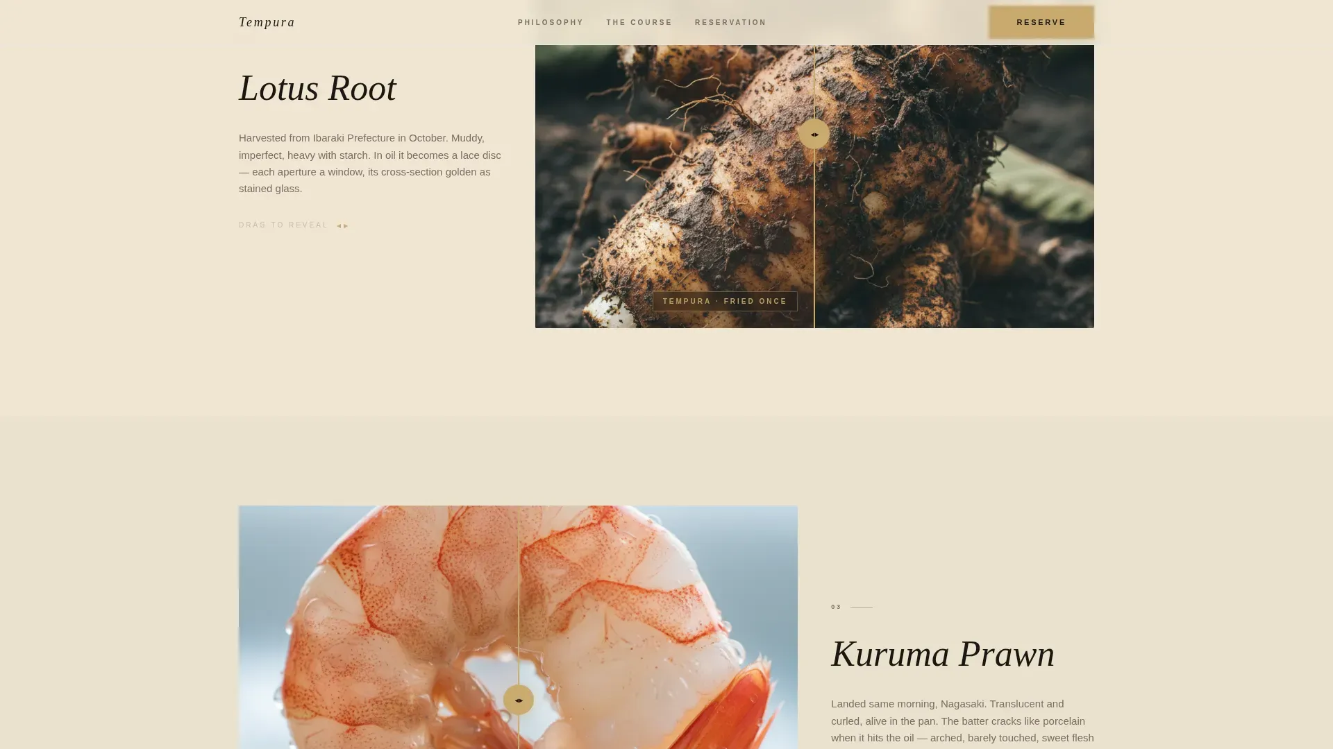
Six drag-slider reveal sections guide visitors through the full omakase progression. The vegetable course covers lotus root, shiso, and sweet potato. The seafood course covers prawn, anago, and hotate. Each slider shows the raw ingredient on one side and the finished tempura piece on the other. Visitors drag the divider and feel the kitchen's transformation in their hand. This interactive format is a proven way to communicate freshness, richness, and the chef's craft without a word of description. The richness of the finished batter and the freshness of the raw ingredient are communicated simultaneously, in a way that no static image can replicate.
Pinned Reservation Form with Booking Logic
A full booking form is pinned after the third ingredient reveal and repeated at the page base. The form collects date, party size (capped at six to reinforce intimacy), and seating preference (counter or private room). A clear "Reserve Your Seat" call to action is rendered in sesame gold, ensuring it stands out against the parchment background. The sticky reservation button remains visible as the user scrolls, maintaining conversion opportunity at every point in the page. A real-time availability setup can be configured to prevent double-booking and manage the restaurant's limited seat count. Clear, transparent pricing details, a cancellation policy notice, and no-show fee language can be placed directly within or immediately below the form. Effective reservation systems for restaurants should provide a seamless user experience, and this template's form structure is built with that principle in mind.
Seasonal Menu Modal
A secondary conversion path labeled "View This Month's Course" opens a modal overlay displaying the current omakase menu. The modal ends with its own reservation button, allowing curiosity to convert on its own terms. This is an important feature for food writers, critics, and experienced diners who want to review the chef's seasonal curation before committing. The modal structure makes it easy to update the menu content each season without altering the page layout.
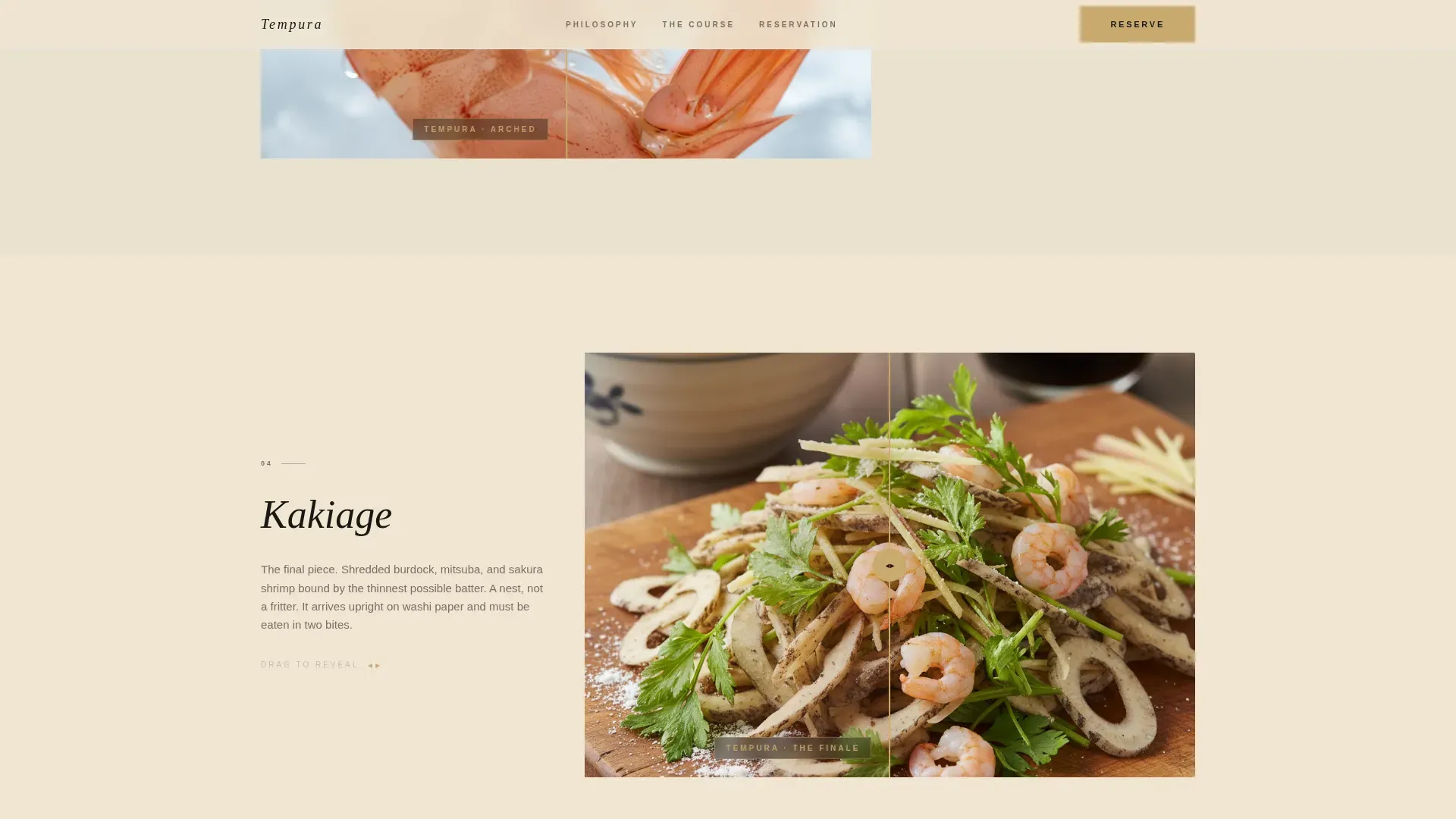
Kakiage Finale Section
The final before-and-after reveal is reserved for kakiage, the most technically complex preparation in the tempura repertoire. It functions as the page's emotional climax, mirroring the omakase progression from simple vegetable course through seafood to the chef's showpiece. This section pairs with the seasonal menu modal and the final reservation call to action, creating a natural conversion moment for visitors who have engaged with the full page. Highlighting the chef's philosophy and the art of the kakiage in this section builds trust and reinforces the restaurant's brand identity.
Luxe Minimal Typography and Color System
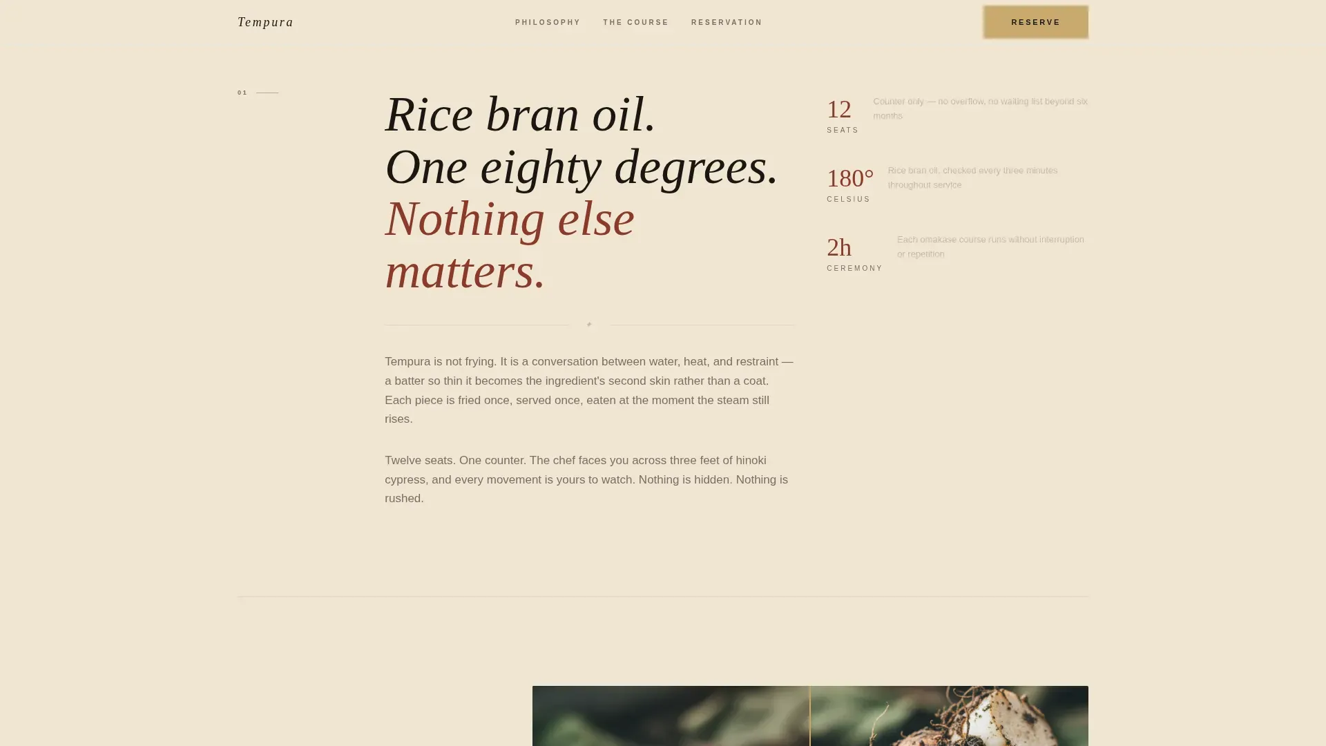
The template ships with a complete Parchment and Rust color system. Aged washi cream (#F0E6D3) serves as the background. Deep iron-oxide rust (#8B3A2A) handles primary type and structural elements. Charred bamboo black (#1A1612) carries body text. Warm sesame (#C9A96E) is reserved for hover states and reservation buttons. Fraunces is the display serif for headings and the restaurant name. DM Sans handles all body and form copy. This system is designed to feel like a lacquered tray: restrained, earned, and quietly authoritative.
Page sections overview
| Section | Purpose |
|---|---|
| Photo Grid Mosaic | Nine-tile viewport header introducing the restaurant through macro still-life fragments |
| Vegetable Course Reveals | Three before-and-after sliders: lotus root, shiso, and sweet potato moving from raw to fried |
| Seafood Course Reveals | Three before-and-after sliders: prawn, anago, and hotate showing the chef's seafood craft |
| Pinned Reservation Form | Booking form with date, party size, and seating preference, anchored after the third reveal |
| Kakiage Finale | Culminating reveal and seasonal menu modal with its own embedded reservation path |
| Minimal Footer | Ultra-minimal horizontal footer with location and contact information clearly displayed |
Design & branding system
The Tempura template's visual identity is built around a principle of earned restraint. Every color, typeface, and spacing decision is traceable to the kitchen itself. High-definition, close-up photographs of delicate batter and the intimate counter seating emphasize the exclusive ambiance that omakase guests expect. Using close-up shots that highlight the lightness of the batter and the freshness of premium ingredients is central to the visual storytelling approach. Professional photography of a signature tempura piece or the chef at work is recommended to make the most of the mosaic and reveal layouts.
- Parchment and Rust color tokens: aged washi cream background, iron-oxide rust primary, charcoal body text, and sesame accent for interactive states and reservation buttons
- Fraunces display serif for all headings and the restaurant nameplate, DM Sans for body copy and form fields, with generous line spacing to maintain the ceremonial pace
- Parallax scrolling on ingredient images, scan-line animation on mosaic tiles, and staggered reveal transitions across all six before-and-after sections
Mobile & speed optimization
The Tempura landing page template is built desktop-first. The Photo Grid Mosaic and drag-slider reveals are designed for the larger viewport that omakase guests typically use when planning their dinner. The template is structured to support image optimization and lazy loading below the fold, which helps the page reach a target load time under three seconds even with high-resolution photography. Location and contact information are clearly displayed in the footer for easy access on any device.
- Desktop-first layout with the nine-tile mosaic scaled for full-viewport impact; mobile breakpoints are included to maintain readability and form functionality on smaller screens
- Lazy loading applied below the fold so that the hero and first reveal section load immediately while the remaining sections load as the visitor scrolls
- High-resolution imagery can be compressed before upload to maintain visual quality while keeping the page fast, following standard best practices for luxury restaurant landing pages
How this template helps you convert
This template is engineered to move a high-intent visitor from first impression to confirmed reservation. Every section earns its place in the conversion sequence. Luxury restaurant landing pages that feature immersive layouts consistently outperform static, text-heavy pages at converting guests who are already planning a special dinner.
- The mosaic header creates immediate sensory impact, communicating the restaurant's level of craft before any copy is read, drawing the visitor deeper into the page
- The six drag-slider reveals build emotional investment across the full omakase progression, so by the time the visitor reaches the reservation form, they are already mentally seated at the counter
- The pinned "Reserve Your Seat" call to action in sesame gold, repeated at the page base, ensures the booking opportunity is always visible and easy to act on, while the seasonal menu modal gives curious visitors a secondary path that still ends in a reservation button
Other information about this template
This template fits naturally within the broader landscape of premium restaurant landing page templates designed for Japanese cuisine. It goes beyond the standard sushi restaurant landing page template by embedding the full omakase narrative directly into the page structure. Sushi restaurant landing page templates are designed to showcase omakase menus and chef stories, and this template takes that principle further by making every section a sensory argument for the reservation. High-end sushi and omakase restaurants benefit from cinematic landing page designs that highlight their brand and menu, and the mosaic-plus-reveal format is precisely that kind of cinematic structure.
- This template sits in the Food and Beverage category, specifically the Japanese Cuisine and Dining subcategory, within the tempura restaurant niche. It is a niche-specific build rather than a general-purpose restaurant template, so it does not try to serve burger counters, pizza restaurants, comfort food diners, fast food operators, or bars. If your restaurant is in one of those categories, a different template will serve you better.
- Omakase-style dining experiences are effectively showcased through premium landing page templates, and this one is powered by that exact insight: the page itself is the first course. The template is powered by a section sequence that mirrors the omakase meal structure, allowing the visitor to experience the progression before they arrive.
- Social proof on this template is delivered through specificity rather than generic testimonials. Named techniques, precise temperatures, seasonal sourcing details, and the intimacy of twelve seats do the work that star ratings do on comfort food and fast food restaurant pages. If you have Michelin mentions, notable press logos, or awards, the template structure supports adding them near the reservation form to justify the premium price point.
- Successful restaurant landing pages often feature immersive layouts that highlight unique dining experiences. This template is designed for that exact use case. A modern look is essential for restaurant landing pages to attract customers and convey the dining experience, and the Luxe Minimal direction delivers that without sacrificing the ceremonial tone that omakase guests expect.
- The template can be used as a reference or starting point for related luxury dining concepts. Other premium sushi restaurant landing page templates such as Kujira are designed for showcasing omakase menus and facilitating reservations in a similar vein. Sushi is a premium restaurant landing page template category that spans multiple cuisine types, from tempura counters to sushi bars and omakase tasting restaurants.
- Highlighting the chef's expertise is vital for conversion. A brief section covering the chef's background, culinary philosophy, and approach to seasonal ingredients can be added within the existing page structure without disrupting the visual flow.
- The reservation form structure supports transparent pricing communication. Stating the set price for the omakase, the currency, and a clear cancellation policy directly on the landing page removes ambiguity and builds the trust that high-intent diners need before committing.
- User-friendly interfaces in reservation systems can significantly improve the booking experience. The form's three-field structure (date, party size, seating preference) is intentionally minimal, making it easy for any visitor to complete in under a minute.
Theme
Luxe Minimal
Creative direction
Before/After Reveal
Color system
Parchment & Rust
Style
Masonry/Pinterest
Direction
Booking/Scheduling
Page Sections
Nine-tile Photo Grid Mosaic Header
Before-and-after Drag Slider Reveals
Pinned Reservation Booking Form
Seasonal Menu Modal with Embedded Call to Action
Kakiage Finale and Course Climax Section
Parchment and Rust Design System
Related questions
Can I use this template for a restaurant that is not a tempura counter?
How does the before-and-after slider work?
What does the seasonal menu modal include?
Does the reservation form support party size limits?
Is this template desktop-first or mobile-first?



