Diabetes Care Professional Website Template
Tend is a hub and spoke landing page template built for diabetes caregiver support services. It guides exhausted family caregivers through a compassionate self-audit experience across five anchor-navigated sections. With interactive checklists, trust-building badge displays, and a click-through flow toward service enrollment, this template turns overwhelmed visitors into confident next-steppers.
by Rocket studio
Quick summary
Tend is a single-page, anchor-navigated landing page template designed for diabetes caregiver support services. It meets family caregivers exactly where they are, overwhelmed, under-resourced, and searching for help. Five spoke sections guide visitors through self-audit checklists covering medication tracking, insurance navigation, burnout signals, and emergency preparation, each building trust before asking for a click.
Who this template is for
This template is purpose-built for healthcare support services that serve unpaid family caregivers of people living with Type 1 or Type 2 diabetes. It fits service providers who need to convert emotionally exhausted visitors into enrolled clients without pushing a hard sell.
- Diabetes caregiver support platforms offering subscription or enrollment services
- Healthcare professionals or organizations recommending structured caregiver resources
- Health and wellness founders building compassionate, audit-driven enrollment flows
What problem this template solves
Family caregivers managing a loved one's diabetes often have no organized support system. They track glucose logs, handle medication schedules, fight insurance prior authorizations, and absorb emotional strain, all without guidance. This template gives a service provider the right structure to meet that caregiver at their breaking point and offer a clear, calm path forward.
- Caregivers arrive overwhelmed and skeptical; a generic pitch page loses them immediately
- The self-audit format surfaces each visitor's specific blind spots, making the service feel personally relevant
- Without a trust-first layout, high-anxiety visitors bounce before reading the value proposition
What you get with this template
This template delivers a fully structured, interactive landing page with five anchor-navigated content spokes, each built around a self-audit checklist. Every section is designed to feel like a compassionate intake interview rather than a sales funnel.
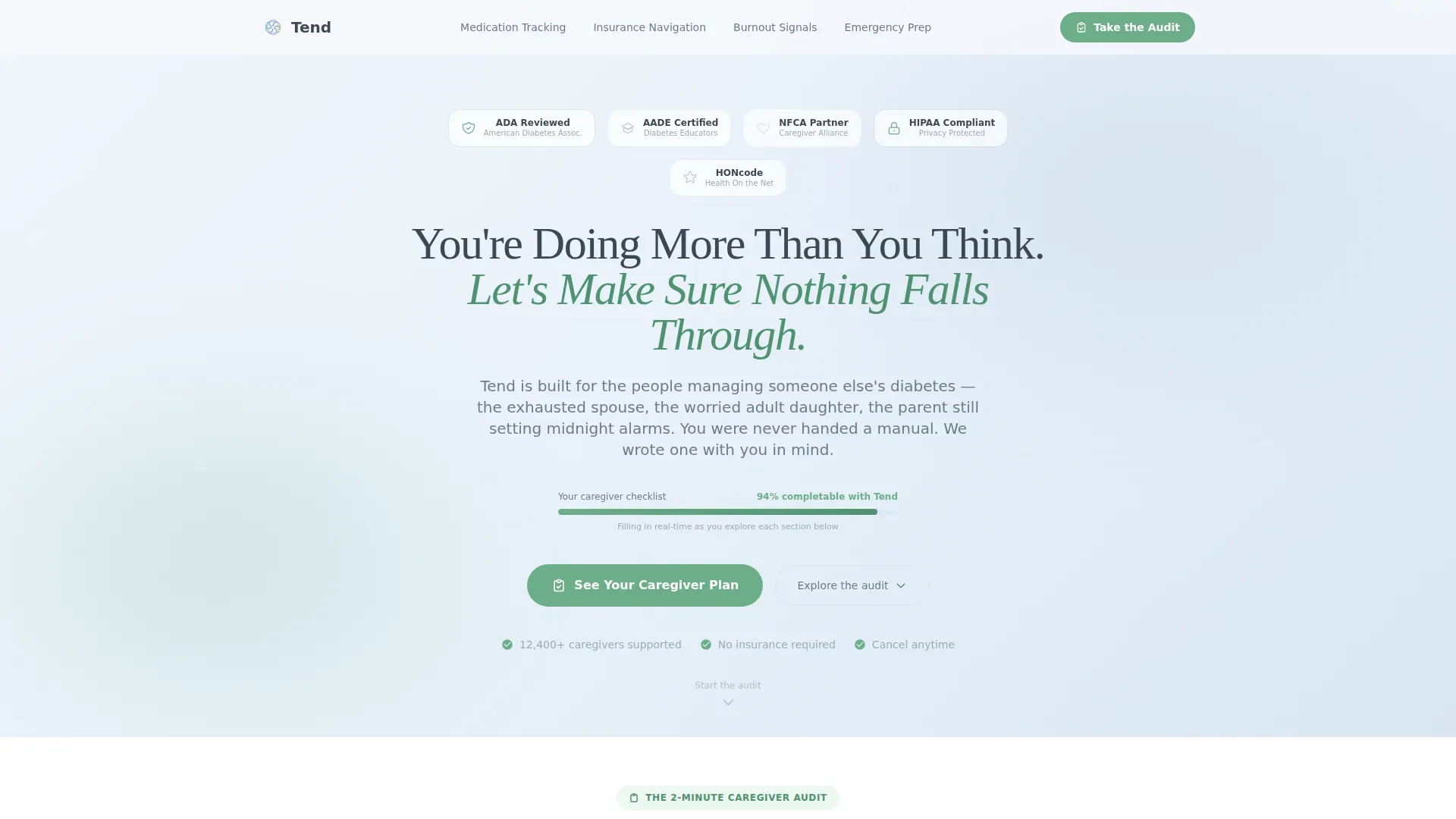
- A hero section with award badge display, animated progress bar, and primary call-to-action placement
- Four spoke sections covering medication tracking, insurance navigation, burnout signals, and emergency preparation, each with its own contextual call to action
- A floating secondary anchor button labeled "Take the 2-Minute Caregiver Audit" that keeps interactive elements within reach at all times
Feature list
This template is built around high-interactivity components and a carefully considered visual identity. Each feature below is grounded in the template's described design and functional scope.
Interactive Self-Audit Checklists
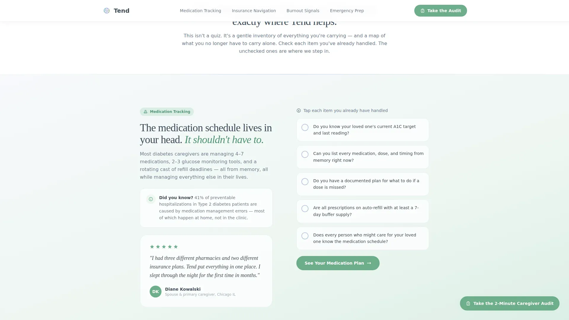
Each of the four spoke sections opens with a three-to-five-item interactive checklist. Caregivers mentally tick items like "Do you know your loved one's A1C target?" The gap between what they can check and what they cannot becomes the compassionate case for enrolling in the service.
Anchor Navigation Bar
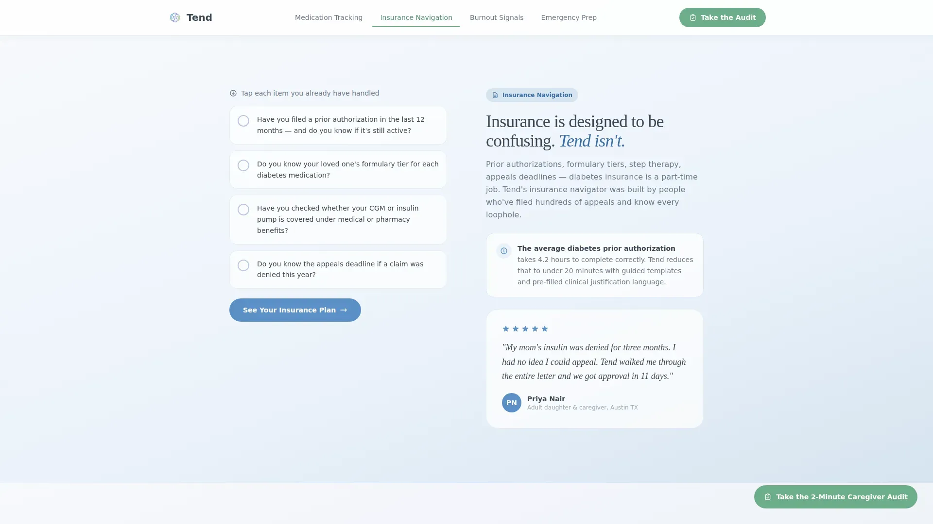
A sticky anchor navigation bar pins to the top of the page once the visitor scrolls past the hero. It displays spoke labels including Medication Tracking, Insurance Navigation, Burnout Signals, and Emergency Prep. Visitors can jump directly to the section most relevant to their immediate concern.
Award Badge Header with Foil Shimmer
The hero section opens with a row of trust-seal badges representing diabetes associations, caregiver advocacy organizations, and health-content review boards. Badges are rendered as soft-edged shields and ribbons with a subtle foil shimmer effect on hover, establishing credibility before the headline is read.
Animated Progress Bar
A thin animated progress bar fills slowly beneath the hero headline, creating a visual promise that relief is measurable and achievable. It sets the tone of the audit experience before any checklist item appears.
Contextual, Escalating Calls to Action
The primary call to action, "See Your Caregiver Plan," appears first beneath the hero audit. It resurfaces at the close of every spoke section, growing more specific each time: "See Your Medication Plan," "See Your Insurance Plan," and so on. No form appears on this page; the click carries visitors forward feeling guided, not sold to.
Floating Audit Anchor Button
A secondary floating button labeled "Take the 2-Minute Caregiver Audit" remains accessible as visitors scroll. It scrolls anyone who skimmed past the interactive elements back to the first checklist, keeping the audit, which is the core persuasion engine, continuously within reach.
Page sections overview
| Section | Purpose |
|---|---|
| Hero with Badges | Open with trust seals, animated progress bar, headline, and primary call to action |
| Medication Tracking | Checklist audit revealing medication blind spots, leading to "See Your Medication Plan" |
| Insurance Navigation | Prior authorization checklist surfacing coverage gaps, leading to "See Your Insurance Plan" |
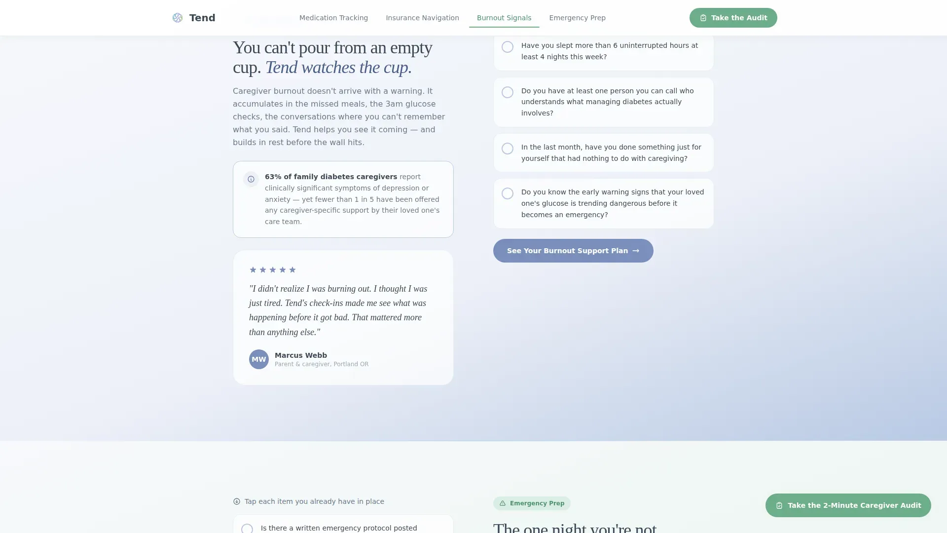
| Burnout Signals | Emotional self-audit helping caregivers recognize strain, leading to "See Your Burnout Support Plan" |
| Emergency Prep | Safety checklist audit confirming crisis readiness, leading to "See Your Emergency Plan" |
| Footer | Horizontal flow footer providing navigation and closing context |
Design & branding system
The visual identity uses a Soft Gradient theme built on an Arctic White color system. The palette is described as feeling like the quiet inside a well-organized medicine cabinet: everything labeled, everything reachable, and nothing alarming. Gradients drift so gently from white to frost blue that they barely register, keeping the eye relaxed while the content works.
- Colors: clinical-calm white (#F7F9FC), breath-of-frost blue (#D6E4F0), steady-pulse lavender (#B8C9E4), reassurance green (#6DAE8B) for checkmarks and primary calls to action, and soft graphite (#3B4856) for body text
- Typography: Fraunces serif display for headlines paired with DM Sans for body copy, creating warmth without losing readability
- Animation: medium-weight animations including progress bar fill, checklist tick reveals, scroll-reveal section entrances, and foil shimmer on badge hover
Mobile & speed optimization
This template is designed with a mobile-first priority, recognizing that most caregivers are searching for help on their phones late at night. The interactive checklist components are built as client-side elements, while the rest of the page prioritizes static content delivery for faster initial load.
- Mobile-first layout ensures checklists, anchor navigation, and floating buttons are thumb-friendly and readable on small screens
- Static content is prioritized at the page structure level, with interactive checklist components loaded as isolated client components to keep the experience responsive
How this template helps you convert
Every structural decision in this template is aimed at moving an anxious, emotionally cautious visitor toward a single confident click. The audit model does the persuasion work so the calls to action feel earned, not forced.
- The self-audit checklist in each spoke section surfaces a personal blind spot, making the service feel directly relevant to that specific caregiver's situation before any benefit is claimed
- Escalating contextual calls to action grow more specific with each section scroll, so by the time a visitor reaches the final spoke, the next step feels obvious and reassuring rather than generic
Other information about this template
This template was designed specifically for the diabetes caregiver support niche within the broader Health and Medical category. It is suited to services targeting the United States market, with English-language copy and USD pricing in mind. The hub and spoke anchor navigation structure makes it straightforward to adapt spoke labels and checklist content to related caregiver niches if needed.
- The page type is a Click-Through landing page; there is no embedded form, and the conversion goal is a single forward click to a detailed service enrollment page
- Inline testimonial quote slots are included after each spoke section to support social proof from real caregiver voices
- The footer follows a horizontal flow pattern suitable for light navigation and closing trust signals
Theme
Soft Gradient
Creative direction
Checklist & Audit
Color system
Arctic White
Style
Hub & Spoke (Anchor Nav)
Direction
Click-Through
Page Sections
Interactive Self-audit Checklists
Sticky Anchor Navigation Bar
Award Badge Hero Display
Animated Hero Progress Bar
Escalating Contextual Ctas
Floating Audit Anchor Button
Related questions
What kind of service is this template designed for?
Does this template include a sign-up form?
Can the checklist items and spoke section labels be customized?
Who is the primary audience this template is built for?
What animations are included in this template?



