Home Health Aide Agency Landing Page Template
Tend is a split-screen landing page built for home health aide agencies. It targets adult children managing a parent's care from a distance, using a clinical Checklist & Audit layout and a five-question risk assessment quiz. The page guides anxious visitors from a gut-punch headline to a personalized care recommendation and a booked consultation call.
by Rocket studio
Quick summary
Tend is a single-page template designed for home health aide agencies. It opens with a stark, text-only headline that stops adult children mid-scroll, then walks them through a split-screen audit of real home safety risks. A five-question progressive quiz scores each visitor's situation and delivers a personalized care recommendation with a clear next step.
Who this template is for
This template is built for home health aide agencies that want to turn urgent online searches into booked care consultations. The visitor it speaks to is not casually browsing. They just got a call, and they need answers fast.
- Home health aide agencies serving adult children of aging parents
- Care coordinators who want a structured, conversion-focused intake experience
- Agencies targeting families living far from an aging parent who needs daily support
What problem this template solves
Most home care websites bury their value proposition under stock photos and generic service lists. Tend solves a different problem: the visitor already knows care is needed but has not admitted how urgent the situation really is.
- Adult children delay action because no single page has made the risk feel real and specific
- Generic agency sites do not differentiate professional aide services from informal help
- There is no guided path from "I'm worried about Mom" to "I scheduled a care call today"
What you get with this template
You get a fully structured, single-page layout built around one conversion goal: booking a free care plan consultation. Every section earns the next click rather than just filling space.
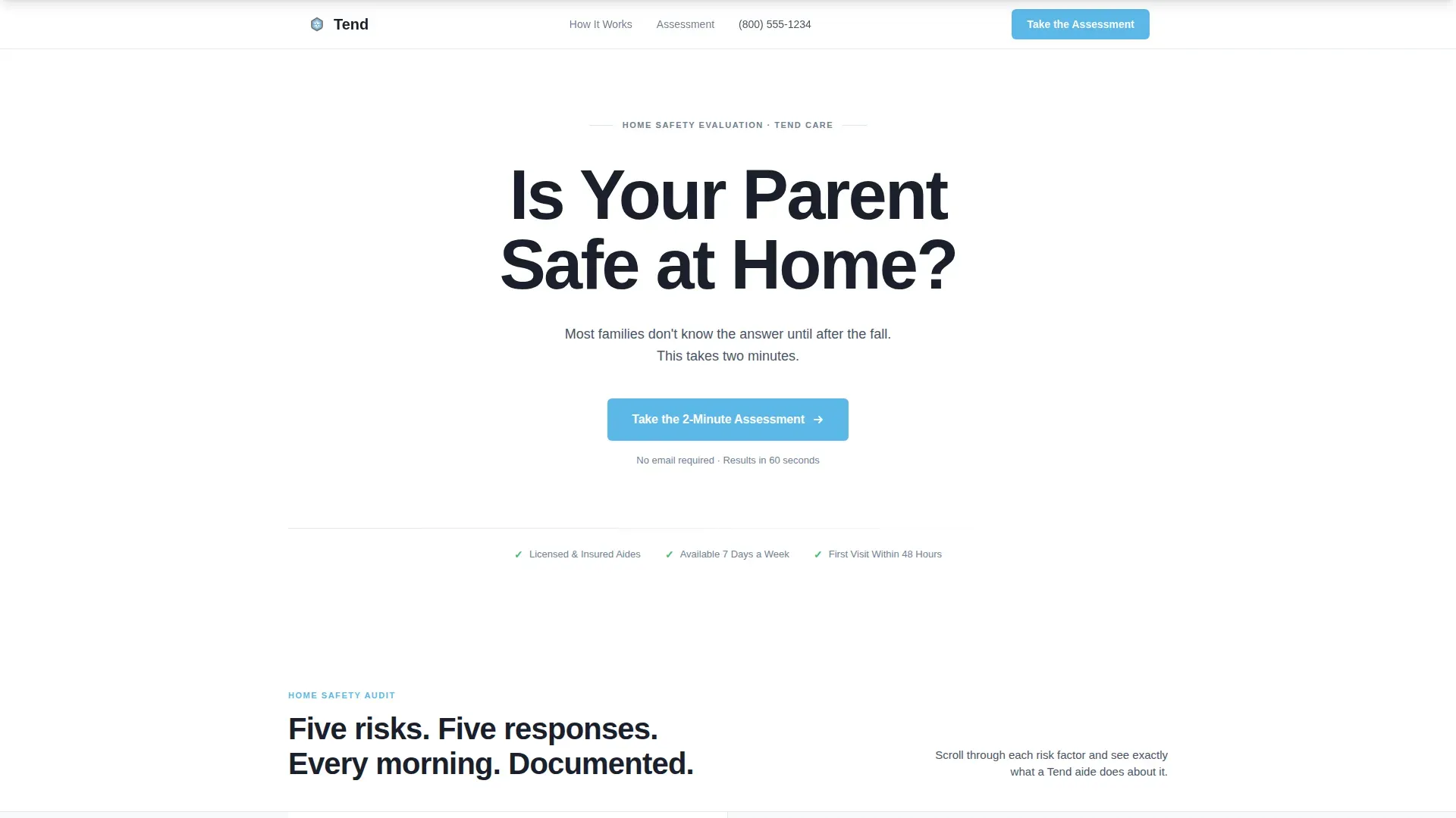
- A text-only hero section with a 80-pixel minimum headline and a single sky-blue call-to-action button
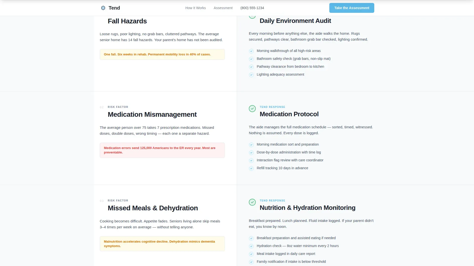
- A split-screen audit section pairing five home safety risk factors with specific aide responses and scroll-triggered checkmark animations
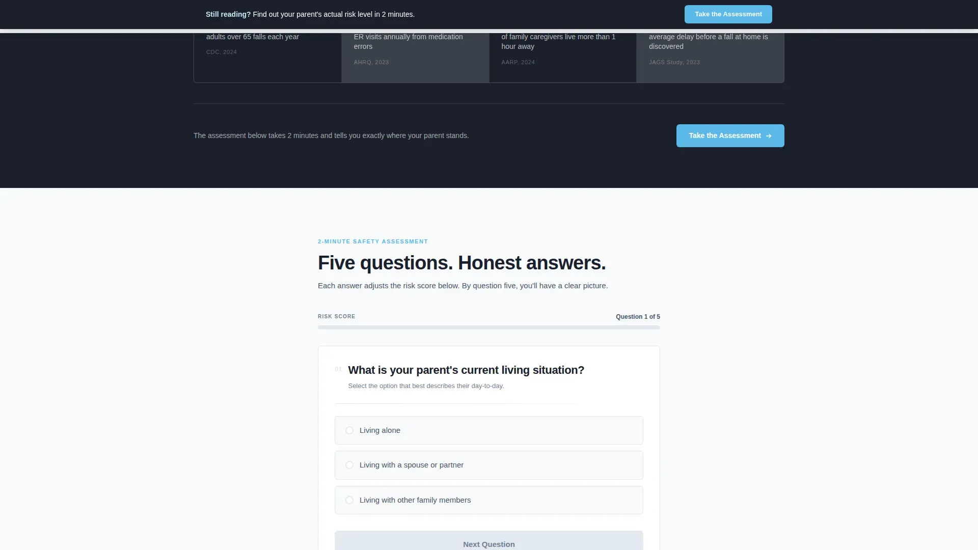
- A five-question progressive quiz with a live sky-blue risk score bar and personalized care recommendations
Feature list
This template includes the following built-in features and interactive elements.
Text-Only Hero with Centered Headline
The hero section strips away all imagery. The headline "Is Your Parent Safe at Home?" appears in DM Sans at 80 pixels minimum, charcoal on white, with a single sky-blue button beneath it. The emptiness functions as a design choice, making the question land before the visitor can scroll past it.
Split-Screen Checklist Audit
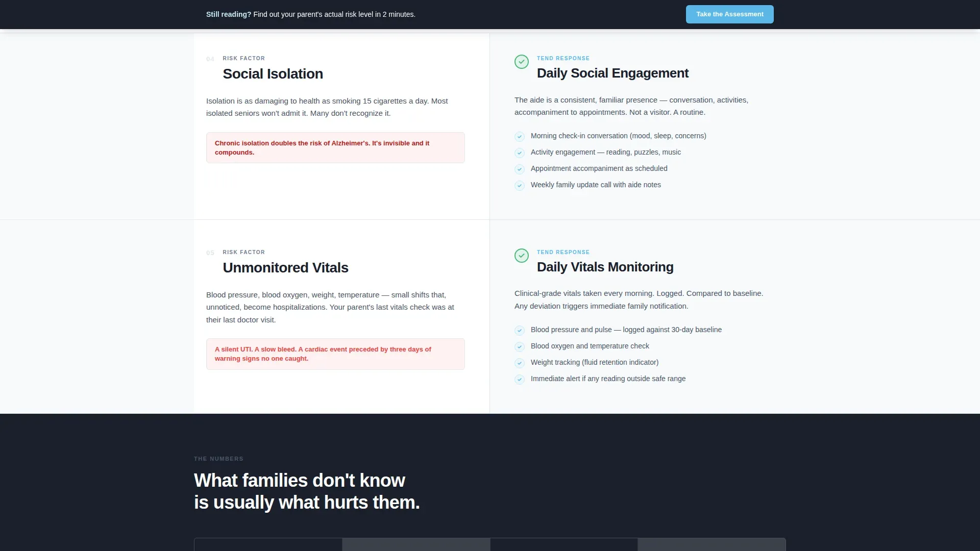
The core body section is a 50/50 split screen. The left column presents a home safety risk factor such as fall hazards, medication mismanagement, missed meals, isolation, or wandering. The right column shows how a trained aide addresses each item. Checkmark animations fire on scroll, creating a clinical audit feel with escalating stakes.
Sticky Assessment Bar
After the visitor scrolls past the third section, a sticky bar floats persistently at the top of the viewport. It repeats the primary call to action and keeps the quiz one tap away throughout the entire page scroll.
Five-Question Progressive Quiz
The quiz asks five questions in sequence: living situation, mobility level, current medication count, caregiver distance from the home, and whether there has been an emergency room visit in the last six months. Each answer adjusts a visible risk score displayed as a sky-blue progress bar.
Personalized Care Recommendation Result
After the final quiz answer, the template delivers one of three care recommendations: light check-ins, daily aide visits, or full-time support. The result screen includes a "Schedule a Free Care Plan Call" button and a phone number input field.
Risk Escalation Statistics Section
A dedicated statistics section uses clinical numbers to raise the stakes between the audit and the quiz. It functions as a bridge that moves the visitor from general awareness to personal urgency before they reach the assessment.
Page sections overview
| Section | Purpose |
|---|---|
| Hero Headline | Stops visitors with a direct safety question and a single call-to-action button |
| Split-Screen Audit | Pairs five risk factors with specific aide responses using scroll-triggered checkmarks |
| Sticky Assessment Bar | Floats after section three to keep the quiz call to action always visible |
| Risk Escalation Stats | Presents clinical numbers that raise the urgency level before the quiz |
| Quiz and Assessment | Five progressive questions with a live risk bar and personalized result output |
| Footer | Horizontal flow footer layout with contact and navigation elements |
Design & branding system
The visual identity follows a Medical Clarity theme. The palette feels like a freshly pressed set of scrubs against a bright morning window: sterile without being cold, and precise without feeling institutional.
- Headlines use deep charcoal (#1A202C) in DM Sans heavy weight; body text uses clinical slate gray (#4A5568) in Manrope for legibility
- Backgrounds use clean antiseptic white (#F7FAFC) throughout; soft sky blue (#87CEEB) highlights every interactive element including buttons and the quiz progress bar
- There is no stock photography anywhere on the page; the design relies entirely on typography, layout, and color to communicate trust and competence
Mobile & speed optimization
The template is built desktop-first, reflecting the primary user: an adult child at a laptop who just received a worrying call and is researching urgently. A solid mobile fallback is also included so the experience holds on any device.
- Static page sections are structured as server components for a fast initial load; the quiz logic runs as a client component to keep interactivity snappy without blocking the rest of the page
- Scroll-triggered animations and the staggered reveal system are set to medium intensity, balancing engagement with performance on standard connections
How this template helps you convert
Every section of this page earns the next action. The conversion architecture is deliberate and sequential, not decorative.
- The text-only headline creates immediate emotional impact without distracting imagery, making the visitor feel the weight of the question before they scroll
- The split-screen audit builds personal identification question by question, so by the time the quiz appears the visitor is already mentally scoring their parent's situation
- The quiz delivers a personalized result that makes the next step feel specific and low-risk, converting general anxiety into a scheduled care call
Other information about this template
This template is well-suited for home health aide agencies operating in the United States market. It is localized for English, USD pricing, and MM/DD/YYYY date formatting throughout.
- The social proof strategy focuses on outcome metrics and testimonial quotes from adult children rather than patients, which matches the target audience's frame of reference
- The footer uses a horizontal flow layout that keeps the page feeling organized and clinical rather than cluttered
- The template is designed for agencies that want a high-interactivity, assessment-led funnel without requiring a multi-page build
Theme
Medical Clarity
Creative direction
Checklist & Audit
Color system
Slate & Sky
Style
Split Screen (50/50)
Direction
Quiz/Assessment
Page Sections
Text-only Hero Headline
Split-screen Checklist Audit
Sticky Assessment Bar
Five-question Progressive Quiz
Personalized Care Recommendation
Risk Escalation Statistics Section
Related questions
Who is the primary visitor this landing page is designed for?
Does the quiz actually calculate a risk score?
Can I launch this template without sourcing any images?
What care recommendations does the quiz deliver?
Is this template built for desktop or mobile users?



