Tenure - Trusted Studenthousing Landing Page Template
Tenure is a landing page template built for student housing investment advisories. It combines an animated stats dashboard, a zigzag city explorer with hover-reveal data, and a five-question guided assessment quiz. The design uses a Dark Emerald color system to convey quiet authority, helping advisories turn curious visitors into booked strategy calls.
by Rocket studio
Quick summary
Tenure is a single-page investment advisory template for purpose-built student accommodation. It opens with a live stats dashboard, moves through an interactive city explorer, and closes with a guided quiz that delivers a personalised city shortlist. The visual identity draws on deep emerald, weathered stone, and mahogany to project old-money confidence with countryside calm.
Who this template is for
This template is designed for advisory firms that match private capital with purpose-built student housing opportunities. It speaks directly to investors who want credibility, clarity, and a clear next step.
- Mid-career professionals with Buy-to-Let equity or Individual Savings Account savings looking to diversify
- Retired couples seeking hands-off yield above six percent without active tenant management
- First-time property investors who want a bricks-and-mortar asset with a guided entry point
What problem this template solves
Most investment landing pages either overwhelm visitors with data or leave them with no clear path forward. Tenure fixes both problems. It presents market numbers with visual confidence, then uses interactive tools to move visitors from passive interest to active shortlisting.
- Generic advisory pages fail to personalise the pitch, so visitors leave without a next step
- Data-heavy layouts bury the opportunity instead of making it feel immediate and real
- Advisories lose qualified leads because the page never earns the meeting before asking for it
What you get with this template
Tenure is a fully structured landing page with three distinct functional layers built in. Each layer is designed to deepen engagement as the visitor scrolls further.
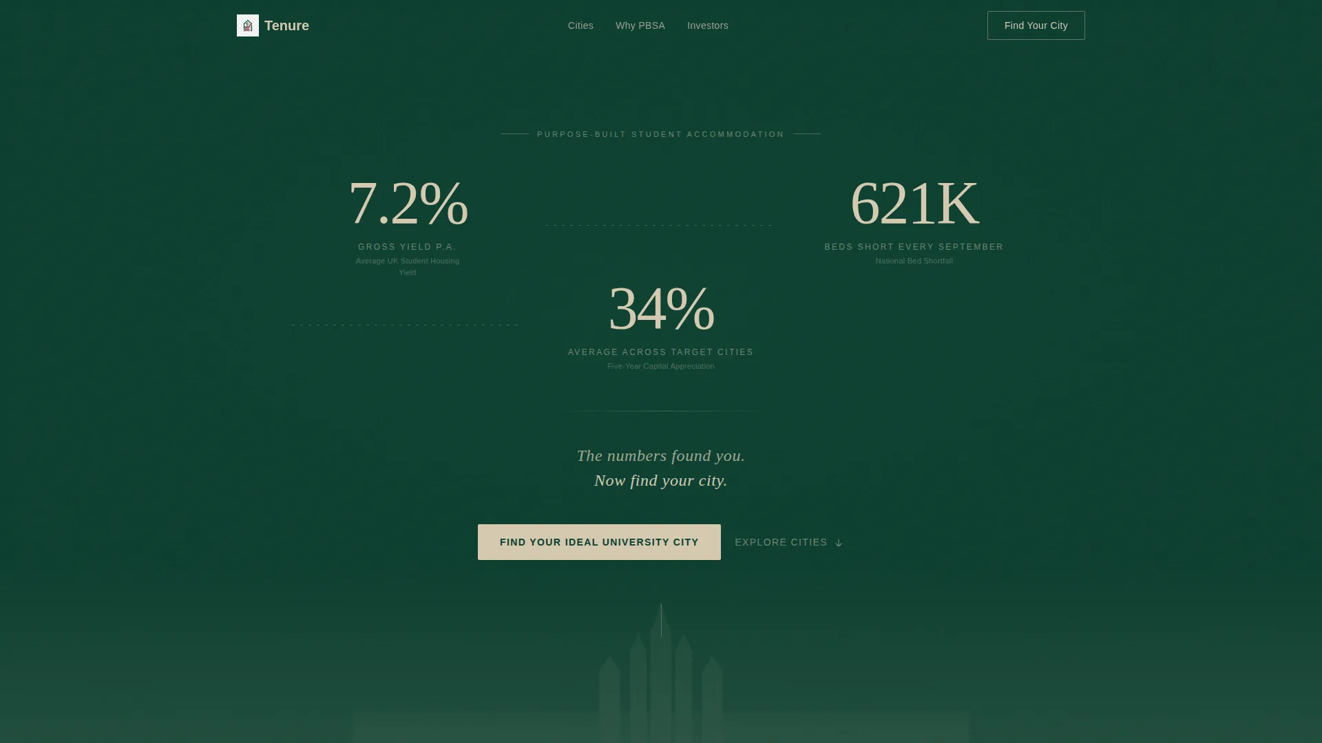
- An animated header dashboard with three live counters showing yield, bed shortfall, and capital appreciation figures
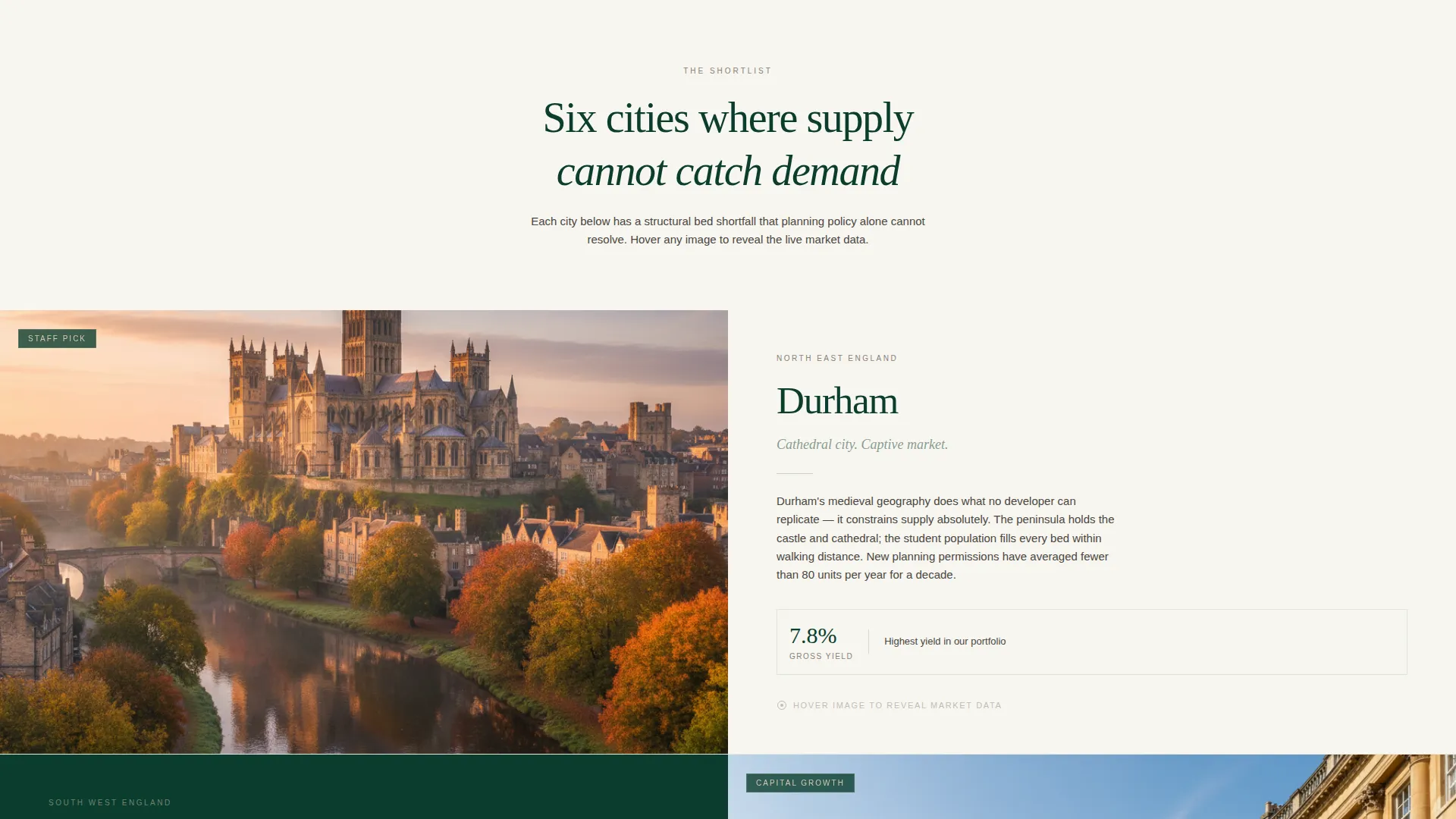
- A zigzag city explorer with hover-reveal panels showing occupancy rate, average rent, and student population growth per city
- A five-question guided assessment quiz that narrows to a personalised city shortlist and surfaces a strategy call prompt
Feature list
This template includes interactive components and a considered visual system. Every feature is grounded in the source brief and serves the advisory conversion journey.
Animated Stats Dashboard Header
Three counters animate upward as the page loads, displaying average UK student housing yield, national bed shortfall, and five-year capital appreciation. Numbers are rendered in a refined serif typeface at display scale. A faint dotted line connects all three figures like plot points on an investor's sketch.
Zigzag City Explorer Sections
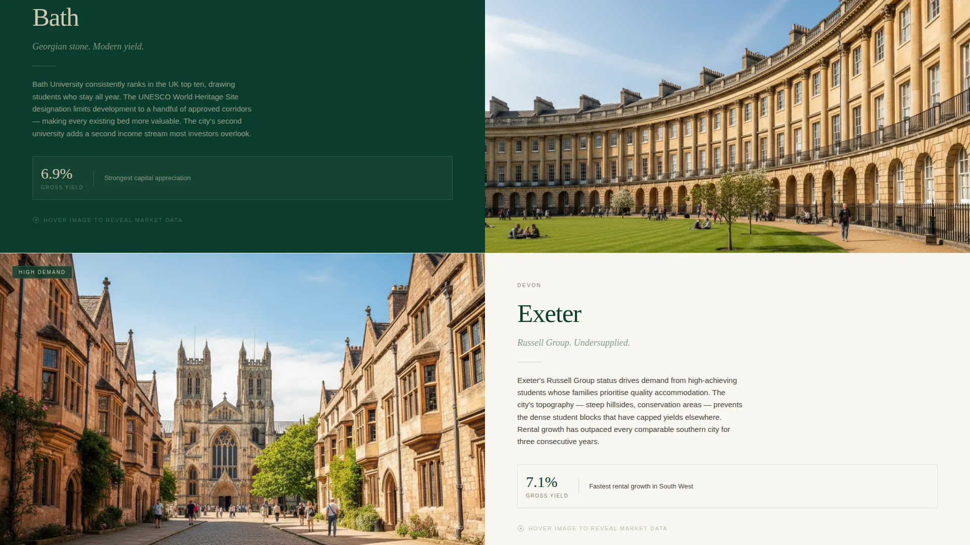
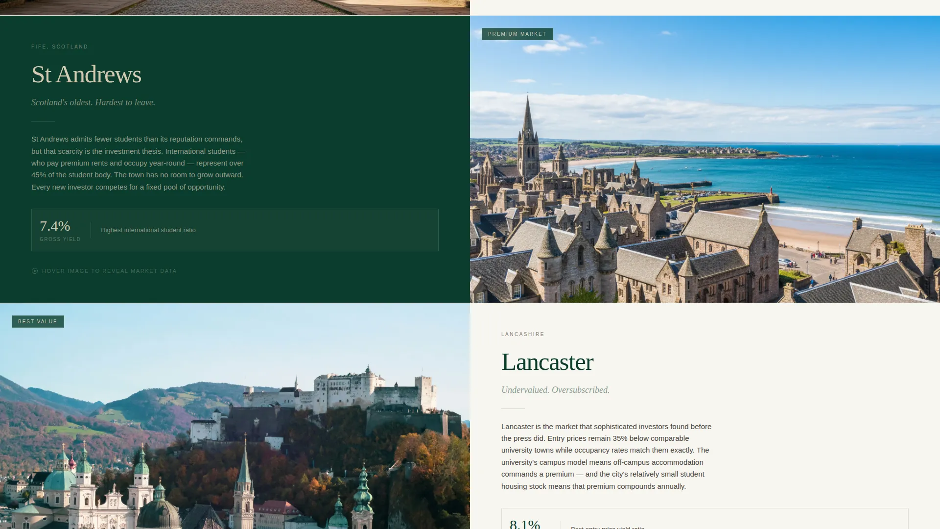
University cities are presented in alternating left-image, right-content and right-image, left-content layouts. Each city block contains a hover-reveal mini layer that surfaces occupancy rate, average rent, and student population growth without navigating away from the page.
Guided Investment Assessment Quiz
A five-question quiz opens from the primary call-to-action button. Questions cover investment budget range, preferred yield versus capital growth, management preference, investment timeline, and existing portfolio size. On completion, the quiz outputs a personalised city shortlist with a strategy call prompt beneath it.
Pastoral Calm Color System
The palette anchors every other alternating section in deep quad green, uses weathered stone and prospectus white for breathing space between sections, and reserves library mahogany exclusively for hover states and active interactive elements. The result reads like a leather-bound portfolio opened in a Georgian study.
Refined Serif Typography at Display Scale
Headline numerals and city names are set in a large serif typeface that evokes prospectus design and institutional trust. Body copy sits in a complementary weight that keeps the page readable without breaking the visual mood.
Scroll-Triggered Section Engagement
Each zigzag section is designed to build mental momentum as the visitor scrolls. Counter animations finish as the visitor's eye reaches each figure. City sections progressively reveal more detail, shifting the visitor's mindset from browsing to shortlisting.
Page sections overview
| Section | Purpose |
|---|---|
| Animated Stats Header | Opens with three live counters anchoring market credibility |
| Tagline call to action Strip | Delivers the line "The numbers found you. Now find your city." |
| City Explorer: City One | Left image, right content with hover-reveal data |
| City Explorer: City Two | Right image, left content with hover-reveal data |
| City Explorer: City Three | Left image, right content with hover-reveal data |
| Quiz Entry call to action | Prompts visitor to start the guided city assessment |
| Guided Assessment Quiz | Five-question flow narrowing to personalised city shortlist |
| Quiz Results Page | Displays city shortlist with strategy call booking button |
Design & branding system
The Tenure template uses a Pastoral Calm theme expressed through a Dark Emerald color system. Every color decision is deliberate: nothing competes with the data or the trust signal.
- Deep quad green (#0B3D2E) anchors alternating hero sections and the header dashboard
- Weathered stone (#D4C9B0) and prospectus white (#F7F5F0) provide open breathing space in between sections
- Library mahogany (#5C2018) appears only on hover states and active elements, functioning like a wax seal pressed at precisely the right moment
Mobile & speed optimization
The zigzag layout and hover interactions are structured to reflow cleanly on smaller screens. Interactive layers adapt so mobile visitors still experience the core data and quiz flow.
- Alternating city sections stack vertically on mobile without losing the left-right visual rhythm at desktop
- Hover-reveal panels on city cards translate to tap-to-reveal interactions on touch devices
- The quiz component is built as a linear step-by-step flow, which works naturally on any screen width
How this template helps you convert
Tenure is structured so that each section earns a little more trust before asking for anything in return. The conversion logic is layered, not rushed.
- The animated stats dashboard opens with hard market numbers, establishing authority before a single word of copy asks for attention
- The city explorer builds genuine engagement by making visitors feel they are shortlisting real opportunities, not reading a brochure
- The quiz earns the strategy call by proving the advisory already understands the visitor's situation before the meeting begins
Other information about this template
Tenure sits at the intersection of the Real Estate and Property category and the Student Housing Real Estate subcategory. It is a strong fit for advisory firms, boutique property consultancies, and student housing investment platforms that need a credible, lead-generating web presence.
- The template uses a Split Screen (50/50) style for its core alternating city sections, paired with an Immersive Visual creative direction
- The header concept follows a Full-Bleed Photo approach, giving the dashboard and opening visual maximum emotional impact
- The overall landing-page direction is Direct Sales, meaning every section has a defined role in moving the visitor toward a booked call
- This template is well suited to firms operating in the student housing appraisal service space, where credibility and personalisation matter equally
- The Pastoral Calm theme distinguishes the page from generic fintech-style property platforms, appealing to investors who value considered restraint over aggressive sales design
Theme
Pastoral Calm
Creative direction
Immersive Visual
Color system
Cloud Canvas
Style
Split Screen (50/50)
Direction
Direct Sales
Page Sections
Animated Stats Dashboard Header
Zigzag City Explorer with Hover Data
Five-question Guided Assessment Quiz
Pastoral Calm Dark Emerald Color System
Scroll-triggered Engagement Flow
Quiz Results and Strategy Call Call to Action
Related questions
Can I customise the university cities shown in the explorer?
How does the guided quiz work for visitors?
Is the Dark Emerald color system easy to adjust to my brand?
What type of investor does this landing page speak to?
Does the template include the results page for the quiz?



