Skills Training Landing page Template
This split-screen landing page template is built for technical skills training platforms that put learners inside live lab environments. It pairs a bold hero headline with a terminal animation, escalates through a story-driven scroll, and drives lead capture with a two-step progressive form. The design runs on a deep terminal-dark palette with electric indigo and cyan accents.
by Rocket studio
Quick summary
A high-intensity, desktop-first landing page template for technical skills training platforms. The layout opens with a 50/50 split screen, places a live terminal animation opposite a conversion headline, and walks visitors through a Hero's Journey scroll. Every section raises the stakes until the final before-and-after data wall makes the return on investment impossible to ignore.
Who this template is for
This template is designed for platforms that replace passive video learning with hands-on, production-grade lab environments. If your product puts learners inside real infrastructure challenges rather than recording someone else solving them, this layout fits your offer.
- Learning and development managers at mid-size tech companies who need to close skills gaps fast
- Team leads seeking to certify engineers or developers on a tight deadline
- Bootcamp graduates and career switchers ready to move from syntax knowledge to production-grade work
What problem this template solves
Most technical training pages look like every other software marketing page: generic screenshots, vague claims, and a single call to action buried near the footer. That mismatch kills trust with technical buyers who can smell inauthenticity instantly.
- Visitors cannot feel the difference between a passive course and a live lab from a static hero section
- L&D managers and team leads need proof of outcomes, not just feature lists, before they commit
- Bootcamp graduates and career switchers need reassurance that complexity is the point, not a barrier
What you get with this template
You get a fully structured, single-page lead generation layout built around a terminal-dark visual identity and a story-driven scroll. Every section is crafted to move a skeptical technical audience from curiosity to conversion.
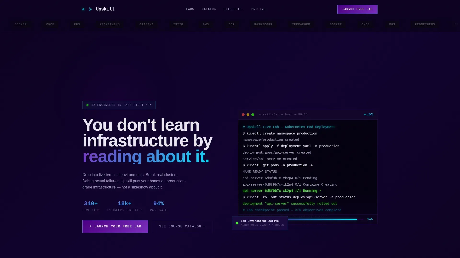
- A 50/50 split-screen hero with a bold headline on the left and a live-rendered terminal animation on the right
- A two-step progressive disclosure form that qualifies leads by role and skill interest before surfacing team-size options
- A sticky bottom call-to-action bar, a social proof flip section, and a before-and-after return-on-investment data wall
Feature list
This template is built around the following prompt-defined capabilities.
Split-Screen Hero with Terminal Animation
The hero divides the viewport evenly. The left side holds the primary headline and call to action. The right side renders a live terminal animation showing a Kubernetes pod deployment executing in real time, cursor blinking, green success messages cascading line by line. The contrast between the two halves makes the product's core value instantly legible.
Logo Bar with Hover Pulse
A horizontal scroll of recognizable employer and certification logos opens the page above the hero. Logos render in monochrome against the terminal-dark background and pulse into electric cyan on hover, grounding the platform's credibility before the visitor reads a single word.
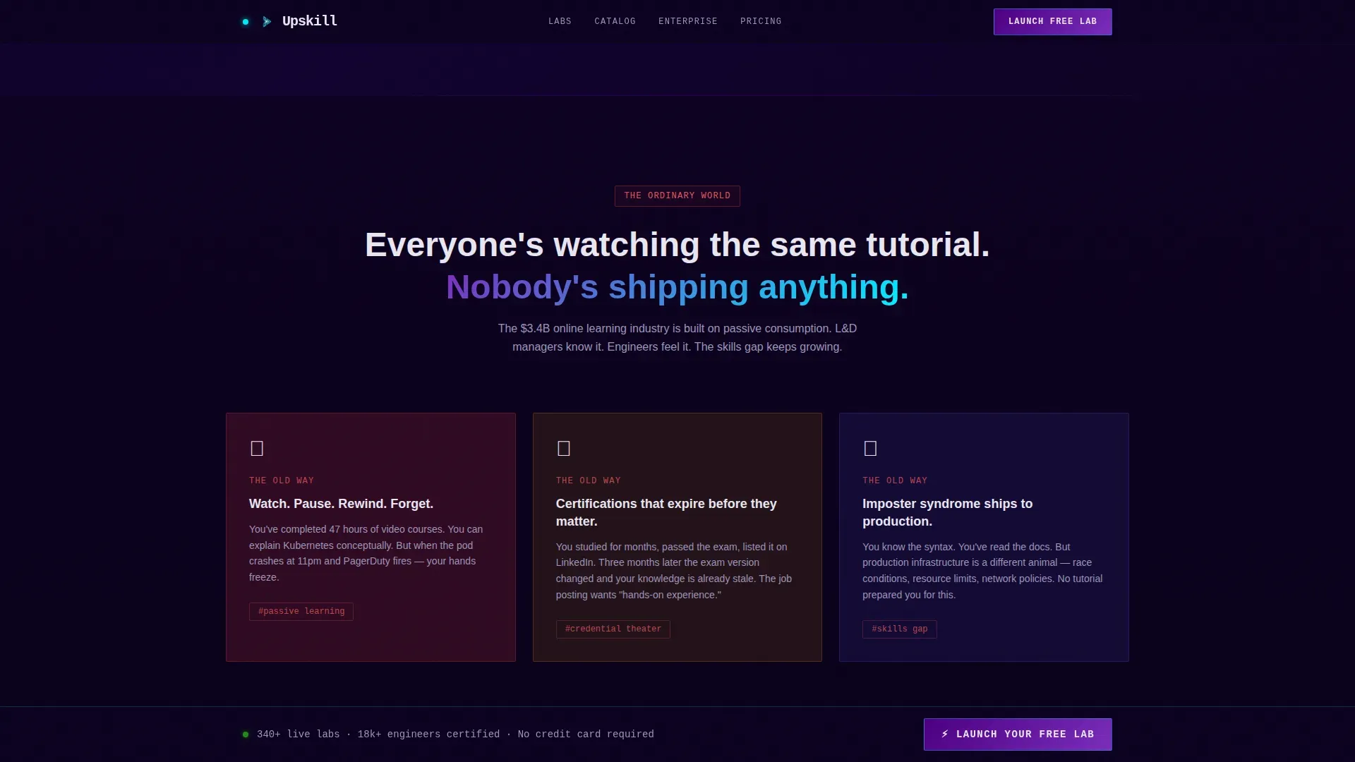
Hero's Journey Scroll Narrative
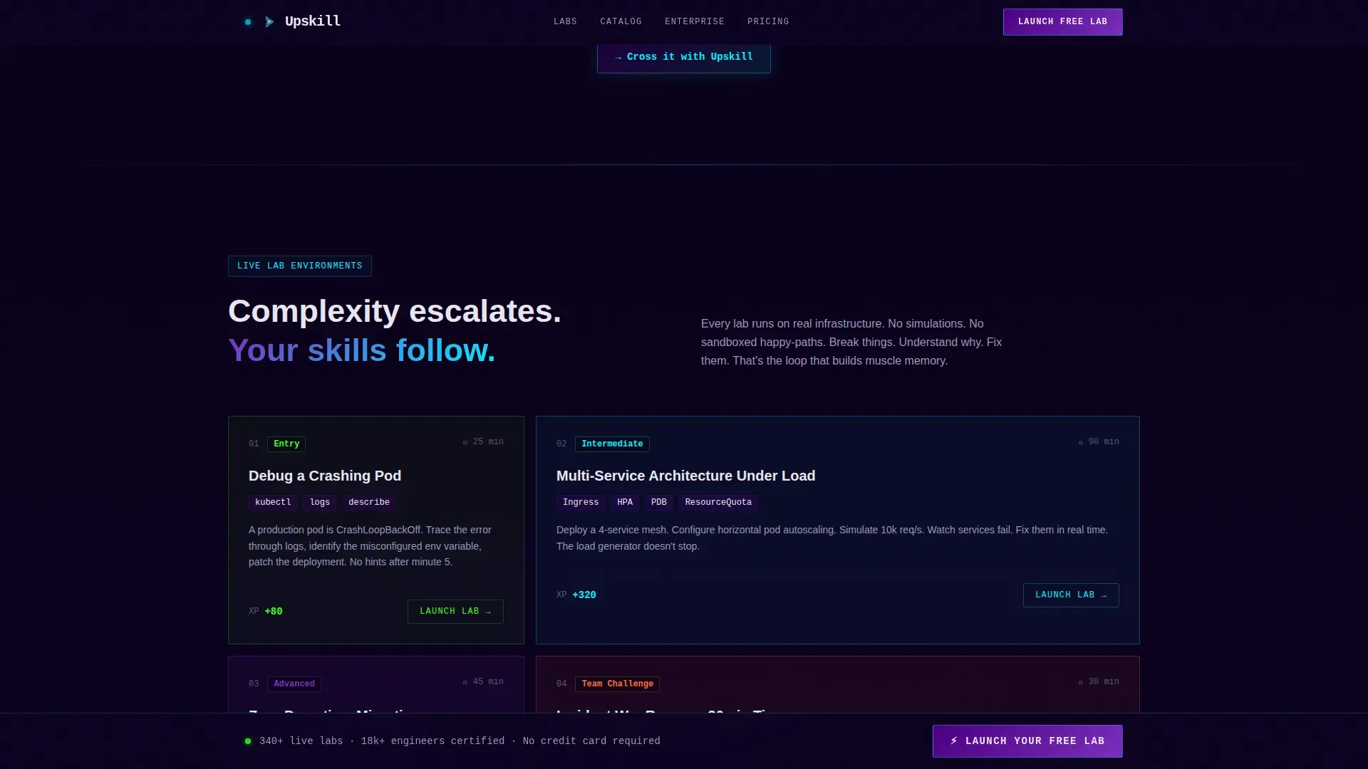
The page scroll follows a deliberate story arc. It opens at the "ordinary world" of stale video courses and expired certifications, then crosses a threshold into live labs. Each subsequent section escalates in complexity, moving from a single terminal exercise to a multi-service architecture challenge to a timed team scenario with real failure states.
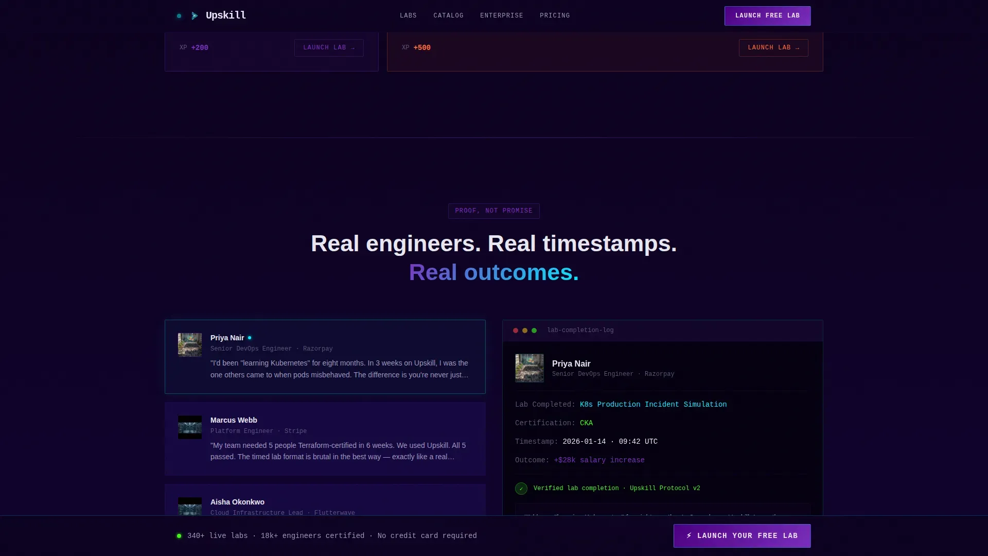
Social Proof Flip Section
At the narrative midpoint, the split-screen layout flips. Learner testimonials appear on the left. Actual lab completion timestamps and certification badges appear on the right. This pairing replaces promise with verifiable proof at the exact moment a visitor is deciding whether to trust the platform.
Two-Step Progressive Disclosure Form
The primary lead capture form opens with just two fields: work email and current role via dropdown. The second step reveals a skill-interest selector covering cloud, DevOps (Development and Operations), data, and security, along with a team-size toggle designed to surface enterprise leads automatically.
Before-and-After Return on Investment Data Wall
The final section of the page presents learner transformation data as a visual before-and-after wall. Salary increases, promotions, and role changes are displayed in a format that makes the return on investment concrete and visceral rather than aspirational.
Page sections overview
| Section | Purpose |
|---|---|
| Logo Bar | Establish credibility with employer and certification logos before the hero loads |
| Split-Screen Hero | Pair the primary headline and call to action with a live terminal animation |
| Pain Threshold Block | Contrast stale video learning with live labs to create narrative urgency |
| Lab Escalation Grid | Show a bento progression from single exercise to timed team challenge |
| Social Proof Flip | Place testimonials beside real lab timestamps to substitute proof for promise |
| Return on Investment Wall | Display before-and-after learner transformation data to make outcomes concrete |
| Sticky Call to Action Bar | Keep the primary conversion action visible throughout the entire scroll |
| Footer | Single-row linear footer with essential links |
Design & branding system
The visual identity runs on a code-editor aesthetic built around a deep terminal-dark background and electric accent colors. Every color that is not black is doing something functional, whether it is marking an interactive state, tracing a progress path, or confirming a success event.
- Background layers stay in the deep black to dark indigo range (#0D0221 to #1A0A3E), with body text rendered in cool white (#E8E6F0) for clean contrast
- Charged indigo (#4B0082) and live-wire violet (#7B2FBE) define card edges, button fills, and skill-path connectors, while electric cyan (#00F0FF) is reserved for hover glows, interactive states, and progress indicators
- Typography pairs JetBrains Mono for all terminal elements with Manrope for headings and body copy, keeping the code-editor feel precise without sacrificing readability
Mobile & speed optimization
The template is designed desktop-first around the split-screen layout, which requires sufficient horizontal space to function as intended. A mobile stack fallback is included so the experience remains usable on smaller screens.
- On mobile, the split-screen sections collapse into a single-column vertical stack, preserving section order and narrative flow
- High-animation elements including the terminal typewriter, SVG beam paths, and staggered scroll-linked reveals are built with GPU-accelerated transforms and Intersection Observer to manage rendering load
- The sticky call-to-action bar and two-step form remain fully functional on mobile, keeping lead capture accessible regardless of device
How this template helps you convert
This template is engineered around a single conversion goal: capturing qualified leads through the "Launch Your Free Lab" call to action. Every structural and design decision supports that goal.
- The primary call to action appears three times across the page, in the header, after the narrative midpoint, and in the sticky bottom bar, so it is always within reach without feeling aggressive
- The two-step progressive form reduces initial friction by asking only for email and role upfront, then qualifies lead intent in the second step before surfacing enterprise-level options
- A secondary path offering "See the Course Catalog" captures visitors who are not ready to commit, directing them into a browsing experience where engagement itself signals qualification
Other information about this template
This template belongs to the Directory and Discovery theme category and is optimized for Lead Generation as the primary landing-page direction. It is built for the Learning and Development Platform subcategory within the technical skills training niche.
- The creative direction follows a Hero's Journey narrative structure, which is well suited to audiences who have experienced the frustration of passive learning before finding a better path
- The Header concept is a Logo Bar, which is a strong fit for platforms whose credibility rests on recognizable employer partnerships and industry certification alignment
- The color system is Electric Indigo, a palette chosen specifically to evoke the focused intensity of a terminal environment rather than the generic blue-and-white of most enterprise software pages
- Content is localized for English-language audiences, formatted in United States dollars and United States date conventions, and suited to a B2B and B2C go-to-market motion
Theme
Directory & Discovery
Creative direction
Hero's Journey
Color system
Electric Indigo
Style
Split Screen (50/50)
Direction
Lead Generation
Page Sections
Split-screen Hero with Live Terminal
Logo Bar with Hover Pulse Effect
Hero's Journey Scroll Narrative
Social Proof Flip with Lab Timestamps
Two-step Progressive Disclosure Form
Return on Investment Data Wall
Related questions
Who is this landing page template designed for?
Can I update the terminal animation with my own lab content?
How does the two-step form reduce friction while still qualifying leads?
Is this template suited to a B2B audience?
What happens on mobile if the split-screen layout cannot render at full width?


