Restaurant Terms of Service Plain-Language Website Template
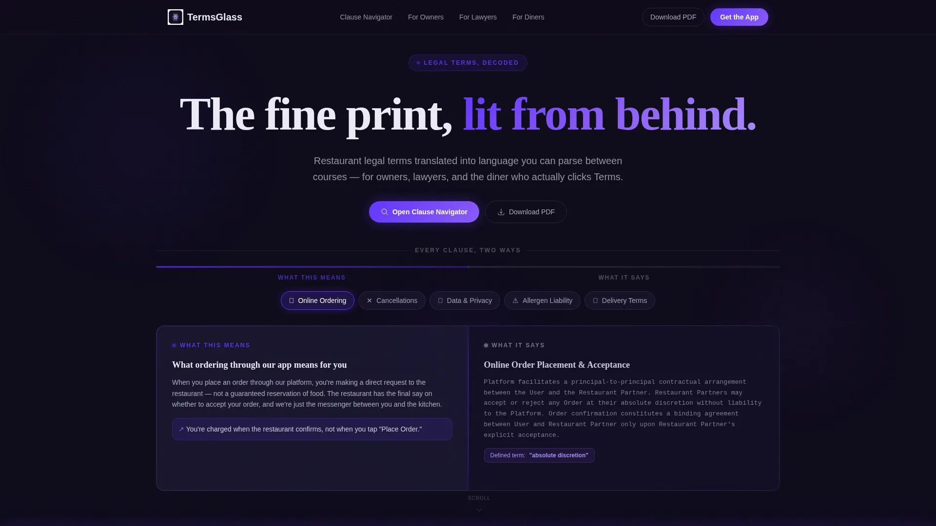
Termsglass is a single-page restaurant terms of service landing page built on a 50/50 split-screen layout. It pairs plain-English clause summaries with enforceable legal text side by side. An interactive clause navigator, frosted glass panels, and an Electric Indigo color system make complex restaurant policies feel clear, approachable, and professionally presented.
by Rocket studio
Quick summary
Termsglass is a single-page landing page that makes restaurant legal terms readable. A 50/50 split-screen layout places plain-language summaries on the left and formal legal text on the right. The Tech Glass visual theme and Electric Indigo palette give the page a polished, modern feel. An interactive clause navigator lets visitors explore topics before any scrolling is required.
Who this template is for
This template serves anyone who needs to present restaurant terms of service in a way that is both legally precise and genuinely readable.
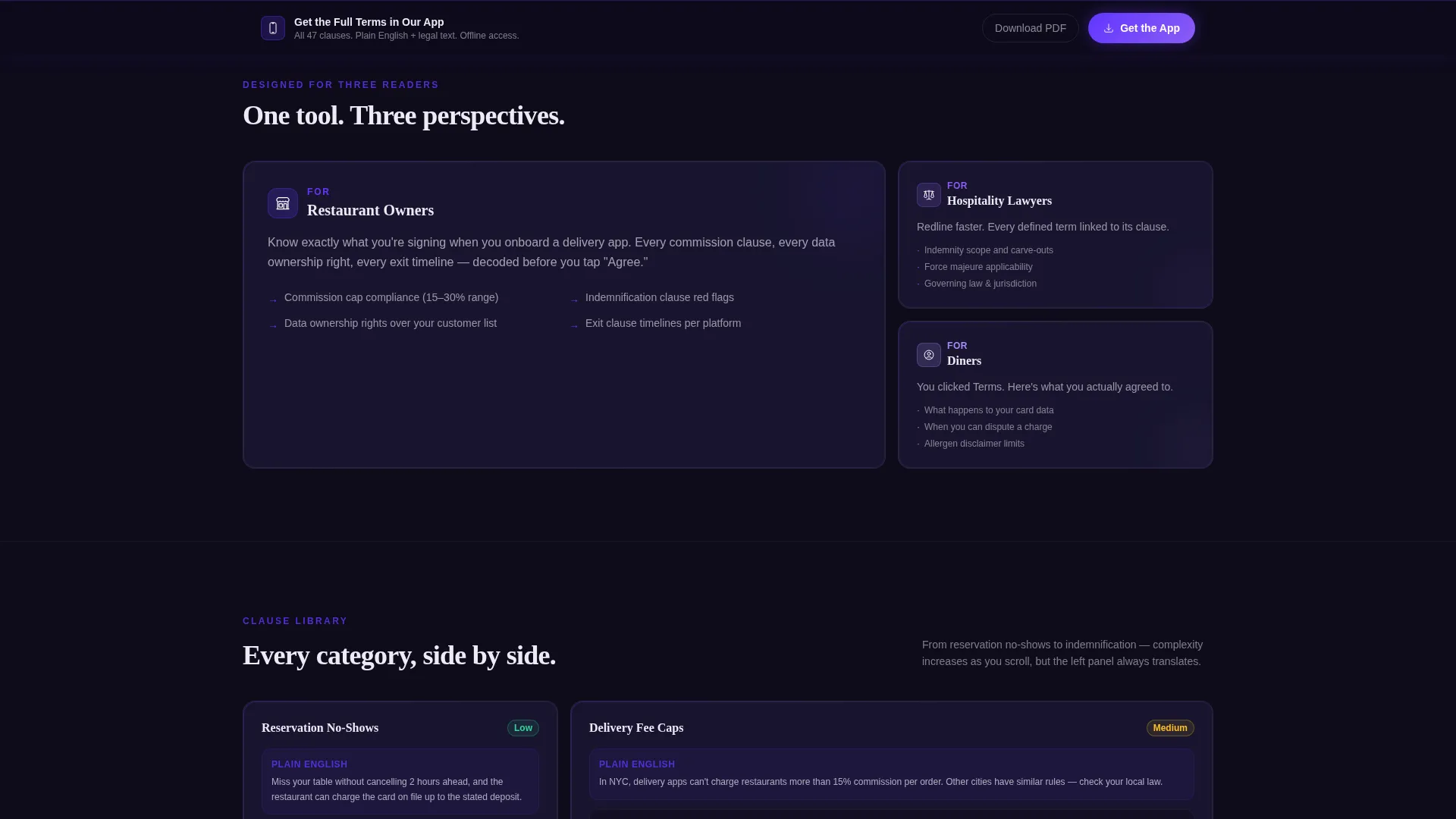
- Restaurant owners who integrate third-party delivery apps and need guests to understand ordering and cancellation policies
- Hospitality lawyers who review and redline indemnity clauses and need a clean, printable format
- Diners who read the fine print before entering payment details on a mobile ordering flow
What problem this template solves
Restaurant legal pages are almost always walls of unformatted text. Guests skip them. Lawyers struggle to share them with clients. Owners paste terms into generic page builders with no visual hierarchy at all.
- Guests cannot parse complex clauses like allergen disclaimers or reservation no-show policies without plain-language help
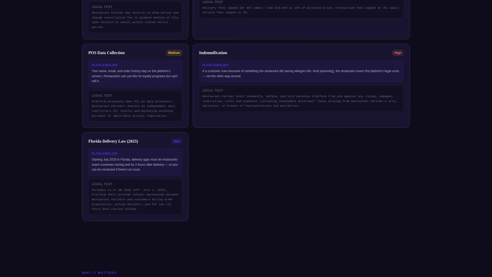
- Owners have no structured way to present data collection notices from point-of-sale systems alongside guest-facing explanations
- Lawyers need a shareable, downloadable version that still looks professional and is easy to navigate
What you get with this template
You get a fully designed single-page layout that handles the entire terms of service experience from first interaction to download.
- A 50/50 split-screen structure with frosted glass panels that display plain English on the left and legal text on the right
- An interactive clause navigator tool that lets visitors select topics such as ordering, cancellations, data privacy, allergen liability, and delivery terms before scrolling
- A sticky bottom bar with a primary call to action and a secondary PDF download path, both anchored to the bottom of the viewport
Feature list
This template delivers a focused set of purposeful components, each designed around the specific needs of restaurant legal communication.
Interactive Clause Navigator
A topic-selector tool sits above the fold so visitors interact immediately. Users choose a clause category and see a plain-language summary on the left panel paired with the enforceable legal text on the right. This proves the tool's value before the visitor scrolls a single pixel.
50/50 Split-Screen Panel Layout
Every section of the page follows the same dual-panel format. The left panel header reads "What This Means" and the right reads "What It Says." This consistent structure trains the reader's eye and removes ambiguity throughout every clause category.
Animated Dividing Line Pulse
A soft animated pulse travels along the vertical line between the two panels. The motion draws the eye downward and reinforces the connection between the plain-language summary and its legal counterpart without distracting from the text.
Sticky App Download Bar
A persistent bottom bar appears after the visitor has interacted with at least two clause categories. The primary call to action reads "Get the Full Terms in Our App." This sequenced reveal asks for commitment only after the template has demonstrated its value.
PDF Download Secondary Path
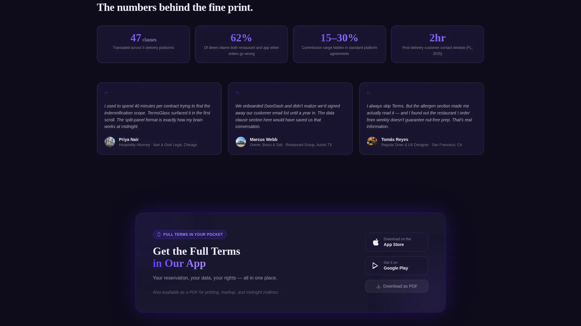
A secondary call to action labelled "Download as PDF" sits alongside the primary app prompt. This path serves hospitality lawyers and anyone who needs a printable, shareable version of the full terms without opening a mobile app.
Frosted Glass Panel System
All content surfaces use frosted glass-style panels at 85% opacity against a deep dark background. Indigo accents pulse on every defined legal term, functioning like hyperlinks to understanding and giving the page a precise, app-like visual texture.
Page sections overview
| Section | Purpose |
|---|---|
| Split-screen header | Introduces the dual-panel concept with two floating frosted panels side by side |
| Clause navigator tool | Lets visitors select a topic and see paired plain-English and legal text instantly |
| Ordering terms section | Covers online ordering policies in the split-screen format |
| Cancellation policies | Presents reservation no-show and cancellation rules with plain-language left panel |
| Data privacy section | Explains point-of-sale data collection in accessible language alongside formal text |
| Allergen liability section | Surfaces allergen disclaimers with a plain-English left panel for guest clarity |
| Delivery terms section | Addresses third-party delivery app terms in the established dual-panel format |
| Indemnification section | Handles the most complex clauses with the same left-translates, right-formalizes structure |
| App download panel | Frosted final panel with app store badges and the closing tagline |
| Sticky bottom bar | Persistent call-to-action bar anchored after two clause interactions |
Design & branding system
The visual identity is built around a Tech Glass theme driven entirely by an Electric Indigo color system. Every surface, interaction state, and typographic choice reinforces the feeling of a precision reservation app viewed on a dimly lit screen.
- Deep app-dark background (#0E0B1A), frosted panel surfaces at 85% opacity (#1A1730), electric indigo accent (#6236FF) on interactive states and defined-term highlights, and crisp interface white (#EDEAF5) for body text
- No stock photography and no restaurant imagery; the visual language treats legal text itself as the design element, lit from behind with indigo glow at panel edges
- The overall aesthetic is described in the brief as reading a menu printed on smoked glass: deliberate, precise, and faintly violet
Mobile & speed optimization
The layout is designed with a mobile ordering context in mind. Diners who tap "Terms" before entering a credit card on a mobile flow are a primary audience, so the template prioritizes a clean, touch-friendly experience.
- The sticky bottom bar is anchored to the viewport bottom and stays accessible on small screens without obscuring the clause content above
- The split-screen panels reflow cleanly for narrower viewports, keeping the paired plain-English and legal-text relationship intact for mobile readers
How this template helps you convert
Conversion here means getting a visitor to engage with the full terms, trust the brand behind them, and take the next step toward the app or a saved PDF copy.
- The clause navigator creates immediate, low-friction interaction before any scrolling, building trust by demonstrating transparency upfront rather than burying terms in a wall of text
- The sequenced sticky bar appears only after two clause interactions, so the call to action feels earned rather than intrusive, increasing the likelihood that a visitor acts on it
- The secondary PDF download path captures hospitality lawyers and detail-oriented users who would otherwise abandon a terms page without finding what they need
Other information about this template
This template is built specifically for the restaurant terms of service niche, where legal accuracy and guest-facing clarity must coexist in the same space.
- The template style is a 50/50 split screen, making it distinct from standard full-width legal page templates available in most marketplaces
- The closing tagline inside the final frosted panel reads: "Your reservation, your data, your rights, all in one place"
- The creative direction is Calculator/Tool First, meaning the interactive navigator is the lead experience rather than a supplementary feature
- The header concept is Dark Glass Panels, with two translucent frosted rectangles floating against the deep void background and glowing faintly at their edges
- The landing page direction is App Download, making the primary conversion goal driving app installs rather than a form submission or email capture
Theme
Tech Glass
Creative direction
Calculator/Tool First
Color system
Electric Indigo
Style
Split Screen (50/50)
Direction
App Download
Page Sections
Interactive Clause Navigator Tool
50/50 Split-screen Panel Layout
Animated Dividing Line
Sequenced Sticky Bottom Bar
PDF Download Secondary Path
Frosted Glass Panel System
Related questions
Who is this landing page template designed for?
Can I use this template to present allergen disclaimers and delivery terms?
Does the sticky call-to-action bar appear immediately on page load?
Is there an option for hospitality lawyers who need a printed copy?
Can the color system be changed to match a different restaurant brand?



