Luxe Outdoor Furniture Landing Page Template
Terrace is a masonry-style landing page template built for luxury outdoor furniture brands. A price-anchored hero, an asymmetric comparison grid, and contextual call-to-action buttons work together to close the gap between aspiration and affordability. The result is a page that feels like a curated editorial shoot rather than a standard product listing.
by Rocket studio
Quick summary
Terrace is a single-page landing page template designed for premium outdoor furniture brands. It opens with a bold price-anchored hero, then guides visitors through a masonry comparison grid that builds confidence card by card. Every design choice, from the Lavender Dream color palette to the brass-toned call-to-action buttons, is calibrated to make beautiful furniture feel attainable.
Who this template is for
This template is built for sellers and specifiers who need to earn trust quickly and convert browsers into buyers. It suits anyone whose products are worth the price but need the right visual context to prove it.
- Homeowners mid-renovation who are ready to furnish an empty deck or rooftop terrace
- Interior designers sourcing outdoor pieces that survive salt air and UV without losing visual elegance
- Boutique hoteliers furnishing rooftop lounges and pool terraces that need to photograph as well as they weather
What problem this template solves
Luxury outdoor furniture often loses online shoppers at the price tag before they understand the value. The gap between aspirational imagery and perceived affordability is where most potential buyers drop off. This template closes that gap by building the case visually before the visitor ever reaches a product page.
- Shoppers leave without converting because price appears before context is established
- Competitor comparisons are usually hidden in spec sheets rather than presented as a visual story
- Call-to-action placement on most templates is passive, appearing once and then disappearing
What you get with this template
This template delivers a fully structured, single-page layout with every section pre-built and ready to customize. The content architecture is deliberate, moving visitors from first impression to click-through in a logical, unhurried sequence.
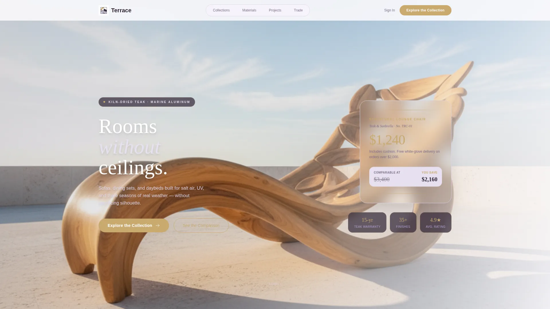
- A price-anchored hero section with an off-center lifestyle composition and gallery-style price display
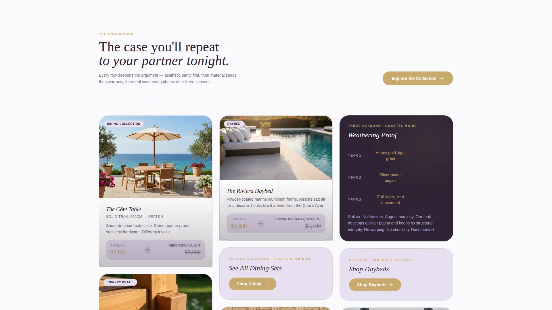
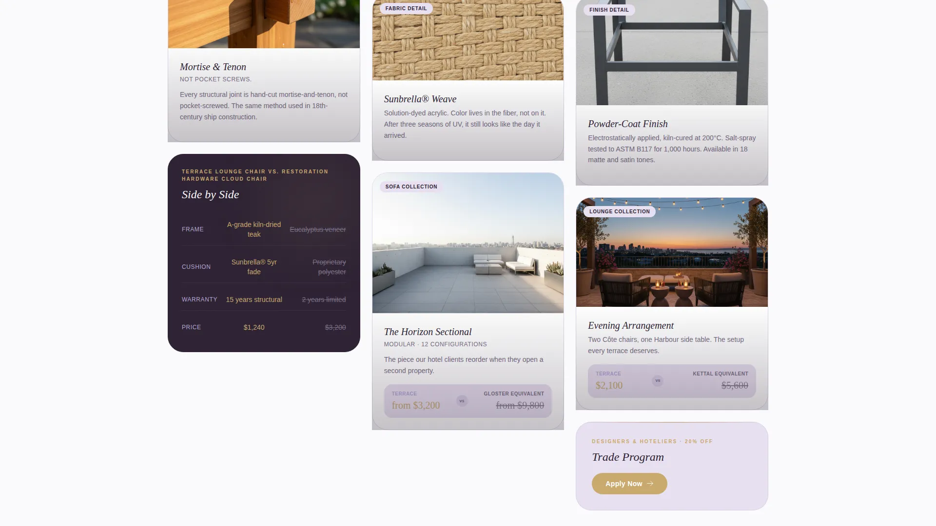
- An asymmetric masonry comparison grid with alternating lifestyle shots and close-up material detail cards
- Recurring contextual call-to-action buttons that resurface every third card with collection-specific labels
Feature list
This template includes purpose-built layout components that work together as a complete persuasion system. Each feature below is drawn directly from the template's design and structure.
Price-Anchored Hero Section
The hero places a single sculptural product image on a whitewashed terrace background. The retail price sits in the negative space beside the chair in large brass-toned type, no qualifiers, no asterisks. A brass pill button labeled "Explore the Collection" appears directly below the price.
Asymmetric Masonry Comparison Grid
The scrollable grid alternates between wide lifestyle photography and tight detail cards. Each row pairs a brand piece against a visually similar competitor at two to three times the price. The sequence moves from aesthetic parity to material specifications, then to warranty length, then to real weathering photography after three seasons of use.
Contextual Recurring Call-to-Action Buttons
The primary call-to-action button reappears on every third masonry card with a label tailored to the surrounding content, such as "See All Dining Sets" or "Shop Daybeds." This keeps the invitation to browse present throughout the scroll without interrupting the comparison narrative.
Lavender Dream Color System
Soft French lavender washes are used for section backgrounds and hover states. Pale wisteria fills card backgrounds. Deep plum-charcoal anchors headline type and navigation. Antique brass highlights buttons, price tags, and accent rules. The palette reads as relaxed luxury with clear material warmth.
Gallery-Style Detail Cards
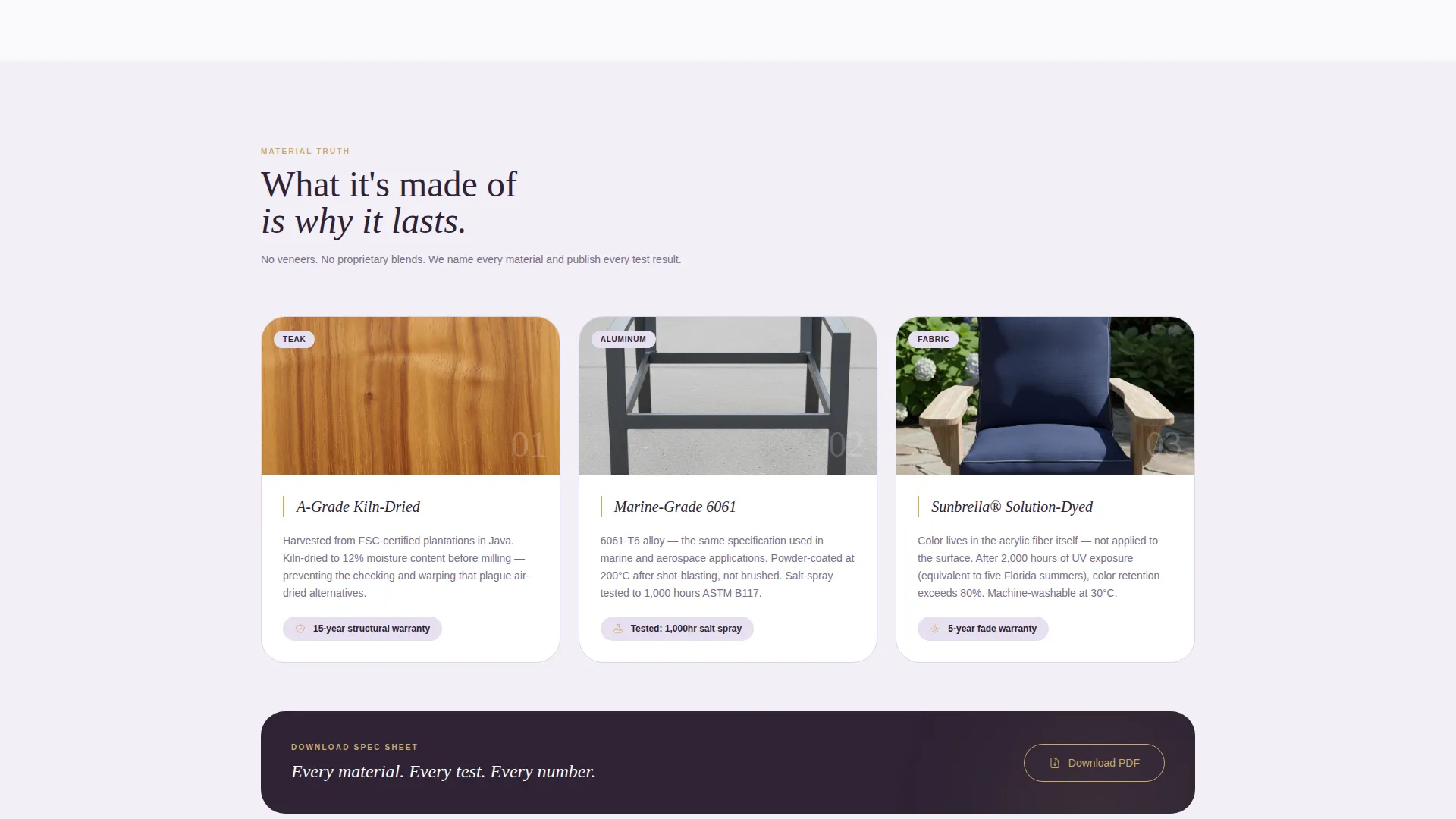
Close-up cards present joinery, fabric weave, and powder-coat finish side by side with a competitor's equivalent. These cards function as visual proof points rather than simple product thumbnails, giving technically minded buyers the specifics they need without a separate comparison page.
Page sections overview
| Section | Purpose |
|---|---|
| Price-Anchored Hero | Opens with a product image and retail price displayed gallery-style, with a primary call-to-action button |
| Masonry Comparison Grid | Scrollable asymmetric grid pairing brand pieces against higher-priced competitors across aesthetics, materials, warranty, and weathering |
| Lifestyle Scene Cards | Wide-format photography showing full outdoor scenes to establish atmosphere and aspiration |
| Material Detail Cards | Close-up shots of joinery, fabric weave, and finish placed alongside competitor equivalents |
| Contextual call to action Cards | Every third grid card carries a collection-specific call-to-action button to maintain browse momentum |
Design & branding system
The visual identity follows a Luxe Minimal theme built around the Lavender Dream color system. Every color and typographic choice reinforces the feeling of relaxed, material-grounded luxury rather than cold high-fashion distance.
- Soft French lavender (#B4A7D6) for section washes and hover states; pale wisteria (#E8E0F0) for card backgrounds; deep plum-charcoal (#2D2233) for headline type and navigation
- Antique brass (#C9A96E) applied consistently to buttons, price tags, and accent rules to unify the premium feel
- Off-center hero composition with long afternoon shadow, gallery-style price placement, and asymmetric grid rhythm throughout
Mobile & speed optimization
The masonry grid and large lifestyle images are structured to present well across screen sizes. The layout adapts the asymmetric rhythm so that detail and lifestyle cards remain readable on smaller viewports without losing the editorial feel.
- Masonry grid reflows across viewport widths while preserving the alternating card-size rhythm
- Brass-toned pill buttons remain tap-friendly at mobile scale and retain their label specificity on smaller screens
How this template helps you convert
The page is structured as a sequential persuasion journey rather than a static product listing. Each section builds on the last so that by the time a visitor reaches a call-to-action button, the value case is already made.
- The price-anchored hero reframes the price as a statement of confidence rather than a barrier, collapsing sticker shock before it forms.
- The masonry comparison grid deepens value perception row by row, moving from visual appeal to material quality to long-term durability, so visitors arrive at the call-to-action with the comparison already complete in their minds.
Other information about this template
This template is categorized under Retail and E-Commerce, specifically within the Home and Furniture Store segment. It is designed to suit the luxe outdoor furniture niche and adapts well to brands selling teak furniture, marine-grade aluminum outdoor pieces, and weather-resistant seating collections.
- The Gallery and Detail template style means the layout balances editorial imagery with close-up product specifics in one continuous scroll
- The single-page landing page format means there are no sub-pages to maintain; the entire brand argument lives in one structured flow
- This template is well suited to brands whose catalog includes outdoor sofas, dining sets, and daybeds positioned as investment-grade outdoor furnishings
Theme
Neo-Retro
Creative direction
Unboxing Experience
Color system
Ink & Paper
Style
Gallery + Detail
Direction
Marketplace/Multi
Page Sections
Price-anchored Hero Section
Asymmetric Masonry Comparison Grid
Contextual Recurring Call to Action Buttons
Lavender Dream Color System
Gallery-style Material Detail Cards
Related questions
Can I change the colors to match my existing brand palette?
Does the masonry grid support both lifestyle photos and close-up detail shots?
Is this template suitable for a boutique hotel furnishing a rooftop lounge?
How does the call-to-action system work across the page?
What product types work best with this template layout?



