Mediterranean Architecture Pre-Launch Website Template
Terroir is a full-width editorial landing page built for a boutique Mediterranean property practice. It guides capital-ready second-home buyers through sensory prose, asymmetric layouts, and an atmosphere-first scroll before presenting a minimal waitlist form. The design uses a cream, black, and terracotta palette to feel like a printed property journal rather than a real estate portal.
by Rocket studio
Quick summary
Terroir is a single-page editorial template for an off-market Mediterranean property specialist. It builds desire through atmosphere and restrained visual storytelling before asking for a waitlist signup. The page reads like a linen-bound journal and converts by earning taste before asking for trust.
Who this template is for
This template is built for boutique property practices that sell through reputation rather than portals. It suits operators who trade in off-market Mediterranean estates and whose clients arrive with capital already in hand.
- Real estate specialists focused on luxury second-home markets in Mallorca, Provence, Puglia, or the Aegean
- Boutique agencies launching a waitlist or "coming soon" presence before a formal opening
- Property advisors whose audience responds to editorial taste rather than listing grids
What problem this template solves
Most real estate landing pages lead with listings, filters, and price ranges. That approach alienates buyers who are already wealthy and deeply taste-led. Terroir removes the portal logic entirely and replaces it with atmosphere, provenance, and scarcity.
- Buyers from London, Zürich, and New York do not need a search bar; they need a reason to trust you
- A generic agency page cannot communicate the whisper-network access that makes a boutique practice worth contacting
- A waitlist with forty places and a seasonal launch date creates urgency without hard-sell language
What you get with this template
You get a fully structured single-page layout that moves through five editorial sections and ends with a waitlist form. Every section is designed to deepen atmosphere before presenting the call to action.
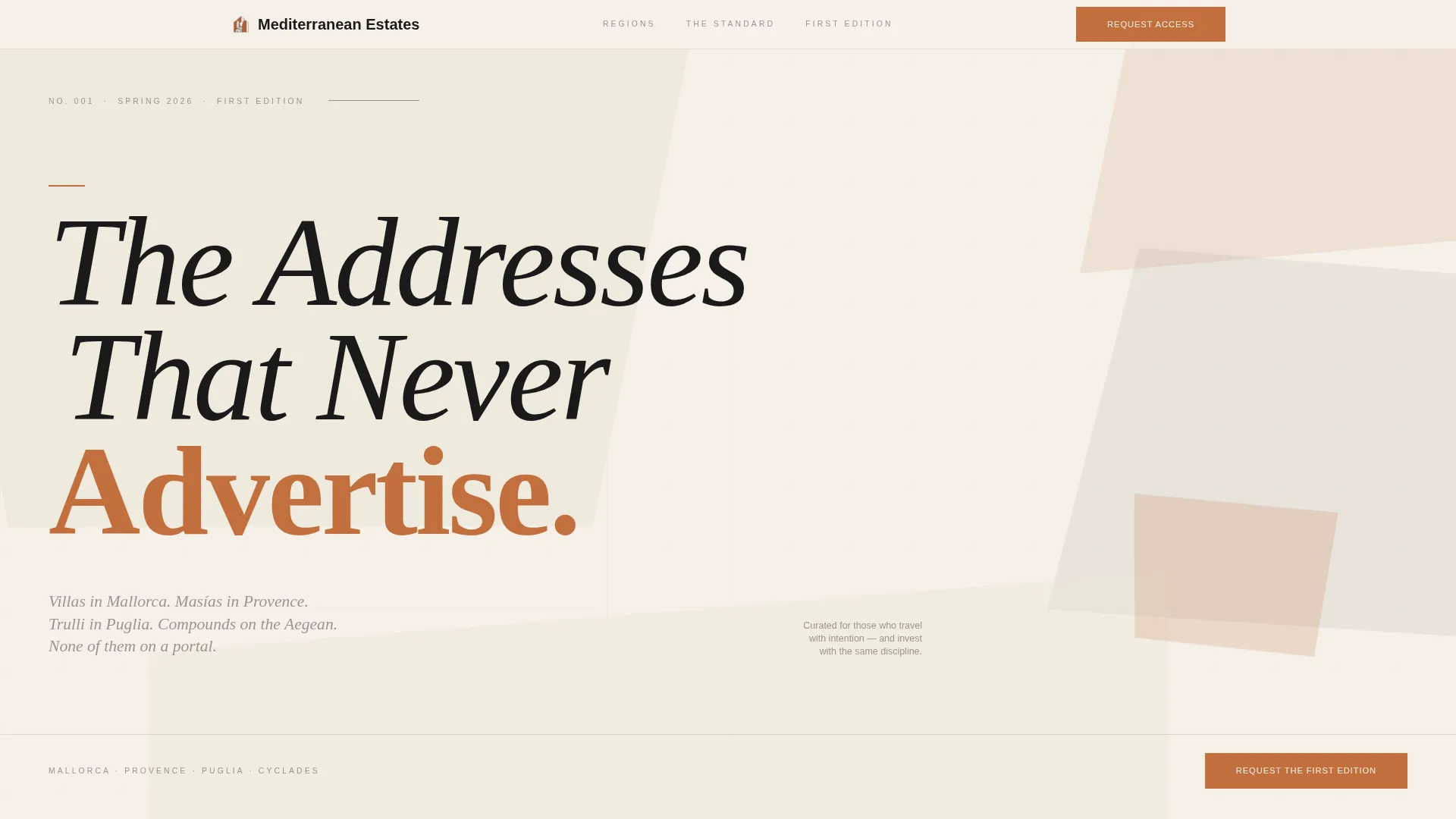
- A hero section with abstract geometric composition, a high-contrast serif headline, and a terracotta accent rule
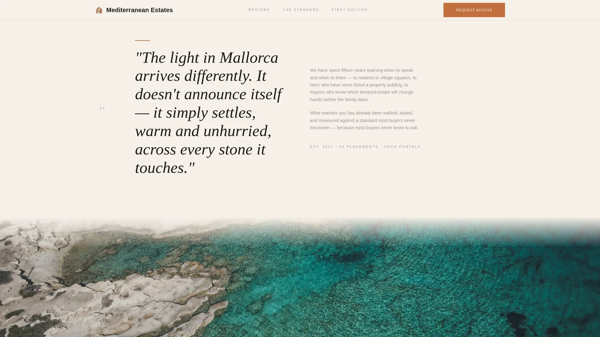
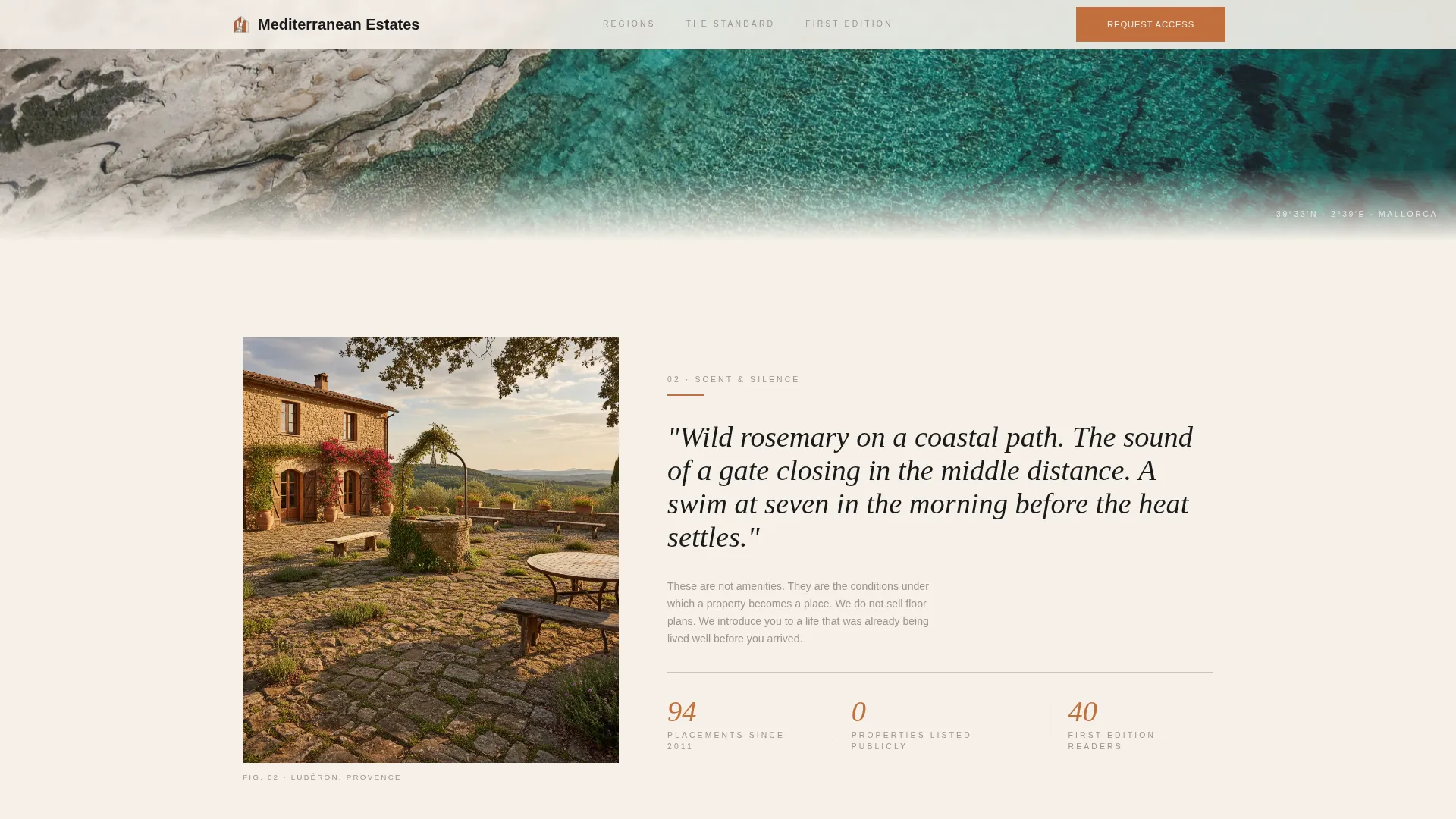
- Sensory atmosphere chapters with scroll-linked prose, parallax imagery, and coordinate-stamped full-bleed photographs
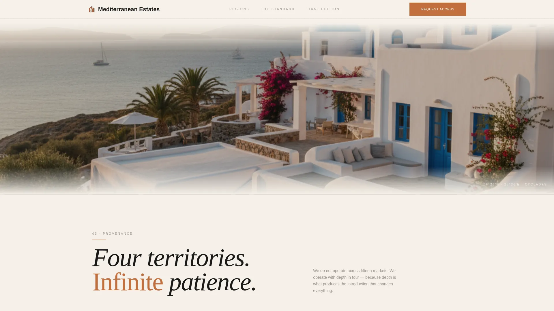
- A provenance section presenting the property types you trade in, styled as an editorial grid rather than a listing
- Journal-style testimonials in an asymmetric layout, styled as handwritten client entries
- A waitlist form asking only for first name, email, and a regional preference dropdown, with a scarcity line beneath the button
Feature list
This section covers the five core capabilities built into the Terroir template.
Abstract Geometric Hero Section
The hero fills the full viewport with intersecting planes of cream, black, and terracotta. The shapes suggest Mediterranean rooflines and coastal contours without depicting literal property. A high-contrast serif headline sits off-center, anchored by a thin rule and a seasonal dateline.
Atmosphere and Mood Scroll Chapters
The page unfolds through sensory prose sections rather than feature lists. Each chapter shifts the reader from information to feeling, using slow parallax on full-bleed images and staggered text entrances timed to scroll position.
Editorial Provenance Grid
The provenance section presents the property types the practice trades in, including Mallorca villas, Provence masías, Puglia trulli, and Aegean compounds. The layout uses an editorial grid format, not a property listing format.
Journal-Style Testimonials
Client voices appear in an asymmetric layout styled as handwritten journal entries. Coordinate-style location stamps replace standard attribution lines, reinforcing the geographic specificity of the practice.
Waitlist Form with Regional Dropdown
The "Request the First Edition" form collects a first name, an email address, and a single dropdown asking "Where are you drawn to?" Region options include Costa Brava, Côte d'Azur, Puglia, the Cyclades, and Surprise Me. A scarcity line beneath the button reads "Launching Spring, forty readers only."
Page sections overview
| Section | Purpose |
|---|---|
| Hero composition | Sets editorial tone and introduces the headline with a terracotta accent rule and seasonal dateline |
| Atmosphere chapters | Draws readers into a sensory experience through prose, slow parallax, and coordinate-stamped imagery |
| Provenance editorial grid | Presents the Mediterranean property types the practice trades in, styled as a curated journal spread |
| Client voices | Builds trust through asymmetric, journal-style testimonials with location stamps |
| Waitlist form | Converts engaged readers with a minimal three-field form and a scarcity-framed call to action |
| Footer | Closes with a minimal horizontal layout on cream background |
Design & branding system
The visual identity follows an Ink and Paper color system built around a cream-dominant palette. Typography is set in a high-contrast display serif for headlines and a clean sans-serif for body text and captions, creating a tension between weight and delicacy.
- Cream (#F5F0E8) covers every background surface; black (#1A1A1A) appears only in large architectural display type; pencil-sketch gray (#9B9590) handles body text and fine rules
- Terracotta (#C2703E) is reserved for interactive moments, hover states, and the waitlist button, appearing sparingly like a wax stamp
- Fraunces is used for display headlines; DM Sans handles body copy and captions throughout
Mobile & speed optimization
The template is designed desktop-first to match how the target audience browses, with graceful adaptation for smaller screens. Layout proportions shift without sacrificing the editorial weight of the typography.
- Scroll-linked animations and parallax effects are handled by a single Client Component to keep the rest of the page using static server rendering
- Full-bleed imagery, staggered text entrances, and large pull quotes reflow naturally at narrower breakpoints
How this template helps you convert
Terroir converts by building desire across the full scroll before presenting any form. By the time the visitor reaches the waitlist section, they are not evaluating a service; they are imagining the terrace.
- The atmosphere-first structure earns trust through taste, so the waitlist ask feels natural rather than transactional
- The minimal three-field form and the regional dropdown lower friction while signaling that this is a curated, personal process
- The scarcity line "Launching Spring, forty readers only" creates urgency without desperation, reinforcing the exclusive positioning established through the rest of the page
Other information about this template
Terroir sits in the Architecture and Design category under the Mediterranean Architecture subcategory. It is built as a full-width immersive layout following an Editorial Magazine theme. The creative direction is Atmosphere and Mood, the header concept is Abstract Geometric, and the page direction is Waitlist and Coming Soon.
- The template targets a niche of Mediterranean realtor specialists operating in the luxury second-home market
- Localization defaults to English with European place names and a Spring 2026 seasonal dating convention
- The footer uses a minimal Horizontal Flow pattern on the cream background
Theme
Editorial Magazine
Creative direction
Atmosphere & Mood
Color system
Ink & Paper
Style
Full-Width Immersive
Direction
Waitlist/Coming Soon
Page Sections
Abstract Geometric Hero Composition
Atmosphere and Mood Scroll Chapters
Editorial Provenance Grid
Journal-style Client Testimonials
Minimal Waitlist Form
Related questions
Can I change the regional options in the waitlist dropdown?
Is this template suitable for a practice that already has active listings?
How does the scarcity line beneath the waitlist button work?
Does the page work well on mobile devices?
Can I update the editorial headline and dateline in the hero section?



