Confidential STD Testing Landing Page Template
Tested is a warm, judgment-free STD testing clinic landing page built around a Problem→Solution zigzag layout. It guides hesitant visitors through three emotional barriers, then moves them to book a confidential visit or order a home kit. The design uses an Organic Flow visual identity with a calm Slate and Sky palette, minimal booking friction, and a mobile-first structure.
by Rocket studio
Quick summary
Tested is a single-page booking experience for an STD testing clinic. It uses a zigzag alternating layout to walk visitors through real anxieties, then dissolve each one with a practical answer. The result is a page where hesitation softens section by section and the "Book a Confidential Visit" call to action feels like the natural next step.
Who this template is for
This template is built for sexual health clinics, direct-to-consumer testing services, and urgent care operators who want to lower the emotional barrier to booking. It is designed for teams that know their audience is reluctant, not uninformed.
- Clinics offering confidential, walk-in, or appointment-based STD testing
- Healthcare operators targeting adults re-entering dating, couples planning a family, or college-aged patients with limited local access
- Service providers who want a clean booking flow without insurance fields or symptom disclosures upfront
What problem this template solves
Most medical landing pages treat the visitor as a patient filling out paperwork. This one treats them as a person who needed courage just to open the tab. The template is built to reduce emotional friction before it asks for anything.
- Visitors avoid testing because of shame, confusion about what to test for, or fear of being judged by staff
- Generic clinic pages offer no reassurance before the form, so visitors leave without booking
- The zigzag layout here pairs each specific fear with a specific, calm answer so resistance dissolves progressively
What you get with this template
You get a fully structured single-page layout with six purposeful sections, a sticky booking bar, and two distinct conversion paths. Every design decision in the template exists to move a reluctant visitor toward action without pressure.
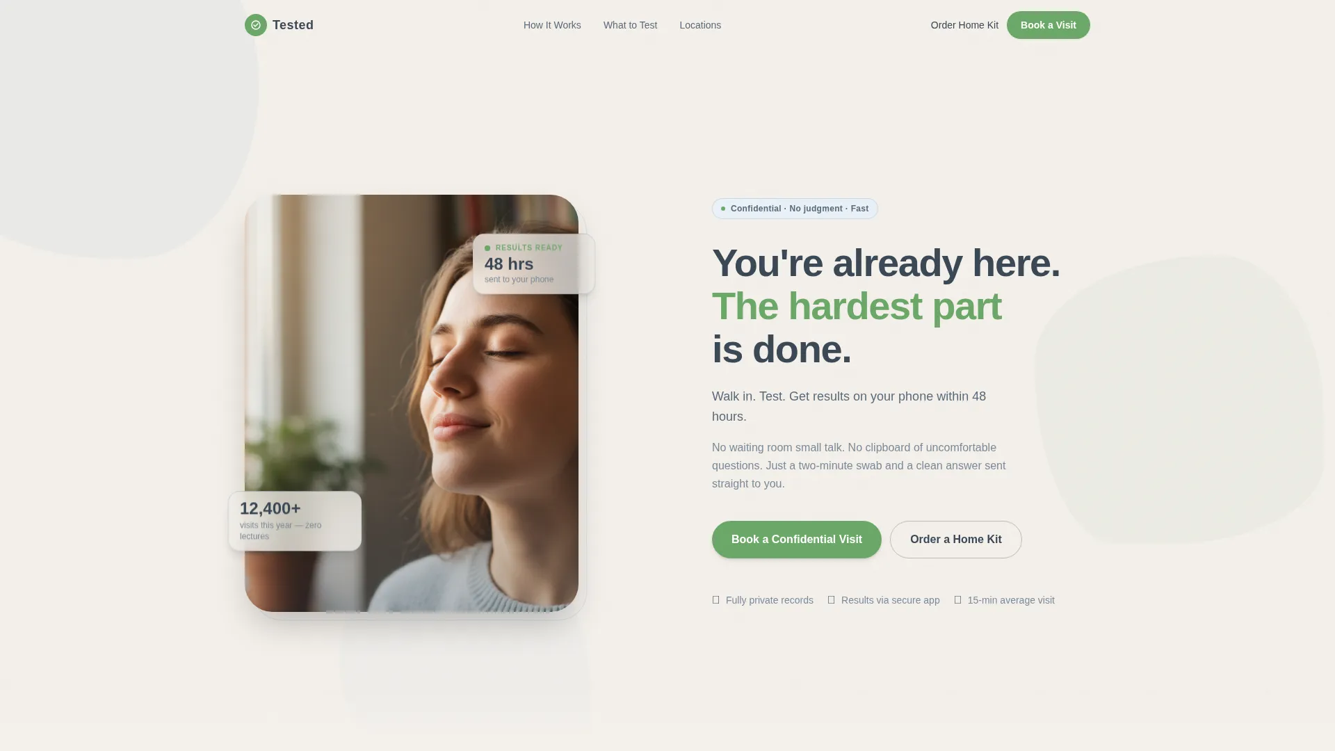
- A half-page hero with a split photo and headline, floating glass-style cards, and a primary booking call to action
- Three Problem→Solution zigzag sections, each targeting a different emotional barrier
- A minimal three-step booking form, a secondary home kit order path, a testimonials block, and a linear single-row footer
Feature list
This section describes each functional component built into the template as described in the source brief.
Split Hero with Floating Glass Cards
The header fills half the page with a shoulder-up photograph on the left, lit by diffused natural light. The right side carries the headline and a subline naming the three-step promise. Floating glass-style cards sit over the composition, and the primary "Book a Confidential Visit" button anchors the top of the page.
Zigzag Problem→Solution Layout
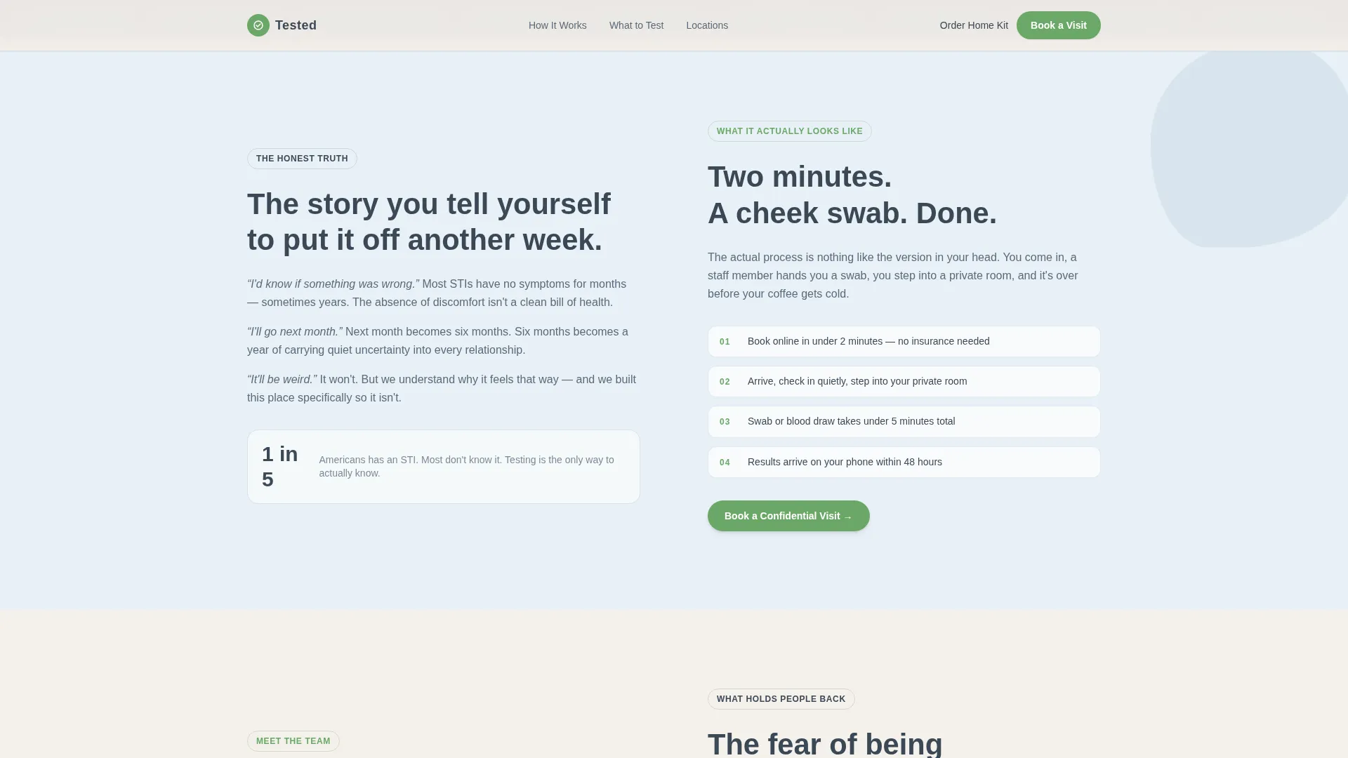
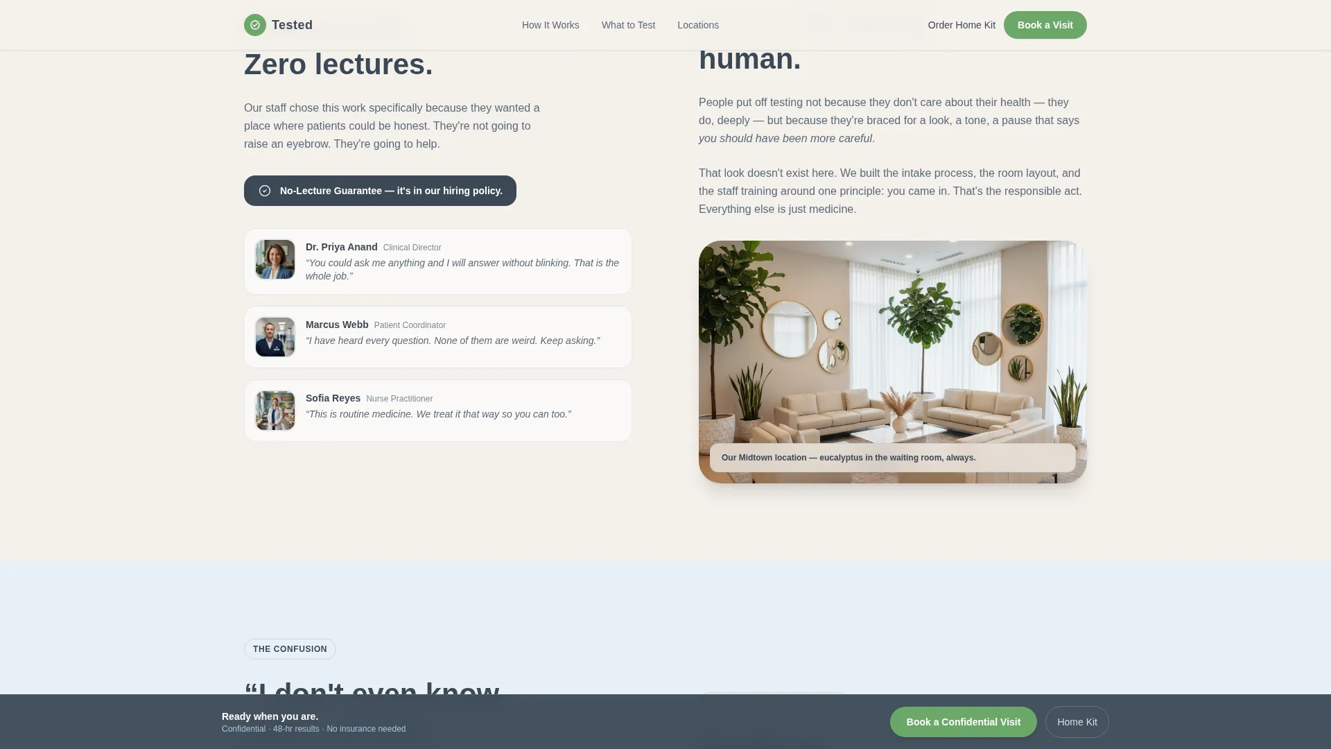
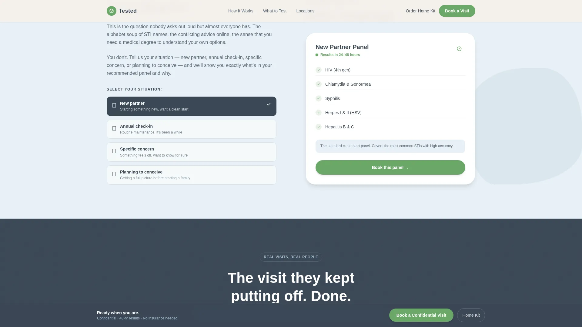
Three alternating sections each follow the same arc: a human problem on one side, a practical resolution on the other. The first addresses testing anxiety against the two-minute process. The second reframes fear of judgment with a no-lecture guarantee and real staff photos. The third replaces confusion about panels with an interactive panel selector.
Interactive Panel Selector
Visitors choose their situation, such as new partner, routine annual check, or a specific symptom, and the recommended testing panel populates in response. This removes the guesswork that often stalls booking and makes the recommendation feel personal rather than clinical.
Minimal Three-Step Booking Form
The booking flow asks only for preferred location, a date and time slot, and a single checkbox for first-time visitors. No insurance field and no symptom disclosure are required upfront. The form keeps friction at the minimum needed to get someone through the door.
Sticky Bottom Booking Bar
After the second section, a sticky bar anchors to the bottom of the screen and persists as the visitor scrolls. It keeps the primary call to action visible without interrupting the reading flow, reducing the distance between intent and action on mobile.
Home Kit Secondary Conversion Path
Visitors who are not ready for an in-person visit can order a home kit instead. The secondary path captures only a name and shipping address, keeping the conversion net wide without undermining the primary booking goal.
Page sections overview
| Section | Purpose |
|---|---|
| Hero split layout | Opens the page with calm confidence and the primary booking call to action |
| Zigzag block one | Pairs testing anxiety with the two-minute process |
| Zigzag block two | Counters fear of judgment with the no-lecture guarantee and staff photos |
| Zigzag block three | Resolves panel confusion with the interactive situation selector |
| Testimonials block | Builds trust with real-situation voices and key visit metrics |
| Booking call to action | Houses the three-step form and the home kit secondary path |
| Linear footer | Delivers single-row navigation and closing information |
Design & branding system
The visual identity follows an Organic Flow theme. It deliberately avoids anything sterile or fluorescent. The palette feels like early morning fog lifting off water, calm and certain rather than clinical and cold.
- Color system: charcoal slate (#3B4856) for headlines and anchor blocks, sky blue (#A8C4D8) washing across alternating section backgrounds, warm cloud white (#F4F0EB) as the primary canvas, and living green (#6BA868) used exclusively on buttons and confirmation states
- Typography: DM Sans for headings set in generous tracking, Manrope for body text, keeping reading comfortable and unhurried
- Animation and motion: medium-intensity blob animations, scroll reveals, staggered card entrances, and a marquee element bring the page to life without overwhelming the calm tone
Mobile & speed optimization
The template is built mobile-first. The primary audience books on their phones, so the layout, form steps, and sticky bar are all designed to perform on a small screen before scaling up.
- Mobile-first layout structure ensures the booking form, sticky call to action bar, and zigzag sections stack and read clearly on any phone screen
- Server Components handle static content while Client Components manage the interactive booking form and panel selector, balancing responsiveness with load efficiency
- Scroll reveals and staggered animations are tuned to feel smooth rather than heavy, supporting a fast perceived experience on mobile connections
How this template helps you convert
Every structural choice in this template is aimed at reducing the distance between a hesitant first visit and a completed booking.
- The zigzag arc addresses shame, judgment, and confusion in order, releasing one emotional barrier per section so the visitor arrives at the booking form already reassured rather than still reluctant.
- The sticky booking bar keeps the primary call to action visible throughout the scroll, so the moment a visitor decides they are ready, the action is immediately within reach without scrolling back to the top.
- The secondary home kit path catches visitors who are not ready for in-person visits, converting hesitant browsers into leads rather than losing them entirely.
Other information about this template
This template sits at the intersection of Health and Medical, Urgent Care and Walk-In services, and the STD testing clinic niche. It is purpose-built for direct-to-consumer sexual health brands that prioritize dignity and discretion over clinical formality.
- The Organic Flow theme and Slate and Sky color system work together to signal safety and calm without looking like a generic medical website
- The template style is Zigzag/Alternating, a layout pattern well suited to emotional storytelling where each section must earn the next scroll
- Creative direction follows a Problem→Solution Arc, meaning every visual and copy decision is organized around removing a specific barrier rather than listing features
- The header concept is a Half-Page Photo and Text split, chosen to center a real human face and establish emotional trust before any claims are made
- The primary landing page direction is Booking and Scheduling, so all layout decisions flow toward a single conversion goal
Theme
Organic Flow
Creative direction
Problem→Solution Arc
Color system
Slate & Sky
Style
Zigzag/Alternating
Direction
Booking/Scheduling
Page Sections
Split Hero with Floating Glass Cards
Zigzag Problem→solution Layout
Interactive Panel Selector
Minimal Three-step Booking Form
Sticky Bottom Booking Bar
Home Kit Secondary Conversion Path
Related questions
Can I customize the panel selector options for my clinic's specific tests?
Does the booking form support multi-location clinics?
Is the home kit path a separate page or part of the landing page?
Can I remove or adjust the sticky bottom booking bar?
What makes this different from a standard medical booking template?



