Powerful Justice Advocacy Landing Page Template
Witness is a masonry-style landing page template built for human rights social enterprises. It combines a cinematic full-bleed hero, a Pinterest-style resource archive, audience-specific pathways, and a persistent Field Network join bar. The result is a living, scrollable wall of survivor testimony, policy tools, and multilingual toolkits designed to move attorneys, researchers, and organizers from browse to download.
by Rocket studio
Quick summary
Witness is a single-page template for human rights social enterprises that distribute survivor testimony as actionable policy tools. It opens with a documentary-style hero, unfolds into a filterable masonry archive of resources, and closes with a persistent network recruitment bar. Every design choice prioritizes trust, weight, and purposeful action.
Who this template is for
This template is built for organizations that sit at the intersection of testimony and policy change. If your work involves translating lived experience into tools that practitioners can actually use, Witness fits your purpose precisely.
- Pro bono attorneys preparing asylum cases who need quick, credible access to field reports and legal toolkits
- Graduate researchers and academics building dissertations or policy analyses on displacement and human rights
- Grassroots organizers in small cities who need printable, multilingual resource kits they can hand to communities directly
What problem this template solves
Human rights organizations often struggle to present deep, document-heavy work in a way that feels navigable rather than overwhelming. A standard blog layout buries resources. A gallery format strips them of context. Neither approach earns the trust of a pro bono attorney under deadline or a researcher mid-dissertation.
- Visitors cannot quickly find the specific resource type, region, or issue they need without effective filters
- Download friction is too high, pushing away practitioners who have limited time and high standards for source credibility
- Organizations struggle to grow a practitioner network because the ask comes before the organization has proven its value
What you get with this template
You get a fully structured, single-page layout built around the logic of a living archive. Every section serves a clear role in moving visitors from curiosity to committed use.
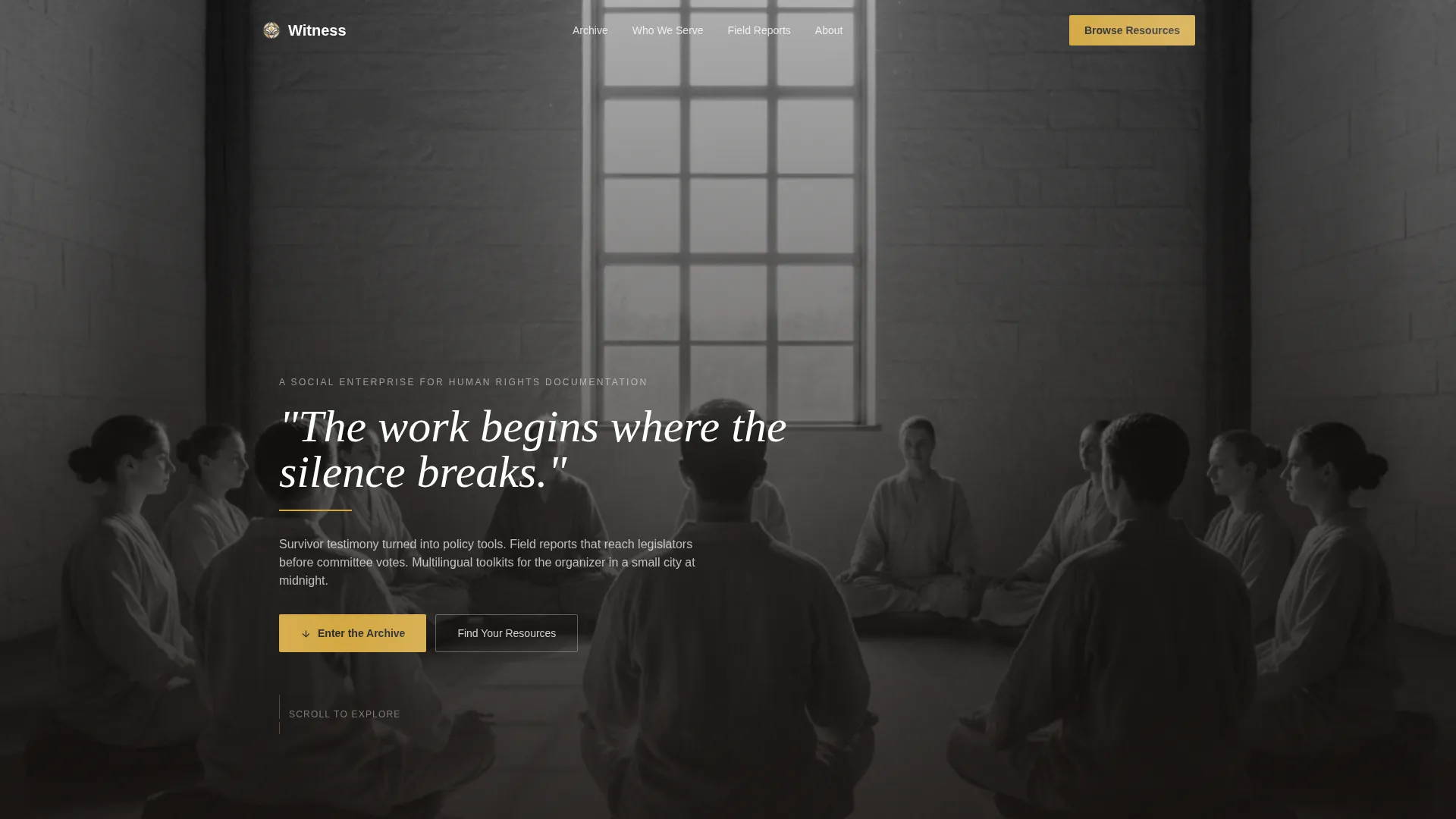
- A cinematic full-bleed hero section with a fade-in quote, a saffron underline accent, and no identifying imagery
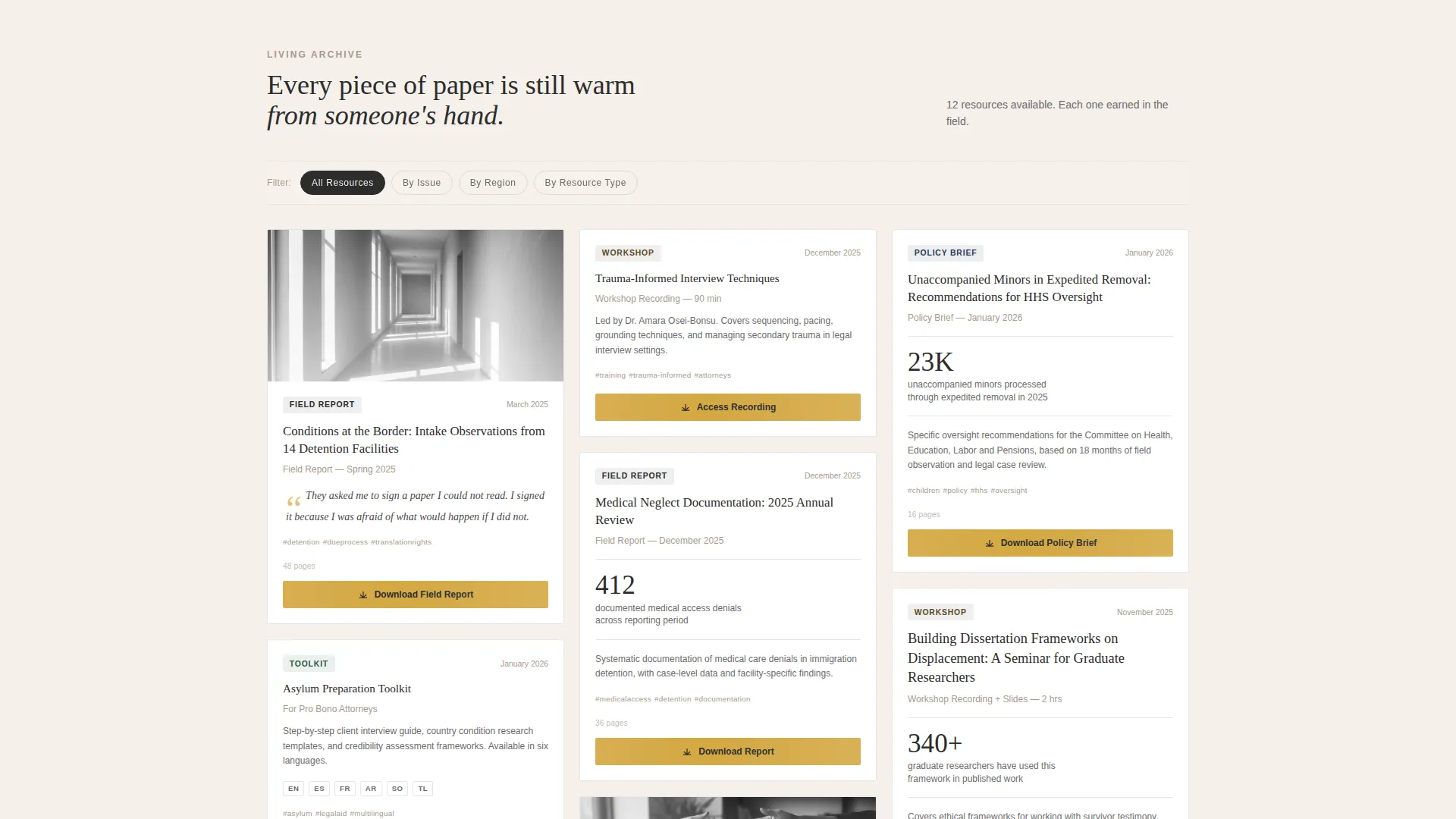
- A Pinterest-style masonry resource archive with category filters and a lightweight email-gated download modal on every card
- A slide-up Field Network bar that appears after three card interactions, collecting name, organization, and area of focus
Feature list
This template is built around several core capabilities that work together to serve a trust-first, resource-first audience.
Masonry Resource Archive with Category Filters
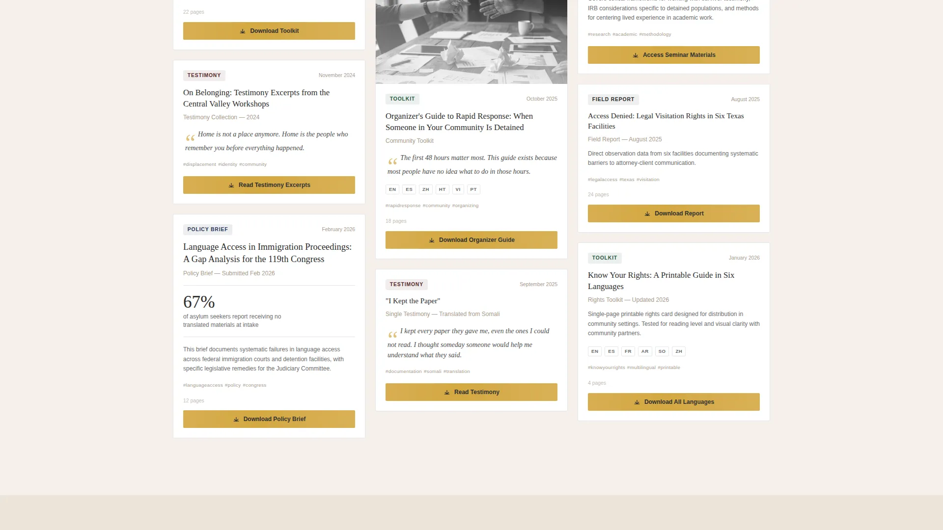
The masonry grid displays cards of varied sizes, each representing a different resource type: field report, toolkit, testimony excerpt, policy brief, or workshop recording. Three pinned filter tabs, By Issue, By Region, and By Resource Type, let visitors narrow the archive without leaving the page. As the visitor scrolls, the grid grows denser, creating a cumulative sense of documentary weight.
Email-Gated Download Modal
Every card carries a "Download This Resource" call to action. Clicking it opens a minimal modal asking only for an email address and a single checkbox for organizational affiliation, choosing from individual, NGO, legal, academic, or government. The low barrier is intentional: the template earns the exchange by showing enough card content to prove the resource's depth before the ask.
Slide-Up Field Network Bar
After three card interactions, a persistent bottom bar slides gently into view. It invites visitors to join the Field Network by entering a name, organization, and area of focus. The timing is deliberate, appearing only after the visitor has demonstrated genuine interest in the archive.
Audience Pathway Section
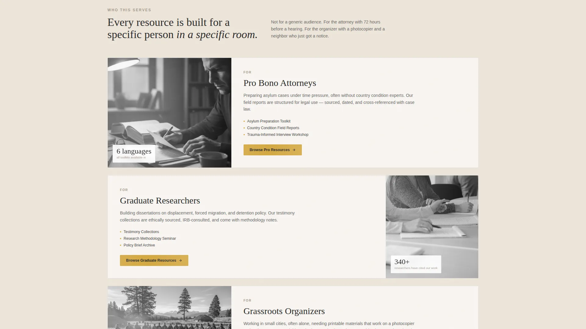
A dedicated "Who This Serves" section presents three distinct audience pathways in an asymmetric layout. Each pathway speaks directly to one of the three primary visitor types: legal practitioners, academic researchers, and grassroots organizers. The layout is visual and skimmable rather than text-heavy.
Impact Numbers Section
A stone-background statistics section presents field report counts, languages served, and legislative placements alongside pull quotes. It functions as social proof for an audience that evaluates credibility by track record, not by marketing language.
Documentary Hero with Fade-In Typography
The full-bleed hero uses a black-and-white documentary photograph taken from behind a circle of seated figures. No faces are visible. A single line of text fades in after a short pause, followed by a thin saffron underline that draws the eye into the archive below.
Page sections overview
| Section | Purpose |
|---|---|
| Hero with quote | Opens with cinematic tone and draws visitors into the archive |
| Masonry resource archive | Displays filterable resource cards across all content types |
| Category filter bar | Lets visitors sort by issue, region, or resource type |
| Who This Serves | Presents three audience pathways in an asymmetric layout |
| Impact numbers | Delivers social proof through statistics and pull quotes |
| Field Network bar | Slides up to recruit practitioners into the broader network |
| Footer | Provides a clean single-row navigation close |
Design & branding system
The visual identity follows a Healing Space theme using a Cloud Canvas color palette. Every color decision is deliberate: nothing decorative, nothing urgent. The palette feels like unbleached cotton laid across a wooden table, warm and unhurried.
- Four-color system: soft parchment white (#F5F0EB), muted stone (#A8998A), deep charcoal ink (#2C2C2C), and muted saffron (#D4A843) reserved exclusively for interactive elements and download buttons
- Typography pairs Fraunces, a serif display face, for headings with DM Sans, a clean humanist sans-serif, for body text, balancing archival warmth with functional clarity
- Backgrounds alternate between parchment and stone across sections, keeping the page visually varied without introducing new colors
Mobile & speed optimization
The template is designed desktop-first, which reflects the primary audience of researchers and attorneys who work at a desk. A mobile fallback ensures the resource archive remains navigable on smaller screens.
- The hero image is static and loads without JavaScript dependency, keeping the initial page view immediate
- Resource cards are lazy-loaded as the visitor scrolls, so the browser only fetches what is visible
- The masonry layout reflows responsively, maintaining card readability on tablet and mobile viewports
How this template helps you convert
This template is built on a give-first philosophy. Visitors receive meaningful content before they are ever asked to share anything. That sequencing builds the trust required to convert a skeptical, time-pressured practitioner audience.
- Every card preview shows enough content depth to establish credibility before the download modal appears, reducing resistance at the point of the ask
- The email-gated download modal asks for minimal information, a single email address plus one checkbox, lowering the barrier for attorneys, researchers, and organizers who guard their inboxes carefully
- The slide-up Field Network bar appears only after demonstrated engagement, so the network recruitment ask feels earned rather than intrusive
Other information about this template
This template is categorized under Community and Nonprofit with a specific focus on the human rights social enterprise niche. It is a strong fit for organizations operating in advocacy, displacement research, and trauma-informed direct service.
- The template supports six-language localization for printed toolkits, reflecting the multilingual needs of the grassroots organizer audience stated in the brief
- The Movement and Cause creative direction means the scroll itself tells a story: the archive assembles like a cause building from fragments, giving the page a cumulative emotional logic
- The footer follows a linear single-row pattern, keeping the page close clean and uncluttered
- The template is built for English-language deployment with US date format and USD localization as defaults
Theme
Healing Space
Creative direction
Movement & Cause
Color system
Cloud Canvas
Style
Masonry/Pinterest
Direction
Content/Resource
Page Sections
Masonry Archive with Filters
Email-gated Download Modal
Slide-up Field Network Bar
Documentary Hero Section
Audience Pathway Section
Impact Statistics Section
Related questions
Who is this landing page template designed for?
How does the resource download system work?
Can the masonry archive be filtered by topic or region?
What is the Field Network bar and when does it appear?
Is this template suitable for organizations working in multiple languages?