Employee Wellness & Benefits Reviews Website Template
Tether is a single-column landing page template built for mental health benefits platforms targeting HR directors, benefits brokers, and senior operations leaders. It pairs a stark, typographically-led hero with a scrolling testimonial mosaic, single-stat breather sections, a plain-language product walkthrough, and a progressive lead generation form with a gated ROI report download.
by Rocket studio
Quick summary
Tether is a lead generation landing page template for employee mental health benefits platforms. It opens with a centered giant headline on pure white, then builds trust through layered human voices, anonymized data cards, and scenario vignettes. A progressive three-field form and a downloadable cost report capture both ready buyers and internal-case builders.
Who this template is for
This template is built for B2B mental health and employee wellness platforms that sell into mid-market companies. It speaks directly to the people who make benefits decisions and carry the cost of getting those decisions wrong.
- HR directors at companies with 200 to 2,000 employees who want a benefits page that leads with empathy before ROI
- Benefits brokers assembling renewal packages who need a polished, conversion-ready presentation of the platform's value
- Chief Operating Officers and senior leaders who have watched top performers leave due to burnout and are ready to act
What problem this template solves
Most employee benefits landing pages lead with feature grids and pricing tables. They skip the human moment entirely. HR directors and operations leaders do not decide to change a benefits package because of a bullet point. They decide because something finally named the problem they have been carrying quietly.
- Standard templates force buyers to translate abstract features into human outcomes on their own
- Carousel-style testimonial layouts dilute social proof rather than building it into something undeniable
- Generic lead forms ask for too much too soon, losing the browser who needs to build an internal case first
What you get with this template
You get a complete, single-column landing page structure designed around one goal: turning an HR director's quiet worry into a booked demo. Every section is intentional. Nothing is decorative without purpose.
- A stark, serif-led hero section with a centered headline and a sky-blue call-to-action button as the only directive on screen
- A full testimonial mosaic layout alternating pull quotes, anonymized data cards, and scenario vignettes that build cumulative social proof as the reader scrolls
- A progressive three-field lead generation form and a separately gated downloadable report to capture both high-intent and research-stage visitors
Feature list
This template includes the following built-in capabilities and layout components.
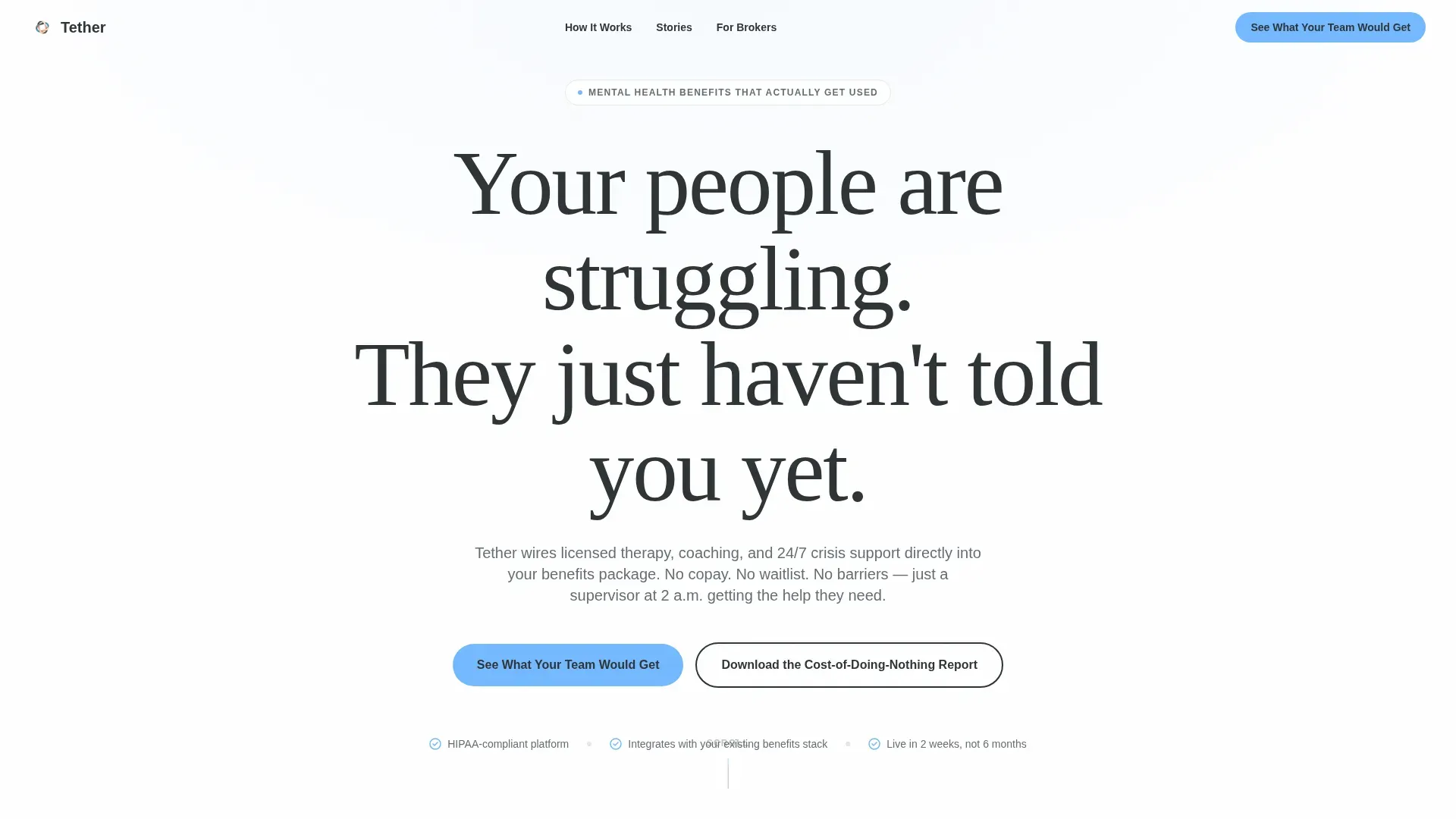
Giant Headline Hero Section
The hero is a single centered headline set in a large humanist serif, black on white, with nothing competing for attention above the fold. A sky-blue call-to-action button sits directly beneath the headline. The emptiness is intentional and carries its own weight.
Testimonial Mosaic Layout
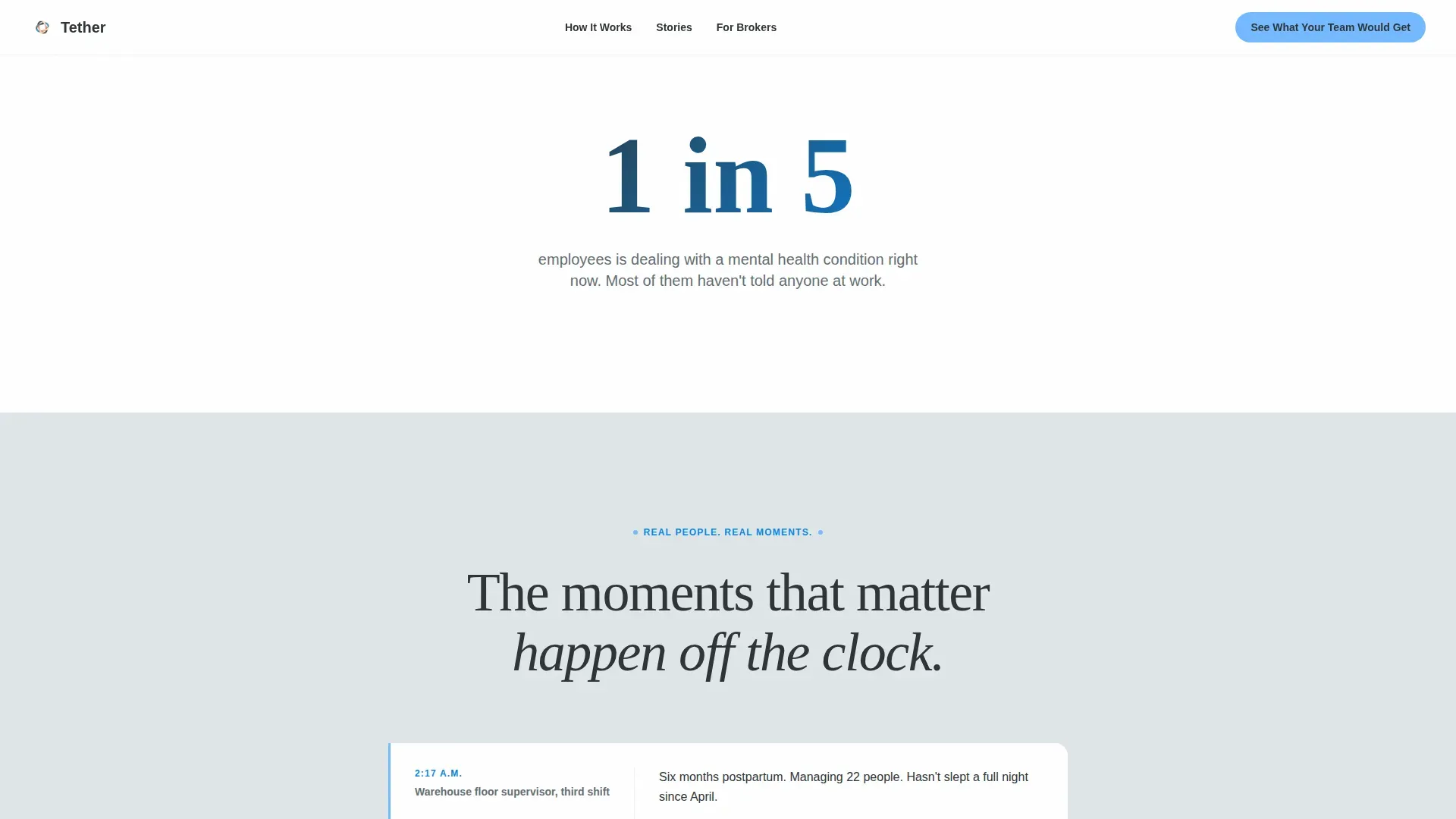
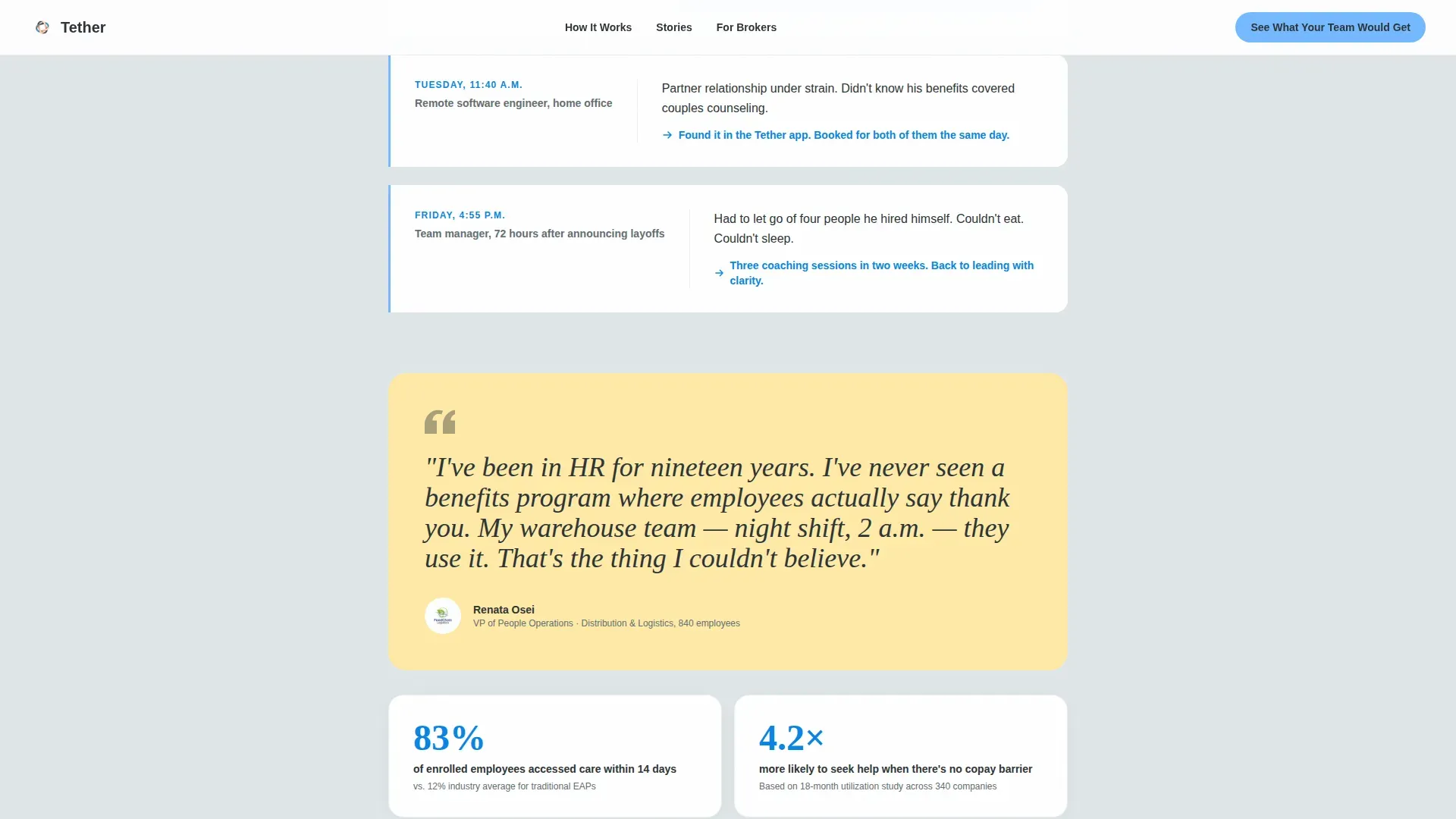
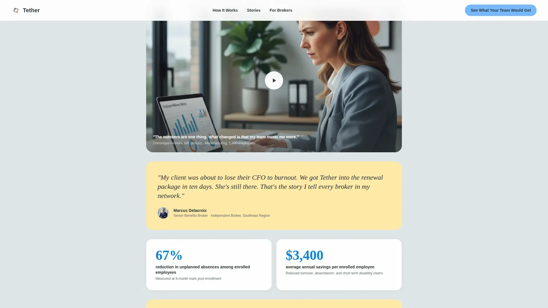
Testimonials are woven into the page architecture rather than stacked in a carousel. The mosaic alternates between large pull quotes, short video still placeholders with play buttons, and small anonymized data cards. The density builds as the visitor scrolls, creating a cumulative effect that feels like evidence rather than marketing.
Single-Stat Breather Sections
Between testimonial clusters, isolated stat sections provide breathing room. Each breather section shows one number and one sentence on a white background, giving the reader a moment to absorb the weight of what they have just read.
Plain-Language How It Works Section
A three-step walkthrough explains the platform in plain human language. No jargon, no technical diagrams. Each step addresses a real concern a buyer would have about implementation or employee adoption.
Progressive Lead Generation Form
The primary form runs a three-field progressive sequence: company size via dropdown, current benefits provider as an optional text field, and work email. The sequence is designed to feel low-stakes and logical rather than like a compliance form.
Gated ROI Report Download
A secondary conversion path offers a downloadable cost-of-doing-nothing report gated behind email only. This catches research-stage visitors who are not ready to book a demo but are actively building an internal case for change.
Page sections overview
| Section | Purpose |
|---|---|
| Hero Headline | Opens with a single centered statement that names the unspoken problem |
| Testimonial Mosaic | Builds layered social proof through alternating quotes, data cards, and vignettes |
| Single-Stat Breather | Delivers one isolated number between testimonial clusters for pacing and impact |
| How It Works | Explains the platform in three plain-language steps |
| Lead Gen Form | Captures high-intent visitors with a progressive three-field form |
| ROI Report Gate | Converts research-stage visitors with a downloadable email-gated report |
| Footer | Closes with a linear single-row pattern |
Design & branding system
The visual identity follows a Family First theme built on the Slate and Sky color system. The palette is calm and authoritative without being clinical. It evokes the first quiet hour of a Saturday morning rather than a hospital waiting room or a corporate intranet.
- Core colors: deep charcoal slate (#2D3436) for all primary text, soft cloud gray (#DFE6E9) for alternating section backgrounds, open-sky blue (#74B9FF) for buttons and interactive highlights, and warm dawn blush (#FFEAA7) as an accent on testimonial cards and pull quotes
- Typography: Fraunces display serif for headlines and pull quotes, Manrope for all body text, creating a pairing that feels human and legible at every size
- Section backgrounds alternate between white and cloud gray to create visual breathing room without heavy dividers
Mobile & speed optimization
The template is built desktop-first to match the primary audience of HR directors working at workstations during the business day. Full mobile support is included so the page remains effective for any visitor on any device.
- GSAP ScrollTrigger powers the staggered mosaic reveal and hero parallax, giving the scroll a sense of weight without heavy load cost
- Server Components handle all static sections while Client Components are isolated to animation-dependent areas, keeping the rendered page lean
- The progressive form sequence reduces cognitive load on smaller screens by surfacing one field decision at a time
How this template helps you convert
The conversion architecture treats the human cost of inaction as the primary persuasion engine, then positions the demo form and the ROI report as relief rather than a pitch.
- The hero headline does the hardest work first: it names the problem the buyer already knows but has not said out loud, making the sky-blue call-to-action button feel like the natural next step rather than a sales prompt
- The testimonial mosaic builds trust incrementally, so by the time the lead form appears mid-scroll, the visitor has already spent time with the voices of people their employees resemble
- The secondary download path ensures that visitors who are not ready to commit still enter a conversion funnel, giving the platform a way to reach internal decision-makers who need evidence before they can move a budget
Other information about this template
This template is purpose-built for the mental health benefits and employee wellness space. It is particularly well-suited for platforms positioning themselves in the growing market for workplace mental health solutions, where buyer trust is the primary barrier and social proof is the most reliable tool for clearing it.
- The Testimonial Mosaic creative direction is designed to reflect the density and variety of real human experience, not a curated highlight reel
- The lead generation structure supports both direct demo booking and longer nurture sequences by splitting high-intent and research-intent visitors at the point of the secondary download
- The Family First theme and Slate and Sky color system are specifically chosen to feel safe and warm rather than clinical, which matters deeply in the mental health category where tone is trust
- The template is localized for USA audiences in English and USD, with section copy written to reflect American workplace culture and benefits infrastructure
Theme
Family First
Creative direction
Testimonial Mosaic
Color system
Slate & Sky
Style
Single Column Flow
Direction
Lead Generation
Page Sections
Giant Headline Hero Section
Testimonial Mosaic Layout
Single-stat Breather Sections
Plain-language How It Works
Progressive Lead Generation Form
Gated ROI Report Download
Related questions
What conversion paths does this template include?
Can I use this template if my platform serves companies of different sizes?
How does the testimonial mosaic section work?
Is this template suitable for a benefits broker presentation?


