Oncology Medicine Comparison Website Template
Tether is a comparison table landing page built for oncology peer support communities. It connects newly diagnosed patients, people in active treatment, post-treatment survivors, and caregivers with the right peer group for their exact moment in the journey. The layout leads with real voices, reduces sign-up friction, and gently moves exhausted visitors toward finding their group.
by Rocket studio
Quick summary
Tether is a single-page lead generation template for an oncology peer support community. It uses a life-stage comparison table stacked with real member voices to build trust through accumulation rather than argument. A low-friction three-field form and a secondary PDF download path give visitors two ways to step closer, at whatever pace they are ready for.
Who this template is for
This template is built for organizations running peer support communities in the oncology space. It speaks directly to people at some of the hardest moments in a cancer journey, and the design reflects that emotional reality.
- Oncology community managers launching or growing a peer support group
- Patient advocacy organizations connecting people by life stage rather than cancer type
- Caregivers and family members looking for a space that acknowledges their specific exhaustion
What problem this template solves
Most healthcare community pages ask too much, too fast. They present a wall of clinical text, demand personal details up front, and feel nothing like a warm, human space. People who are already tired close the tab.
- Visitors in active treatment or crisis need immediate emotional recognition, not a feature pitch
- Caregivers who have not slept properly in months will not fill out a long, clinical form
- Newly diagnosed patients need to see that others at their exact life stage are already inside the community
What you get with this template
This template delivers a complete, scroll-guided landing page built around the emotional architecture of an oncology support community. Every section has a clear job, and nothing asks more of the visitor than they can give.
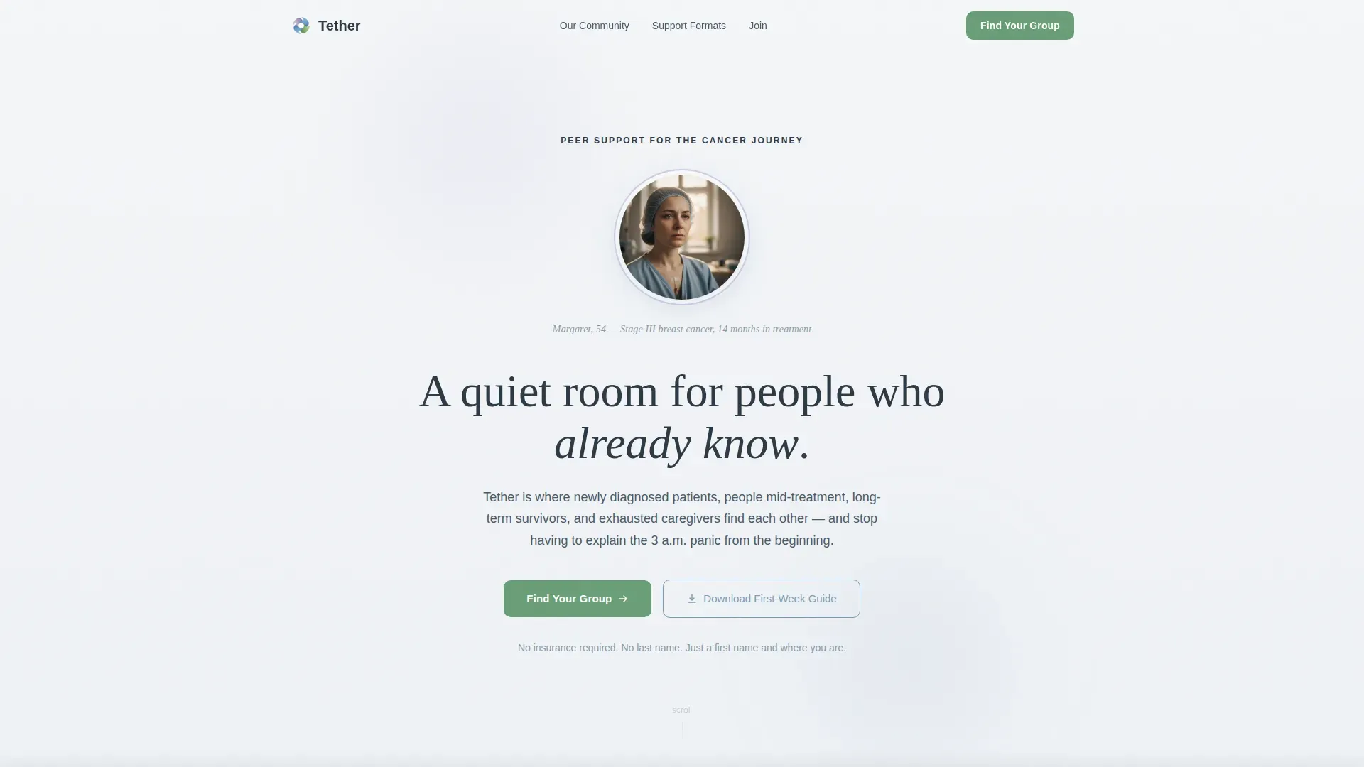
- A portrait-centered hero section with a name, diagnosis detail, and a primary call to action
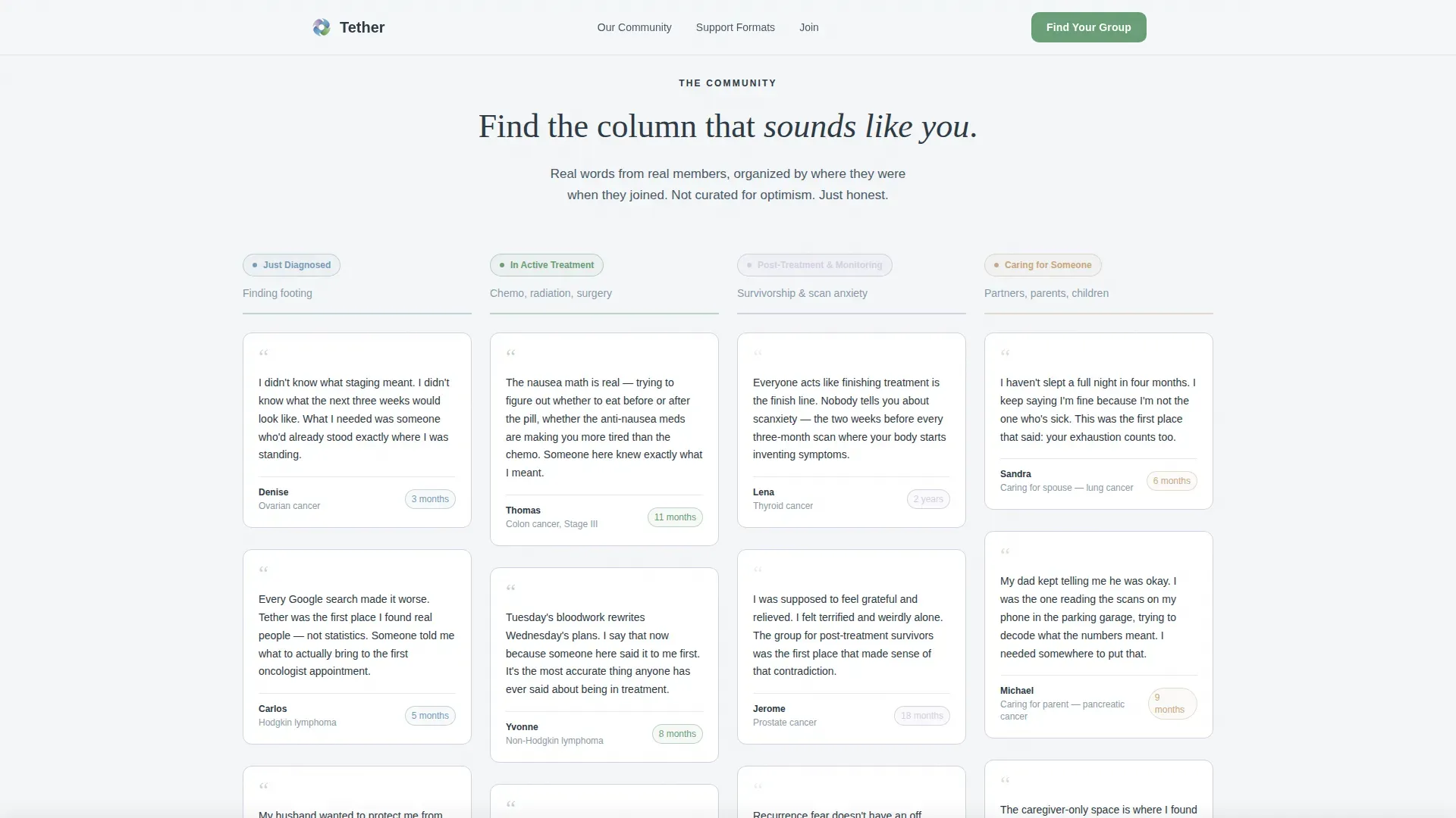
- A testimonial mosaic comparison table organized by life stage, stacking real member voices as the visitor scrolls
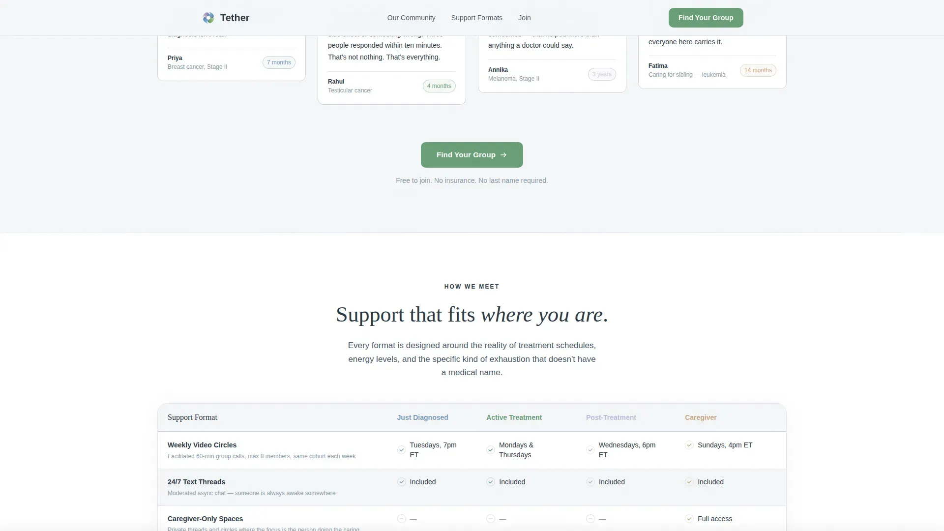
- A support formats comparison table, a community proof section, and a low-friction three-field sign-up form with a secondary PDF download path
Feature list
This template is built from a small set of well-considered decisions. Each one serves people who are reading from a phone in a waiting room or an infusion chair.
Life-Stage Comparison Table
The core visual element organizes member voices into four columns: Just Diagnosed, In Active Treatment, Post-Treatment and Monitoring, and Caring for Someone. Testimonial tiles stack as the visitor scrolls, so the community populates the page rather than selling itself.
Portrait-Centered Hero Section
A single softly lit face, a name, and a diagnosis type open the page. Shallow depth of field blurs the background. The composition is built for specific, human presence rather than generic stock imagery.
Support Formats Comparison Rows
A clean table compares the available support formats: weekly video circles, round-the-clock text threads, and caregiver-only spaces. Visitors can see at a glance which format fits their life right now.
Low-Friction Three-Field Lead Form
The sign-up form asks only for a cancer type or caregiver role, a current stage, and a first name with email address. No phone number, no last name, no insurance information. The form is designed around the energy levels of someone already carrying a lot.
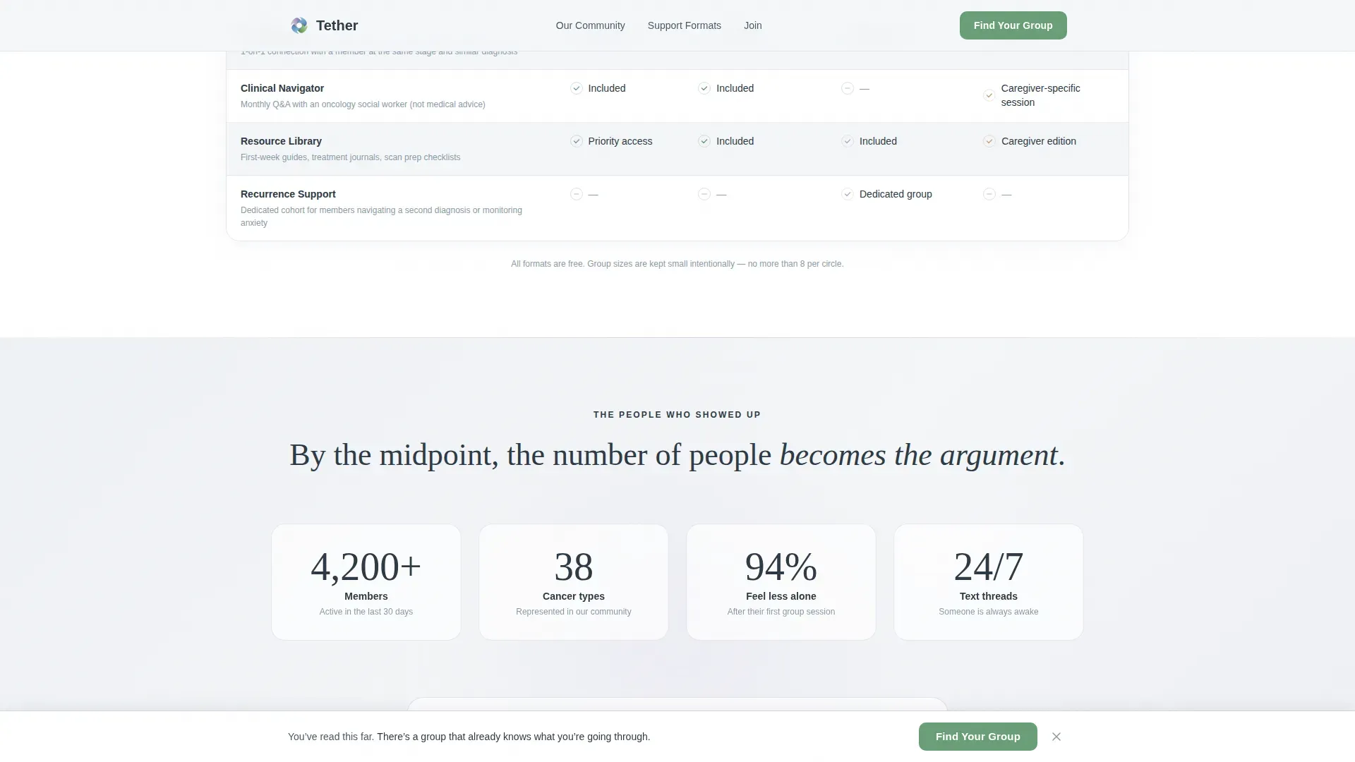
Sticky Call-to-Action Bar
After a visitor scrolls past sixty percent of the page, a gentle sticky bar appears with the primary "Find Your Group" call to action. It stays visible without interrupting the reading experience.
Secondary PDF Download Path
Visitors not yet ready to join can download a free First-Week Guide in exchange for an email address only. This gives the community a second way to stay in contact with people who are still deciding.
Page sections overview
| Section | Purpose |
|---|---|
| Hero Portrait | Opens with a real face, name, diagnosis, and primary call to action |
| Testimonial Mosaic Table | Stacks member voices across four life-stage columns as visitor scrolls |
| Support Formats Table | Compares weekly video circles, text threads, and caregiver-only spaces |
| Community Proof | Accumulates member count and named social proof to build trust |
| Lead Generation Form | Captures role, stage, and first name plus email with minimal friction |
| PDF Download Path | Offers a free First-Week Guide for visitors not ready to join yet |
| Footer | Single-row linear layout with essential navigation and links |
Design & branding system
The visual identity follows a Medical Clarity theme softened into something that feels like a hospital corridor where someone took real care. The palette stays in a fog-to-white range for backgrounds, with lavender used sparingly as a held breath between sections.
- Color system: morning fog white (#F4F6F8), quiet lavender (#D5D0E5), clinical calm blue (#7B9DB7), living green (#6A9E78) for action states only, and deep slate (#2E3A45) for all body text
- Typography: Fraunces serif for headings, giving warmth and unhurried weight; DM Sans for body copy, keeping clinical readability without coldness
- Lavender appears in card borders and section dividers; living green is reserved strictly for buttons, links, and hope-forward moments
Mobile & speed optimization
This template is built mobile-first. The primary audience reads it on a phone, often in a waiting room, an infusion chair, or in the early hours of the morning when sleep has not come.
- Layouts stack cleanly on small screens; the comparison table scrolls horizontally on mobile without breaking the reading flow
- Animations are kept low to medium intensity: gentle scroll reveals and staggered testimonial tile entrances that do not demand processing power
- The sticky call-to-action bar and the three-field form are both sized and spaced for easy thumb interaction on a phone screen
How this template helps you convert
The conversion strategy is emotional before it is functional. The page builds a felt sense of community through accumulated voices, then offers a clear, low-effort path to join it.
- The testimonial mosaic creates social proof through volume: as the visitor scrolls, more and more named people with real cancer types and membership durations appear, making the community feel genuinely populated and specific
- The three-field form removes every non-essential input field, so the moment a visitor decides they are ready, the barrier to entry is as small as possible
- The secondary PDF download path holds visitors who are not yet ready to commit, keeping them within reach of the community through a single email address
Other information about this template
This template is a single landing page, not a multi-page site. It is designed for one focused conversion goal at a time, with a clear primary path and one secondary option for softer leads.
- The footer uses a Pattern 1 linear single-row layout, keeping the bottom of the page clean and uncluttered
- The form dropdown includes caregiver as a role option alongside cancer types, so the page serves support-givers explicitly, not as an afterthought
- Animation behavior includes form validation feedback, dropdown interaction, and scroll-triggered tile reveals, all handled without heavy third-party libraries
Theme
Medical Clarity
Creative direction
Testimonial Mosaic
Color system
Soft Mist
Style
Comparison Table
Direction
Lead Generation
Page Sections
Life-stage Testimonial Mosaic
Portrait-centered Hero Section
Support Formats Comparison Table
Low-friction Three-field Form
Sticky Find Your Group Bar
Secondary PDF Download Path
Related questions
Who is this landing page template designed for?
How does the life-stage comparison table work?
What does the lead generation form ask for?
Is there an option for visitors who are not ready to join?
Does the template address caregivers as a separate audience?



