Depression Telehealth Landing Page Template
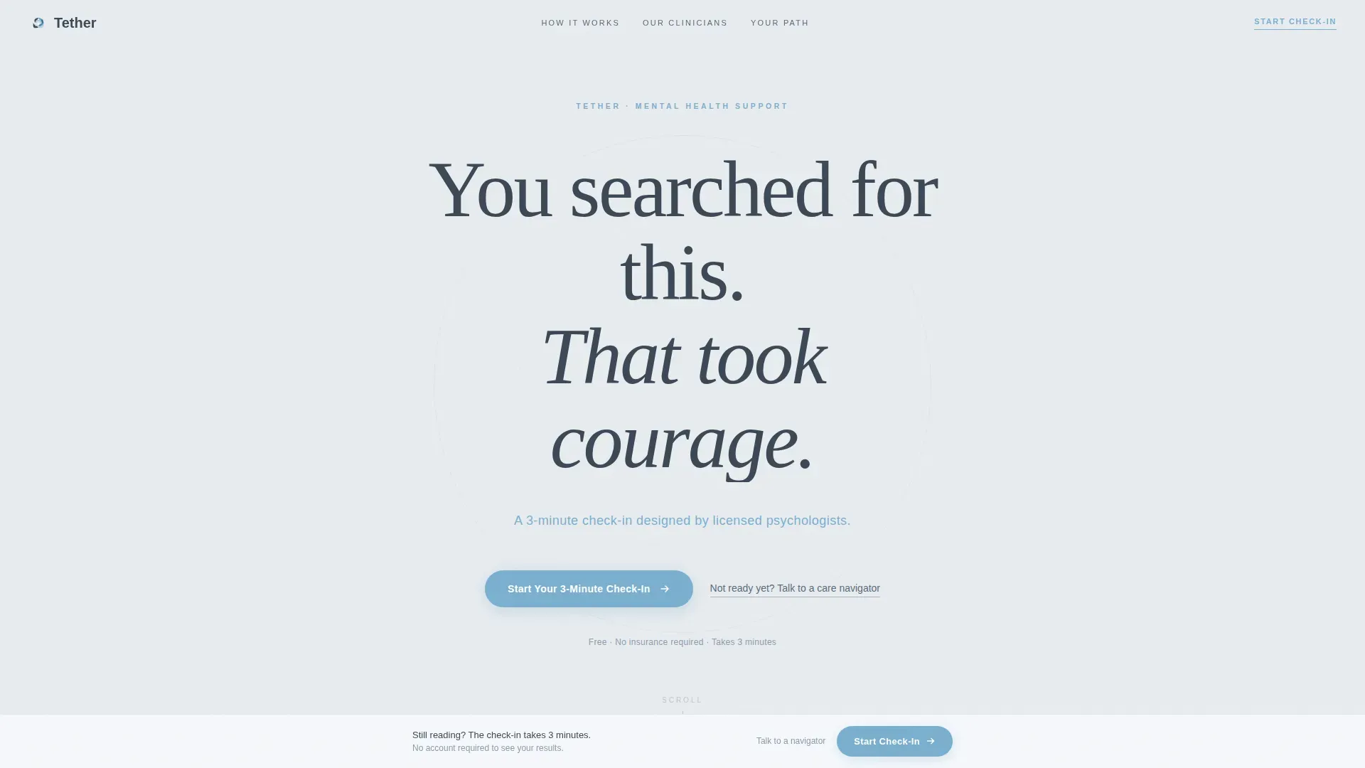
Tether is a single-column depression telehealth landing page built for warmth and trust. It guides visitors from a bold, honest headline through an annotated self-assessment, a human introduction to licensed therapists, and a clear three-step path to a first session. The inline quiz opens without a redirect, making the first step as frictionless as possible.
by Rocket studio
Quick summary
Tether is a depression telehealth landing page designed around one idea: earn the click before you ask for it. The page scrolls like a patient conversation, educating visitors about the assessment before they take it. An inline quiz, a persistent call-to-action bar, and a warm editorial tone work together to move hesitant visitors toward booking a first therapy session.
Who this template is for
This template is built for direct-to-consumer mental health services that connect people with licensed therapists online. It fits teams that want to reduce visitor anxiety before asking for any commitment.
- Depression telehealth services looking for a conversion-focused landing page
- Mental health startups offering licensed therapy with an intake assessment
- Clinicians or group practices building a direct booking flow for online therapy
What problem this template solves
People searching for depression support at 2 a.m. are not ready for a clinical intake form. They need a page that meets them where they are, removes fear, and earns trust before asking anything of them.
- Visitors arrive anxious and avoidant; the page normalizes the experience before the quiz appears
- Long counseling waitlists and cold clinical designs push people away; this template replaces both with warmth and transparency
- Most health landing pages bury the call to action; this one surfaces it early and keeps it visible through a persistent bar
What you get with this template
You get a fully structured single-column landing page with five clearly defined sections, an inline quiz flow, and a persistent call-to-action bar. Every element is designed to reduce friction and build confidence step by step.
- Hero section with a bold centered headline, sky-blue subline, and a primary call-to-action button
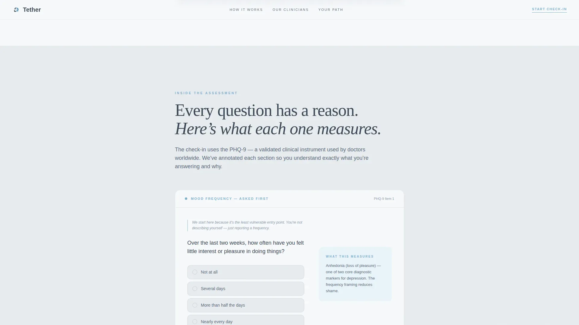
- Annotated assessment preview that explains each sample question before visitors commit to answering
- Three-step visual path from assessment results to matched therapist to first session
Feature list
This template includes the following core capabilities drawn directly from the design brief.
Inline Quiz with Progressive Disclosure
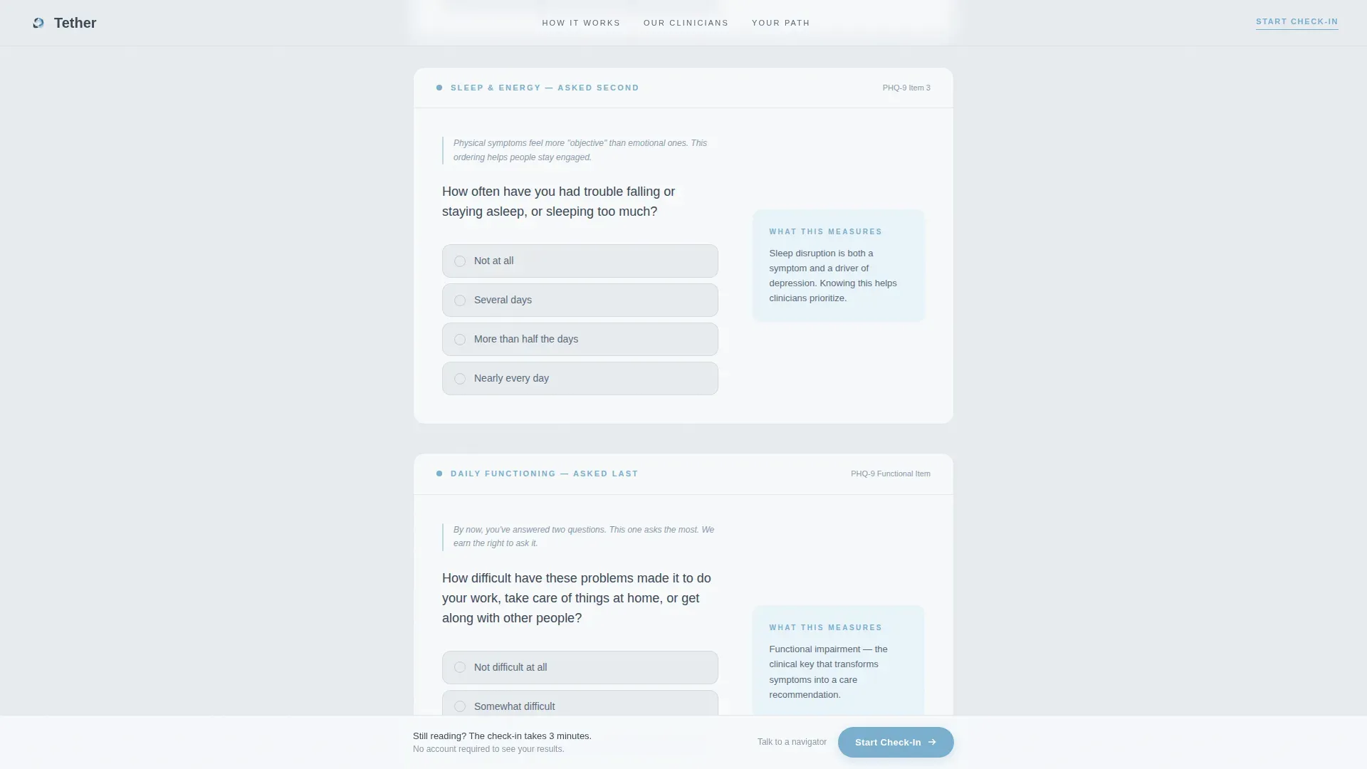
The assessment opens directly on the page without redirecting visitors to another URL. Questions appear one at a time in large, readable type. The order moves from least to most sensitive: mood frequency first, then sleep and energy, then daily functioning. A soft sky-blue progress bar fills across the top of the quiz as visitors move forward.
Persistent Call-to-Action Bar
After visitors scroll past the second section, a fixed bottom bar appears carrying the primary call to action. It stays visible through the remaining sections so the prompt to begin the check-in is always within reach without interrupting the reading flow.
Annotated Assessment Preview
Section two shows sample quiz questions alongside gentle explanatory notes. Each annotation tells the visitor what the question measures and why. This converts the assessment from something that feels like a test into something that feels like self-knowledge.
Scroll-Reveal Animation System
The page uses scroll-triggered reveal animations powered by IntersectionObserver. Sections and elements stagger into view as the visitor reads downward. The motion is moderate, never distracting, and designed to reinforce the unhurried pacing of the page.
Secondary Care Navigator Path
A text link below the primary call to action reads "Not ready yet? Talk to a care navigator." Selecting it opens a low-commitment chat window. This gives hesitant visitors a softer entry point without removing the primary conversion path.
Human Clinician Profiles
Section three introduces the clinical team through their own words rather than credentials alone. Each therapist explains why they chose this work. The format builds personal connection and replaces the anonymity that makes online therapy feel impersonal.
Page sections overview
| Section | Purpose |
|---|---|
| Hero headline | Acknowledge the visitor's courage and introduce the check-in |
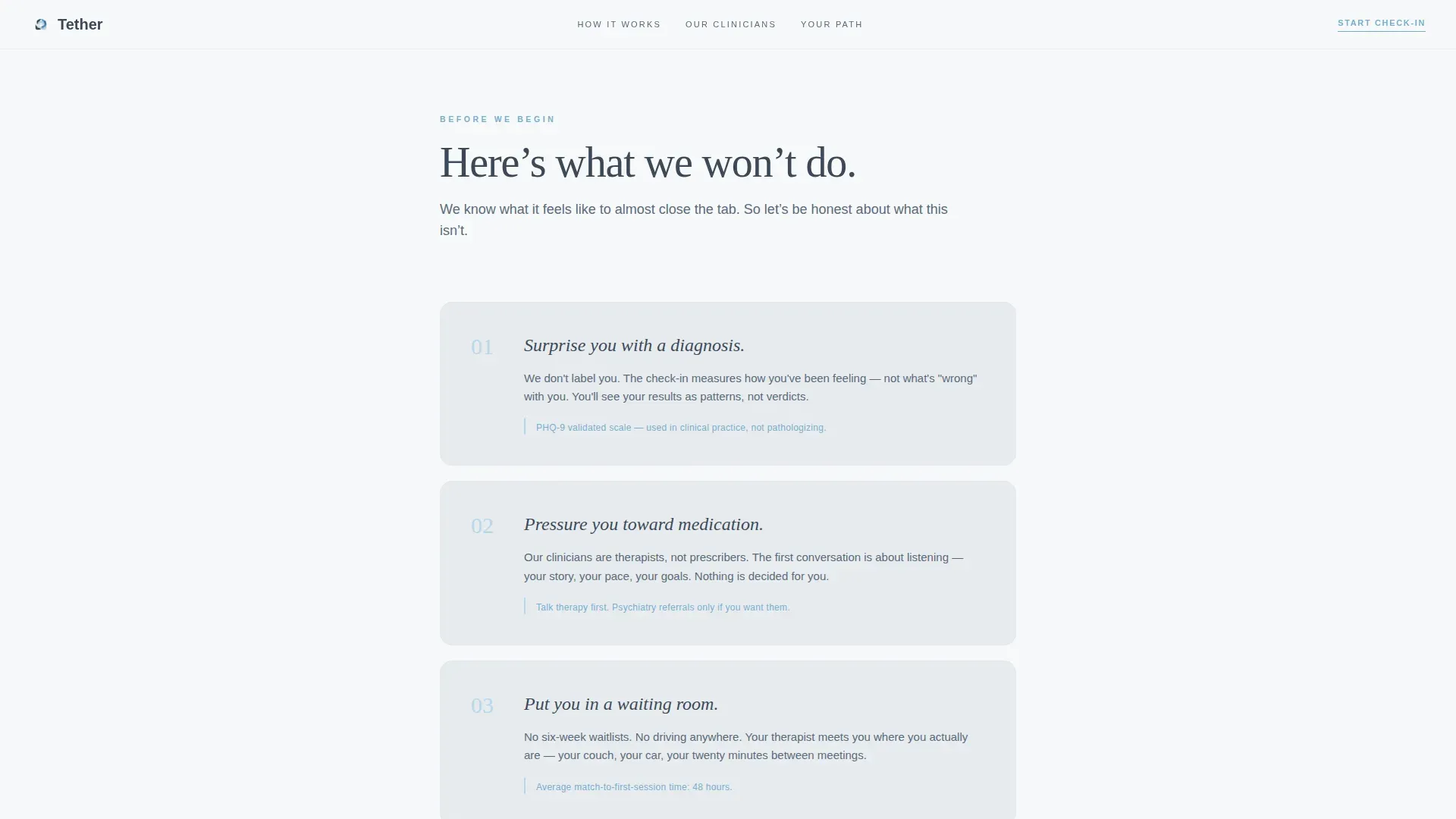
| What we won't do | Remove fear by listing what the service explicitly avoids |
| Inside the assessment | Educate with annotated sample questions before the quiz starts |
| Meet the clinicians | Build trust through therapist personal statements |
| Your path forward | Show a three-step visual map from results to first session |
| Persistent call to action bar | Keep the primary action visible after section two |
| Footer | Linear single-row pattern with essential links |
Design & branding system
The visual identity follows an Educational Guide theme built on a Slate and Sky color system. The palette is described in the brief as the honest light of a Tuesday morning: not blinding, not dark, just open and calm.
- Deep slate (#3B4856) for body text and grounding headers; soft fog gray (#E8ECF0) as the primary background; open-sky blue (#7AAFCF) on interactive elements and the progress bar; gentle dawn white (#F7F9FB) for card surfaces
- Typography pairs Fraunces serif headlines with DM Sans body text, combining editorial warmth with clean readability
- White space is treated as a design element; the hero intentionally uses emptiness to signal that the page will not rush or overwhelm the visitor
Mobile & speed optimization
The template is built mobile-first, reflecting its target user: someone on a phone in a parked car or lying awake at 2 a.m. Every layout decision prioritizes thumb-friendly interaction and readable type at small sizes.
- Quiz tap targets are large and simple, designed for one-handed use on a phone screen
- Server Components handle all static sections while Client Components manage the quiz and scroll effects, keeping the initial page load lightweight
- Scroll-reveal animations are implemented with IntersectionObserver so they degrade gracefully on lower-powered devices
How this template helps you convert
The page is structured to move a hesitant visitor toward action by reducing uncertainty at every scroll point. Trust is built before any ask is made.
- The hero headline meets visitors at their emotional state and immediately introduces a low-commitment, 3-minute check-in as the next step, lowering the perceived cost of engaging.
- The annotated assessment preview replaces mystery with transparency, so by the time visitors reach the quiz, they already understand what each question measures and why it matters.
- The persistent call-to-action bar and the secondary care navigator link ensure that every visitor, whether ready or still hesitant, has a clear and appropriately sized next step available throughout the page.
Other information about this template
This template is built as a single-column flow landing page using a Next.js architecture with a mix of server-rendered and client-rendered components. It is localized for English (United States) audiences with standard US date formatting and no currency symbols.
- Animation intensity is set to medium: IntersectionObserver scroll reveals with stagger timing keep motion purposeful without being distracting
- The FAQ-style accordion component is available for use within relevant sections to handle additional questions without adding page length
- Social proof elements include therapist personal statements, a session count statistic, and a response time metric, all of which can be updated to reflect real service data
- The footer follows a linear single-row pattern keeping the bottom of the page clean and uncluttered
Theme
Educational Guide
Creative direction
Step-by-Step Guide
Color system
Slate & Sky
Style
Single Column Flow
Direction
Quiz/Assessment
Page Sections
Inline Quiz with Progressive Disclosure
Persistent Call-to-action Bar
Annotated Assessment Preview
Scroll-reveal Animation System
Human Clinician Profiles
Secondary Care Navigator Path
Related questions
What kind of service is this template designed for?
Does the quiz redirect visitors to another page?
Who is the intended visitor this page is designed to reach?
Can I update the therapist profiles and social proof content?
What does the page show visitors after they complete the assessment?



