PTSD Specialist Landing Page Template for Trauma Clinics
Thaw is a calming PTSD specialist landing page template built for trauma therapy clinics. It opens with an interactive Recovery Readiness self-assessment, pairs a persistent sidebar with contextual call-to-action prompts, and structures every content section around clinical outcome data followed by human stories. The design uses an arctic white palette to create immediate emotional safety for visitors.
by Rocket studio
Quick summary
Thaw is a single-page, sidebar companion landing page template designed for PTSD specialist clinics. It leads with a five-question Recovery Readiness self-assessment that returns a personalized symptom summary. Each content section opens with a stark clinical statistic, then unfolds into therapist voices and anonymized recovery stories. The page closes every section with one calm, frictionless call to action.
Who this template is for
This template is built for trauma-focused mental health practices that need to earn trust before asking a visitor to make contact. It suits clinics serving populations who carry real fear about reaching out for care.
- PTSD specialist clinics treating combat veterans, first responders, and assault survivors
- Solo trauma therapists or small group practices offering Eye Movement Desensitization and Reprocessing (EMDR), Cognitive Processing Therapy (CPT), or somatic experiencing
- Practice administrators or marketing leads building a first digital presence for a trauma care program
What problem this template solves
Trauma survivors do not click "Book Now" because a page told them to. They need proof that a clinic understands their specific experience before they will pick up a phone. Generic medical templates offer none of that. They feel cold, clinical, and transactional at exactly the moment a visitor needs warmth and evidence.
- Visitors arrive skeptical and scared; the template dissolves hesitation with outcome data before any copy asks for commitment
- People with PTSD often avoid retelling their story; this layout removes that friction by carrying assessment answers forward into the intake flow
- Clinics struggle to communicate clinical credibility and human warmth at the same time; the stats-first, then story rhythm solves that balance precisely
What you get with this template
The template delivers a fully structured, interactive landing page with every section and component specified and ready to customize. Nothing is left as a blank placeholder waiting to be figured out later.
- A five-question Recovery Readiness self-assessment with a live visual meter that shifts from red-amber to lichen green as answers are entered
- A persistent sticky sidebar that displays assessment results, a "Your Next Step" prompt, and a single contextual call-to-action button that evolves as the visitor scrolls
- Five fully designed content sections plus a footer, each following the data-hit, then warmth, then proof scroll rhythm described in the brief
Feature list
This section details the core interactive and structural components built into the Thaw template.
Recovery Readiness Self-Assessment
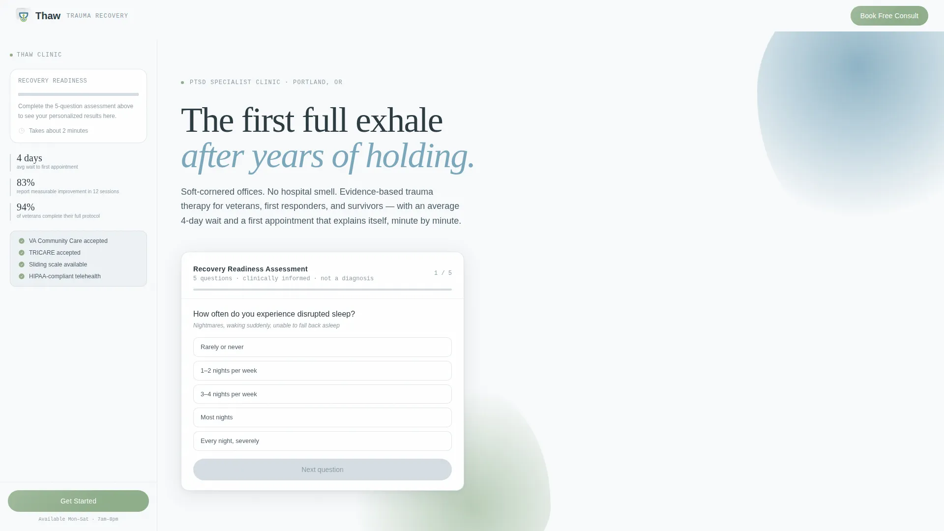
A floating calculator card sits in the hero section and presents five clinically informed questions covering sleep disruption frequency, avoidance behavior intensity, hypervigilance level, emotional numbness, and time since the triggering event. Each answer updates a live visual meter in real time. The final screen returns a personalized summary: an estimated symptom severity band, a recommended treatment modality, and a typical session range. No diagnosis is made or implied.
Persistent Sticky Sidebar
A softly shadowed left rail follows the visitor down the entire page on desktop. It anchors the visitor's assessment results, a "Your Next Step" prompt, and a single calm call-to-action button. The button label evolves contextually based on scroll position, reinforcing the next logical step at every stage of the page.
Stats-First Content Sections
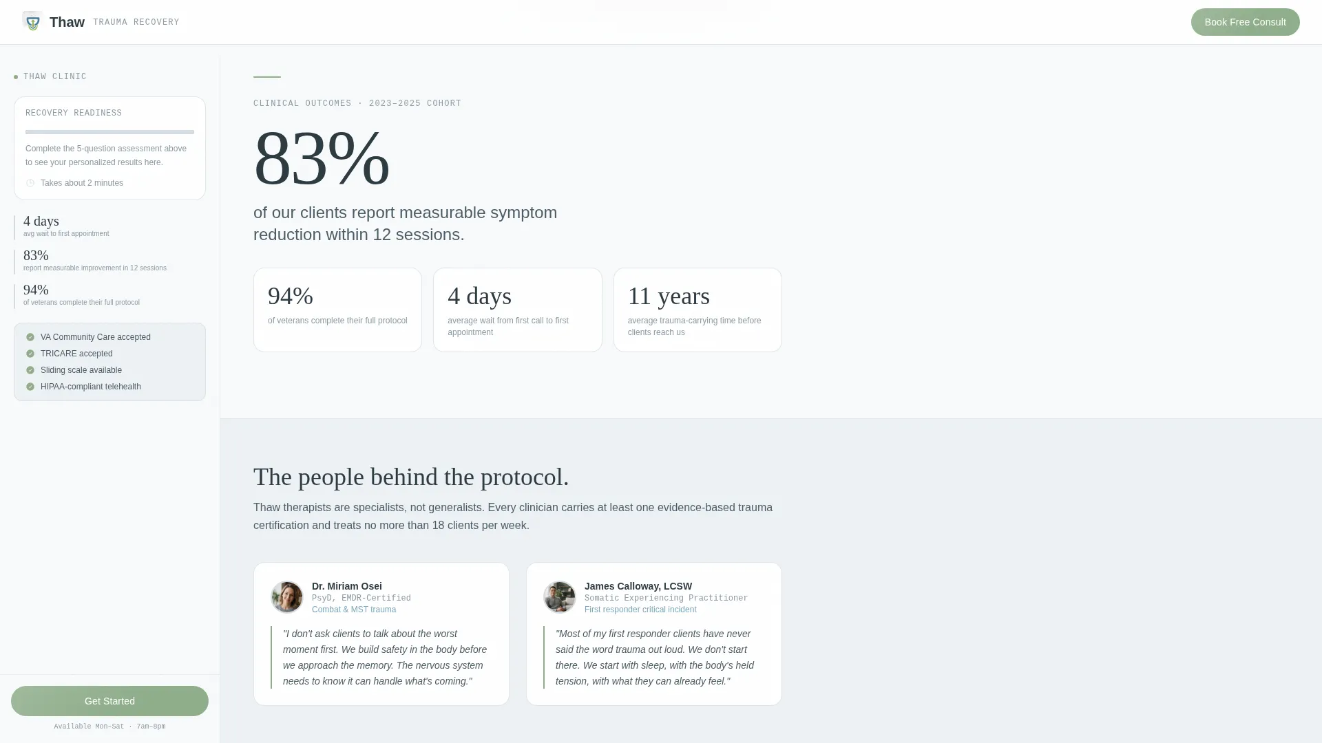
Each of the three main content sections opens with a large-set statistic rendered in a monospaced display style. The data lands visually before any explanatory copy appears. This structure repeats three times with escalating emotional weight, moving from clinical outcomes to population-specific care tracks to appointment transparency.
Zero-Repeat Intake Flow
The page carries the visitor's self-assessment answers forward when they click the primary call to action. No form fields live on the landing page itself. The click transfers their context into the scheduling intake page so they never have to repeat their story from scratch.
Contextual Call-to-Action System
The primary call-to-action button, "Book Your Free 15-Minute Consult," appears in three deliberate positions: inside the sidebar after assessment completion, at the close of each stats section, and as a fixed bottom bar on mobile. Each placement is earned by the surrounding content, not forced.
Anonymized Recovery Timeline Display
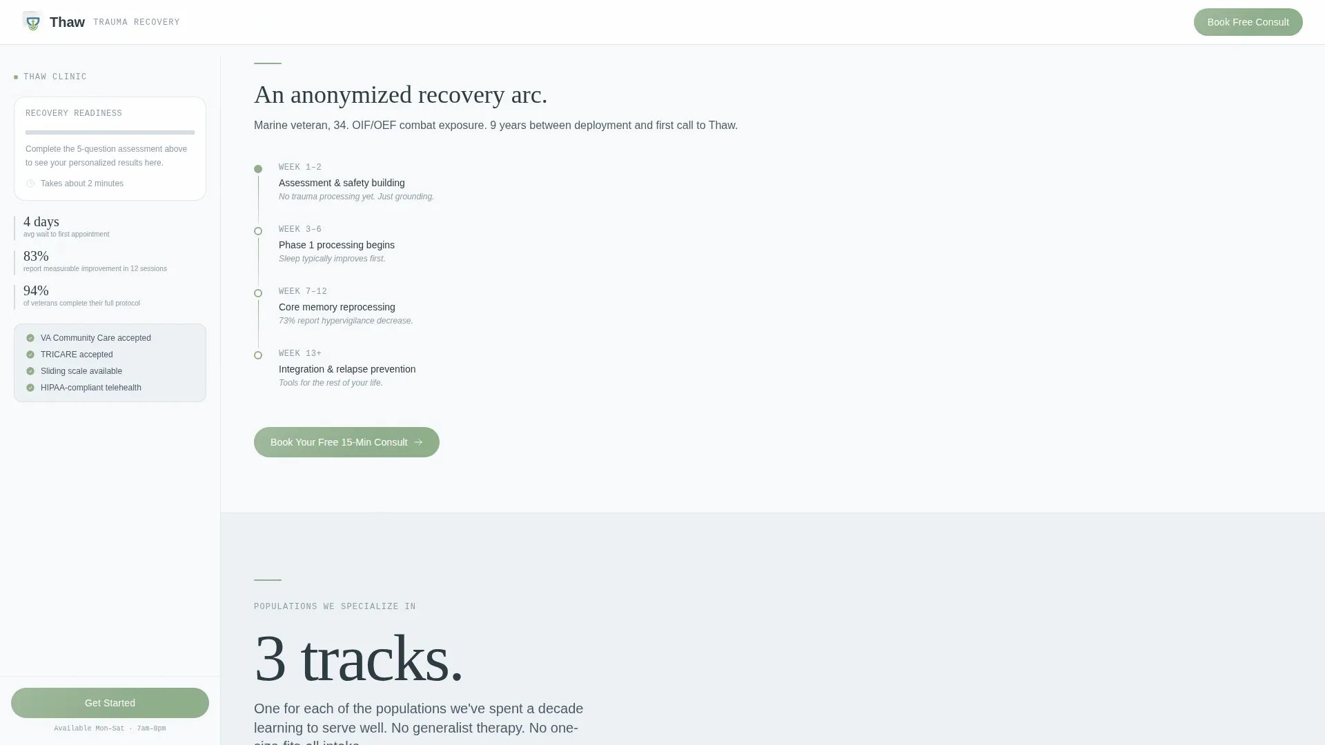
One section presents an anonymized client recovery arc told in a visual timeline format. This sits alongside direct therapist quotes, giving the page both social proof and human texture without compromising client privacy.
Page sections overview
| Section | Purpose |
|---|---|
| Hero + Assessment | Opens the page with the Recovery Readiness calculator card in a split layout |
| Clinical Outcomes Stats | Delivers stark outcome numbers, then therapist voices beneath each figure |
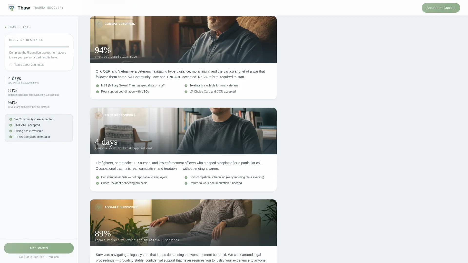
| Who We Treat | Presents three population-specific care tracks for veterans, first responders, and survivors |
| Your First Appointment | Shows a minute-by-minute breakdown of the first session to remove fear of the unknown |
| Coverage & Access | Lays out VA benefits, insurance, and sliding scale options with zero ambiguity |
| Footer | Single-row linear footer with practice contact and navigation essentials |
Design & branding system
The visual identity follows an Organic Flow theme anchored in an Arctic White color system. Every color choice is deliberate and emotionally calibrated for a trauma-sensitive audience.
- Base background uses open snow white (#F8FAFB), with breath-fog gray (#D6DDE3) for surface separation and still-water blue (#7BA7BC) for primary interactive elements
- Lichen green (#8FAE8B) is reserved exclusively for the assessment meter, progress indicators, and the primary call-to-action button, acting as the single sign of life in an otherwise still palette
- Typography pairs DM Sans for headings, Fraunces as a display serif for emotional accent moments, and JetBrains Mono for all statistical figures, giving numbers a precise, trustworthy weight
Mobile & speed optimization
On desktop, the sidebar companion layout is the primary experience. On mobile, the layout adapts so the sidebar content does not obstruct the scroll flow, and a fixed bottom bar takes over the call-to-action role.
- The fixed mobile bottom bar displays the "Book Your Free 15-Minute Consult" button persistently without interrupting reading
- Static content sections use server-side rendering while the interactive assessment and sidebar components are isolated as client-side elements, keeping the initial page load clean
- Scroll-reveal animations, counter animations on statistics, and the assessment meter transition are all set to medium intensity, avoiding visual overwhelm for a trauma-sensitive audience
How this template helps you convert
The page is structured as a click-through landing page. Every design and copy decision builds toward one action: a calm, informed click to the scheduling intake page.
- The self-assessment creates immediate personal relevance. A visitor who sees their own symptom picture reflected back to them in a personalized summary is far more likely to trust the clinic than one who read a generic services list.
- The stats-first rhythm builds clinical credibility before asking for anything. Figures like an 83% symptom reduction rate and a four-day average wait time land as proof, not promises, making the call to action feel earned rather than pushy.
- The "Your First Appointment" section removes the single biggest barrier to booking: fear of the unknown. Showing exactly what the first session looks like, minute by minute, dissolves the anxiety of calling a stranger about deeply personal trauma.
Other information about this template
This template is part of a broader library of specialty healthcare and mental health landing page designs. A few additional details are worth knowing before you build.
- The template is designed desktop-first with a sidebar companion layout, meaning the sidebar is the primary navigation anchor on large screens
- The Organic Flow theme and Arctic White color system are specifically chosen to signal clinical calm rather than clinical sterility, a meaningful distinction for trauma care marketing
- Animation intensity is set to medium throughout; this is intentional and appropriate for a PTSD-focused audience where visual chaos can be counterproductive
- The footer follows a Pattern 1 Linear Single-Row layout, keeping the page exit clean and uncluttered
- All localization is set for the United States market, using USD pricing and 12-hour time format for appointment references
Theme
Organic Flow
Creative direction
Stats-First Impact
Color system
Arctic White
Style
Sidebar Companion
Direction
Click-Through
Page Sections
Recovery Readiness Self-assessment
Persistent Sticky Sidebar
Stats-first Section Structure
Zero-repeat Intake Flow
Contextual Call-to-action Placement
Anonymized Recovery Timeline
Related questions
Does this template include actual therapy content or clinical copy?
Can I use this template if I only offer one treatment modality?
Is this template suitable for a solo trauma therapist or only for a full clinic?
What happens to the sidebar layout on mobile devices?
Does the template include the scheduling intake page it links to?



