Keto Frozen Meals Landing Page Template | Masonry Layout
The Thaw chef crafted keto frozen meals landing page template is a masonry-style, single-page layout built for direct-to-consumer keto frozen food brands. It combines a dramatic cinemagraph hero, scroll-linked meal card grid, bundle tiers, a flavor quiz interstitial, and a persistent call-to-action bar, all styled in a Luxe Minimal Citrus Burst palette to turn frozen food into a premium, crave-worthy experience.
by Rocket studio
Quick summary
The Thaw chef crafted keto frozen meals landing page template is a premium, masonry-layout single page designed for keto frozen food brands selling chef-developed meals. It opens with a cinemagraph hero, flows through a Pinterest-style meal grid, and closes every section with a persistent "Build Your First Box" call to action. The visual language is dark, rich, and unapologetically indulgent, frozen food that earns respect.
Who this template is for
This template is built for founders, marketers, and creative teams running direct-to-consumer keto frozen food brands who need to turn a cold product into a warm, craveable first impression. It works best when the brand sells chef-developed frozen meals as a prepared meal delivery service, competing on quality and macro transparency rather than price alone.
- Direct-to-consumer keto food brands launching or relaunching a frozen meal delivery product
- Food entrepreneurs positioning chef-crafted, fresh-frozen meals against generic prepared meal options
- Marketing teams who need a high-conversion, scroll-driven landing page ready to connect to a box-builder or meal plan selector
What problem this template solves
Frozen food has a perception problem. Most prepared meal delivery service brands struggle to communicate indulgence, freshness, and nutritional precision on a single page without the design feeling clinical or cheap. Time-starved keto buyers need to feel the quality before they click, they want to see the macros, taste the concept visually, and trust the brand in under thirty seconds. Standard templates built for generic meal delivery services cannot do that job.
- Converts skeptical keto shoppers who have been burned by rubbery meal prep and boring low carb options
- Eliminates the cold, sterile look that makes most frozen food pages feel like a hospital cafeteria menu
- Bridges the gap between restaurant quality food photography and a fast, frictionless "Build Your First Box" purchase path
What you get with this template
You get a fully structured, five-section single-page layout with every visual component, animation concept, typography pairing, and color token defined. The template is built around the Taste and Aroma creative direction, meaning each section is designed to escalate sensory appeal as the visitor scrolls deeper, from individual meals to curated bundles to a guided box builder. Every section carries a consistent call to action so no click is wasted.
- Cinemagraph hero section with sequential macro badge reveals and a bold headline
- Scroll-linked masonry meal grid with hover micro-animations, ingredient tooltips, and star ratings on every card
- Bundle tiers bento grid, flavor quiz interstitial, sticky call-to-action bar, review ticker, and a trust banner anchored above the fold
Feature list
This section covers the core built-in components that make the Thaw template work as a focused, high-converting prepared meal delivery service page.
Cinemagraph Hero with Sequential Macro Badges
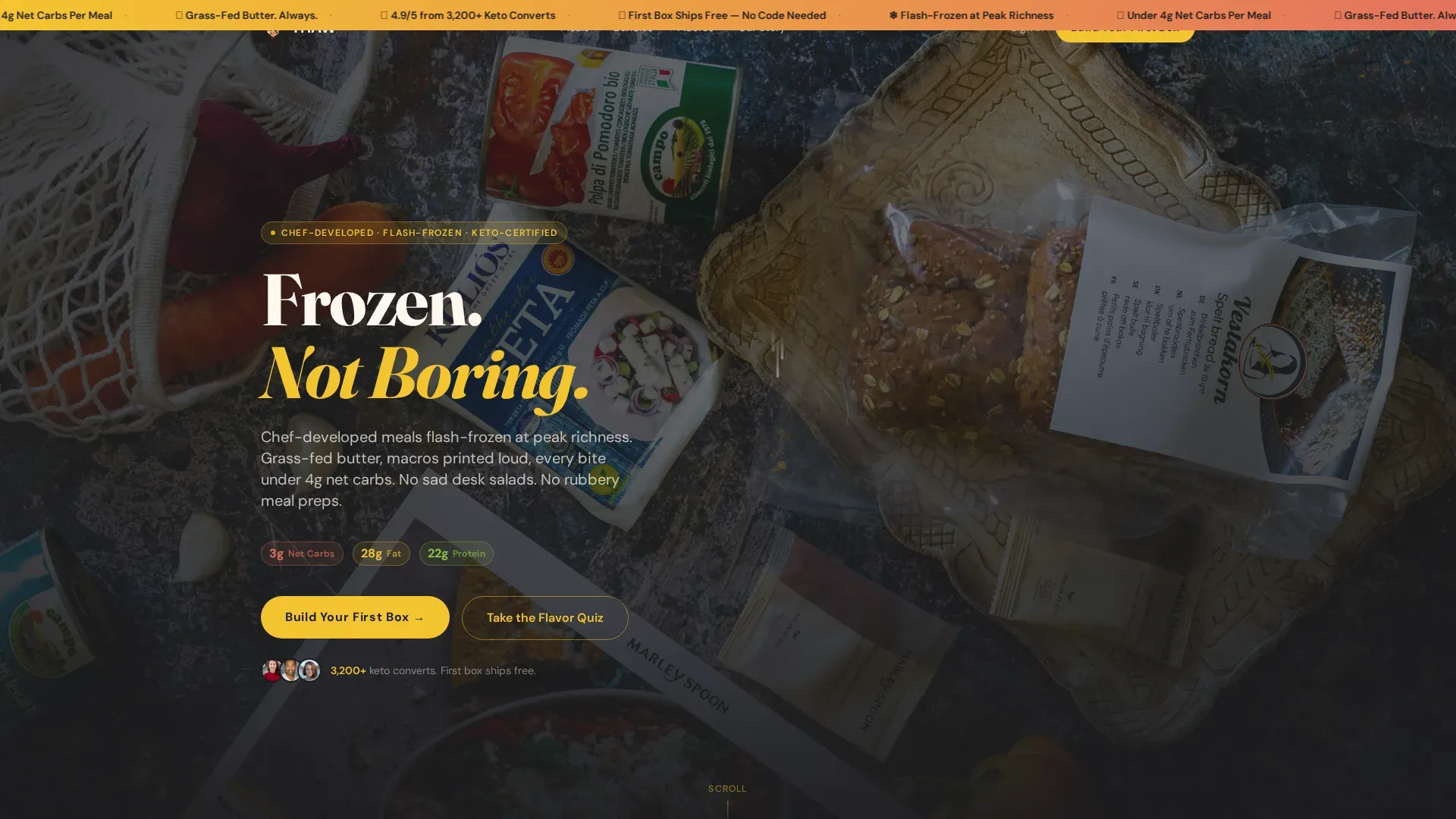
The hero opens on a full-bleed dark slate food photograph where everything is still except a single curl of steam and a slow herb butter drizzle. A bold sans-serif headline, "Frozen. Not Boring.", fades in over the darkness. Macro badges, 3g net carbs, 28g fat, 22g protein, appear one by one like quiet credentials, giving keto shoppers the nutritional information they need before they even begin to scroll. This approach treats dietary transparency as a design element, not a footnote.
Masonry Meal Grid with Hover Micro-Animations
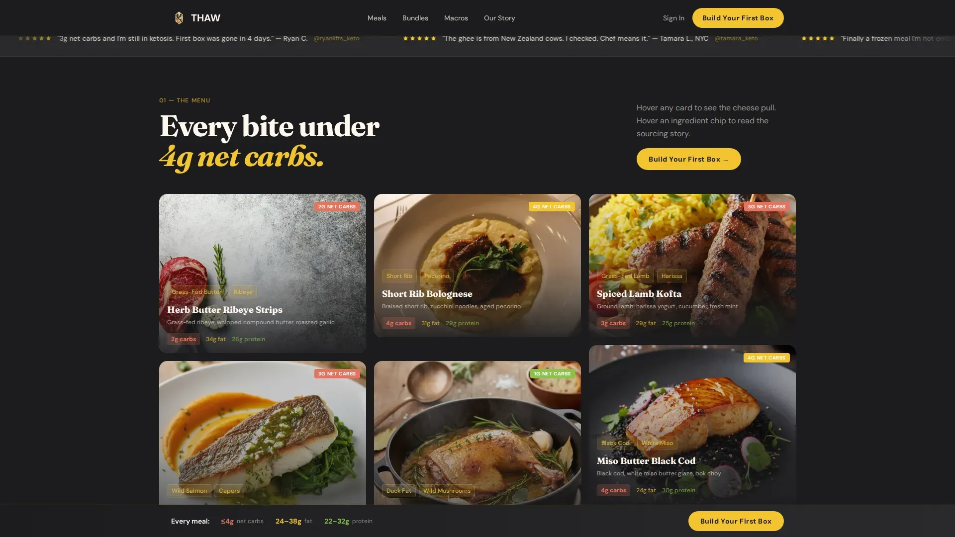
The core content section uses a Pinterest-style varied-card-height grid to display individual meals with dramatic chiaroscuro food photography. Hovering a card triggers a micro-animation, a cheese pull, a sauce drizzle, or herb flakes tumbling, making the scroll feel alive and sensory. Ingredient origin tooltips appear on hover, surfacing details like sourcing notes that elevate the prepared meal from convenient food to considered food. The grid is scroll-linked and built to collapse from a multi-column desktop layout to a two-column then single-column mobile view.
Bundle Tiers Bento Grid
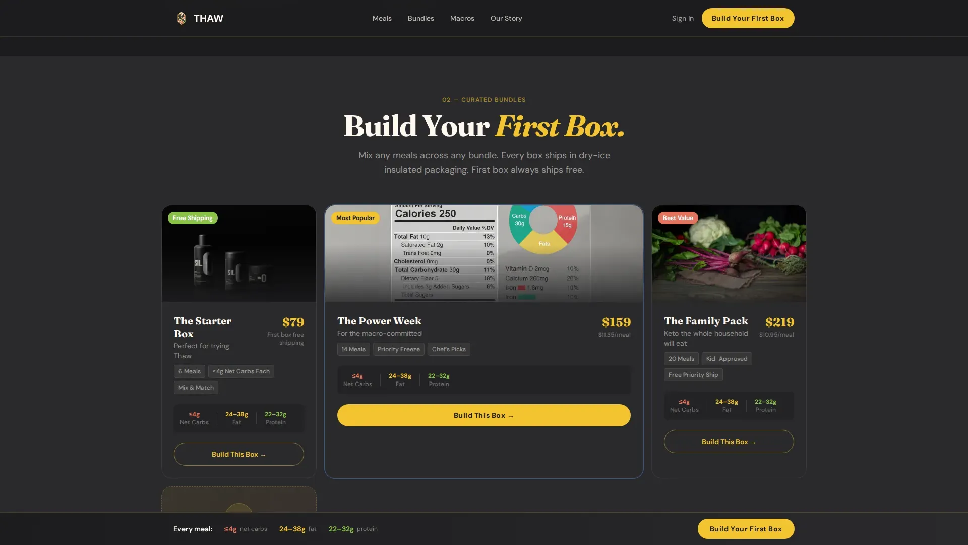
As the visitor scrolls deeper, individual meal cards give way to curated bundle tiers displayed in an asymmetric bento grid. Each tier includes a macro summary and a clear call to action, letting carb conscious shoppers compare meal plan options at a glance without leaving the page. The layout moves from single meals to full weekly meals packages, matching the visitor's growing purchase intent as they scroll.
Scrolling Review Ticker and Trust Bar
A continuously looping review ticker carries five-star review fragments across the screen, building social proof without dedicating a full section to testimonials. A "First Box Ships Free" banner is anchored just above the fold so it remains in view early in the scroll. These two elements work together to reduce friction for first-time buyers who are comparing meal delivery services and need a reason to commit.
Flavor Quiz Interstitial and Sticky Call-to-Action Bar
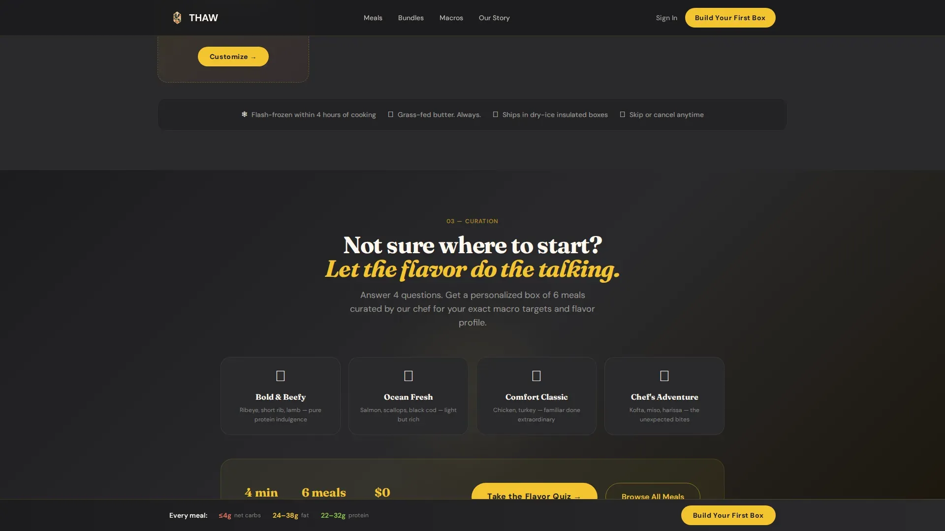
A mid-page interstitial offers a secondary conversion path: a "Take the Flavor Quiz" button for visitors who prefer curation over browsing the full menu. This captures indecisive shoppers without losing them. The sticky call-to-action bar persists across every section of the page, always showing "Build Your First Box" so the primary purchase intent is never more than one click away regardless of scroll depth.
Page sections overview
| Section | Purpose |
|---|---|
| Cinemagraph Hero | Opens with moody food film, sequential macro badges, and the headline "Frozen. Not Boring." |
| Masonry Meal Grid | Scroll-linked Pinterest card layout with hover animations and ingredient tooltips |
| Review Ticker Bar | Looping five-star review fragments and "First Box Ships Free" trust banner |
| Bundle Tiers Bento | Asymmetric bento grid showing curated meal bundles with macro summaries |
| Flavor Quiz Interstitial | Mid-page quiz prompt for visitors who want curation over choice |
| Full-Width Call to Action | Bold "Build Your First Box" section driving clicks to the box-builder flow |
| Footer | Vercel Horizontal Flow pattern with brand and navigation elements |
Design & branding system
The visual identity follows a Luxe Minimal theme with a Citrus Burst color system. The palette is designed to feel like slicing a cold citrus fruit on a black marble countertop, sharp, alive, and far more sophisticated than any frozen food brand has a right to be. Typography pairs Fraunces, a high-contrast display serif, with DM Sans for body and interface text, creating a tension between editorial elegance and functional clarity.
- Deep charcoal (#1C1C1E) backgrounds make food photography glow; Meyer lemon (#F4C430) drives button and macro callout accents; blood orange (#E3735E) activates hover states and net-carb badges; clean cream (#FFF8F0) surfaces card backgrounds and body text
- Fraunces handles all display headlines for an upscale editorial feel; DM Sans keeps navigation, macro labels, and call-to-action buttons clean and immediately readable
- Chiaroscuro food photography with a single warm directional light source from the upper left creates the dark marble countertop aesthetic throughout every meal card and hero image
Mobile & speed optimization
The template is built desktop-first but designed to collapse gracefully. The masonry grid shifts from its full multi-column desktop layout to a two-column then single-column stack on smaller screens, keeping food photography prominent and call-to-action buttons easy to tap. Animation is handled through CSS transitions and IntersectionObserver scroll reveals to keep the experience smooth without heavy scripts.
- Masonry grid collapses from full desktop columns to two-column then single-column mobile layout, keeping meals prominent at every screen size
- CSS-driven animations and IntersectionObserver-based scroll reveals are used throughout to keep motion lightweight and responsive on mobile devices
How this template helps you convert
Every design decision in this template flows toward one outcome: getting a first-time visitor to click "Build Your First Box." The page earns that click by building trust visually and structurally before asking for it.
- Macro transparency displayed at the hero level means keto shoppers see the nutritional information, net carbs, fat, protein, within the first few seconds, removing the primary objection before it forms
- The sticky call-to-action bar and full-width call-to-action section ensure the purchase path is always visible, while the flavor quiz interstitial captures undecided visitors who are not yet ready to browse the full menu independently
Other information about this template
This template is designed specifically for the keto frozen food niche within the broader meal delivery services landscape. Understanding how this space works helps clarify exactly what this page is built to communicate and compete against.
- Flash-freezing preserves nutritional value and flavor, making these frozen meals often fresher than refrigerated options. The template is structured to communicate this clearly so buyers understand that frozen does not mean compromised.
- Frozen meals stay fresh for up to 3 months or longer in the freezer, compared to fresh meals that typically expire within 4 to 7 days. The template's trust bar and tooltip system are designed to reinforce this shelf-life advantage as a benefit, not a drawback.
- The best prepared meal delivery service brands offer dietitian approved meals with transparent nutrition data. This template surfaces that transparency on every card and in the hero so keto shoppers can verify macros instantly.
- Many meal delivery services ship their frozen orders with ice packs and cooler bags to maintain temperature during transit. A page built on this template can visually reinforce that care through packaging photography and ingredient callout tooltips.
- Meal delivery services vary in pricing, typically ranging from $7.50 to $16 or more per meal before shipping. Brands using this template can position their value clearly in the bundle tiers bento section by showing what a full weekly menu of healthy meals costs relative to eating out.
- Flexible meal delivery services allow customers to order without a weekly subscription commitment. This template supports both a subscription service path and a one-time box path through the box-builder call-to-action flow, accommodating a range of dietary preference and purchase behavior.
- Many shoppers exploring meal delivery are also managing dietary restrictions. Brands using this template can call out gluten free, dairy free, and plant based options clearly on meal cards and in ingredient tooltips, helping picky eaters and households with mixed dietary needs find what works for them.
- Plant based options and fully vegan options are increasingly common within the keto space. While the Thaw template is designed around a high-fat, animal-protein-forward menu, the card and tooltip system can accommodate plant based labeling without restructuring the layout.
- The meal card tooltip system supports callouts like "grass-fed ghee," "olive oil from single-origin farms," and sourcing notes for organic ingredients, quality ingredients, and whole vegetables used in the recipes.
- The template's weekly menu and weekly recipes display system supports brands that rotate their prepared meal options on a weekly basis, keeping the menu fresh for repeat visitors and weekly subscription customers.
- Reducing food waste is a meaningful part of the frozen meal value proposition. Because meals stay fresh in the freezer far longer than delivered fresh options, the template is positioned to help brands communicate this reduce waste benefit naturally within the trust and macro-transparency sections.
- Cooler bags and ice packs are part of the physical delivery experience for frozen meal delivery brands. While this template does not manage logistics, the design system includes space for packaging callouts and delivery detail reassurances that help buyers feel confident about how meals stay fresh during shipping.
- The home chef aesthetic of the Thaw template makes it suitable for brands that want to communicate restaurant quality without the formal or overly clinical feel of large-scale meal kits. Every section is designed to feel like it was art-directed by a home chef who happens to have professional-grade food styling skills.
- Brands that want to position themselves alongside or above services like cookunity meals will find this template's emphasis on macro transparency, ingredient sourcing, and sensory-rich photography a strong differentiator in a crowded prepared meal delivery service market.
- Added salt, basil leaves, cauliflower rice, tree nuts, and other specific ingredient callouts can be surfaced through the tooltip system on the masonry grid, giving the page the feel of reading a fine-dining menu while browsing a grocery shopping replacement.
- Portion sizes are displayed per card alongside macro data, helping calorie conscious and calorie smart shoppers make fast decisions without navigating to a separate nutrition page.
- Protein ranges are visible across the bundle tiers bento grid, letting protein packed meal seekers compare options without leaving the page.
- The template's delivery times callout space lets brands reassure buyers about when to expect their box and confirm that meals work with their week-ahead planning schedule.
- Whether a brand serves locally owned restaurant partnerships or a fully centralized production kitchen, the design system adapts to communicate origin, care, and craft at every scroll point.
Theme
Luxe Minimal
Creative direction
Taste & Aroma
Color system
Citrus Burst
Style
Masonry/Pinterest
Direction
Click-Through
Page Sections
Cinemagraph Hero with Macro Badge Reveals
Scroll-linked Masonry Meal Grid
Bundle Tiers Bento Grid
Scrolling Review Ticker and Trust Bar
Flavor Quiz Interstitial and Persistent Call-to-action Bar
Related questions
What kinds of keto frozen food brands is this template best suited for?
How does the masonry grid display meals and nutritional information?
Can this template support gluten free, dairy free, and plant based meal labeling?
How long do frozen meals stay fresh, and does the template help communicate that?
Does this template require visitors to sign up for a weekly subscription?



