Financial Analyst Profile Professional Website Template
Thesis is a bento grid landing page built for independent financial analysts who publish contrarian equity research. It combines a high-contrast photo mosaic header, live-updating data cards, and a bold brutalist visual identity to communicate credibility before a visitor reads a single word. The layout guides readers from identity to proof to action.
by Rocket studio
Quick summary
Thesis is a single-page bento grid landing page designed for independent financial analysts. It opens with a six-tile photo mosaic, moves through a grid of research cards, subscriber metrics, and testimonials, and closes every visitor loop with two focused calls to action. The design feels like conviction on a screen, not polish for its own sake.
Who this template is for
This template is built for analysts who operate solo but publish with the weight of a full research desk. It suits anyone whose personal brand is the product and whose audience expects rigor, not relatability.
- Independent equity researchers publishing original, contrarian investment theses
- Financial writers and fintech content creators who want their landing page to reflect the depth of their work
- Junior analysts or finance professionals building a public profile beyond their day job
What problem this template solves
Most personal website templates are built for creatives or coaches. They default to soft gradients, centered hero text, and generic "book a call" layouts. A financial analyst using one of those templates immediately loses credibility with a sophisticated audience.
- Generic templates signal a generic mind, which kills trust with institutional readers and serious retail investors
- There is no standard layout that presents tickers, timestamps, accuracy metrics, and a subscribe prompt as a unified, coherent story
- Building this kind of page from scratch requires design decisions that most analysts do not have time to make
What you get with this template
This template delivers a fully structured single-page layout that does the credibility work upfront. Every section has a defined role, and every visual choice is backed by the source brief.
- A six-tile asymmetric photo mosaic header with overlaid brutalist typography and a floating call-to-action pill
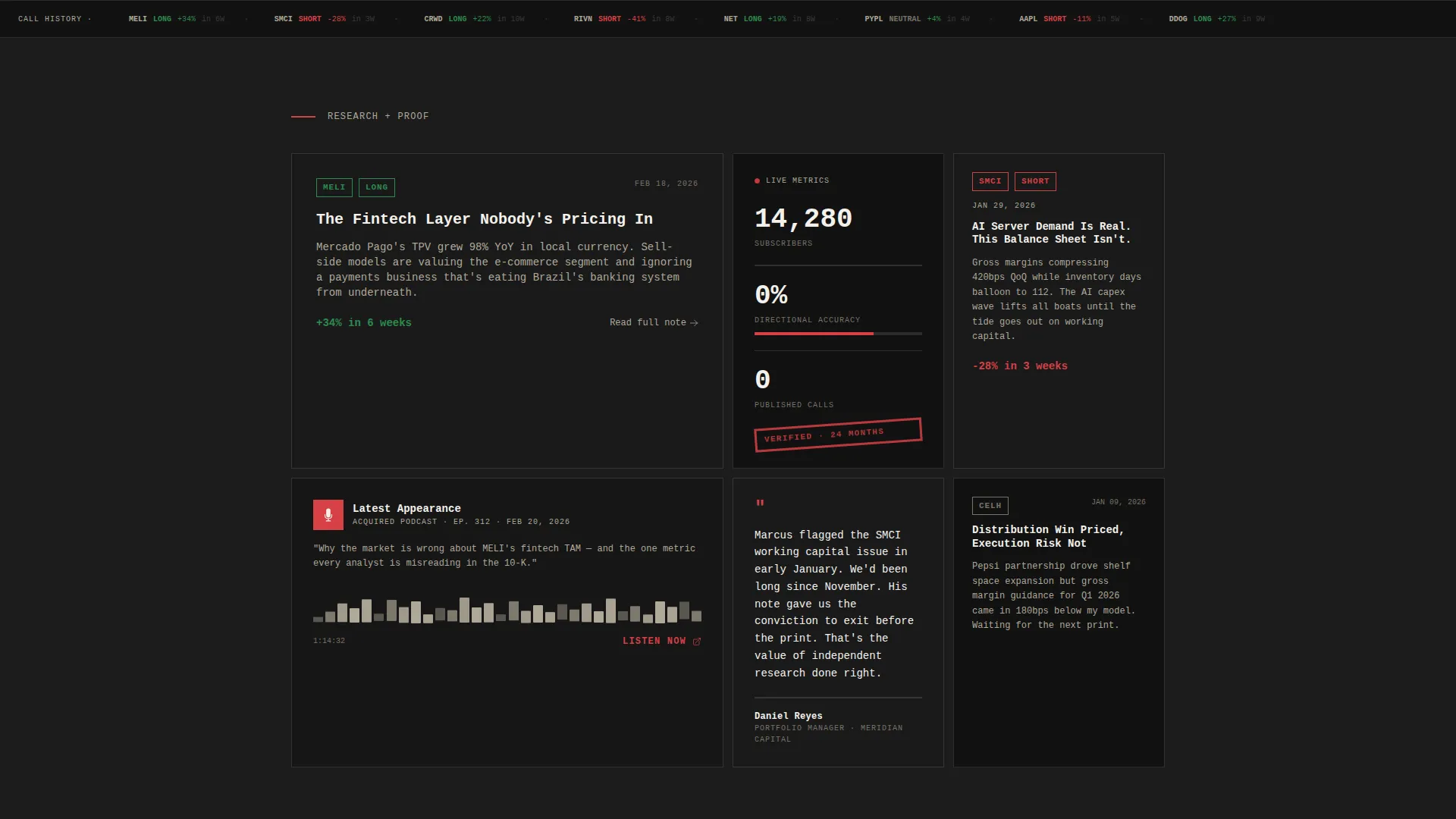
- A bento grid body with research note cards, a podcast embed card, a live-counter metrics card, a testimonial card, and a philosophy card
- A dedicated subscribe card styled as a torn notebook page, plus a persistent mobile bottom bar for the primary call to action
Feature list
This section breaks down the core functional components delivered by the template.
Six-Tile Photo Mosaic Header
The header fills the full viewport with six asymmetric black-and-white photograph tiles. The analyst's name sits in oversized brutalist type across the bottom third, partially overlapping two tiles. A one-line positioning statement and a signal-red floating pill call to action anchor the composition.
Bento Grid Research Cards
Below the header, the grid presents recent research notes with ticker symbols and publication dates. Cards vary in height and width, creating a layout that rewards exploration the way a financial data terminal does. Each card carries its own visual weight.
Live-Updating Metrics Counter Card
One dedicated bento card displays subscriber count and prediction accuracy as live-updating counters. This turns abstract credibility into visible, earned proof that a visitor can read in seconds.
Podcast Embed Card with Waveform Visual
A card inside the grid embeds the analyst's latest podcast appearance alongside a waveform graphic. It extends the analyst's voice beyond the written word and gives audio-first followers an immediate point of entry.
Investment Philosophy Card
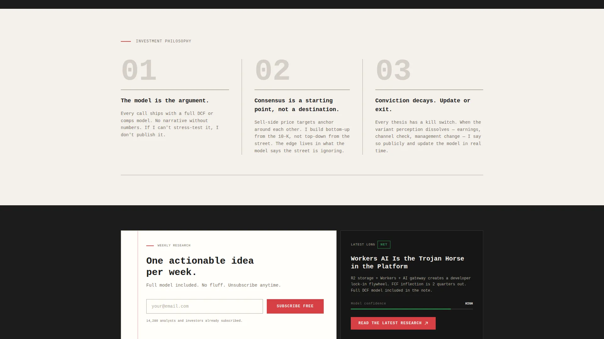
A tall bento card presents the analyst's investment philosophy as three numbered rules set in brutalist monospaced type. It communicates conviction and methodology without needing a paragraph of explanation.
Torn Notebook Subscribe Card
The secondary call to action lives on a card styled like a torn notebook page. It contains only an email input field and a single line of copy. The stripped-back design keeps the ask honest and the friction low.
Page sections overview
| Section | Purpose |
|---|---|
| Photo mosaic header | Establish identity through raw, high-contrast imagery |
| Name and positioning | Lock in brand and contrarian value proposition |
| Floating call to action pill | Drive first click toward research portal |
| Research note cards | Prove recency and rigor with real tickers and dates |
| Podcast embed card | Extend reach to audio-first audience |
| Live metrics counter | Show subscriber count and prediction accuracy |
| Testimonial card | Deliver third-party social proof from a portfolio manager |
| Philosophy card | Communicate analytical worldview in three numbered rules |
| Subscribe card | Capture email with minimal friction |
| Mobile bottom bar | Persistent primary call to action for mobile visitors |
Design & branding system
The visual identity follows a Bold Brutalist theme built on the Cloud Canvas color system. Every color and type choice is functional first, decorative never.
- The palette uses vapor white (#F4F1EC) for card backgrounds, exposed concrete gray (#B0A999) for borders and dividers, charcoal slab (#1C1C1C) for oversized display type, and signal red (#D64045) reserved exclusively for calls to action and live data callouts
- Typography is monospaced and set flush-left at brutally large sizes, with backgrounds alternating between vapor white and charcoal slab to create visual weight shifts across the grid
- The overall feel is a hedge fund whiteboard at 4 AM: every mark deliberate, nothing included for decoration
Mobile & speed optimization
The template is built with mobile visitors in mind, particularly the fintwit and retail investor audiences who arrive on a phone after seeing a post shared on social media.
- A persistent bottom bar on mobile keeps the primary call to action, "Read the Latest Research," visible without interrupting the scroll
- The bento grid layout adapts to narrower screens so card content remains readable and the photo mosaic retains its impact at smaller sizes
- Heavy visual components like the mosaic and waveform graphic are laid out to stay purposeful rather than decorative, keeping the page functional even on constrained displays
How this template helps you convert
The page is structured around a Click-Through objective. Every section earns the next click by delivering proof before asking for anything.
- The photo mosaic and brutalist name treatment create immediate authority. A visitor knows in under three seconds that this is a serious research operation, not a hobby blog.
- The bento grid presents real tickers, real timestamps, real accuracy counters, and a portfolio manager testimonial before the subscribe prompt ever appears. Trust is built through evidence, not assertion.
- The subscribe card asks for only an email and frames the value in one sentence. By the time a visitor reaches it, the decision to subscribe feels obvious.
Other information about this template
This template fits naturally into a broader personal brand strategy for financial analysts who publish independently through platforms like Substack or a dedicated research portal.
- The template is categorized under Personal and Resume, with a specific focus on the Financial Analyst Profile subcategory
- The bento grid layout and photo mosaic header are drawn from the Creator Spotlight creative direction, which guides the visitor arc from identity into proof into worldview
- The landing page is designed as a single-page flow, making it straightforward to host, share, and update without managing a multi-page site

Theme
Bold Brutalist
Creative direction
Creator Spotlight
Color system
Cloud Canvas
Style
Bento Grid
Direction
Click-Through
Page Sections
Six-tile Asymmetric Photo Mosaic
Bento Grid Research Card Layout
Live Metrics Counter Card
Podcast Embed with Waveform Visual
Investment Philosophy Display Card
Torn Notebook Subscribe Card
Related questions
Who is this landing page template built for?
Can I use this template if I do not have a podcast?
How does the template handle the call to action?
What is a bento grid layout?
Do I need design experience to customize this template?



