Streetwear Landing Page Template for Clothing Brands
Thread is a gallery-and-detail landing page built for a Black-owned streetwear brand with roots in Atlanta cut-and-sew workshops. It pairs a capsule-drop countdown with a scroll-driven comparison journey, guiding visitors from curiosity to conviction. The design speaks in zine energy: warm ink, handmade paper tones, and editorial negative space that lets every garment breathe.
by Rocket studio
Quick summary
Thread is a single-page streetwear landing page designed for a Black-owned clothing brand with cultural roots and craft-forward production. A countdown timer drives drop urgency while a comparison gallery educates shoppers on value. The result is a page that earns trust before it asks for a click.
Who this template is for
This template is built for independent clothing brands that lead with story as much as style. It fits founders who want their page to feel handmade, not mass-produced.
- Streetwear and capsule-collection brands launching limited drops
- Black-owned clothing businesses that want to communicate craft, origin, and cultural authorship
- Creative founders selling to educated, values-driven buyers who research before they purchase
What problem this template solves
Most e-commerce landing pages push products without context. Buyers see a price and hesitate. Thread solves this by replacing passive browsing with an active education journey.
- Visitors arrive skeptical about pricing and leave understanding exactly what they are paying for
- The comparison gallery removes the "why does this cost more" objection before it forms
- The countdown timer gives drop-based brands a structural reason to return, not just browse
What you get with this template
Thread delivers a complete gallery-and-detail landing page experience. Every section is intentional, every component earns its place on the page.
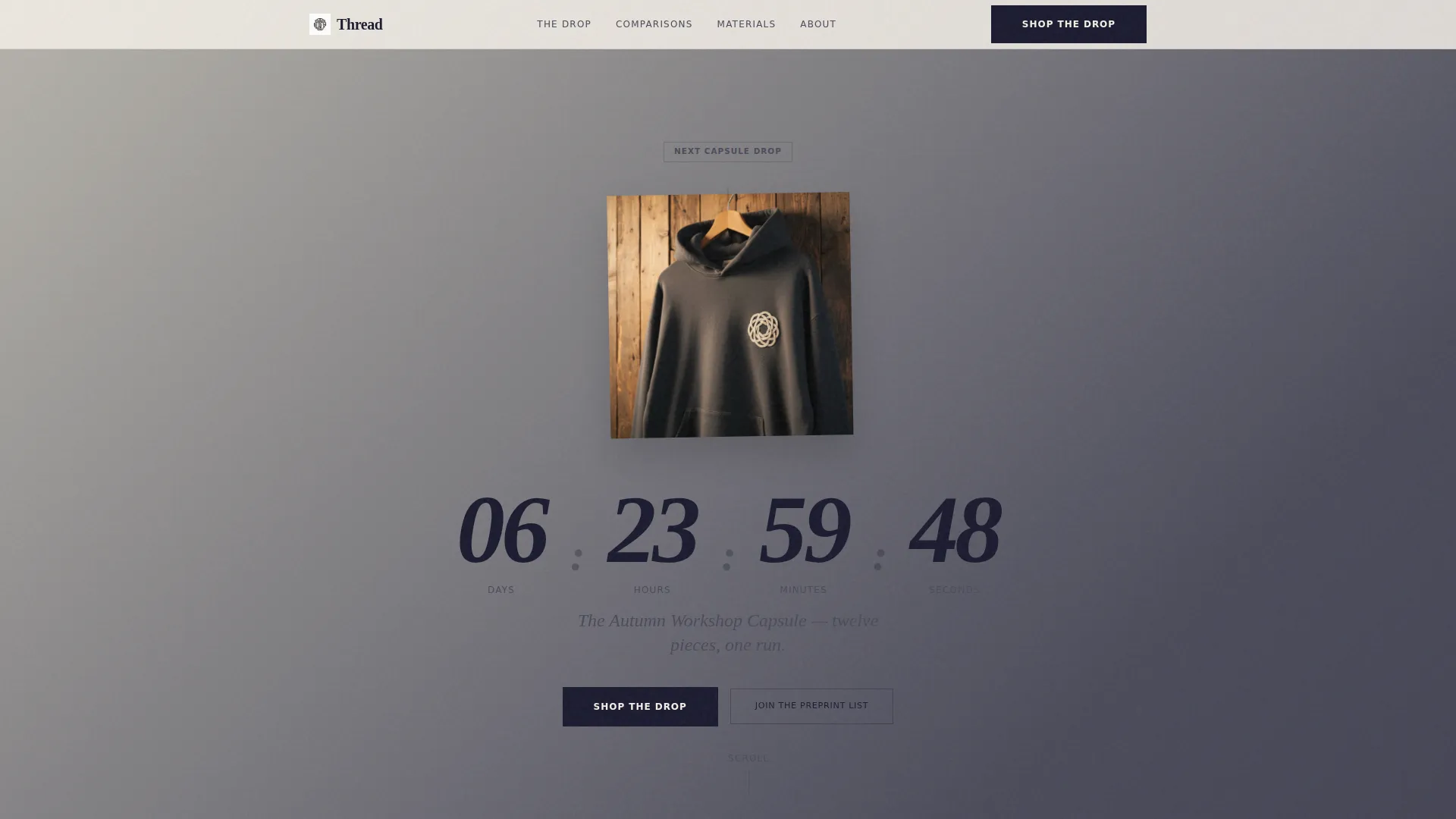
- A hero header with a live countdown timer, editorial garment photography composition, and a slow-moving gradient backdrop
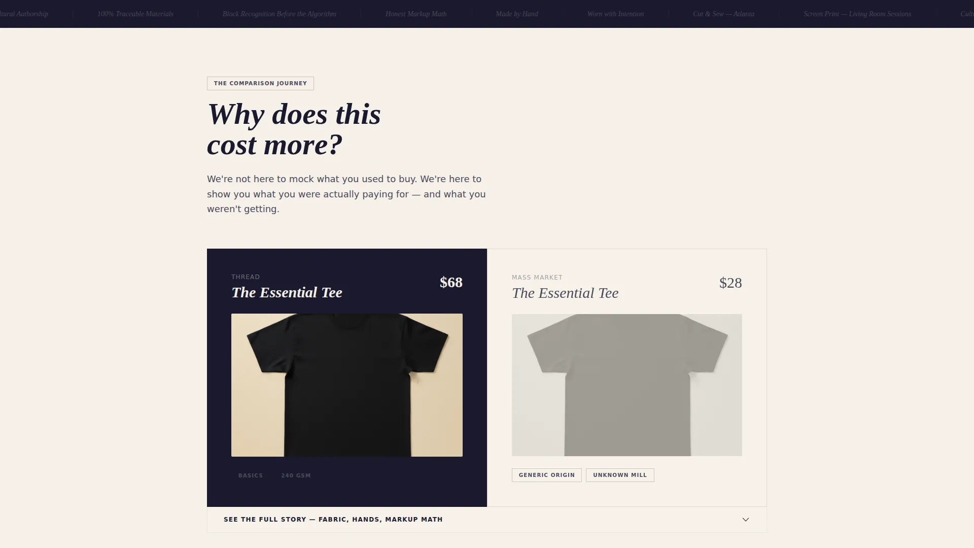
- A scrollable comparison journey with expandable gallery cards showing fabric weight, material origin, artisan process, and transparent markup details
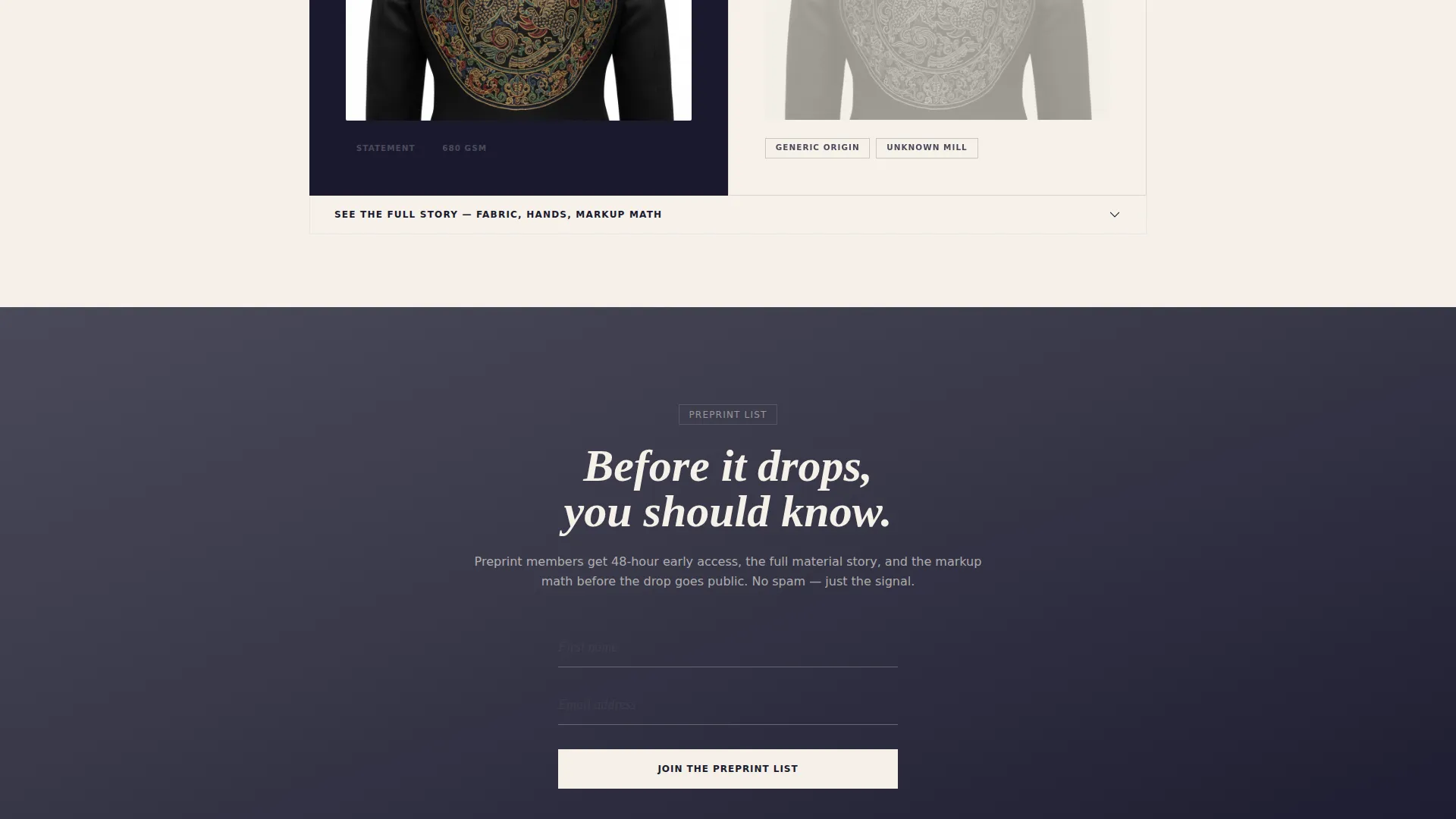
- Two conversion paths: a primary "Shop the Drop" call to action and a secondary email capture form titled "Join the Preprint List"
Feature list
Thread is built around a focused set of components that work together to move a visitor from first impression to confident action.
Capsule Drop Countdown Timer
The header opens with an oversized countdown rendered in serif numerals that feel stamped rather than typed. The timer marks the next capsule release and sits against a slow gradient shifting from unbleached cotton to graphite over thirty seconds. A single garment rotates almost imperceptibly behind it, keeping the composition editorial and unhurried.
Scroll-Driven Comparison Gallery
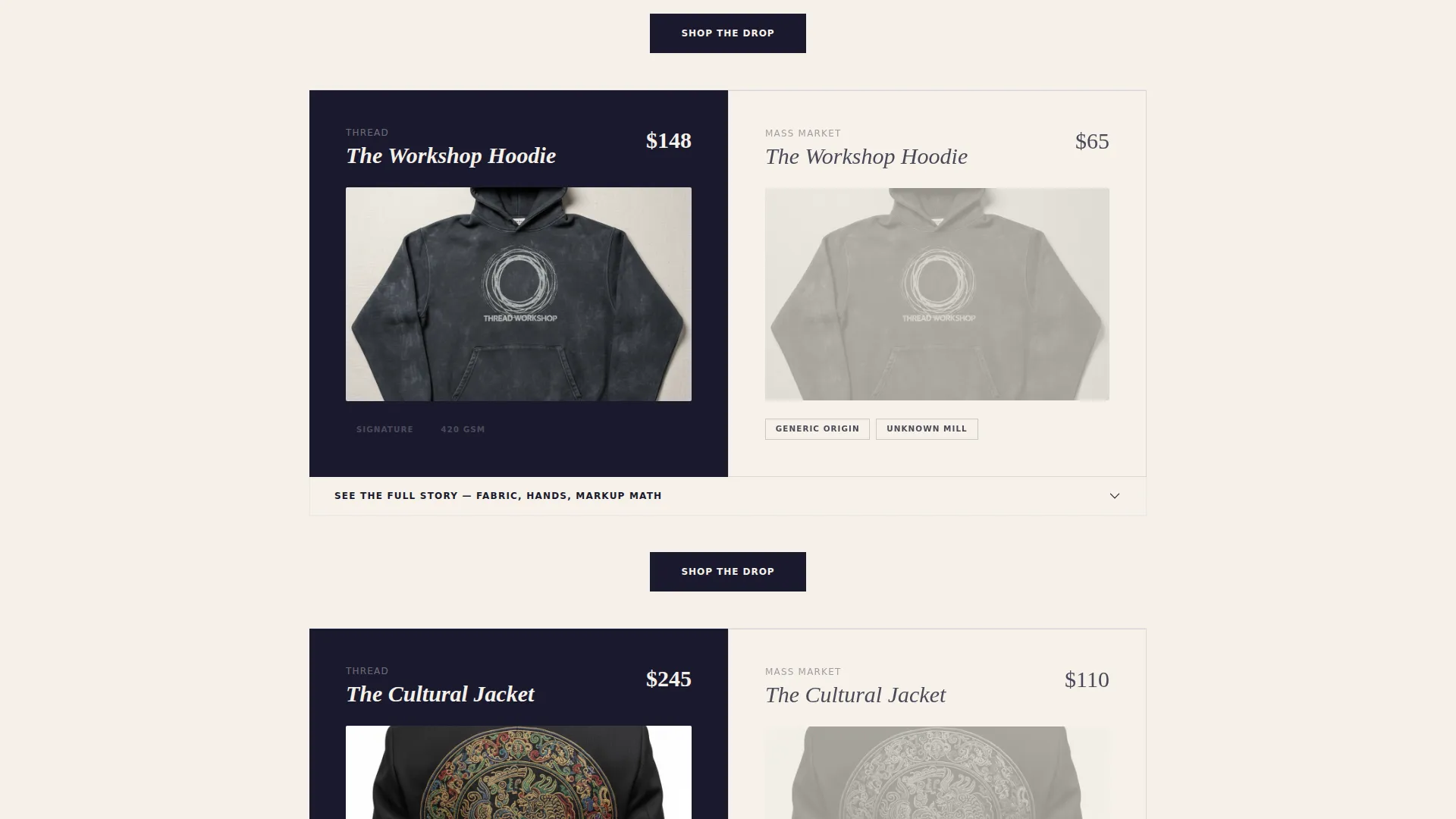
Each gallery card expands into a full detail panel. Visitors see fabric weight, material origin, artisan production imagery, and markup math placed side by side with mass-market alternatives. The journey scales from basics to statement pieces, with each comparison more revealing than the last.
Dual Conversion Paths
The primary call to action, "Shop the Drop," appears beneath the countdown and repeats after every third comparison card, routing traffic directly to the product catalog. A secondary path, "Join the Preprint List," captures first name and email for early access to future capsule releases.
Ink and Paper Visual System
The color palette uses deep manuscript black, warm unbleached cotton, smudged graphite, and a pressed violet accent that appears only on hover states and active selections. Backgrounds shift between cotton and graphite in gentle gradients. The violet reveals itself sparingly, like a signature at the bottom of a handwritten note.
Zine-Inspired Editorial Layout
The page is designed to feel like flipping through a zine your friend made. Negative space dominates. Garments breathe. Typography feels stamped and deliberate rather than generated. Every scroll feels like turning a page in something worth holding with both hands.
Page sections overview
| Section | Purpose |
|---|---|
| Hero Countdown Header | Introduces the brand, displays the drop timer, and anchors editorial garment imagery |
| Comparison Gallery | Educates visitors on craft and value through expanding product detail cards |
| Fabric and Origin Detail | Reveals material sourcing, artisan process, and transparent pricing context |
| Shop the Drop call to action | Drives primary click-through to the full product catalog at regular scroll intervals |
| Preprint Email Capture | Collects first name and email for early access to future capsule drops |
Design & branding system
The visual identity follows a Soft Gradient theme built on an Ink and Paper color system. Every tone is chosen to feel tactile and handmade, not digital and sterile.
- Core palette: deep manuscript black (#1A1A2E), warm unbleached cotton (#F5F0E8), smudged graphite (#4A4A5A), and pressed violet (#6C5B7B) reserved exclusively for hover and active states
- Backgrounds shift between cotton and graphite in slow, soft gradients that move like light crossing a studio wall
- Typography reads like stamps on handmade paper, serif numerals dominate the countdown, and text throughout lives in manuscript black
Mobile & speed optimization
The layout is designed to translate the editorial, zine-like experience across screen sizes without losing the intentional pacing of the comparison journey.
- Comparison gallery cards are structured to expand cleanly on smaller screens, preserving the full detail panel experience
- The countdown timer and hero garment composition are framed for vertical viewports, keeping urgency visible above the fold on mobile devices
How this template helps you convert
Thread is structured to close the distance between a curious visitor and a confident buyer. The page does not rely on pressure; it relies on accumulated understanding.
- The countdown timer creates genuine time-based urgency tied to the brand's capsule drop model, giving visitors a clear reason to act now rather than later
- The comparison gallery systematically removes price objections by showing exactly what goes into every garment, building trust through transparency rather than persuasion
- Repeating the "Shop the Drop" call to action after every third gallery card ensures the conversion moment appears at exactly the point when a visitor's confidence is highest
Other information about this template
Thread is a single landing page template suited to retail and e-commerce brands operating in the Black-owned business space. It was designed with a gallery-and-detail structure in mind, reflecting a masonry-influenced layout philosophy that organizes visual information in a flowing, editorial rhythm rather than a rigid grid. The Soft Gradient theme and Comparison Journey creative direction are well matched for brands whose product pricing requires active context rather than passive display.
- The template supports a direct sales landing-page direction, meaning every section is built to move visitors toward a purchase or list sign-up
- It is designed for brands launching capsule collections or limited drops where urgency and story both matter
- The layout suits founders who want their online presence to reflect the same cultural authorship present in their physical garments and workshop practices
Theme
Soft Gradient
Creative direction
Comparison Journey
Color system
Cloud Canvas
Style
Masonry/Pinterest
Direction
Direct Sales
Page Sections
Capsule Drop Countdown Timer
Scroll-driven Comparison Gallery
Dual Conversion Paths
Ink and Paper Color System
Zine-style Editorial Layout
Related questions
Can I use this template without an active capsule drop?
Is this template designed only for streetwear brands?
How does the email capture section work?
Can I customize the color palette for my own brand?
Does the comparison gallery support multiple product categories?



