Boutique Womenswear Bento Grid Landing Page Template
Thread is a bento grid landing page built for boutique womenswear stores with character. It pairs a Neo-Retro visual identity with interactive scroll moments, an owner-forward hero section, and a conversion path that moves single-item browsers toward curated outfit bundles and a Style Letter membership. Everything on the page feels intentional, warm, and unmistakably independent.
by Rocket studio
Quick summary
Thread is a single-page bento grid template designed for brick-and-mortar boutiques selling women's clothing. It leads with a full-bleed owner photo, layers in tactile micro-interactions across the grid, and closes the sale through bundle upsells and a membership bottom bar. The Ink and Paper color system keeps every visual choice deliberate and editorial.
Who this template is for
This template speaks directly to independent boutique owners who want their online presence to feel as considered as their shop floor. It is built for women who have curated a real point of view and want visitors to feel that immediately.
- Women-owned clothing boutiques with a distinct aesthetic identity
- Store owners selling vintage-inspired or limited-run womenswear pieces
- Boutiques ready to grow revenue through outfit bundles and membership offers
What problem this template solves
Most boutique websites look like they were built from a generic retail kit. They flatten the personality out of a store that took years to build. Thread solves the gap between a beautifully curated shop and a website that communicates nothing.
- Visitors arrive for one item and leave without discovering the full range
- The store owner's voice and story get lost behind stock photography and cold layouts
- No clear path guides browsers toward higher-value purchases or repeat engagement
What you get with this template
Thread delivers a fully structured bento grid landing page with every section mapped to a specific moment in the customer journey. The layout does not just display products; it builds trust, reveals personality, and earns the upsell naturally.
- A full-bleed hero section featuring the owner and an animated headline
- An interactive bento product grid with distinct hover behaviors per cell
- A persistent "Join the Style Letter" membership bar and bundle-driven call to action system
Feature list
Each feature listed below comes directly from the template brief. Nothing here is speculative.
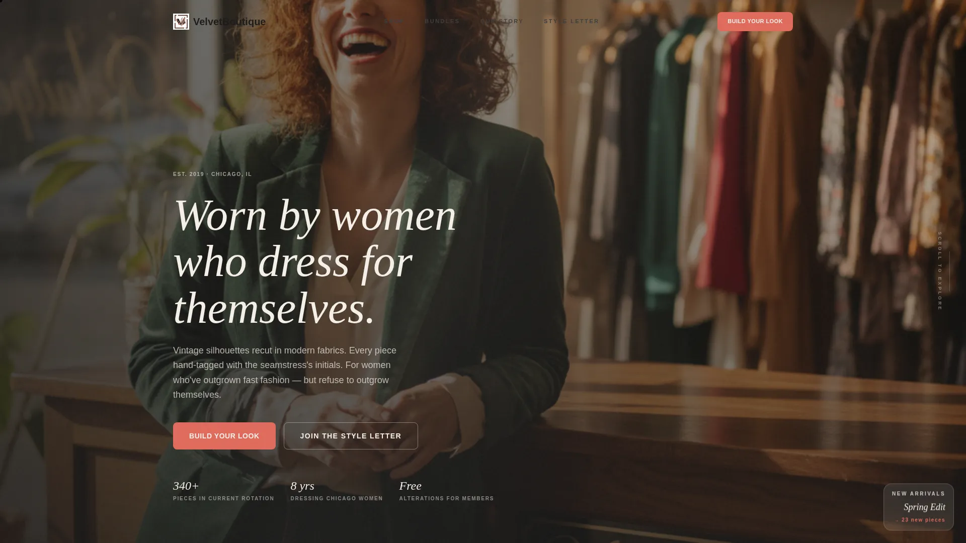
Full-Bleed Owner Hero Section
The header uses a wide-angle photo of the store owner in her own space, mid-laugh, with afternoon light cutting across the frame. A serif monospace headline types itself across the image, reading: "Worn by women who dress for themselves." This section establishes authenticity before a visitor reads a single product description.
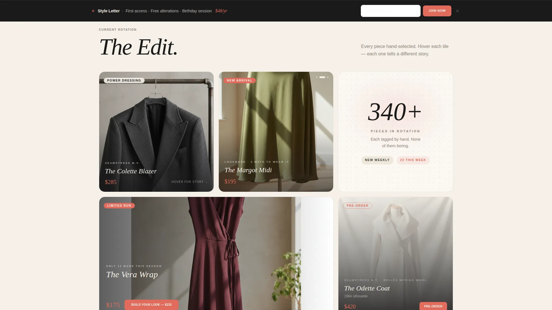
Interactive Bento Product Grid
The grid is engineered so every cell behaves differently. One tile flips on hover to show a garment's origin story. Another expands into a mini lookbook carousel. A third plays a short fabric-in-motion clip. No two cells repeat the same interaction, so every scroll depth feels like a small discovery.
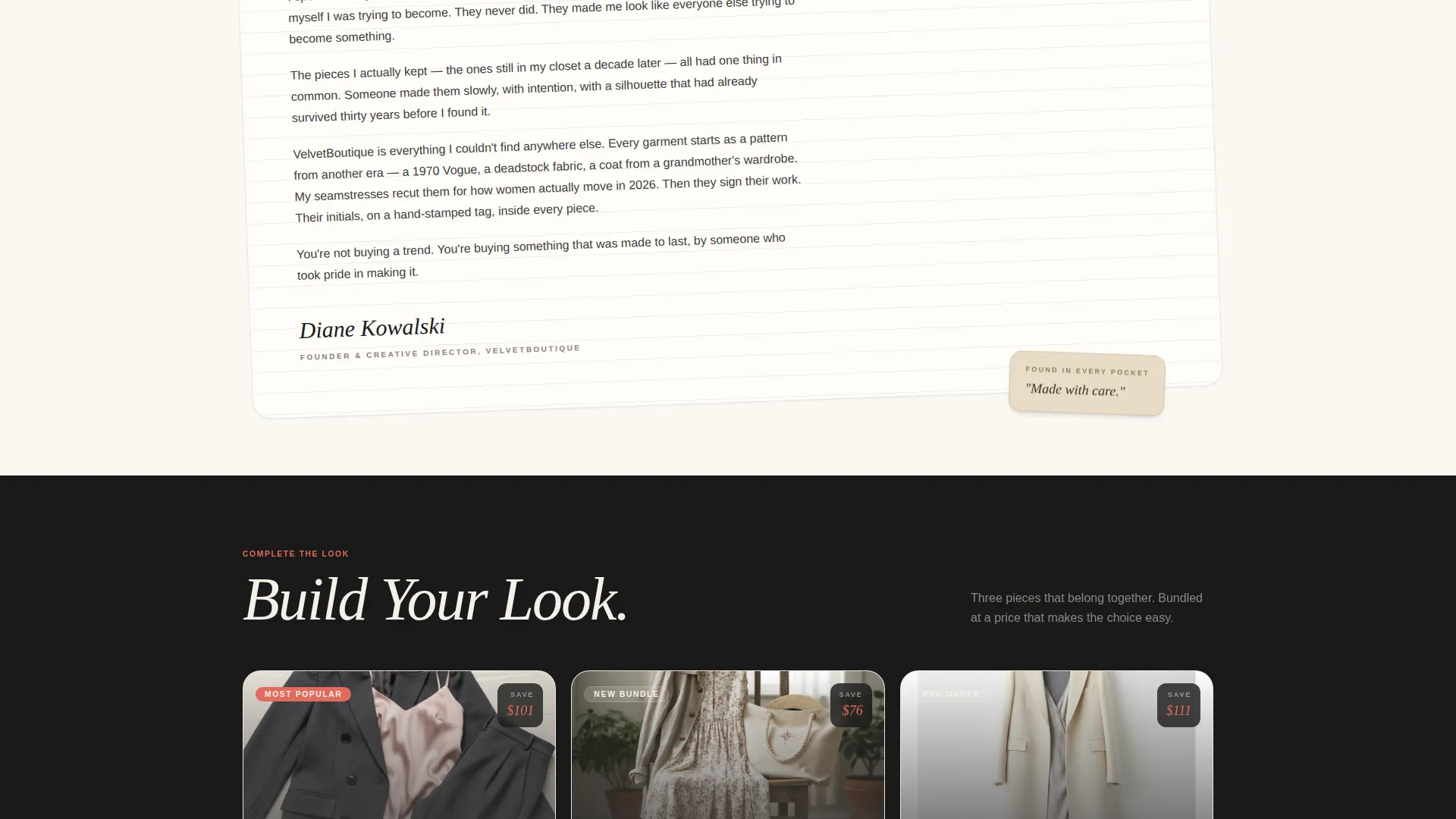
"Complete the Look" Bundle Tiles
Each product cell includes a "Build Your Look" call-to-action. It dynamically pairs the featured item with two complementary pieces at a bundled price. The savings figure appears in coral against charcoal so it reads clearly and draws the eye before any other detail on the tile.
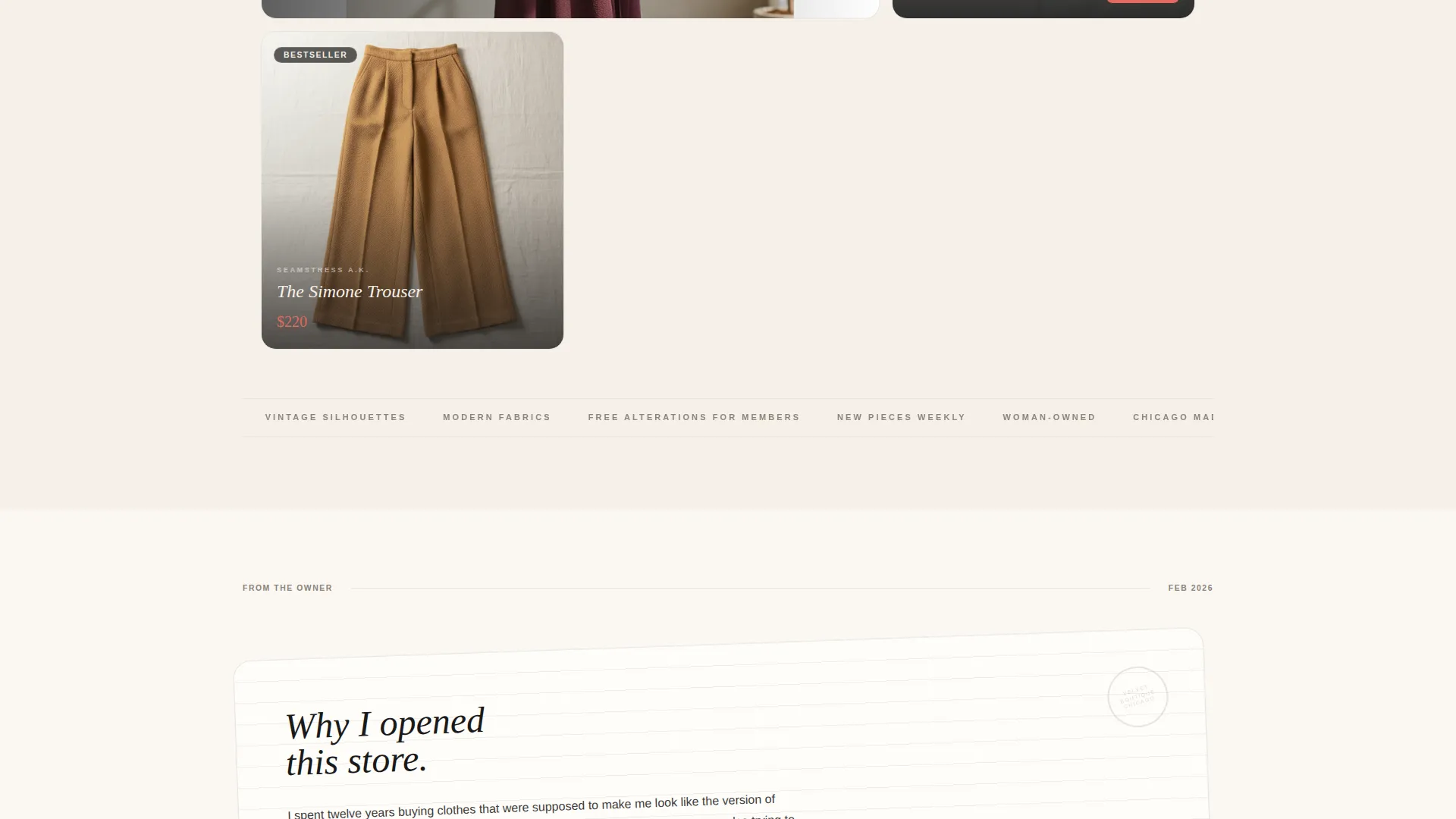
Handwritten Owner Letter Section
Midway through the page, a full-width tile breaks the bento grid entirely. It displays a scanned handwritten note from the owner explaining why she opened the store. Placed on cream like a letter found in a coat pocket, this moment humanizes the brand in a way no product description can.
Persistent Style Letter Membership Bar
A fixed bottom bar offers visitors a secondary conversion path at every scroll position. It promotes the quarterly Style Letter membership with three clear benefits: first access to new drops, a birthday styling session, and free alterations for members.
Member Testimonial Tile
A testimonial block is styled to look like a group-chat screenshot rather than a formal review. It surfaces real social proof in the visual language of the store's actual customers, which makes it feel genuine rather than polished.
Page sections overview
| Section | Purpose |
|---|---|
| Full-Bleed Hero | Introduce the owner and set the brand tone |
| Bento Product Grid | Showcase pieces with distinct interactive moments |
| "Complete the Look" Tiles | Drive bundle upsells with paired pricing |
| Owner Letter Tile | Humanize the brand with a handwritten story |
| Style Letter Bar | Capture membership sign-ups persistently |
| Member Testimonial Tile | Reinforce trust through social proof |
Design & branding system
The template uses an Ink and Paper color system inspired by a 1960s editorial aesthetic. Every color choice is deliberate. Nothing competes with the clothing.
- Deep editorial black (#1A1A1A), unbleached cotton cream (#F5F0E8), and typewriter ribbon charcoal (#3D3D3D) form the base palette
- Lipstick coral (#E06B5C) appears only in price callouts, hover states, and call-to-action buttons
- Typography uses a serif monospace style that feels like a well-loved magazine, not a storefront sign
Mobile & speed optimization
The bento grid layout is structured to adapt across screen sizes without losing its visual rhythm. Interaction moments are designed to feel intentional on both desktop and touch devices.
- Bento cells reflow gracefully so smaller screens still experience the editorial composition
- Touch-friendly hover states ensure mobile visitors encounter the same discovery moments as desktop users
How this template helps you convert
Thread does not just display products. It moves visitors through a deliberate path from curiosity to purchase and then toward a longer relationship with the store.
- The bundle pricing system shows real savings in coral beside each product tile, reducing the friction of upgrading from a single item to a curated outfit set
- The persistent Style Letter bar stays in view at every scroll position, offering a low-commitment entry point for visitors who are not ready to buy today but want to stay connected
Other information about this template
Thread is built as a single landing page in a bento grid layout, matching the Neo-Retro theme and Surprise and Delight creative direction from the matched intersection context. It is a strong fit for boutique retail in the women's fashion category, particularly for store owners who want a page that feels as personal as their shop.
- The template style follows a bento grid structure suited to visually rich, story-led retail brands
- The Neo-Retro theme means the design references vintage editorial aesthetics while staying fully modern in layout and interaction
- This template sits inside the Retail and E-Commerce category under the Woman-Owned Business subcategory
- It works well for boutiques that rely on word-of-mouth, social sharing, and community feel rather than high-volume catalog browsing
Theme
Neo-Retro
Creative direction
Surprise & Delight
Color system
Sunset Gradient
Style
Bento Grid
Direction
Quiz/Assessment
Page Sections
Full-bleed Owner Hero Section
Interactive Bento Product Grid
Build Your Look Bundle Tiles
Handwritten Owner Letter Section
Persistent Style Letter Membership Bar
Group-chat Testimonial Tile
Related questions
Is Thread designed for a single page or multiple pages?
Can I replace the owner photo with my own image?
What is included in the Style Letter membership bar?
How does the bundle pricing display work in the product tiles?
Who is this template best suited for?


