Menopause Care Reviews Website Template
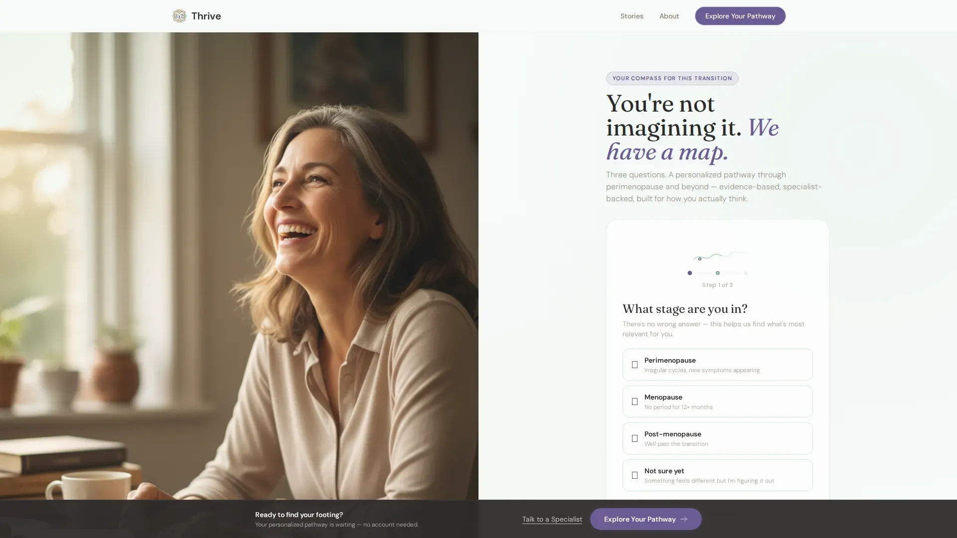
Thrive is a split-screen landing page template built for menopause patient education platforms. It pairs an authentic portrait with a three-step multi-step form, then guides visitors through a Testimonial Mosaic of real stories backed by clinical context. The Alpine Fresh color system and Organic Flow design make the experience feel warm, clear, and deeply human from the first scroll.
by Rocket studio
Quick summary
Thrive is a single-page, click-through landing page template designed for women's health and menopause care platforms. It opens with a 50/50 split-screen hero, moves through a mosaic of personal stories paired with clinical validation, and closes with a persistent call-to-action bar. The result is a page that earns trust before it ever asks for a click.
Who this template is for
This template is built for health educators, digital health founders, and clinicians who serve women navigating perimenopause and menopause. It suits teams that want to lead with empathy, validate real symptoms, and move visitors toward personalized content rather than a hard sign-up wall.
- Women's health platforms offering symptom trackers and specialist consultations
- Patient education services targeting women aged 44 to 55 experiencing hormonal transition
- Digital health brands that prioritize compassionate, evidence-led storytelling over clinical distance
What problem this template solves
Many women reach menopause-focused platforms after being dismissed by their general practitioner or after Googling symptoms alone at 2 a.m. A generic landing page with stock imagery and bullet-point feature lists fails them. This template solves the trust gap by making visitors feel seen before asking them to do anything.
- It replaces cold, clinical layouts with warm, story-driven sections that mirror a patient's real experience
- It removes registration friction by sending visitors to a personalized content hub first, not a form gate
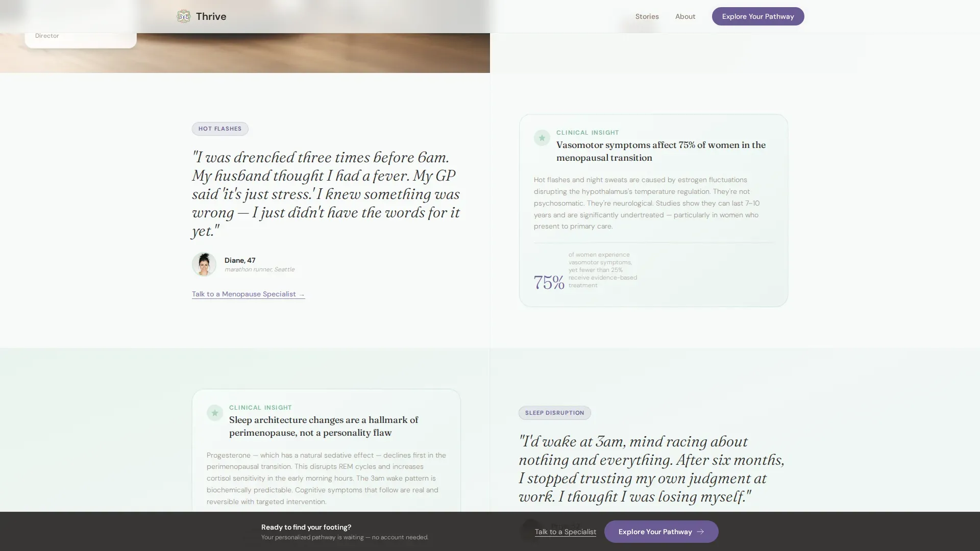
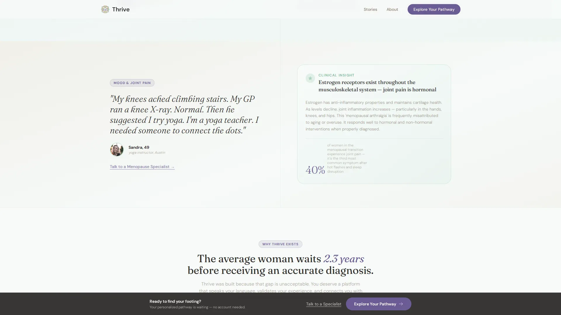
- It validates specific symptoms such as hot flashes, sleep disruption, mood shifts, and joint pain through paired testimonial and clinical panels
What you get with this template
You get a fully structured, single-page layout with every section already planned and connected. The design system, typography, animations, and interactive components are defined so you can focus on content rather than layout decisions.
- A 50/50 split-screen hero with a multi-step form on the right and an authentic portrait slot on the left
- A scrollable Testimonial Mosaic with four symptom-specific story and clinical validation tile pairs
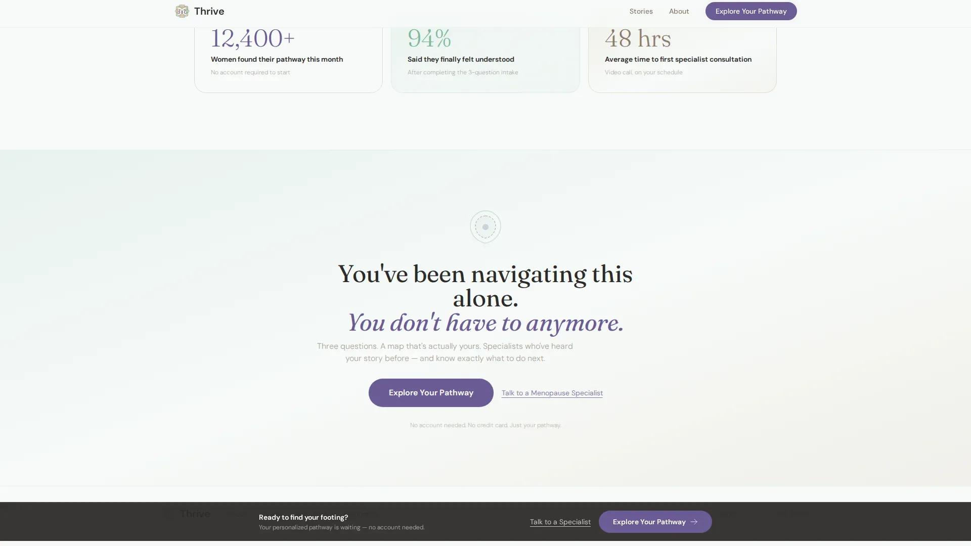
- A persistent bottom call-to-action bar, a secondary specialist text link, and a minimal horizontal footer
Feature list
A quick paragraph: each component in this template was chosen to serve one clear goal: move a woman who feels dismissed toward a platform that finally gets her.
Three-Step Multi-Step Form
The hero form asks three gentle questions one at a time: "What stage are you in?", "What's your biggest concern today?", and "How do you prefer to learn?" A vine illustration blooms with each completed step. Once finished, the visitor sees a personalized result and the primary call-to-action button.
Testimonial Mosaic Layout
Four split-screen testimonial sections build a cumulative story arc. Each tile pairs a handwritten-style pull quote with an age and identifying detail on one side, and a clinical insight panel on the other. Topics progress from hot flashes through sleep disruption, mood shifts, and bone density.
Persistent Call-to-Action Bar
After the third testimonial section, a bottom bar follows the scroll. It carries the "Explore Your Pathway" button and stays visible without interrupting reading. A secondary text link, "Talk to a Menopause Specialist," floats beneath each testimonial cluster for visitors ready to move faster.
Organic Flow Animation System
Smooth form-step transitions, a vine bloom SVG animation tied to form progress, and scroll-linked section reveals are built into the template. Animations are set to medium intensity so the page feels alive without feeling distracting.
Alpine Fresh Color System
The palette uses mountain air white (#F7FAF9) for open breathing room, soft glacier green (#A8D5BA) across alternating sections, warm stone (#D4C5A9) anchoring testimonial cards, and gentian violet (#6B5B95) reserved for buttons and interactive highlights only.
Fraunces and DM Sans Typography Pairing
Fraunces, a variable serif, carries the emotional weight of headlines and pull quotes. DM Sans handles body copy with clean legibility. The pairing creates a tone that feels both editorially trustworthy and easy to read.
Page sections overview
| Section | Purpose |
|---|---|
| Split Screen Hero | Introduces the platform with an authentic portrait and the three-step personalization form |
| Testimonial Mosaic 1 | Pairs a hot flashes personal story with a clinical validation panel |
| Testimonial Mosaic 2 | Pairs a sleep disruption story with a supporting clinical insight |
| Testimonial Mosaic 3 | Pairs mood shifts and bone density experiences with clinical context |
| Persistent call to action Bar | Keeps "Explore Your Pathway" visible after the third testimonial section |
| Minimal Footer | Provides horizontal navigation links in a clean, low-distraction layout |
Design & branding system
The visual identity follows an Organic Flow theme. Every color, type choice, and spacing decision is made to feel like a morning hike above the treeline rather than a sterile medical portal.
- Colors: mountain air white (#F7FAF9), glacier green (#A8D5BA), warm stone (#D4C5A9), and gentian violet (#6B5B95) for interactive elements only
- Typography: Fraunces serif for headlines and emotional pull quotes; DM Sans for all body text and form labels
- Visual style: authentic portrait photography, handwritten-style quote treatment, vine SVG illustration for form progress
Mobile & speed optimization
The template is designed desktop-first to honor the 50/50 split-screen hero, but the layout stacks cleanly for smaller screens. Static sections use server components and the interactive form runs as a client component to keep rendering efficient.
- Split-screen sections reflow to single-column stacks on mobile without losing the story-and-clinical-insight pairing
- The persistent call-to-action bar adapts to mobile viewport height so it never covers key content
- The vine bloom SVG and scroll-linked reveals are scoped to avoid layout shifts on smaller devices
How this template helps you convert
This template is optimized as a click-through page. The entire structure is built to earn the first click without demanding registration.
- The multi-step form personalizes the visitor's experience immediately, so the "Explore Your Pathway" result feels tailored rather than generic, making the click feel like a natural next step.
- The Testimonial Mosaic builds layered proof across four symptom topics, each one more specific than the last, so by the third tile the visitor feels deeply understood rather than sold to.
- The persistent bottom bar and secondary specialist link offer two distinct conversion paths, one for browsers and one for women already ready to consult a specialist, so no visitor leaves without a clear next step.
Other information about this template
This template sits at the intersection of patient education design and digital health conversion strategy. It is a strong fit for any team building a menopause care platform that values emotional resonance alongside clinical credibility.
- The page is localized for English (US) and includes no currency display, making it straightforward to adapt for subscription or free-access platform models
- The footer uses a Vercel Horizontal Flow pattern for a minimal, uncluttered close to the page
- The template supports the full perimenopause and menopause education journey, from first-time symptom researchers to women ready to book a video consultation with an endocrinologist
Theme
Organic Flow
Creative direction
Testimonial Mosaic
Color system
Alpine Fresh
Style
Split Screen (50/50)
Direction
Click-Through
Page Sections
Three-step Personalization Form
Testimonial Mosaic Sections
Persistent Call-to-action Bar
Vine Bloom SVG Animation
Alpine Fresh Color System
Fraunces and DM Sans Type Pairing
Related questions
What kind of platform is this template built for?
Does the multi-step form connect to a backend or database?
Can I adapt the testimonial sections for different symptoms?
Is this template suitable for a mobile audience?
What does a click-through landing page mean for this template?



