Menopause Care Booking Website Template
Thrive is a menopause telehealth landing page built around a Problem→Solution scroll arc. It pairs two side-by-side comparison tables with a lead-generation booking form, a soft-entry symptom assessment, and a trust-first header loaded with award badges and press credentials. The result is a calm, editorial experience designed to move frustrated women from doubt to their first specialist appointment.
by Rocket studio
Quick summary
Thrive is a single-page menopause telehealth landing page template. It opens with a credential-heavy hero, walks visitors through two comparison tables that reframe their experience, and closes with a booking form and a symptom assessment path. Every scroll step is designed to replace frustration with clarity and move a visitor toward booking her first visit.
Who this template is for
This template is built for virtual menopause clinics and women's health telehealth practices that need to convert skeptical, research-mode visitors into booked patients. It works especially well when your audience has been dismissed by a general practitioner and needs to see specialist credentials before trusting a new provider.
- Women's health telehealth providers staffed by certified menopause specialists
- Perimenopause and menopause care clinics offering remote appointments across multiple states
- Healthcare marketers who need a lead-generation page for a specialty audience
What problem this template solves
Most women in perimenopause or menopause arrive at a new provider's website already frustrated. They've been told their symptoms are anxiety, aging, or stress. A generic clinic homepage does nothing to counter that dismissal. This template is built specifically to meet that emotional reality and redirect it.
- Dismissed-symptom visitors need their experience validated before they trust a new service
- Generic telehealth pages fail to explain why a specialist matters more than a generalist
- Standard booking forms feel clinical and cold for a vulnerable, high-consideration audience
What you get with this template
This template delivers a fully structured, single-page layout with every section mapped to a specific stage of the visitor's decision journey. Design, copy structure, and interactive components are all included and pre-organized around the lead-generation goal.
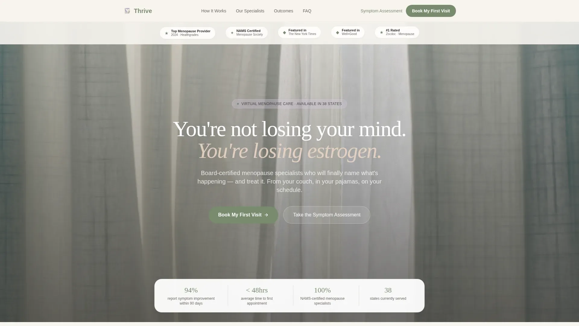
- A hero section with an award badges row, a headline, and a floating credential strip
- Two pre-built comparison tables covering dismissed symptoms and care quality side by side
- A patient outcomes and testimonials section, a multi-field booking form, and a secondary symptom assessment call to action
Feature list
This template includes six purposeful building blocks. Each one is grounded in the source brief and serves a specific role in the conversion flow.
Award Badges Header Row
The hero opens with a horizontal row of trust signals. Award badges, certification seals, and press logo placements sit on a soft pearl white field. Trust is established visually before the visitor reads a single word of copy.
Symptom Truth Comparison Table
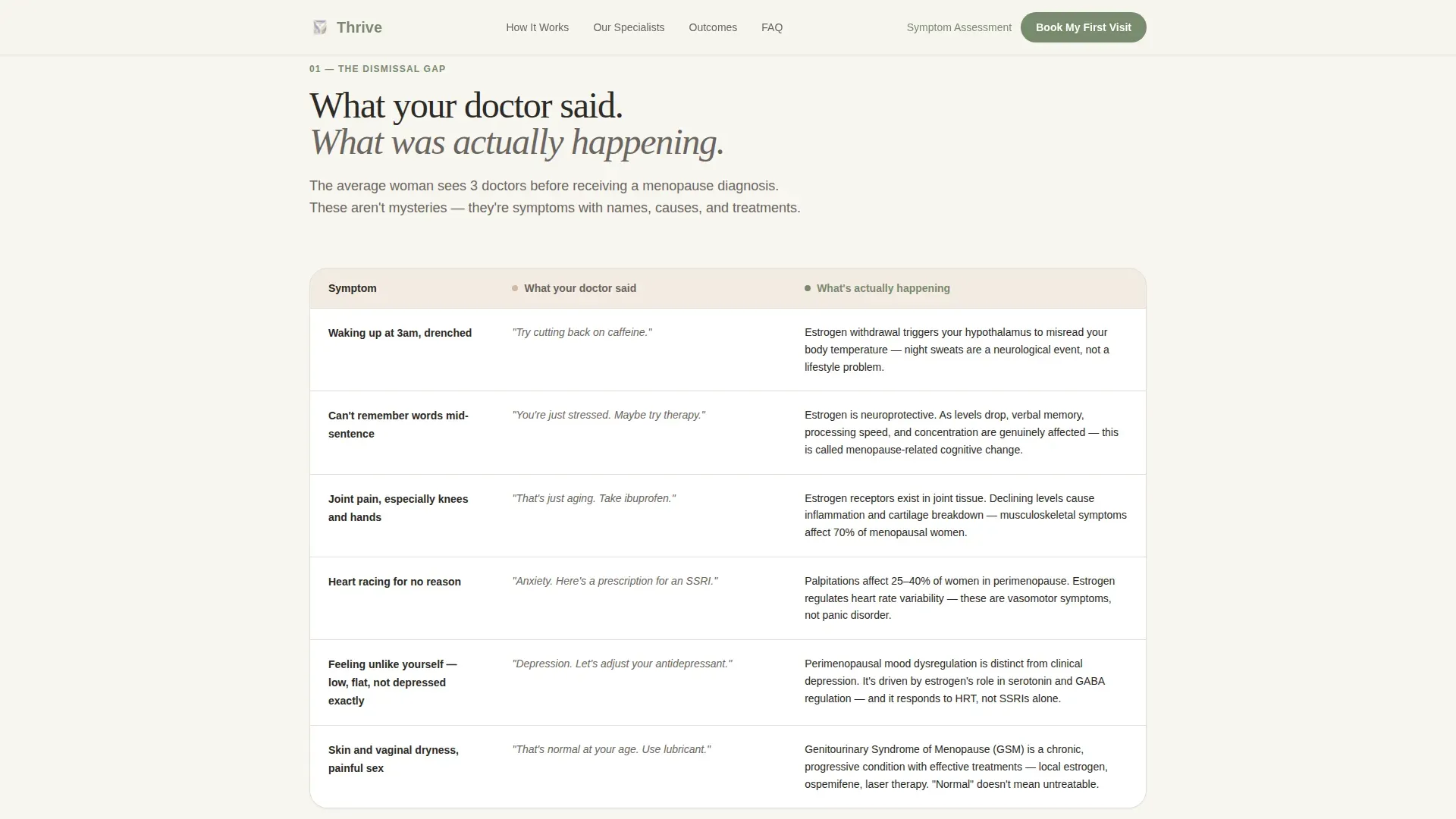
The first comparison table maps dismissed diagnoses to their actual hormonal root causes. Each row pairs what a general practitioner may have said against what is actually happening hormonally. This section validates the visitor's lived experience and builds immediate credibility.
Traditional Care versus Specialist Table
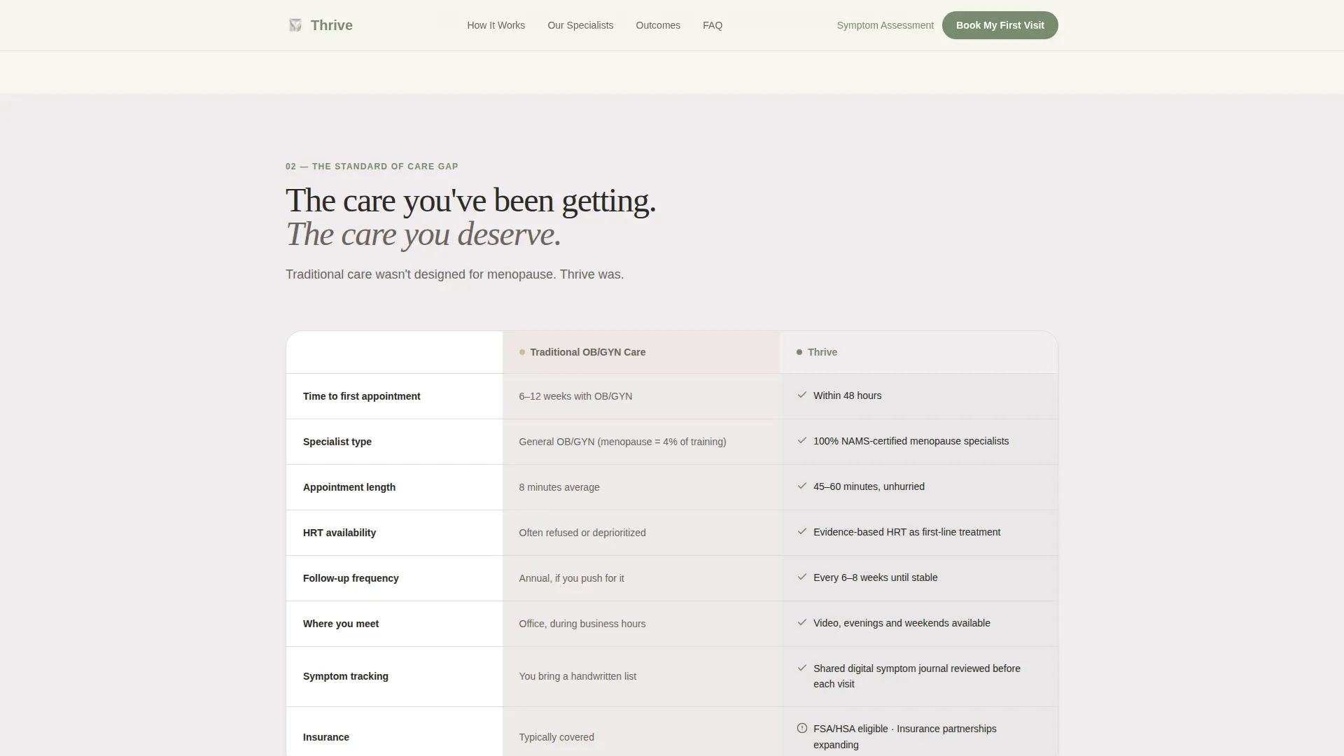
The second comparison table contrasts traditional obstetrics and gynecology care with this telehealth service. It covers wait times, specialist access, treatment options, and follow-up frequency side by side. Visitors can see the difference at a glance without reading a long paragraph.
Lead-Generation Booking Form
The primary booking form collects first name, state of residence for licensure compliance, primary symptoms via a multi-select checklist, and preferred appointment window. The form is gentle in tone and structured to reduce friction at the most critical conversion point.
Symptom Assessment Secondary Path
A soft-entry quiz offers a lower-commitment alternative for visitors who are not yet ready to book. It scores symptom severity and delivers a personalized report by email. This path captures leads before a visitor is ready to commit to a full appointment.
Outcomes and Testimonials Block
Patient outcome data and three testimonial cards appear after the comparison tables. The testimonials are framed to feel like letters from a future self, giving the visitor a concrete picture of what improvement looks like after specialist care.
Page sections overview
| Section | Purpose |
|---|---|
| Hero with Badges | Establish trust and open the emotional headline |
| Symptom Truth Table | Validate dismissed symptoms with hormonal context |
| Care Comparison Table | Contrast traditional care with telehealth specialist access |
| Outcomes and Testimonials | Reinforce credibility with data and patient voices |
| Booking Form | Capture primary leads with a low-friction multi-field form |
| Symptom Assessment call to action | Offer a soft entry path for visitors not ready to book |
| Footer | Linear single-row footer with essential links |
Design & branding system
The visual identity follows a Healing Space theme. Every design decision favors breathability and warmth over clinical sharpness. The palette is grounded in natural, textile-inspired tones that feel reassuring rather than sterile.
- Color system uses pearl white (#F7F5F0), lavender mist (#D5C8E6), linen blush (#E8D5C4), and sage (#7A8B6F) on calls to action and interactive elements
- Typography pairs DM Sans for body text with Fraunces, an organic serif, for headings that carry warmth without losing authority
- Animations are medium intensity with reveal-on-scroll fades and staggered table row entrances that feel unhurried
Mobile & speed optimization
The template is built mobile-first, reflecting that the target audience researches care options from a couch, a bed, or a phone late at night. Layout decisions prioritize thumb-friendly tap targets and readable text at small screen sizes.
- Comparison tables reflow cleanly for narrow viewports so no data is hidden or truncated
- Server Components are used for static sections to keep JavaScript payload minimal and page load light
How this template helps you convert
The page is structured as a deliberate Problem→Solution Arc. Every section lifts the visitor one degree closer to taking action. The conversion logic is baked into the scroll order itself.
- The comparison tables do the convincing work first, so by the time the visitor reaches the booking form, her objections have already been addressed by the content above it.
- The dual call-to-action structure gives every visitor a next step, whether she is ready to book immediately or needs a lower-commitment entry point through the symptom assessment quiz.
Other information about this template
This template is filed under the Health and Medical category, specifically within the Menopause Care subcategory. It is purpose-built for the menopause telehealth service niche and carries an intersection match score of 13, reflecting a tight alignment between the template style, creative direction, and audience intent.
- The Comparison Table template style is the structural backbone, with two distinct tables serving separate persuasion roles
- The Problem→Solution Arc creative direction guides every section's tone and placement order
- The Cloud Canvas color system and Healing Space theme are applied consistently across backgrounds, typography, and interactive elements
- The header concept uses Award Badges as the primary trust mechanism, placing credentials before emotional copy
- The landing page direction is Lead Generation, with "Book My First Visit" as the primary call to action
Theme
Healing Space
Creative direction
Problem→Solution Arc
Color system
Cloud Canvas
Style
Comparison Table
Direction
Lead Generation
Page Sections
Award Badges Trust Header
Dual Comparison Tables
Gentle Multi-select Booking Form
Soft-entry Symptom Assessment
Outcomes and Testimonials Section
Reveal-on-scroll Animations
Related questions
What type of business is this template designed for?
Can I customize the comparison table content?
How does the symptom assessment path work?
Is the booking form suitable for multi-state telehealth practices?
Does this template work well for a mobile audience?



