Cancer Recovery Care Booking Website Template
Thrive is a split-screen landing page template built for cancer recovery patient education platforms. It guides post-treatment survivors, caregiving family members, and nurse navigators from overwhelm to clarity. The design pairs trust-building social proof with a warm Organic Flow visual identity, and the layout drives bookings through a proven Problem→Solution Arc structure.
by Rocket studio
Quick summary
Thrive is a single-page booking and scheduling template for cancer recovery education platforms. It uses a 50/50 split-screen layout, a warm Slate & Sky color system, and a Problem→Solution Arc to walk post-treatment patients from confusion to confident action. The primary goal is to convert visitors into booked 20-minute recovery walkthrough consultations.
Who this template is for
This template was designed for a specific kind of healthcare platform: one that serves real people navigating life after cancer treatment ends. It works equally well for direct patient outreach and for clinical teams looking for a polished hand-off tool.
- Post-treatment cancer patients in the first two to sixteen weeks after discharge, searching for clear daily guidance
- Caregiving spouses and family members researching support options, often during off-hours
- Nurse navigators and oncology care coordinators who need a trustworthy patient-facing resource
What problem this template solves
Leaving treatment is disorienting. Patients receive thick discharge packets written in clinical language, and most of that material sits unread on a kitchen table. There is no shortage of information, but there is a severe shortage of clarity. This template addresses that gap directly.
- Survivors feel lost when medical instructions do not translate into everyday routines
- Caregivers and family members lack a reliable, calm resource to share with their loved ones
- Healthcare navigators need a professional, non-overwhelming tool to hand patients at the point of discharge
What you get with this template
You get a fully structured, single-page landing page built around the emotional and practical arc of post-treatment recovery. Every section is purposeful, sequenced, and designed to earn the visitor's trust before asking for any commitment.
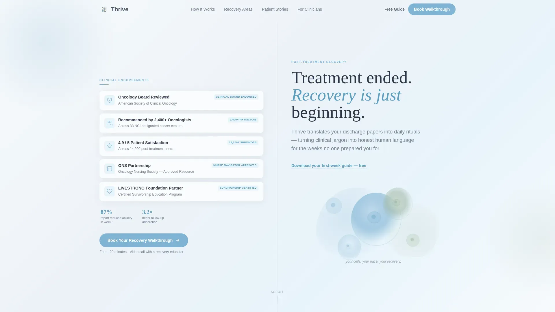
- A split-screen hero section with a trust-badge panel on the left and a warm serif headline with an organic SVG animation on the right
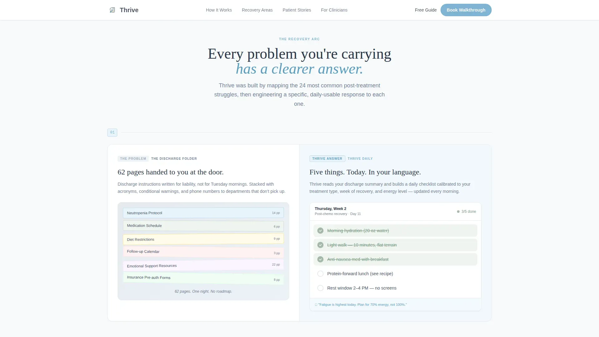
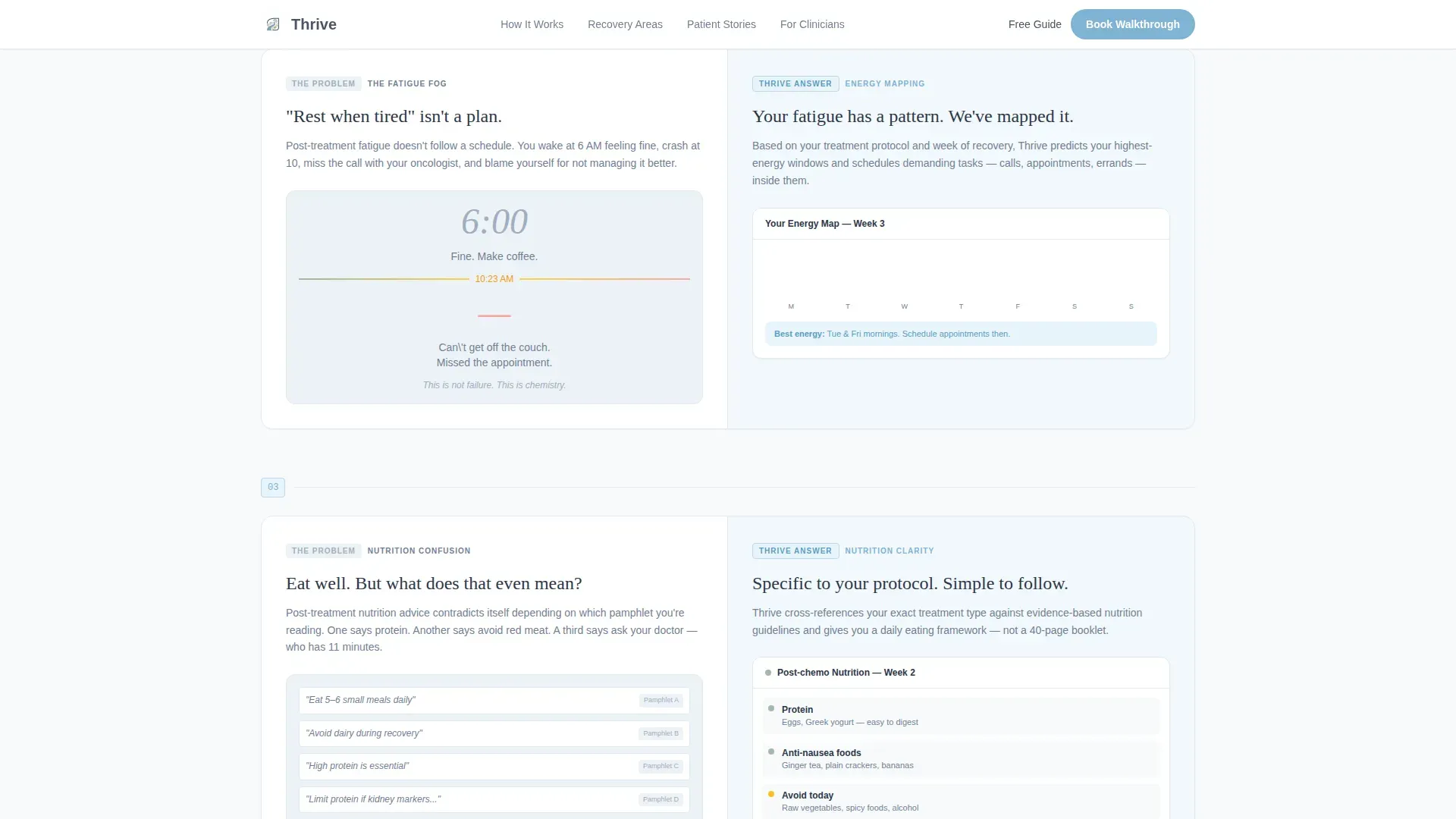
- A scrollable Problem→Solution Arc covering fatigue, nutrition, emotional re-entry, and follow-up scheduling, each pair rendered as a left-problem / right-solution split frame
- A two-step inline booking scheduler, an editorial testimonial slider, and a soft email-capture path for visitors not yet ready to book
Feature list
This template includes a focused set of high-impact components. Each one serves the recovery education context directly.
Split-Screen Hero with Trust Badges
The hero section divides into two equal panels. The left panel displays clinical board endorsements, patient satisfaction ratings with real numbers, oncology association partnerships, and a "Recommended by 2,400+ Oncologists" seal. Each badge is typeset with the issuing body's name readable at a glance. The right panel carries a large serif headline and a looping organic SVG animation in sage and sky watercolor tones.
Problem→Solution Arc Layout
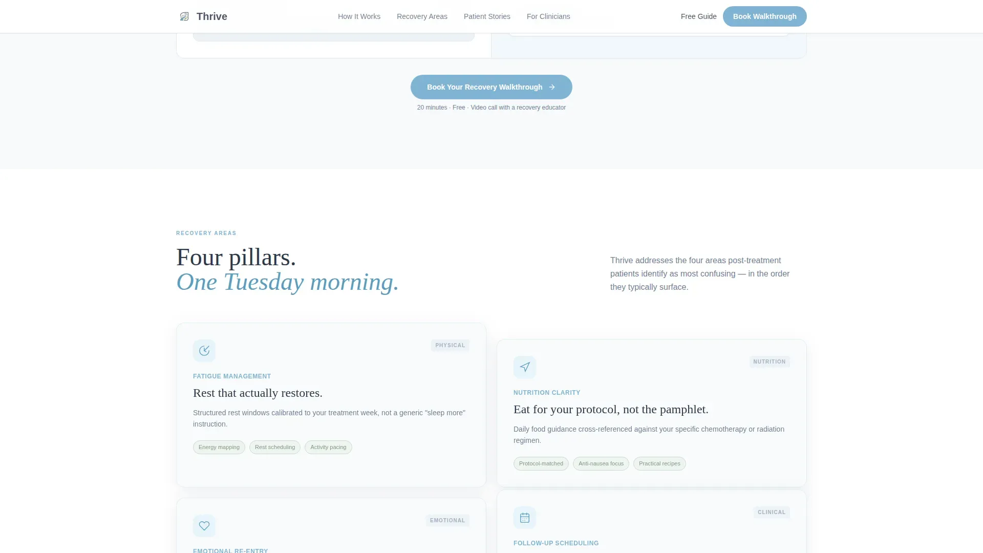
The core scroll experience pairs a real post-treatment challenge on the left with a platform interface preview on the right. Four recovery pillars are covered: fatigue management, nutrition confusion, emotional re-entry, and follow-up scheduling anxiety. The rhythm tightens as the user scrolls, making the platform feel increasingly personal and precise.
Two-Step Inline Booking Scheduler
The primary call to action opens a two-step inline scheduler without leaving the page. Step one collects treatment type via a dropdown (chemotherapy, radiation, surgical, immunotherapy, or combination) and weeks post-treatment. Step two reveals available 20-minute video consultation slots with a recovery educator.
Soft Conversion Email Capture
A secondary path offers a "Download Your First-Week Guide" option for visitors who are not ready to book. It captures only a first name and email address. This reduces friction for hesitant visitors and keeps the platform growing its contact list without pressure.
Editorial Testimonial Slider
A scrollable testimonial block presents patient voices as photo-and-blockquote editorial cards. The slider format keeps the section compact while allowing multiple stories to surface. Patient voices are presented in full, honest language consistent with the platform's human tone.
Persistent Mobile call to action Bar
On mobile screens, the primary "Book Your Recovery Walkthrough" call to action reappears as a fixed bottom bar. This ensures the booking option is always one tap away for caregivers or patients browsing at late hours on a phone.
Page sections overview
| Section | Purpose |
|---|---|
| Hero split screen | Establish trust and introduce the headline promise |
| Problem versus. solution | Show the overwhelm and answer it visually |
| Four recovery pillars | Address fatigue, nutrition, emotions, scheduling |
| Testimonial slider | Build emotional confidence through patient voices |
| Inline booking scheduler | Convert visitors with a low-friction two-step form |
| Soft email capture | Provide an alternative path for hesitant visitors |
| Footer row | Close with navigation and minimal legal links |
Design & branding system
The visual identity follows an Organic Flow theme. Every color and type choice reinforces the feeling of stepping outside a hospital into soft morning air: grounded, unhurried, and gently warming without false cheerfulness.
- Color system uses weathered slate (#4A5568) for headings and body text, open sky blue (#7FB3D3) for buttons and highlighted phrases, soft cloud white (#F7FAFC) for backgrounds, and quiet sage (#A3B9A8) for hover states and completed progress steps
- Typography pairs Fraunces serif for all headlines with DM Sans for body copy and interface labels, creating a contrast between emotional warmth and functional clarity
- Sage appears exclusively on hover interactions and completed checklist steps, rewarding engagement without visual noise
Mobile & speed optimization
The template is built desktop-first to serve the caregiver and nurse navigator use case, where longer reading sessions happen on larger screens. It includes a strong mobile fallback for the pattern of late-night searching on a phone.
- Static content sections are structured as server components to reduce load overhead on first render
- The two-step inline scheduler is built as a client component, keeping interactivity isolated to where it is needed
- The persistent bottom call to action bar on mobile ensures the booking action is always visible without scrolling back to the top
How this template helps you convert
The page earns each conversion step by solving a small, real problem before asking for anything in return. The call to action appears three times, each time feeling more natural than the last.
- The hero section places the "Book Your Recovery Walkthrough" button beneath the trust badges, so the first impression is credibility before commitment
- After the third Problem→Solution pair, the call to action reappears when the visitor already feels understood, making the booking feel like a logical next step rather than a sales push
- The persistent mobile bottom bar and the soft "Download Your First-Week Guide" path together capture visitors at every readiness level, from ready-to-book to just-exploring
Other information about this template
This template sits at the intersection of patient education and digital health scheduling. It is designed for platforms operating in the cancer recovery care space with both a direct-to-patient audience and a business-to-business-to-consumer channel through clinical staff.
- The layout supports a dual audience strategy: emotional resonance for patients and clean credibility signals for healthcare professionals reviewing the page on behalf of their patients
- The footer follows a linear single-row pattern, keeping the close of the page minimal and uncluttered
- Animation is set to a medium intensity level: organic SVG cell shapes, fade-in section reveals, scroll-linked opacity transitions, and staggered entry effects that feel alive without being distracting
- The template is localized for English-language audiences in the United States, with no currency display
- Social proof elements are built into the template structure, including the 2,400+ oncologist recommendation seal, satisfaction ratings, clinical board endorsements, and oncology association partnership badges
Theme
Organic Flow
Creative direction
Problem→Solution Arc
Color system
Slate & Sky
Style
Split Screen (50/50)
Direction
Booking/Scheduling
Page Sections
Split-screen Hero with Trust Badges
Problem→solution Arc Scroll Experience
Two-step Inline Booking Scheduler
Soft Conversion Email Capture
Editorial Testimonial Slider
Persistent Mobile Bottom Call to Action Bar
Related questions
Who is this landing page template designed for?
What does the booking scheduler include?
Can visitors convert without booking a consultation?
What layout style does this template use?
Is this template suitable for nurse navigators and clinical teams?



