Motorcycle Training Landing Page Template
Throttle is a split-screen motorcycle training landing page template built for riding schools. It uses a cinematic dark palette, a before/after slider header, and interactive comparison sections to guide visitors from hesitation to booking. The primary call to action drives course comparisons, a guided level-and-goal selector, and a friction-reducing quiz for undecided riders.
by Rocket studio
Quick summary
Throttle is a single-page motorcycle training template designed for riding schools. It combines a 50/50 split-screen layout with a Tech Glass visual identity and cinematic dark color system. Interactive comparison panels, a before/after header slider, and a course-matching selector work together to move nervous first-timers toward booking with confidence.
Who this template is for
This template is built for motorcycle training providers who need a landing page that does real selling work. It suits schools serving a mixed audience of complete beginners, lapsed riders, and career-driven certificate seekers.
- Riding schools offering Compulsory Basic Training (CBT) certificates and A2 licence courses
- Instructors targeting weekend learners, career-changers, and returning riders in their fifties
- Training businesses that want interactive course comparison to replace static pricing tables
What problem this template solves
Most motorcycle training pages are flat and passive. They list courses, show a phone number, and leave visitors to figure out the rest. Throttle solves the decision paralysis that stops hesitant riders from booking.
- Visitors often do not know which course matches their experience level or goal
- Standard pages force users to read walls of text rather than interact and self-select
- Friction builds when there is no clear path from "I'm curious" to "I've reserved my bike"
What you get with this template
You get a fully structured, interactive landing page ready to represent a motorcycle training school. Every section is built around a split-screen comparison logic that keeps visitors engaged.
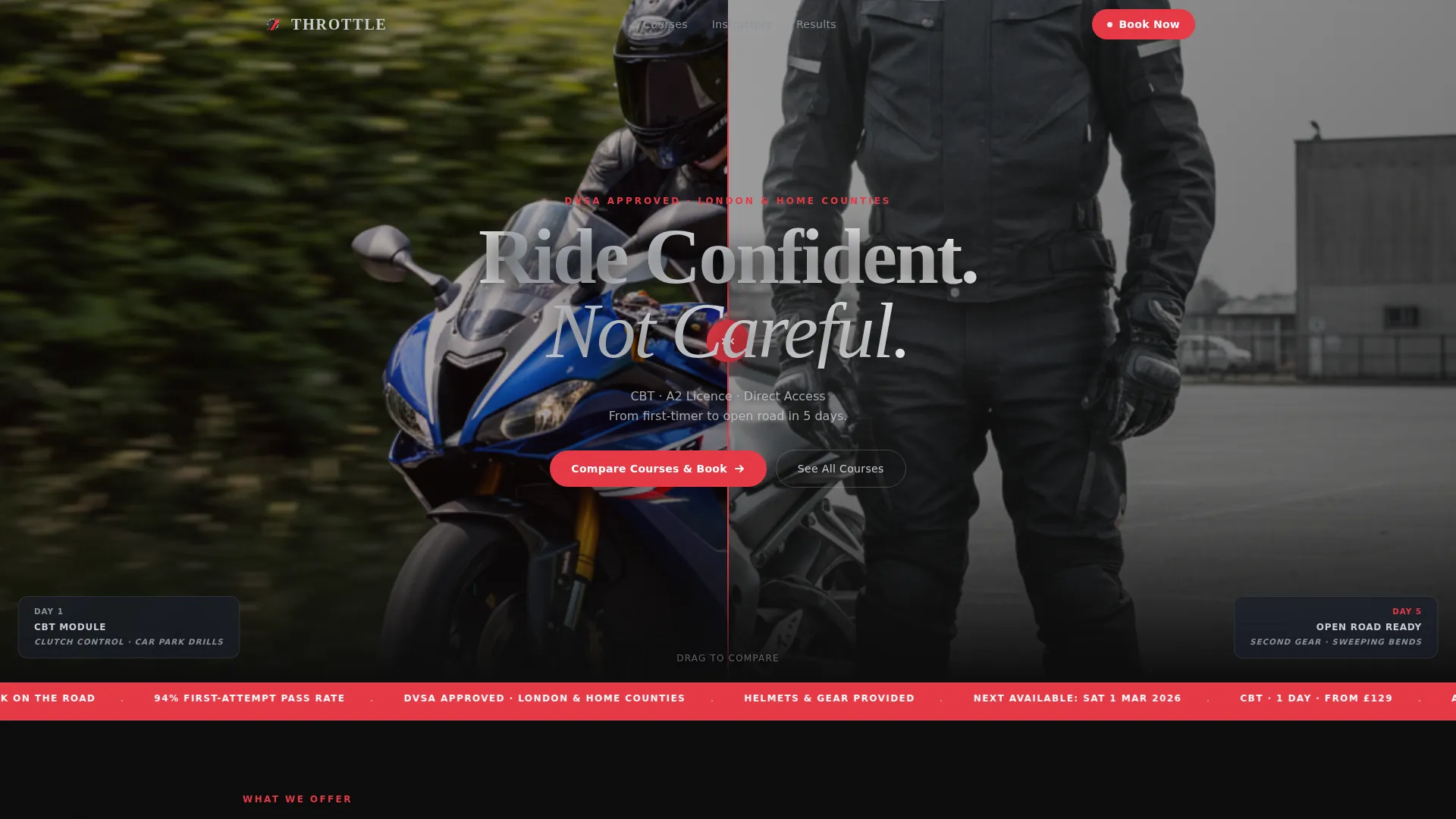
- A before/after header slider showing a learner's transformation from Day 1 to open-road ready
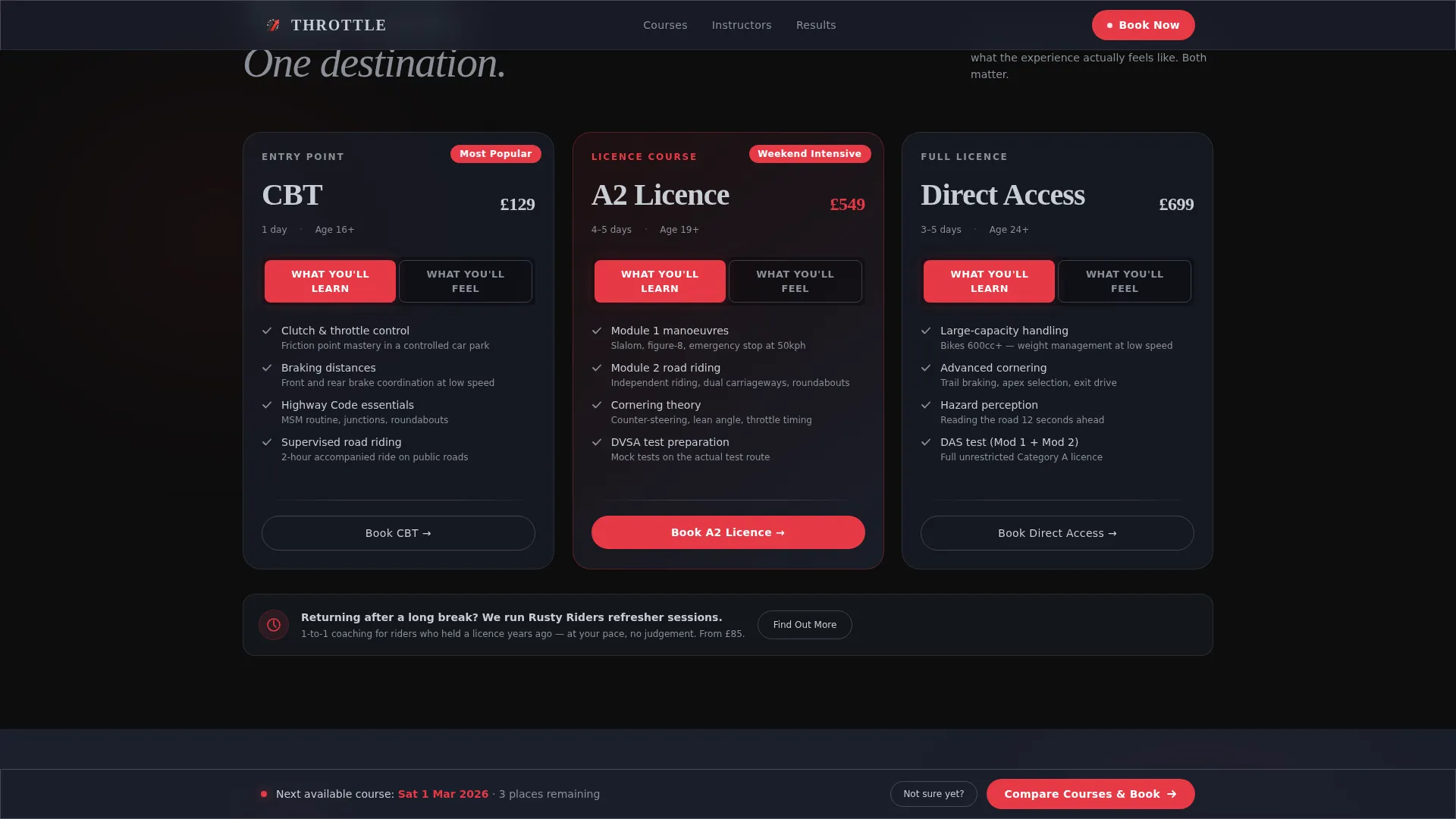
- Module toggle panels letting visitors switch between "What You'll Learn" and "What You'll Feel"
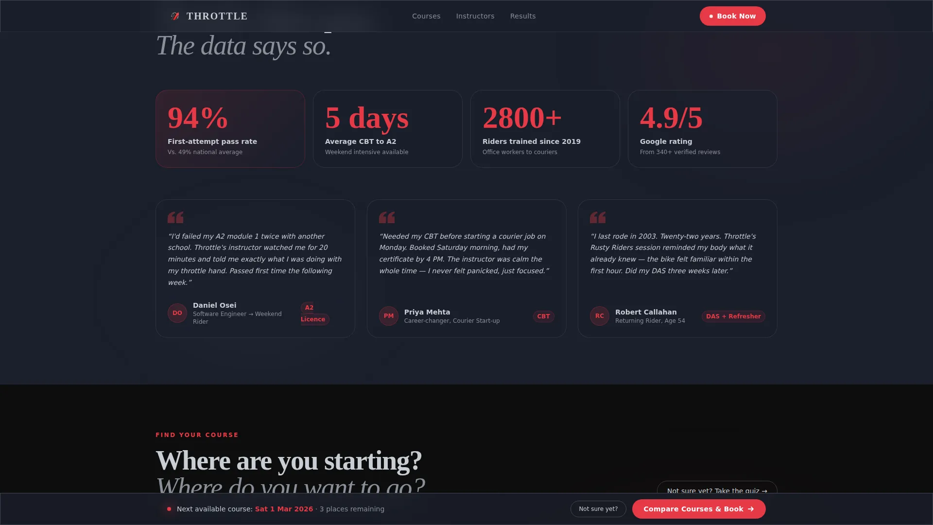
- A sticky bottom bar with the primary call to action, a two-column course selector, and a three-question quiz for undecided visitors
Feature list
This template packs several purpose-built interactive components into a single cohesive page flow. Each feature is designed to reduce friction and mirror the hands-on nature of motorcycle training itself.
Before/After Header Slider
The header splits the viewport clean down the middle. Left shows a stationary learner on Day 1; right shows the same rider mid-lean on Day 5. A glowing red drag handle lets visitors slide between the two states, with metadata labels updating beneath each half as they move it.
Course Comparison Selector
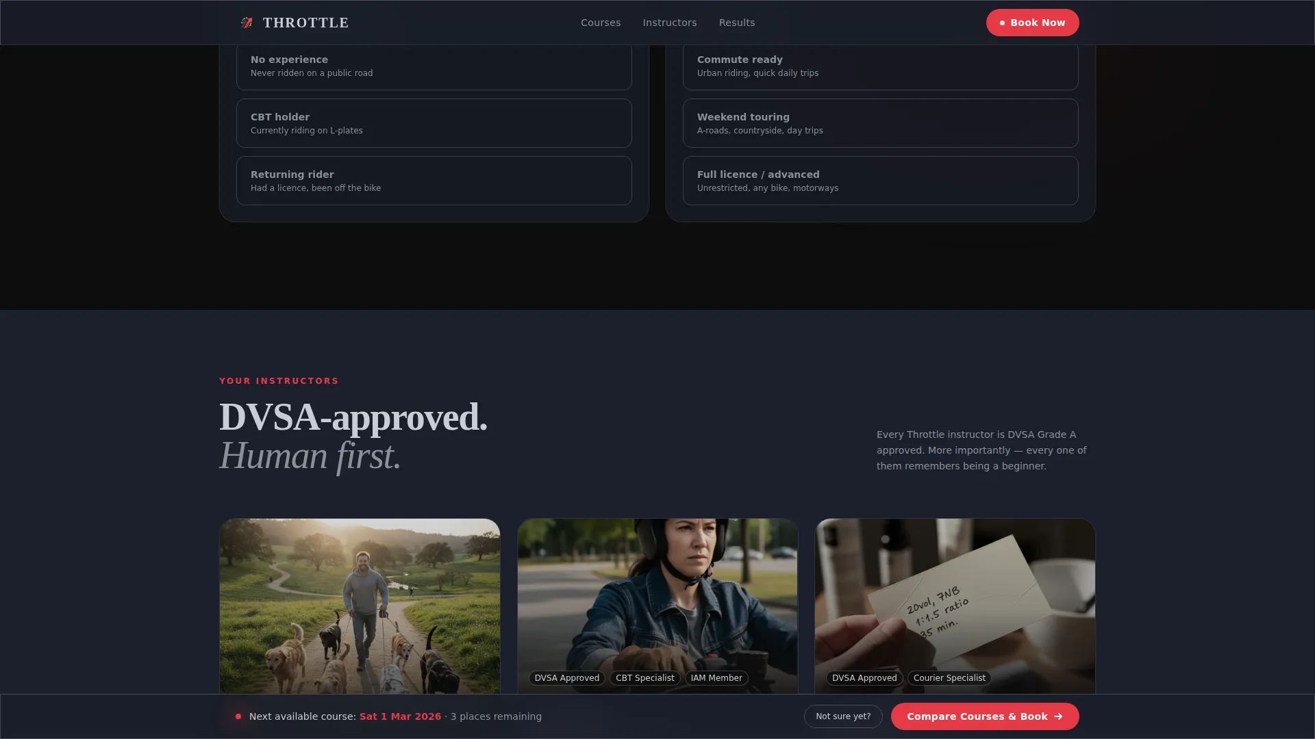
After the first scroll, a sticky bottom bar surfaces the primary call to action: "Compare Courses and Book." Clicking opens a two-column selector where visitors choose their current level on the left and their riding goal on the right. The page instantly returns a course match with price, next available date, and a single booking field.
Three-Question Recommendation Quiz
A "Not Sure Yet?" secondary path opens a short quiz. Three questions return a personalised course recommendation. This reduces decision friction for the hesitant majority who do not yet know the difference between a CBT certificate and a Direct Access Scheme (DAS) qualification.
Interactive Module Toggles
Each course module section offers a toggle between two views. Visitors can flip between "What You'll Learn" (the structured syllabus view) and "What You'll Feel" (the experiential, confidence-building view). This dual framing speaks to both analytical and emotionally motivated buyers at once.
Cursor-Responsive Pricing Panels
Pricing tiers are laid out side by side in animated panels. An animated highlight follows the cursor as visitors move across the comparison, making the relative value of each tier immediately tangible rather than buried in small print.
Split-Screen Bike Spec Sections
Bike specification sections divide between engine diagrams and cockpit-view footage. This gives potential students both the technical reassurance and the first-person riding perspective that builds excitement and trust before they ever arrive on site.
Page sections overview
| Section | Purpose |
|---|---|
| Before/After Header | Show rider transformation and set emotional tone |
| Module Toggle Panels | Let visitors explore course content interactively |
| Bike Spec Split | Compare technical specs with cockpit-view footage |
| Pricing Comparison | Display course tiers with cursor-following highlight |
| Sticky call to action Bar | Keep "Compare Courses and Book" always accessible |
| Course Match Selector | Match visitor level and goal to the right course |
| Recommendation Quiz | Guide undecided visitors to a personalised result |
Design & branding system
The visual identity follows a Tech Glass theme built on a Cinematic Dark color system. Every design choice reinforces the feeling of a tinted helmet visor at dusk: everything darkened and precise, with sharp points of light pulling the eye exactly where action is needed.
- Core palette: deep asphalt black (#0D0D0D) for backgrounds, visor-tint charcoal (#1A1F2B) for section fills, and reflective chrome silver (#C8CDD5) for body text
- Brake-light red (#E63946) is reserved exclusively for calls to action and interactive hotspots, ensuring every clickable element stands out with unmistakable urgency
- Section dividers catch light like polished fairings, and the drag handle in the header is styled as a glowing red disc shaped like a rear brake light
Mobile & speed optimization
The split-screen layout is structured to adapt cleanly to narrower viewports. Interactive elements are sized for both mouse and touch input, keeping the comparison and slider experience usable on mobile devices.
- The 50/50 split panels reflow gracefully so key content stays readable on smaller screens
- Touch-based dragging on the before/after slider is supported by the interaction model described in the template brief
- Sticky bar placement ensures the primary call to action remains visible without obscuring content during mobile scroll
How this template helps you convert
Throttle is built around the insight that motorcycle training buyers need guidance, not just information. Every interactive element is a micro-commitment that moves visitors closer to booking.
- The before/after slider creates an immediate emotional arc. Visitors see themselves in the "Day 1" image and want the "Day 5" outcome, anchoring desire before any course details appear.
- The course-match selector removes the most common barrier to booking: not knowing which course to choose. By letting visitors self-select their level and goal, the template delivers a personalised recommendation that feels earned rather than pushed.
- The three-question quiz catches visitors who would otherwise leave undecided. A short, low-effort interaction returns a specific result, turning curiosity into a concrete next step.
Other information about this template
Throttle sits within the Automotive and Transport category, specifically targeting the Driving School and Motorcycle Training niche. It is designed as a standalone landing page, not a multi-page site, so all conversion paths resolve within a single scrollable view.
- The template style is Split Screen (50/50), and the creative direction is Interactive Explorer, meaning visitor engagement is built into the layout logic rather than bolted on
- The header concept is a Before/After Slider, and the landing page direction is Comparison/Versus, making the template well suited to schools that offer tiered courses with meaningfully different outcomes
- The Comparison/Versus structure also makes it straightforward to present CBT certificate courses alongside A2 licence programmes and Direct Access Scheme (DAS) pathways in a single unified view
Theme
Tech Glass
Creative direction
Interactive Explorer
Color system
Cinematic Dark
Style
Split Screen (50/50)
Direction
Comparison/Versus
Page Sections
Before/after Header Slider
Two-column Course Match Selector
Three-question Recommendation Quiz
Interactive Module Toggle Panels
Cursor-responsive Pricing Comparison
Split-screen Bike Specification Sections
Related questions
What type of riding school is this template designed for?
Can I update the course selector to match my real offerings?
How does the three-question quiz help undecided visitors?
Is Throttle a single landing page or a multi-page site?
What images do I need to use the before/after header slider?