RC & Drone Hobby Store Landing Page Template
Throttle is a bento grid landing page built for hobby-grade RC and drone shops. It uses a side-by-side comparison layout to help visitors self-select their setup, from crawlers to FPV quads. A UGC photo wall header, hand-drawn geometric styling, and persistent "Browse All Gear" sticky bar drive confident clicks straight into the catalog.
by Rocket studio
Quick summary
Throttle is a single-page bento grid landing page designed for RC cars and drone hobby stores. It guides backyard bashers, FPV pilots, and first-time buyers through a visual comparison journey that ends with a confident click into the full product catalog. No forms, no friction, just stacked cards and direct shop links.
Who this template is for
This template is built for hobby shop owners who sell brushless motors, ready-to-run RC cars, FPV goggles, and drone parts online. It works especially well when your audience ranges from total beginners to experienced hobbyists who already know their specs.
- Hobby-grade RC and drone retailers looking to convert browsers into buyers fast
- Store owners targeting both gift shoppers and experienced builders who want to self-select their gear
- Shops that carry a wide product range and need visitors to find their fit without a long consultation
What problem this template solves
Most hobby store pages overwhelm first-time visitors with too many categories and too little guidance. A parent buying a birthday gift and a seasoned FPV pilot both land on the same page and need completely different answers. This template solves that by using a scrollable comparison structure that narrows down choices naturally.
- Buyers leave without purchasing because product pages feel like walls of specs with no clear starting point
- Stores lose gift shoppers who cannot quickly identify the right product tier or category for their budget
- FPV and RC enthusiasts abandon carts when they cannot compare two options side by side before committing
What you get with this template
You get a complete, ready-to-customize single-page layout built around a bento card grid and a visual comparison journey. Every section is designed to push the visitor one step further toward a product decision, ending with a direct link to a pre-filtered collection.
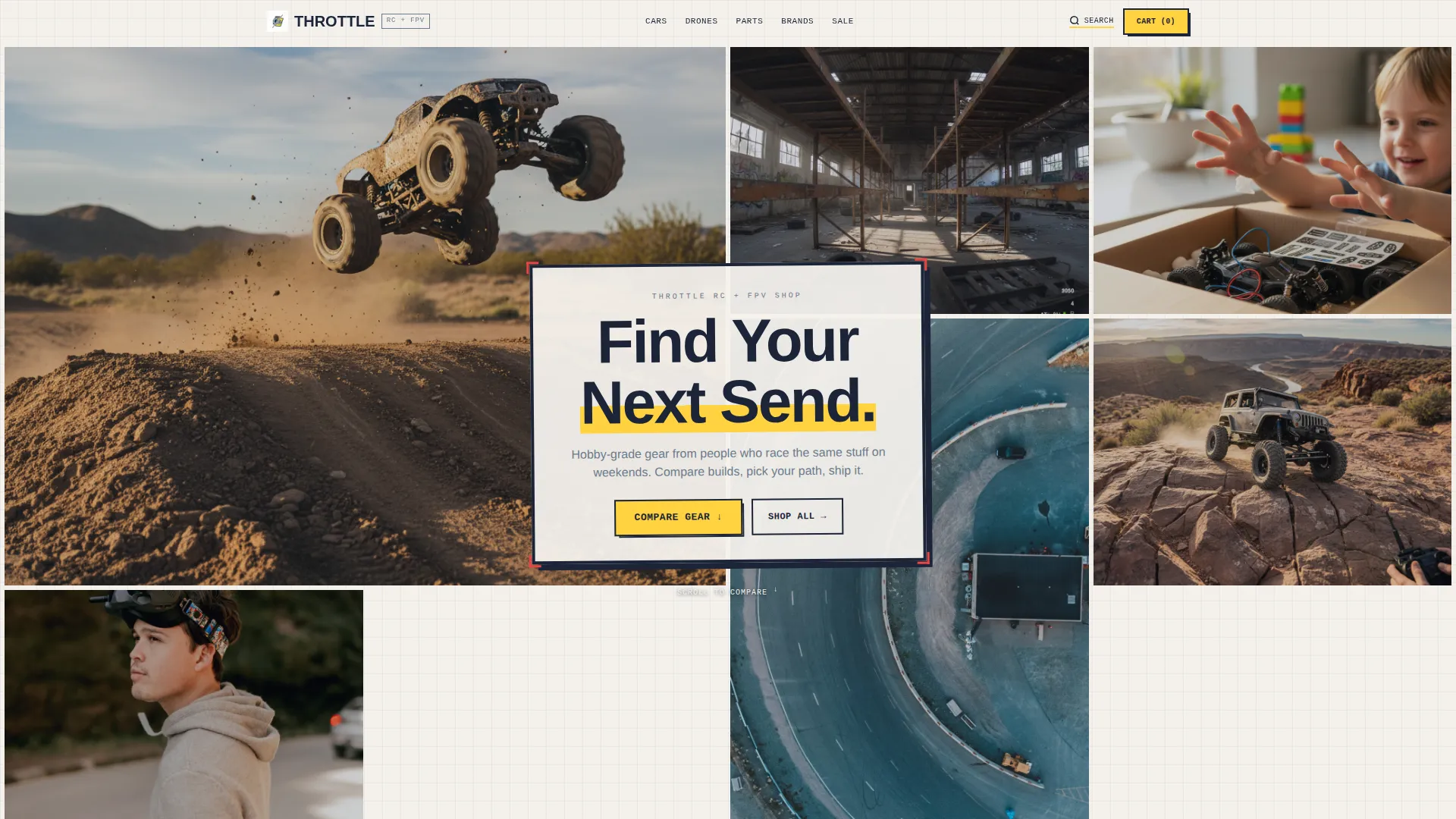
- A UGC-style photo wall header with bold headline overlay and asymmetric mosaic layout
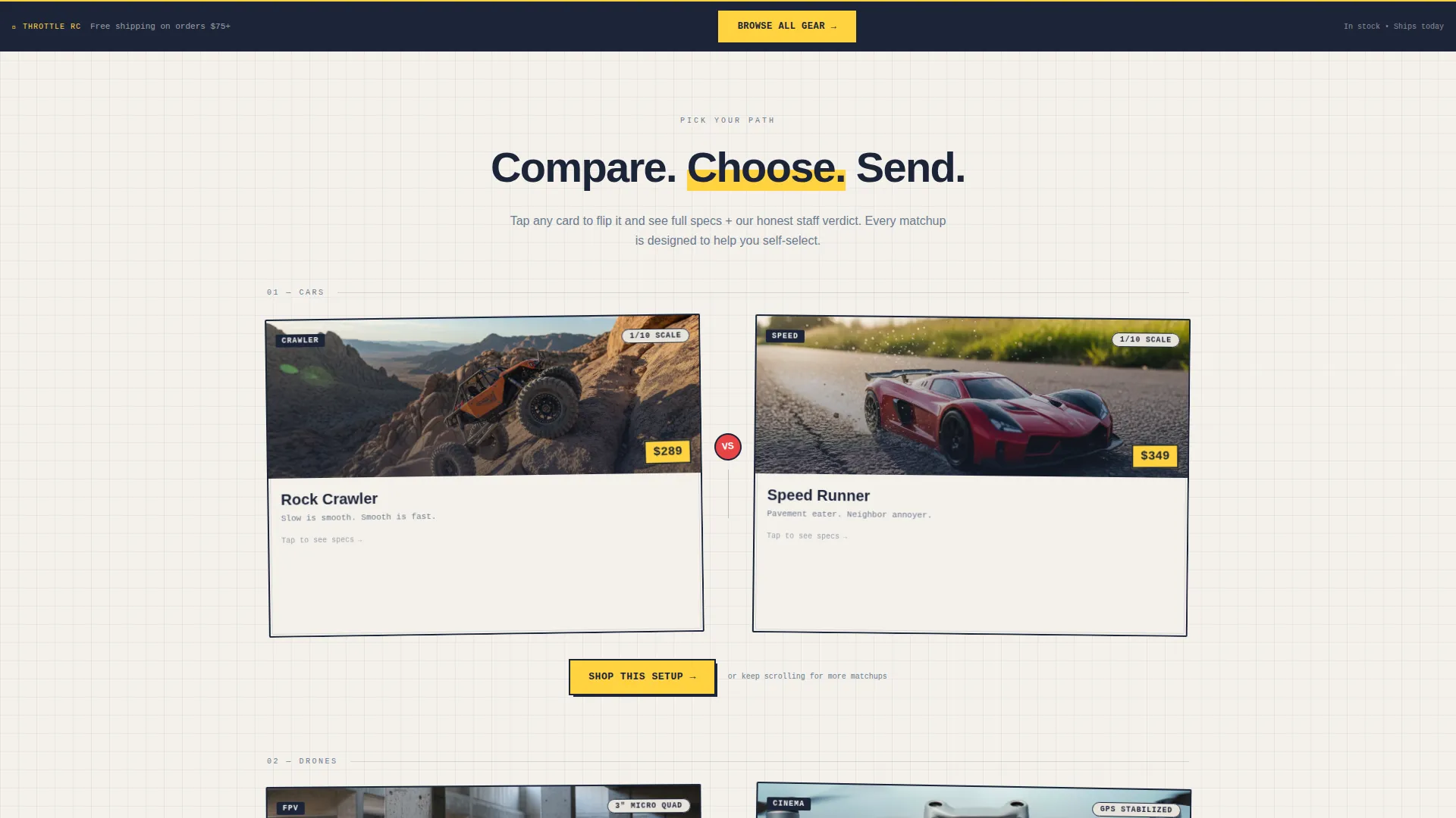
- Side-by-side comparison bento cards covering product categories, specs, price points, and staff verdicts
- A persistent sticky navigation bar and per-section "Shop This Setup" calls to action
Feature list
This template brings together several purpose-built design components and layout patterns for hobby retail.
UGC Photo Wall Header
The header fills the full viewport with an asymmetric mosaic of customer-style photos and short video clips. A bold headline overlays the center tile. The layout sets an authentic, garage-culture tone from the first second on the page.
Bento Grid Card Layout
The page is structured as a modular card grid. Each card block is styled with slight tilts and hand-drawn outlines, echoing a doodled product catalog. Cards are tappable and link directly to relevant collection pages.
Side-by-Side Comparison Cards
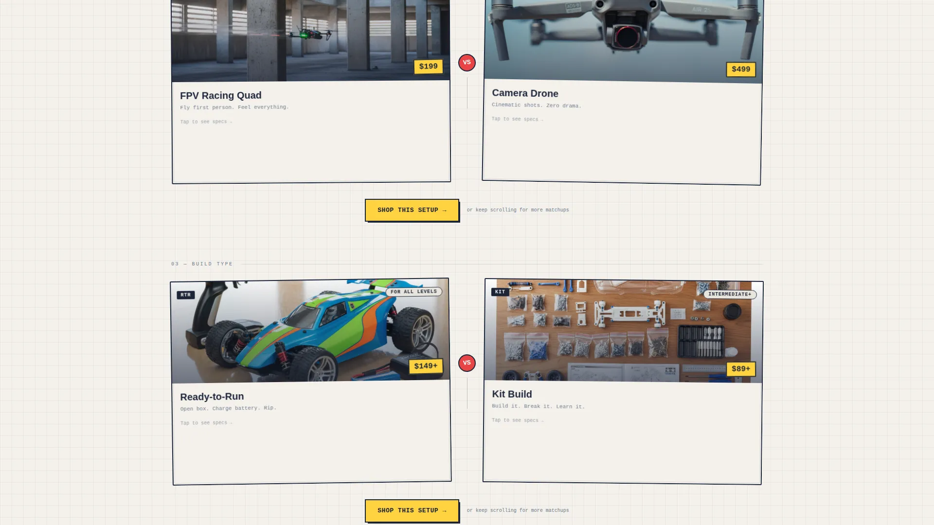
Each bento section pairs two products or categories head to head. Cards flip to reveal specs, price, and a one-line staff verdict. Comparisons start broad, crawlers versus speed runners, and grow more specific with every scroll.
Persistent Sticky Bar
A sticky navigation bar stays visible throughout the entire page. It carries the "Browse All Gear" call to action in highlighter yellow, giving visitors a constant exit ramp into the full catalog at any scroll depth.
Per-Section Shop calls to action
Each comparison pair ends with a "Shop This Setup" button. These buttons link to pre-filtered collection pages, removing the need for the visitor to search manually after making their mental product decision.
Playful Geometric Visual System
Typography, card borders, and color accents follow a hand-drawn geometric style. Slight card tilts, outlined boxes, and graph-paper energy give the page personality without sacrificing product clarity.
Page sections overview
| Section | Purpose |
|---|---|
| UGC Photo Wall | Sets garage-culture tone with a mosaic header and bold headline |
| Category Comparison Start | Broad head-to-head cards for crawlers versus. speed runners |
| FPV versus. Camera Drones | Helps pilots and casual buyers self-select their drone type |
| Ready-to-Run versus. Kit | Guides newcomers and builders to the right product tier |
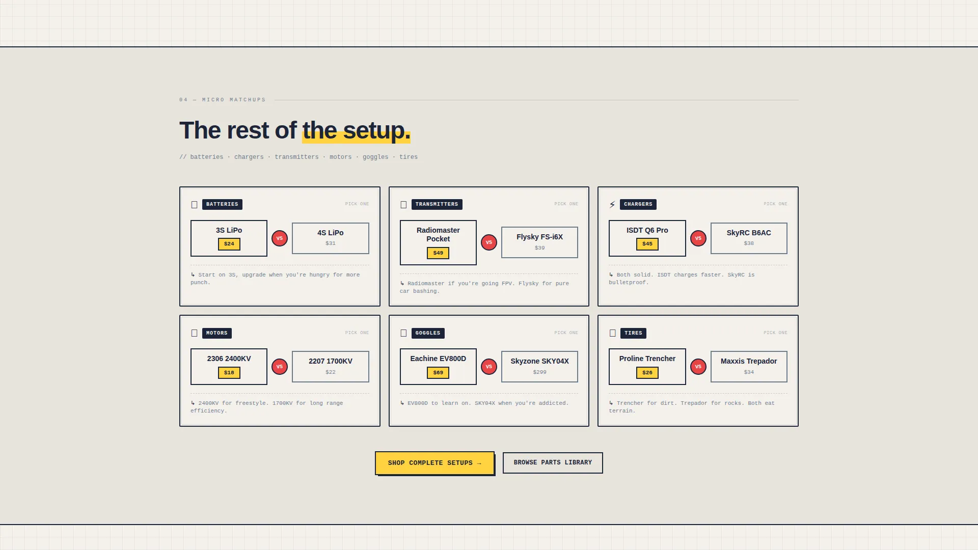
| Batteries and Chargers | Narrows setup decisions to supporting gear comparisons |
| Transmitters and Receivers | Covers advanced accessory matchups for experienced buyers |
| Shop This Setup call to action | Converts each comparison pair with a direct collection link |
| Sticky Browse Bar | Provides constant catalog access across all scroll depths |
Design & branding system
The visual identity uses an Ink and Paper color system that feels like a hand-annotated product catalog. Every design choice reinforces the hobby garage atmosphere without looking unfinished or unprofessional.
- Color palette: matte newsprint white (#F4F1EC), ballpoint ink navy (#1B2438), graphite sketch gray (#6B7B8D), and highlighter yellow (#FFD23F) used across calls to action, price tags, and hover states
- Card styling uses slight tilts and hand-drawn outlines to suggest graph-paper sketches, making the layout feel energetic and personal
- Typography and layout follow a Playful Geometric theme, technical in structure but light in personality, consistent across every card and section
Mobile & speed optimization
The bento grid layout is built to work just as well on a phone screen as it does on a desktop. Hobby shoppers frequently browse on mobile, especially last-minute gift buyers and pilots checking gear between sessions.
- Every card and image in the grid is tappable, keeping the mobile interaction feel fast and intentional
- The sticky bar remains accessible at every scroll depth on small screens, so the catalog is always one tap away
- The comparison card flip interaction is designed to work through touch, keeping the spec-reveal experience intact on mobile
How this template helps you convert
The entire page architecture is built around removing hesitation and creating forward momentum toward the catalog.
- The comparison journey guides each visitor toward a self-identified product fit before they reach a single product page, so they arrive with intent instead of confusion.
- The "Shop This Setup" call to action appears directly after each decision point, capturing the visitor at peak interest rather than asking them to scroll back up or search.
- The persistent sticky bar means no visitor ever feels stuck, the full catalog is always visible, reducing the chance of a frustrated exit.
Other information about this template
This template sits at the intersection of hobby retail and high-engagement content layout. It is designed for stores where product knowledge and community identity matter as much as price.
- The template style is Card Grid (Modular), making it straightforward to reorder, add, or remove comparison sections as your inventory evolves
- The header concept supports a photo mosaic feel that suits user-generated content from real customers, event shots, or staff race-day photos
- The Comparison Journey creative direction is especially effective for stores that carry competing product lines, RC crawlers versus speed runners, FPV racing quads versus camera drones, hobby-grade kits versus ready-to-run options
- The color system and Playful Geometric theme are applied consistently so new product cards added later will match the existing visual language with minimal effort
- This template is a strong fit for hobby dropshipping store concepts where a curated, confidence-building front page matters more than a deep navigation tree
Theme
Playful Geometric
Creative direction
Comparison Journey
Color system
Ink & Paper
Style
Card Grid (Modular)
Direction
Quiz/Assessment
Page Sections
UGC Photo Wall Header
Side-by-side Comparison Cards
Bento Grid Modular Layout
Persistent Sticky Navigation Bar
Per-section Shop Ctas
Playful Geometric Visual System
Related questions
Can I use this template for a store that sells both RC cars and drones?
Does this template include product pages or just the landing page?
How customizable are the comparison cards?
Is this template a good fit for a beginner-friendly audience?



