Robotics & Automation Cost Calculator Website Template
The Throughput warehouse automation landing page template is a single-page, zigzag-layout website designed for industrial SaaS and robotics companies. It combines an animated SVG warehouse floor infographic, three escalating case study sections, knockout stat bars, and a furnace-orange ROI calculator call to action. Built on a Dashboard Pro theme with a Fire and Earth color system, this template targets operations directors and logistics decision-makers running large-scale warehouse facilities.
by Rocket studio
Quick summary
The Throughput template is a dark-industrial, data-forward landing page built to showcase warehouse automation results to serious operations buyers. It opens with a living warehouse floor infographic, walks visitors through three real-outcome case studies, and closes with a high-visibility ROI calculator call to action. Every design decision serves one goal: turn a skeptical ops director into a qualified lead.
Who this template is for
This template is built for companies selling warehouse automation technology, robotics platforms, or industrial SaaS solutions to operations-level buyers. If your product touches how a warehouse moves goods, this presentation structure was designed for your pitch.
- Operations directors at mid-size third-party logistics providers running 200,000-plus square-foot facilities who need to justify automation investment to leadership
- E-commerce fulfillment managers dealing with Q4 surge volume who need to showcase how warehouse automation absorbs demand spikes without adding temporary headcount
- Supply chain vice presidents at food and beverage distributors where a single mispick can trigger a recalled load and need to demonstrate the cost case for automation
What problem this template solves
Traditional warehouse operations rely heavily on human intervention. Paper pick lists, clipboard supervisors, and manual receiving workflows introduce human operational errors that compound at scale. When your audience already knows the pain, your landing page needs to skip the education and go straight to proof. Designing a page that earns trust through data before it asks for a click is exactly what this template is built to do.
- Ops buyers arrive skeptical. Generic feature lists do not convert them. This template leads with named metrics and case study evidence so the call to action feels like a logical conclusion, not a leap of faith.
- Warehouse automation landing pages that bury their proof below the fold lose qualified visitors fast. This template surfaces knockout numbers at every scroll point, keeping the pace of the argument sharp and the user engaged.
- Without a clear conversion path, even great warehouse automation content fails. This template structures the full page around one primary goal: driving qualified visitors to a personalized ROI calculator.
What you get with this template
You get a fully designed, section-complete single-page website ready to present warehouse automation results to decision-makers. Every component is built around the Dashboard Pro theme and the Fire and Earth color system, creating a visual identity that feels like a live facility control room rather than a corporate brochure.
- A full-viewport animated SVG warehouse floor infographic header with live-styled counters ticking up order counts, pick accuracy rates, and dock-to-stock durations
- Three zigzag case study sections that alternate image-left and image-right layouts, each telling a distinct client transformation story with before-and-after visual states
- Two furnace-orange interstitial stat bars between case studies, a solidified call-to-action block driving visitors to an ROI calculator, and a secondary text-link lead capture for a downloadable case study PDF
Feature list
This template includes a focused range of purpose-built features that support designing a high-converting warehouse automation landing page from the first scroll to the final call to action.
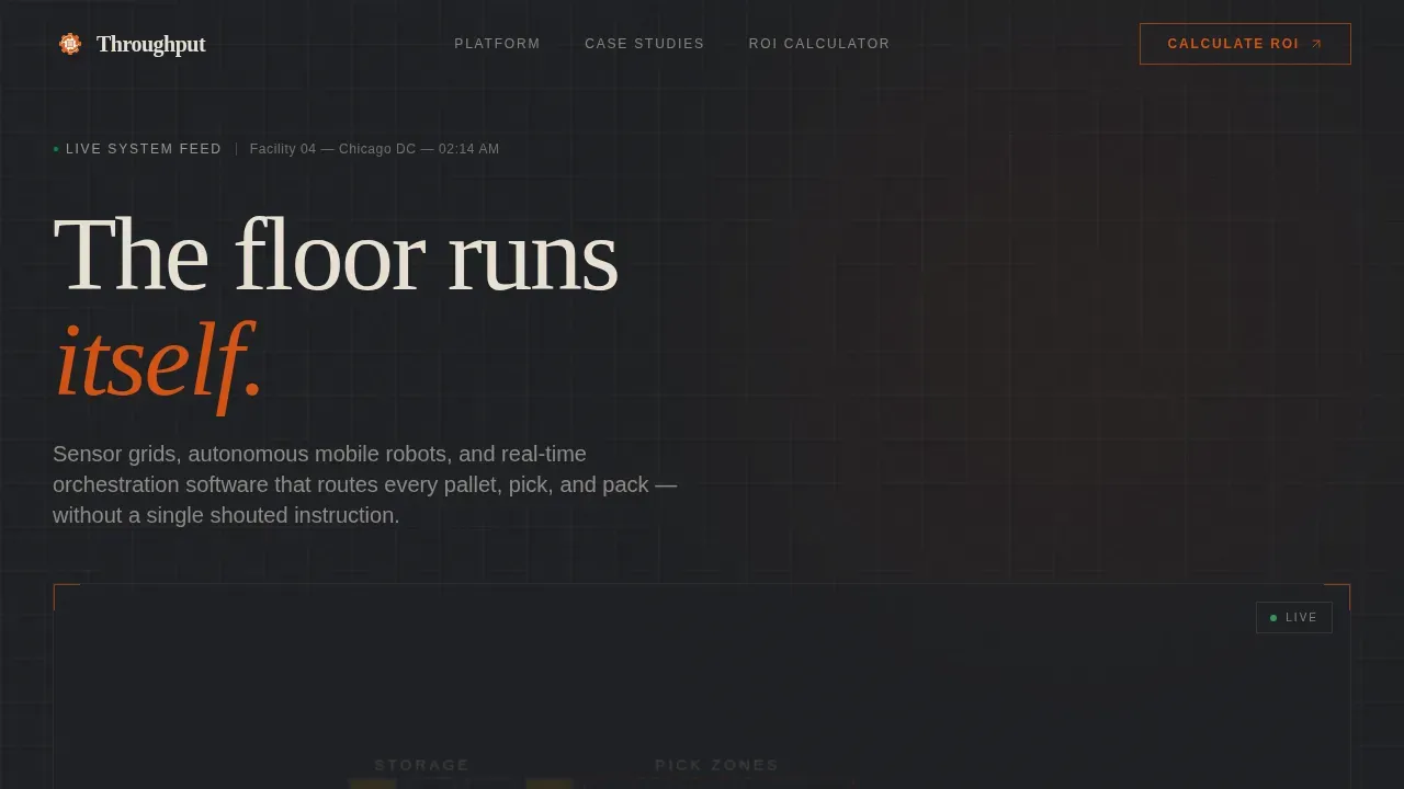
Animated SVG Warehouse Floor Infographic Header
The full-viewport header renders a stylized top-down warehouse floor plan in thin bone-white linework on a deep concrete background. Animated dots in furnace orange trace real product paths: inbound receipts flow through putaway, inventory populates rack cells, pick waves dispatch bots, and parcels converge on pack stations. Live-styled counters tick upward to display order counts, pick accuracy, and dock-to-stock duration. The dashboard shows the floor in motion before any copy loads, setting the pace immediately for logistics decision-makers.
Zigzag Case Study Narrative Layout
Three alternating sections tell the story of warehouse automation outcomes using a case study narrative structure. Section one showcases a 3PL that cut mispicks by 84 percent, with a before-state photo of paper pick lists and an after-state dashboard screenshot showing error rate trends. Section two covers an e-commerce fulfiller that absorbed three times peak holiday volume with zero temporary hires. Section three presents a cold-chain distributor that dropped dock-to-stock time from 47 minutes to 9. Each section escalates the stakes, so the scroll builds an airtight argument rather than a list of features.
Furnace-Orange Interstitial Stat Bars
Between each case study, full-width interstitial bars in furnace orange deliver single knockout statistics that reward the scroll. These elements break the visual rhythm intentionally. They create pause points where important information lands with maximum emphasis, keeping the user moving through the page without losing momentum.
Dual Call-to-Action Conversion System
The primary call to action, labeled "Calculate Your Throughput Gain," appears first as a ghost-outline button at the base of the hero section. It then solidifies into a full furnace-orange block after the second case study, once credibility is established. A secondary text link, "Download the 3PL Case Study PDF," captures visitors not yet ready to engage the calculator but willing to exchange an email. Both calls to action are designed to track two distinct visitor intent levels without splitting the visual hierarchy.
Dashboard Pro Industrial Dark Theme
The entire website is designed using the Dashboard Pro theme with the Fire and Earth color system. Furnace orange (#D45113) drives live-data accents and call-to-action pulses. Molten amber (#E8991C) highlights key performance indicators. Deep warehouse concrete (#2B2D31) forms the primary background. Dock-door steel (#5C5F66) surfaces card panels and section dividers. Dusty bone (#E8E0D4) handles body text. Fraunces display serif pairs with DM Sans body type. The result is a modern, industrial aesthetic that communicates precision and authority without decoration.
Scroll-Reveal Animations and Hover Interactions
The template includes SVG path animations, counter tick-up effects, dot-tracing animations on the floor plan, and scroll-reveal entrance behaviors on case study cards. Hover states activate on case study panels. The call-to-action button includes a pulse animation. These animations are GPU-accelerated through CSS and triggered by Intersection Observer, so they respond to the scroll pace naturally without blocking the user experience.
Page sections overview
| Section | Purpose |
|---|---|
| Hero Infographic Header | Animate live warehouse floor metrics and open with a ghost call-to-action button |
| Case Study One | Showcase 3PL mispick reduction with image-left, text-right zigzag layout |
| Interstitial Stat Bar | Deliver a single knockout automation metric in full furnace-orange strip |
| Case Study Two | Present e-commerce surge absorption story with text-left, image-right layout |
| Second Stat Bar | Reinforce scale proof with a second full-width orange interstitial statistic |
| Case Study Three | Demonstrate cold-chain dock-to-stock speed gain with image-left, text-right |
| ROI Calculator call to action | Drive visitors to personalized ROI calculator with a solid furnace-orange block |
| PDF Secondary call to action | Capture email leads with a downloadable 3PL case study PDF text link |
| Footer | Display single-row linear footer pattern with company and navigation elements |
Design & branding system
The visual identity is built to feel like a warehouse running third shift: dark ambient surfaces punctuated by the hot glow of status indicators and data accents. Every color serves a functional role, and the typography choices reinforce the industrial-intelligent tone of the content.
- Color palette: furnace orange (#D45113) for live-data accents and call-to-action pulses, molten amber (#E8991C) for key performance indicator highlights, deep warehouse concrete (#2B2D31) as the primary background, dock-door steel (#5C5F66) for card surfaces and section dividers, and dusty bone (#E8E0D4) for body text and labels
- Typography: Fraunces display serif for headlines creates an editorial weight suited to case study-style storytelling, while DM Sans body type keeps data descriptions and copy clean, readable, and scannable at dashboard glance speed
- Visual style: the overall aesthetic is industrial dark dashboard with a third-shift warehouse mood, where warmth comes from machines working, not from decorative color, keeping the focus on data and results throughout every section
Mobile & speed optimization
The template is built desktop-first to match the primary user behavior of operations directors working on workstations. It also scales responsively for mobile and tablet viewports so logistics and supply chain professionals can access and review content from any device.
- All CSS animations are GPU-accelerated and triggered via Intersection Observer, so scroll-reveal effects and counter animations fire at the right moment without janky behavior across devices
- The zigzag layout, interstitial bars, and call-to-action blocks reflow cleanly for smaller viewports, ensuring the case study narrative stays intact and the conversion path remains clear for every user regardless of screen size
How this template helps you convert
This landing page is designed around one conversion objective: move qualified warehouse operations leaders to a personalized ROI calculator. Every structural decision supports that goal.
- The case study narrative structure earns credibility before asking for anything. Ops directors arrive skeptical. Three escalating real-outcome stories, each with named metrics and specific percentage improvements, build the argument systematically so the call-to-action button feels like a natural next step rather than a demand.
- The dual call-to-action system captures two visitor intent levels. The ghost-outline button at the top invites early action without pressure. The solid furnace-orange block after the second case study converts warmed visitors who have seen the proof. The secondary PDF text link saves leads who are not yet ready for the calculator, keeping them in the funnel without friction.
Other information about this template
This template is one of a range of warehouse automation website templates designed for industrial SaaS and logistics technology companies. It sits within the Robotics and Automation subcategory under the broader Manufacturing and Industrial category, making it a strong fit for any business presenting throughput warehouse automation capabilities to a B2B audience.
- The throughput warehouse automation system landing page template is designed for desktop-first presentation but supports responsive mobile display, consistent with best practices for warehouse automation landing pages that serve logistics decision-makers across devices
- Warehouse management systems (WMS) are essential for tracking inventory and managing warehouse operations. This template is structured to present how a warehouse management system integrates with physical automation technologies like autonomous mobile robots (AMRs), conveyor belts, and Automated Storage and Retrieval Systems (AS/RS), which can save up to four times more floor space by using vertical storage
- Automation systems can cut operational costs by up to 55 percent, process three times more orders per day, and achieve a 99.9 percent read rate for error reduction. Warehouse automation also decreases inventory storage cost, reduces human operational errors, improves the utilization of warehousing space, and leads to faster inventory accounting. These are the kinds of metrics this template is designed to showcase with credibility and visual impact
- The creative direction uses a Case Study Narrative structure, which is widely recognized as one of the most effective strategies for warehouse automation landing pages because it builds trust through specific, named outcomes rather than generic claims about efficiency gains
- The ppt templates and slide-based presentation style common in sales environments does not translate directly to digital landing pages for warehouse automation. This template solves that gap by giving teams a web-native design that mirrors the presentation quality of a polished slide deck while delivering the interactivity and animations a modern website needs
- Digital automation technologies, including artificial intelligence (AI), machine learning for predictive analytics, and automated labeling and scanning, sit alongside physical systems in any serious warehouse automation pitch. This template gives your team the design structures to showcase all of these components clearly in a single scrollable page
- Training plans for warehouse automation should include topics such as sales and purchase order management and vendor invoice management. Templates for warehouse operations can help new employees learn processes faster by defining the steps in each task. This template supports onboarding and internal presentation use cases as well as outbound marketing, since the case study format is equally effective for internal stakeholder buy-in as it is for external customer acquisition
- The template is editable and customizable. You can fill in your own client case study details, adjust color values to match your company brand, swap placeholder dashboard screenshots with real product imagery, and customize the call-to-action text and destination URLs. Every section is built for practical reuse across different warehouse automation sales contexts


Theme
Dashboard Pro
Creative direction
Case Study Narrative
Color system
Fire & Earth
Style
Zigzag/Alternating
Direction
Click-Through
Page Sections
Animated SVG Warehouse Floor Infographic
Zigzag Case Study Narrative Sections
Furnace-orange Knockout Stat Bars
Dual Call-to-action Conversion System
Dashboard Pro Industrial Dark Theme
Scroll-reveal Animations and Hover States
Related questions
Who is this landing page template built for?
Can I customize the case study content and color palette?
Does the template include animations and interactive elements?
What conversion goal does this landing page support?
Is the template suitable for presenting warehouse management system integrations?


