Restaurant Consulting Landing Page Template
Ticket is an editorial-style restaurant consulting landing page template built for digital transformation firms. It leads with a bold stats wall, walks visitors through a five-phase methodology, and closes with a transparent click-through call to action. The layout is clean, data-forward, and designed to earn trust before asking for anything.
by Rocket studio
Quick summary
Ticket is a single-page landing page template for restaurant technology consultancies. It opens with oversized transformation metrics, then guides visitors through a numbered five-phase process from audit to measurement. The design uses editorial typography, a utility-focused color palette, and a sticky call to action bar to move qualified restaurant operators toward a free diagnostic assessment.
Who this template is for
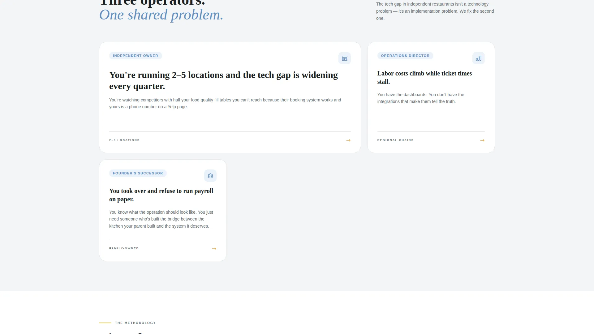
This template is built for consultancies that help restaurants close the gap between how they currently operate and how modern technology can run their kitchen, floor, and books. It speaks directly to operators who are already feeling the pressure and need proof before they commit.
- Independent restaurant owners running two to five locations who feel behind on technology
- Operations directors at regional chains watching labor costs rise and ticket times stall
- Family-owned restaurants transitioning leadership to a new generation ready to drop paper-based processes
What problem this template solves
Restaurant operators are skeptical of consultants. They have seen flashy decks that promise transformation and deliver confusion. This template solves the trust problem by making the entire methodology visible before asking for any commitment.
- Visitors leave before reading because generic hero sections fail to hook them immediately
- Consultant credibility is hard to establish without proof, and stock photography does nothing to build it
- The ask comes too early, before the visitor understands what working with the consultancy actually looks like
What you get with this template
You get a fully structured landing page layout designed around a transparent, process-first narrative. Every section earns the next scroll by answering the skepticism the previous one created.
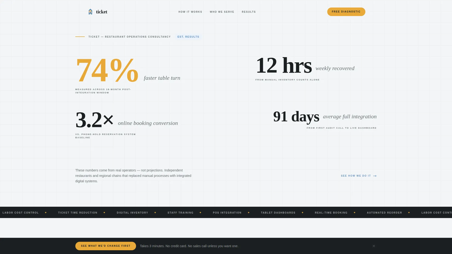
- A full-width stats wall header with oversized editorial numbers and supporting context tags
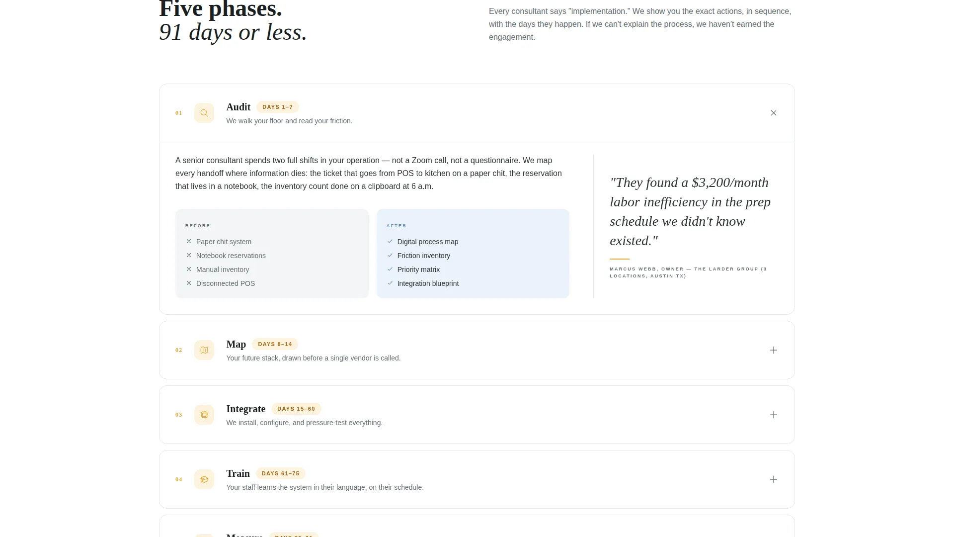
- A five-phase process reveal (Audit, Map, Integrate, Train, Measure) formatted as a magazine article spread with pull quotes, process diagrams, and timeline callouts
- A sticky bottom call to action bar and a primary click-through button linking to a free diagnostic assessment
Feature list
This template is built around a specific editorial and conversion architecture. Each feature below is directly reflected in the layout and design direction described in the brief.
Stats Wall Header
The header is a full-width composition of real transformation metrics displayed in oversized editorial typography. Numbers are staggered at different scales, each paired with a single-line context tag in small caps. There is no hero image. The data itself is the visual hook.
Five-Phase Process Sections
Each phase (Audit, Map, Integrate, Train, Measure) is presented as a numbered magazine-style article spread. Sections include pull quotes from restaurant operators, before-and-after tech stack diagrams, and timeline callouts that show days-not-months implementation windows.
Sticky call to action Bottom Bar
A persistent bottom bar surfaces the primary call to action after the second scroll. It includes a supporting line that lowers friction by clarifying the commitment level required to take the next step.
Click-Through Diagnostic call to action
The primary call to action, "See What We'd Change First," appears after the process reveal and links to a free diagnostic assessment page. The placement is intentional: the offer only appears after the methodology has been fully demonstrated.
Editorial Typography System
The template uses staggered scale typography to create a magazine-feature reading experience. Oversized stats, pull quotes, and small-caps labels are layered together to give the page visual weight without relying on photography.
Cloud Canvas Color System
The palette uses soft cloud white as the dominant background, slate charcoal for body text, muted interface blue for interactive elements and data accents, and ticket amber reserved exclusively for calls to action and key metric highlights.
Page sections overview
| Section | Purpose |
|---|---|
| Stats Wall Header | Opens with transformation metrics to hook visitors immediately |
| Phase 1: Audit | Shows how the consultancy diagnoses the current tech stack |
| Phase 2: Map | Explains how a custom improvement roadmap is built |
| Phase 3: Integrate | Demonstrates how new tools replace clipboard-based workflows |
| Phase 4: Train | Covers how staff adopt tablet dashboards and booking systems |
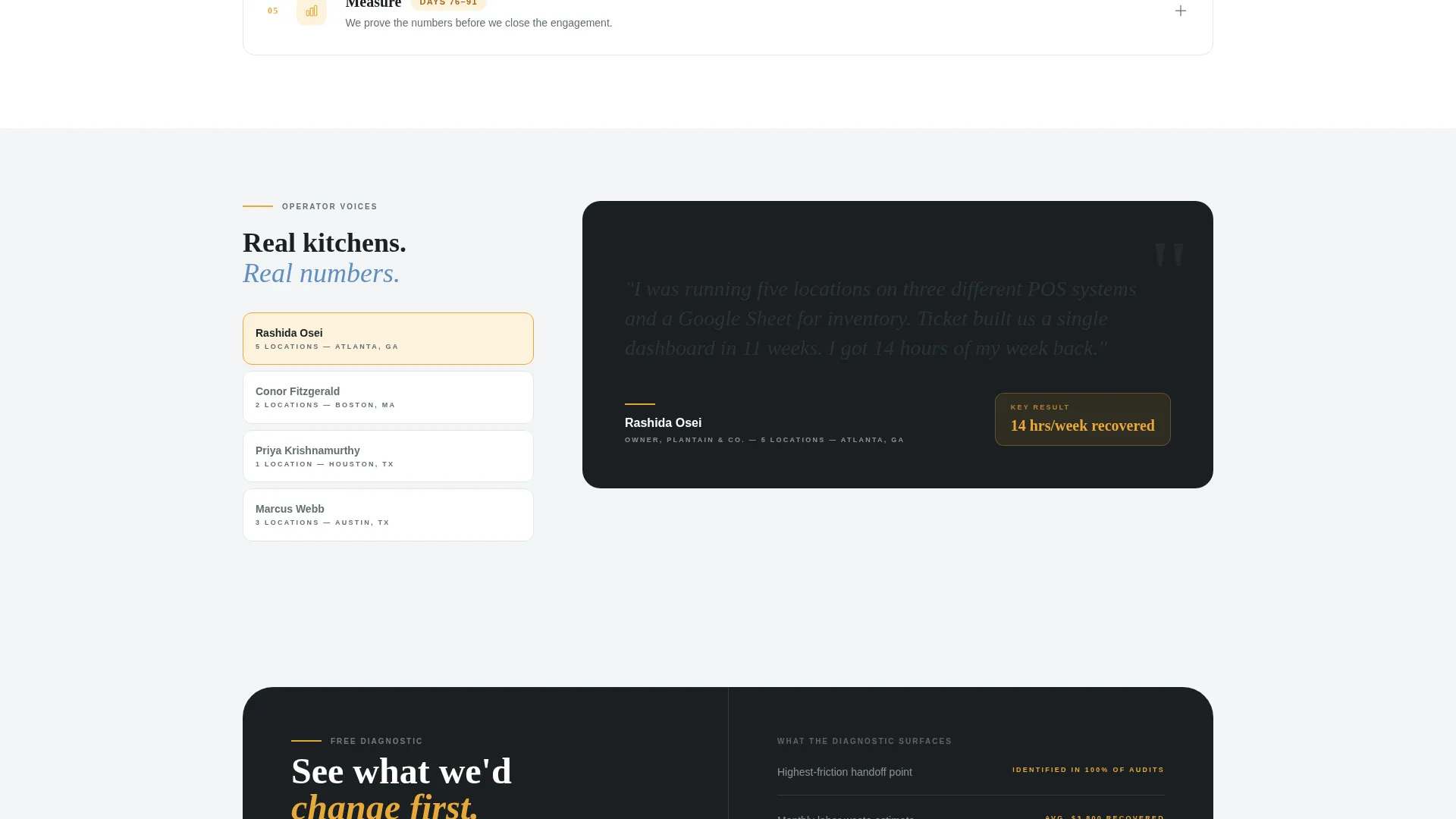
| Phase 5: Measure | Shows how outcomes are tracked against the opening metrics |
| Primary call to action Block | Invites visitors to access a free diagnostic assessment |
| Sticky Bottom Bar | Keeps the call to action visible as visitors scroll through the page |
Design & branding system
The visual identity follows a Service Utility theme. The palette feels like a SaaS dashboard opened early in the morning before a lunch rush: organized and clinical, but not cold or sterile.
- Cloud white (#F4F5F7) dominates the background, slate charcoal (#2D3436) handles editorial body text, and muted interface blue (#5F8EBF) marks interactive elements and data accents
- Ticket amber (#E8A838) is used exclusively for calls to action and key metric highlights, keeping the warm signal color visually distinct and meaningful
- Typography is staggered at multiple scales to create editorial hierarchy, with small-caps context tags, oversized stat figures, and pull quote formatting creating a magazine-spread reading rhythm
Mobile & speed optimization
The layout is structured for clarity and scannability across screen sizes. The editorial composition translates well to narrower viewports because it relies on typographic hierarchy rather than complex image grids.
- Staggered stat typography and numbered phase sections reflow naturally without losing their visual impact at smaller widths
- The sticky call to action bar is designed to remain accessible throughout the scroll experience on both desktop and mobile viewports
How this template helps you convert
This template is built on a transparency-first conversion strategy. It earns the click by giving away the full methodology before making any ask.
- The stats wall creates immediate credibility by leading with specific, concrete transformation numbers rather than generic headline copy, pulling the visitor into the content before they consciously decide to read.
- The five-phase process reveal systematically removes consultant skepticism one scroll at a time, so by the time the call to action appears, the visitor already understands the value and the work behind it.
- The sticky bottom bar and friction-reducing call to action copy ("Takes 3 minutes. No credit card. No sales call unless you want one.") lower the commitment barrier and make the diagnostic assessment feel safe to click.
Other information about this template
This template is categorized under Professional Services with a Restaurant Consulting subcategory. It is suited for consultancies operating in the restaurant technology space, including those focused on operational systems, reservation management, and inventory workflow modernization.
- The template style draws from a Comparison Table approach in its process phase sections, letting visitors clearly see the before-and-after state of each operational area
- The landing page direction supports a Booking and Scheduling use case by positioning real-time reservation systems as one of the core transformation outcomes
- The creative direction is rooted in editorial authority rather than traditional logo walls or badge-heavy layouts, letting methodology and metrics do the persuasion work
Theme
Legal Shield
Creative direction
Logo Wall Authority
Color system
Cloud Canvas
Style
Comparison Table
Direction
Booking/Scheduling
Page Sections
Stats Wall Header with Editorial Metrics
Five-phase Process Reveal Layout
Sticky Bottom Call to Action Bar
Click-through Diagnostic Call to Action Block
Cloud Canvas Color System
Staggered Editorial Typography
Related questions
Who is this landing page template designed for?
Can I customize the transformation metrics in the stats wall?
What is the purpose of the five-phase process layout?
How does the sticky call to action bar work?
Is this template suited for one service or multiple offerings?



