Ocean Conservation NGO Landing Page Template
Tidewatch is a nature-inspired ocean conservation landing page template built for international NGOs. It uses a zigzag alternating layout to move visitors through the urgency of the ocean crisis and into meaningful action. With a cinematic team photo header, open-access credibility sections, and a resource download flow, it converts researchers, funders, and policymakers into engaged partners.
by Rocket studio
Quick summary
Tidewatch is a single-page landing page template designed for international ocean conservation organizations. It alternates between crisis storytelling and program outcomes in a tidal, left-right rhythm. A Desert Rose color system and editorial typography give it the warmth of a tide pool at golden hour. The final section delivers a resource library with a segmented download form.
Who this template is for
This template is built for NGOs and coalitions that need to reach high-trust audiences across multiple professional sectors. It is ideal for organizations that lead with evidence and want their credibility to do the persuading before any ask appears.
- Marine research organizations and international conservation coalitions presenting field science to funders
- Documentary producers and journalists seeking a credible, visually compelling research partner
- Coastal government offices and policy teams evaluating organizations for legislative partnership
What problem this template solves
Most nonprofit landing pages either overwhelm visitors with text or underdeliver on credibility. Neither outcome works when your audience is a foundation program officer or a government official who has five minutes and a short list. Tidewatch solves the trust gap by surfacing open data and video before any form appears.
- Visitors leave before converting because the value is gated behind a wall of asks
- Conservation organizations struggle to communicate both the scale of the crisis and the concrete progress of their programs on the same page
- Generic nonprofit templates lack the editorial weight needed to impress documentary producers or philanthropic foundations
What you get with this template
You get a fully structured, single-page layout ready to communicate ocean conservation impact at a professional level. Every section has a defined role in a conversion journey that earns the click by giving value first.
- A cinematic hero section with a fade-in teal headline over a wide-angle team photo
- A zigzag alternating body with crisis statistics sections and program outcome sections in alternating visual registers
- A resource library section with a segmented download form, a floating subscription banner, and open-access credibility content before any form appears
Feature list
This template includes purpose-built sections and interactive components that work together to move serious visitors toward meaningful engagement.
Cinematic Hero with Fade-In Headline
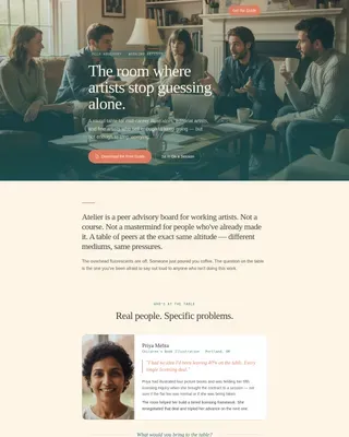
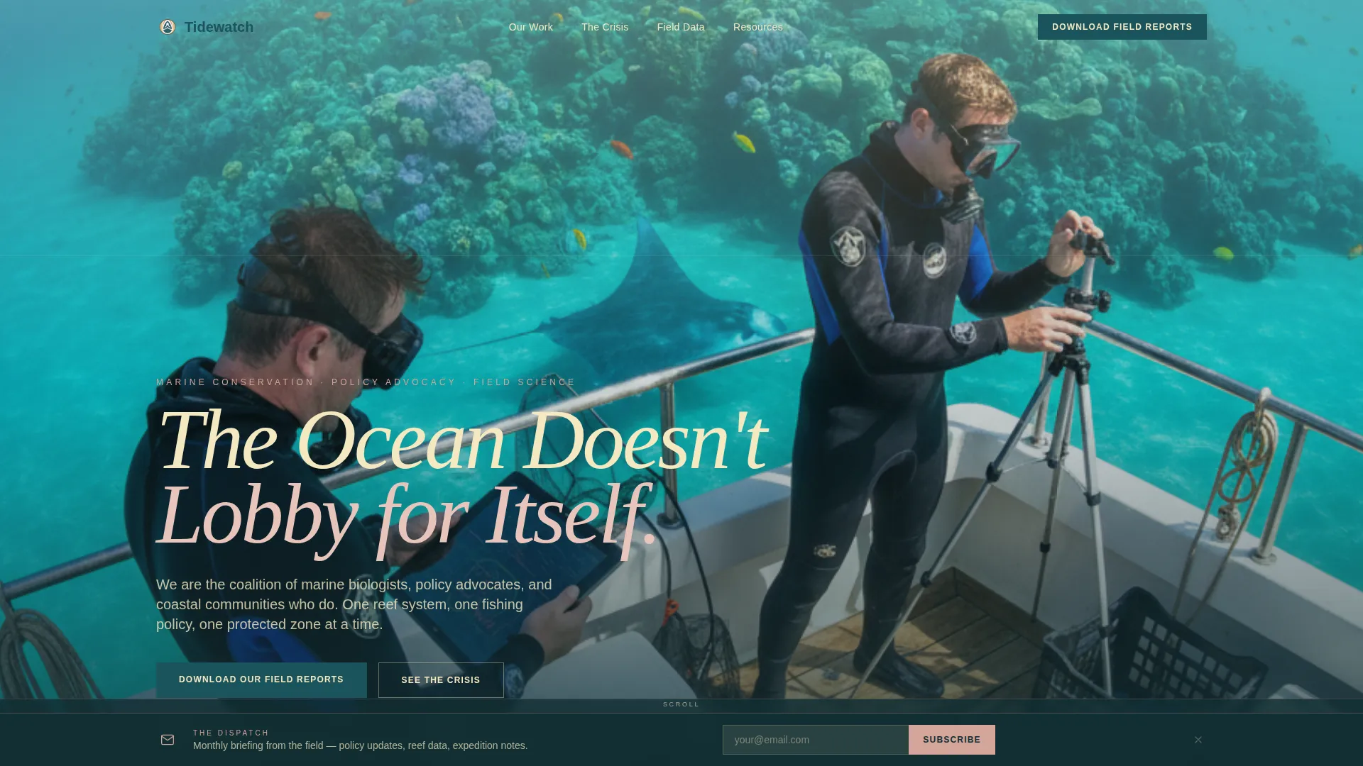
The header uses a wide-angle team photo showing researchers in wetsuits on a boat deck. A teal headline fades in over the water with a scroll-triggered animation. The horizon sits at the upper third, giving the image an editorial, documentary quality.
Zigzag Alternating Crisis and Program Sections
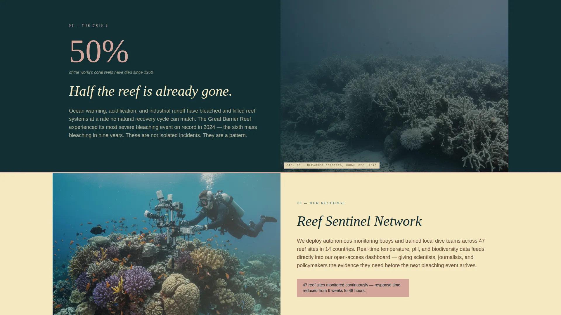
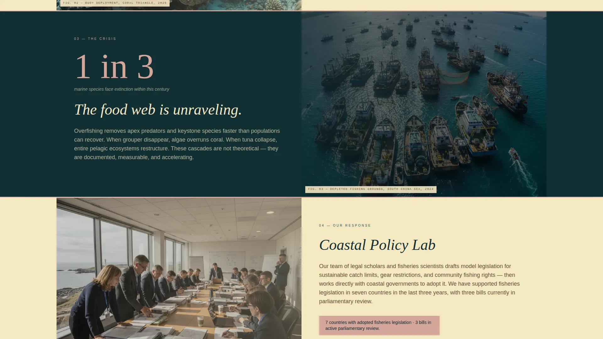
The page body alternates between WHY sections showing single staggering statistics with full-bleed underwater photography and HOW sections showing field stories with measurable outcomes. Teal-dark tones cover crisis sections; sand-light tones cover program sections. The visual rhythm mirrors the feeling of a wave pattern.
Open-Access Credibility Block
Before any form appears, the template surfaces two open-access statistics dashboards and an embedded three-minute expedition video reel. This section establishes organizational transparency and builds trust with skeptical professional audiences.
Segmented Resource Library Form
The final section anchors the primary call to action: a download form that asks for name, organization, and role. Role options include researcher, educator, journalist, funder, and policymaker, allowing follow-up communications to be targeted by audience segment.
Persistent Subscription Banner
A floating "Subscribe to Dispatch" banner appears after the second scroll section. It asks only for an email address. It is designed to be visible without being intrusive, offering a lower-commitment conversion path alongside the primary download form.
Scroll-Triggered Animation System
The template uses scroll-triggered reveals throughout, including zigzag stagger animations, Ken Burns effects on images, and stat counter animations. These are built using Intersection Observer logic and CSS-first techniques to keep motion purposeful and smooth.
Page sections overview
| Section | Purpose |
|---|---|
| Hero Header | Introduces the organization with a cinematic team photo and fade-in headline |
| Crisis Stats Block | Communicates ocean crisis scale with statistics and underwater photography |
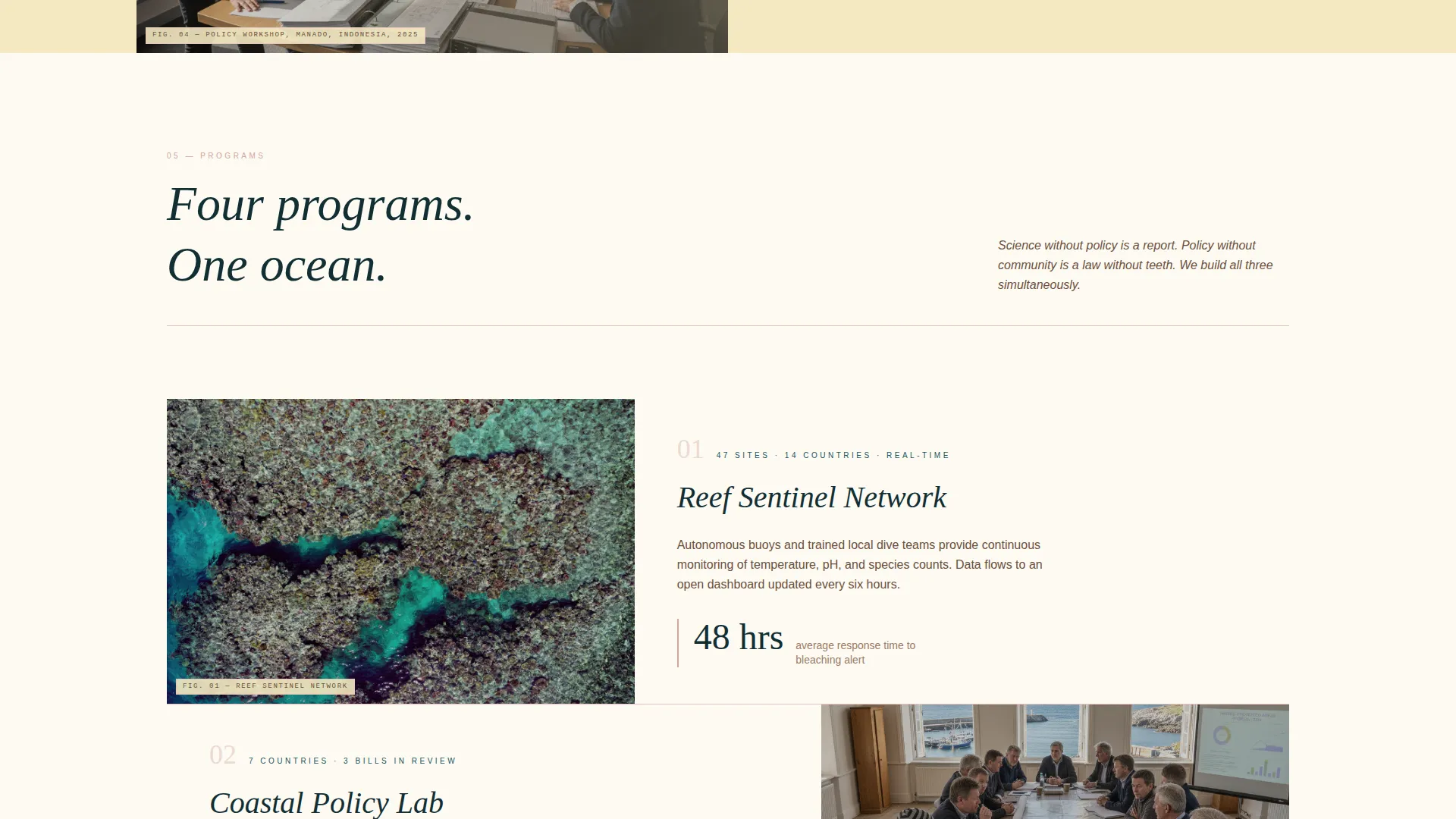
| Programs Showcase | Shares field stories and measurable conservation outcomes |
| Expedition Reel | Embeds a three-minute video and open-access dashboards for credibility |
| Resource Library | Hosts downloadable field reports, reef maps, and expedition summaries |
| Download Form | Collects name, organization, and role to segment follow-up communications |
| Dispatch Banner | Floats a low-friction email subscription offer after the second scroll section |
Design & branding system
The template uses a Desert Rose color system that draws from the natural palette of a tide pool at golden hour. Each color has a specific role in the layout, keeping the visual hierarchy consistent and emotionally resonant throughout the page.
- Sand (#F4E8C1) dominates background areas; coral pink (#D4A59A) marks section dividers and pull-quote blocks; deep oceanic teal (#1A535C) commands headlines and interactive elements; driftwood brown (#6B4F3B) handles body text for grounded readability
- Fraunces serif is used for editorial headlines at weight; DM Sans handles body copy and interface elements for clean legibility
- The Nature-Inspired editorial style combines full-bleed photography, warm weathered tones, and high-contrast teal anchors to feel urgent and alive without being clinical
Mobile & speed optimization
The template is designed desktop-first to serve documentary producers and foundation program officers working on larger screens. Full mobile support is included, with layout adaptations that preserve the tidal rhythm and visual hierarchy across screen sizes.
- Scroll animations use Intersection Observer for efficient triggering, and motion is CSS-first where possible to reduce scripting overhead
- The zigzag layout reflows to a stacked single-column structure on smaller screens, keeping crisis and program sections clearly separated
- The floating subscription banner and download form are touch-friendly and remain functional across mobile breakpoints
How this template helps you convert
The conversion strategy is built around earning trust before making any ask. Every section is ordered to move the visitor from emotional engagement through evidence-based credibility and into a clear, low-friction action.
- The hero section creates immediate emotional impact with a real team photo and a headline that frames the mission in one line, giving visitors a reason to keep scrolling.
- The open-access credibility block places dashboards and expedition video before any form, so professional visitors experience the organization's transparency firsthand before they are asked to share their details.
- The segmented download form and the floating subscription banner offer two distinct commitment levels, meeting funders, researchers, and policymakers at the level of engagement they are ready for.
Other information about this template
This template was designed specifically for the intersection of ocean conservation advocacy and professional grant and partnership audiences. It reflects the visual and editorial standards those audiences expect.
- The template style is Zigzag/Alternating, with a Vision and Mission creative direction that structures the page as a tidal pattern of crisis and response
- The header concept is a Team Photo, intentionally editorial and field-based rather than posed, to signal authenticity to documentary and philanthropic audiences
- The landing page direction is Content and Resource distribution, meaning the page is built around delivering value through open data and downloadable materials before capturing contact information
- The color system is Desert Rose, a Nature-Inspired palette that distinguishes this template visually from standard nonprofit or charity page designs
Theme
Nature-Inspired
Creative direction
Vision & Mission
Color system
Desert Rose
Style
Zigzag/Alternating
Direction
Content/Resource
Page Sections
Cinematic Hero with Fade-in Headline
Zigzag Crisis and Program Rhythm
Open-access Credibility Block
Segmented Resource Download Form
Persistent Subscription Banner
Scroll-triggered Animation System
Related questions
Who is the primary audience for this template?
Does the page show any content before the download form appears?
What fields does the resource download form include?
What is the subscription banner and when does it appear?
Is this template suitable for an international conservation organization?