Artisan Seasonal Landing Page Template
Tinsel is a bento grid landing page template built for artisan seasonal decoration makers and curated gift sellers. It pairs a Dopamine Pop color palette with a scroll-reveal layout to showcase handmade collections by season. A built-in style quiz, App Store Preview header, and lookbook-style bento cells guide shoppers from discovery to purchase in one beautifully layered page.
by Rocket studio
Quick summary
Tinsel is a single-page bento grid template designed for artisan seasonal decoration stores. It blends a joyful Dopamine Pop color system with a Directory and Discovery theme, turning a product page into a browsable seasonal lookbook. The layout guides visitors from the hero header through curated collection cells and into a personalized style quiz, all without leaving the page.
Who this template is for
This template fits makers, curators, and boutique owners who sell handmade or artisan seasonal goods. It works equally well for an individual studio selling hand-dyed wool pumpkins as it does for a small shop offering curated gifting bundles.
- Artisan makers who sell directly to customers and want a storefront that reflects their craft
- Boutique owners looking to showcase seasonal collections without a generic catalog feel
- Gift curators and hostess-market sellers who need a page that communicates quality and intentionality
What problem this template solves
Most e-commerce templates flatten handmade goods into the same grid used for mass-produced inventory. Artisan seasonal decoration sellers lose the texture, story, and mood that make their work worth the price. Tinsel fixes this by replacing a standard product grid with a living, editorial layout.
- Buyers struggle to feel the difference between handcrafted and mass-produced when every storefront looks identical
- Seasonal sellers have no clean way to separate autumn, winter, spring, and summer collections in one scrollable page
- Shoppers without a clear gift idea rarely convert because nothing invites them to explore
What you get with this template
Tinsel delivers a complete single-page layout structured around seasonal discovery. Every element is built from the source brief, so nothing is filler and nothing needs to be invented.
- A bento grid hero section with an App Store Preview device mockup and floating product thumbnail orbit
- A five-question personalized style quiz modal that delivers a curated collection result with a one-click purchase path
- A scroll-reveal layout with varied bento cell sizes, seasonal color accents, and a sticky bottom bar call to action
Feature list
This template packs a focused set of purpose-built components that serve artisan seasonal retail specifically.
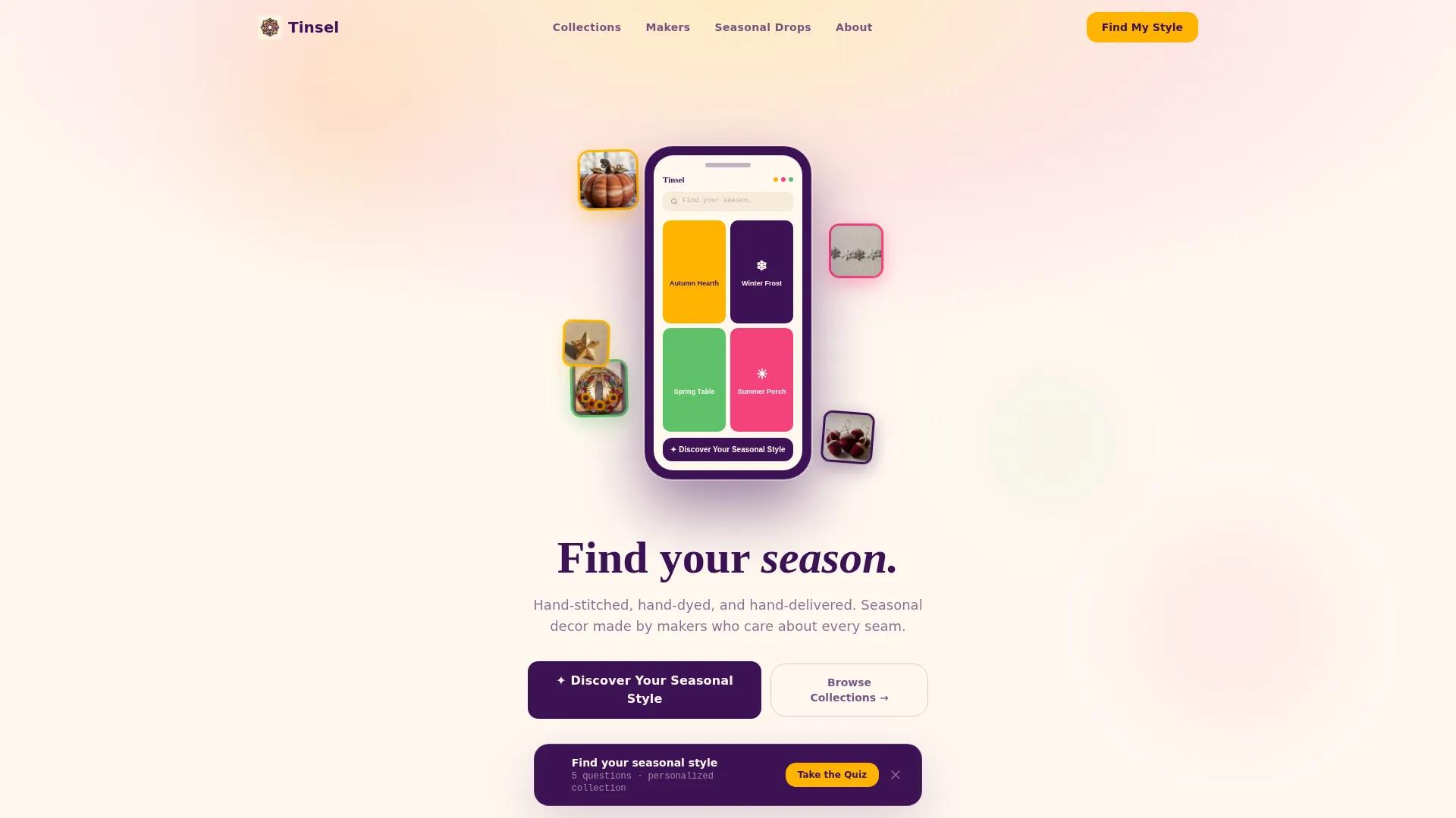
App Store Preview Hero
The header frames a stylized phone screen mid-scroll through the store's collection. Floating product thumbnails orbit the device like ornaments on a mobile. Inside the screen, four category tiles are visible: "Autumn Hearth," "Winter Frost," "Spring Table," and "Summer Porch." A fade-in headline below the device reads "Find your season."
Bento Grid Collection Layout
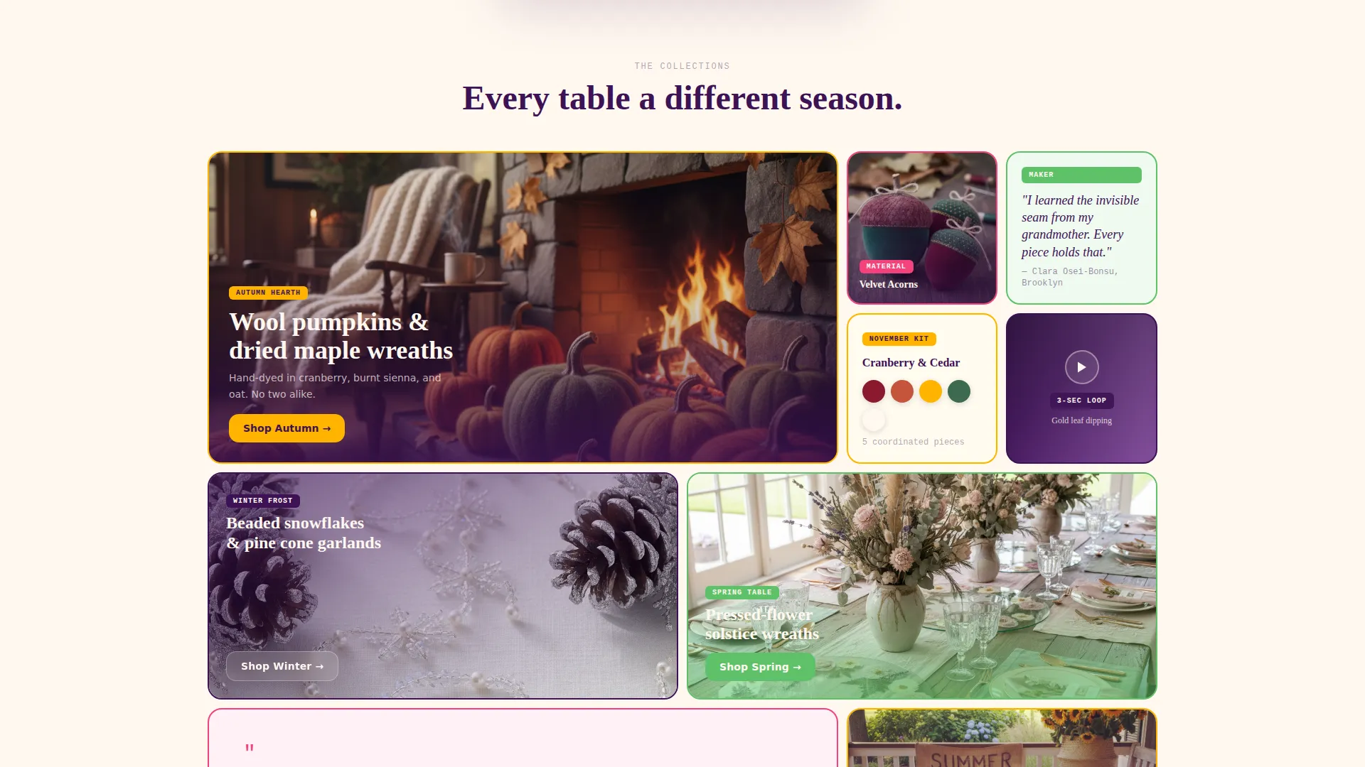
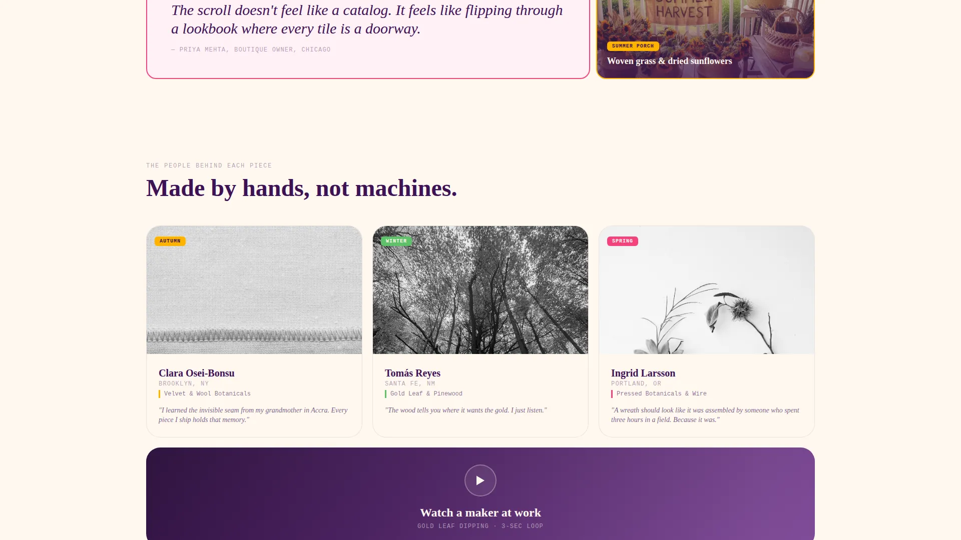
The page uses a multi-size bento grid where cells vary between hero-width features, half-width material close-ups, and quarter-width maker portraits. Each row shifts the seasonal mood forward. The grid breathes without repeating a rhythm, so scrolling feels like flipping through a curated lookbook rather than a product catalog.
Seasonal Style Quiz Modal
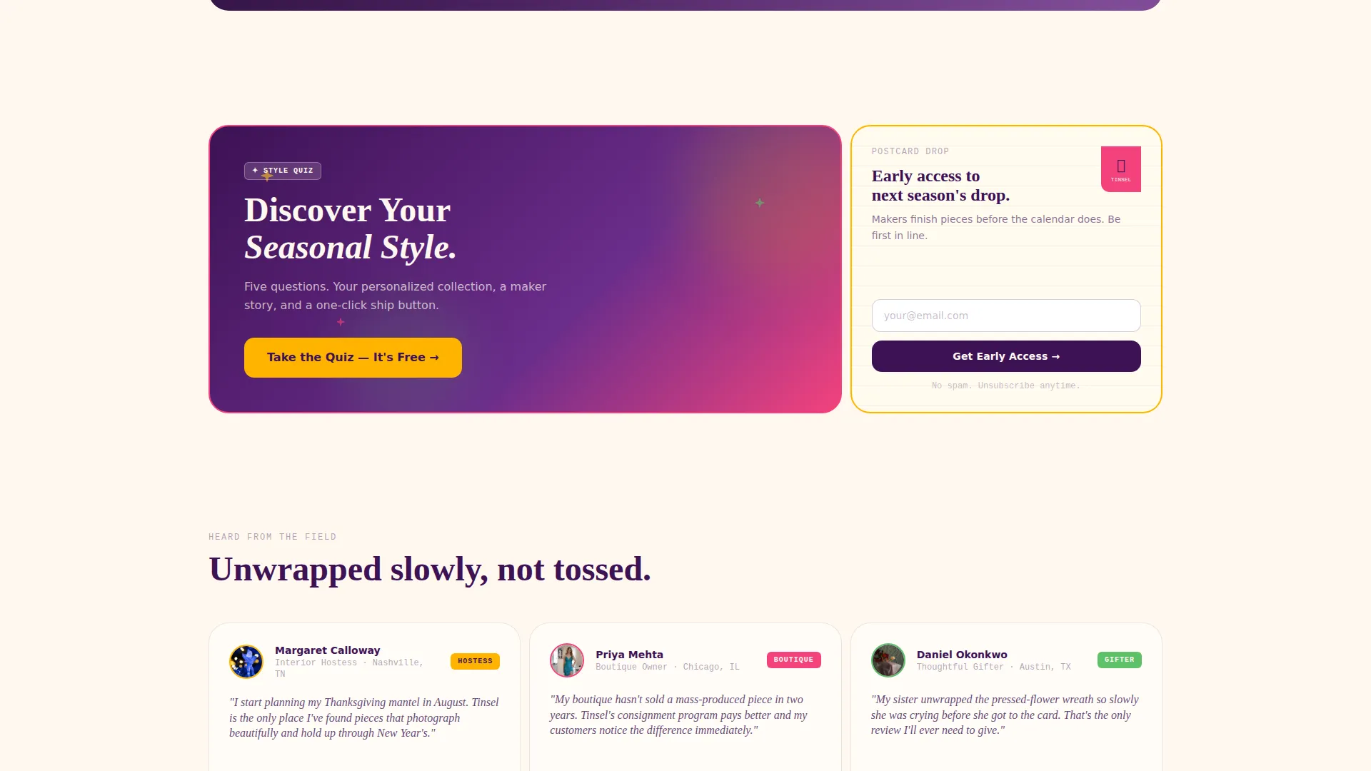
The primary call to action opens a five-question modal quiz. Questions cover preferred hosting season, color instinct shown as swatches, table-setting style, gift-giving frequency, and budget comfort range. Results deliver a personalized seasonal collection page with a curated bundle, a maker story, and a one-click "Ship This Collection" button.
Sticky Bottom Bar Call to Action
A sticky bottom bar appears after two scroll depths on the page. It carries the "Discover Your Seasonal Style" quiz prompt and stays visible as shoppers continue scrolling, keeping the primary conversion path accessible throughout the full page experience.
Handwritten Postcard Email Cell
One bento cell is styled as a handwritten postcard and contains a simple email capture form. The copy invites visitors to "Get Early Access to Next Season's Drop," creating a low-commitment secondary conversion path alongside the quiz.
Per-Cell Accent Color System
Every bento cell receives exactly one accent color from the Dopamine Pop palette. One card is bordered in marigold, the next tagged in peony, the next badged in sage. Hover states bloom from deep plum to the cell's individual accent, making the grid feel like a patchwork quilt of seasonal color.
Page sections overview
| Section | Purpose |
|---|---|
| App Store Hero | Introduces the browsable seasonal world with a device mockup and floating product thumbnails |
| Category Tile Row | Displays four season tiles inside the hero device for immediate collection navigation |
| Hero Headline | Fades in the tagline "Find your season" below the device mockup |
| Bento Grid Body | Holds all curated collection cells across varied sizes and seasonal moods |
| Material Story Cells | Half-width cells featuring close-up textures like velvet acorns and gold leaf dipping loops |
| Maker Portrait Cells | Quarter-width cells for maker portraits and pull quotes within the grid |
| Color Palette Cell | Displays a seasonal color swatch kit such as "Cranberry and Cedar, November Kit" |
| Postcard Email Cell | Styled as a handwritten postcard with an email capture for early access drops |
| Style Quiz Modal | Five-question overlay that delivers a personalized seasonal collection result |
| Sticky Bottom Bar | Persistent call-to-action bar that appears after two scroll depths |
| Collection Result Page | Personalized outcome screen with a curated bundle, maker story, and purchase button |
Design & branding system
The visual identity runs on a Dopamine Pop color system built around five deliberate colors. Cream dominates all backgrounds and card surfaces to keep the overall tone warm and readable. Plum anchors body text and navigation for consistency across every section.
- Marigold yellow (#FFB400), hot peony pink (#F4427D), electric sage (#5EC269), deep plum (#3D1255), and warm cream (#FFF8F0) form the full palette
- Each bento cell gets exactly one accent color, so the grid reads like a patchwork quilt without feeling chaotic
- Interactive hover states transition from plum to the cell's own accent color, giving the layout a tactile, responsive feel
Mobile & speed optimization
The bento grid layout is built to reflow naturally across screen sizes. The scroll-reveal progression means content loads in sequence rather than all at once, keeping the page experience light and focused as users move through it.
- Bento cells stack and resize responsively so seasonal content stays visually clear on smaller screens
- The sticky bottom bar and quiz modal are designed to function within a mobile viewport without blocking key content
- The App Store Preview hero composition is tight and compact, keeping the header readable on phones without requiring horizontal scrolling
How this template helps you convert
Tinsel is structured around two clear conversion paths that work together rather than competing. The layout pulls curious visitors into the quiz and keeps passive browsers captured through the email cell.
- The "Discover Your Seasonal Style" quiz converts browsers by replacing a generic browse experience with a personalized collection recommendation, reducing decision fatigue and delivering a direct purchase path.
- The handwritten postcard email cell captures visitors who are not ready to buy today, building an audience for future seasonal drops with a single low-friction form.
Other information about this template
This template sits within the Retail and E-Commerce category, specifically designed for seasonal decoration stores and artisan gifting markets. It is best suited for a single-page landing structure rather than a multi-page site build.
- The template style is Scroll Reveal with progressive content loading as users move down the page
- The theme follows a Directory and Discovery model, treating the page like a browsable seasonal market rather than a flat storefront
- The Curated Collection creative direction means every cell tells a material or mood story, not just a product listing
- The Intersection Match Score for this template is 9 out of 10, reflecting a strong alignment between the seasonal decorations niche and the chosen layout and color approach
- This template is a strong fit for makers selling through platforms like Etsy, independent storefronts, or consignment boutique portals who want a standalone discovery page
Theme
Directory & Discovery
Creative direction
Curated Collection
Color system
Dopamine Pop
Style
Scroll Reveal (Progressive)
Direction
Marketplace/Multi
Page Sections
App Store Preview Hero Header
Bento Grid Lookbook Layout
Personalized Seasonal Style Quiz
Sticky Bottom Bar Conversion Path
Per-cell Dopamine Pop Accents
Handwritten Postcard Email Capture
Related questions
Can I use this template without activating the quiz feature?
How many seasonal collections can the bento grid display?
Is this template a good fit for boutique owners as well as individual makers?
What does the Scroll Reveal template style mean for this page?
Can the postcard email cell be updated to promote a different offer?



