Embassy & Consulate Pricing & Packages Website Template
Tithe is a hub-and-spoke landing page template built for cross-border mission support platforms. It combines an animated icon-grid header, stats-first section design, a fee-comparison table, a named worker story, and a searchable giving module. The result is a transparent, trust-first donation experience that shows donors exactly how much of every dollar reaches the field.
by Rocket studio
Quick summary
Tithe is a single-page, anchor-nav template designed for faith-based disbursement platforms that fund field workers across multiple countries. It opens with a mosaic of sixty country icons and animated impact counters, then walks donors through fee proof, worker stories, and a tiered giving module, earning each gift with data before asking for it.
Who this template is for
This template is built for organizations that move donor funds across borders to support missionaries, church planters, and Bible translators. It suits teams that need to demonstrate financial transparency before asking for a gift.
- Missions platform teams managing worker directories across dozens of countries
- Megachurch missions boards allocating large annual budgets across field workers
- Small giving communities, such as small-group leaders or retired couples, funding individuals directly
What problem this template solves
Legacy wire transfers consume a significant share of every donated dollar before it ever reaches a field worker. Donors rarely see proof of what arrives, and that invisibility erodes trust over time.
- No clear way to show donors how fees reduce the actual amount received
- No single page that connects aggregate impact data to individual worker stories
- No giving flow that lets a donor search, choose, and fund a specific person in one session
What you get with this template
You get a complete, section-led landing page that moves a visitor from curiosity to committed donor without leaving the page. Every section is purposeful and ordered to build trust incrementally.
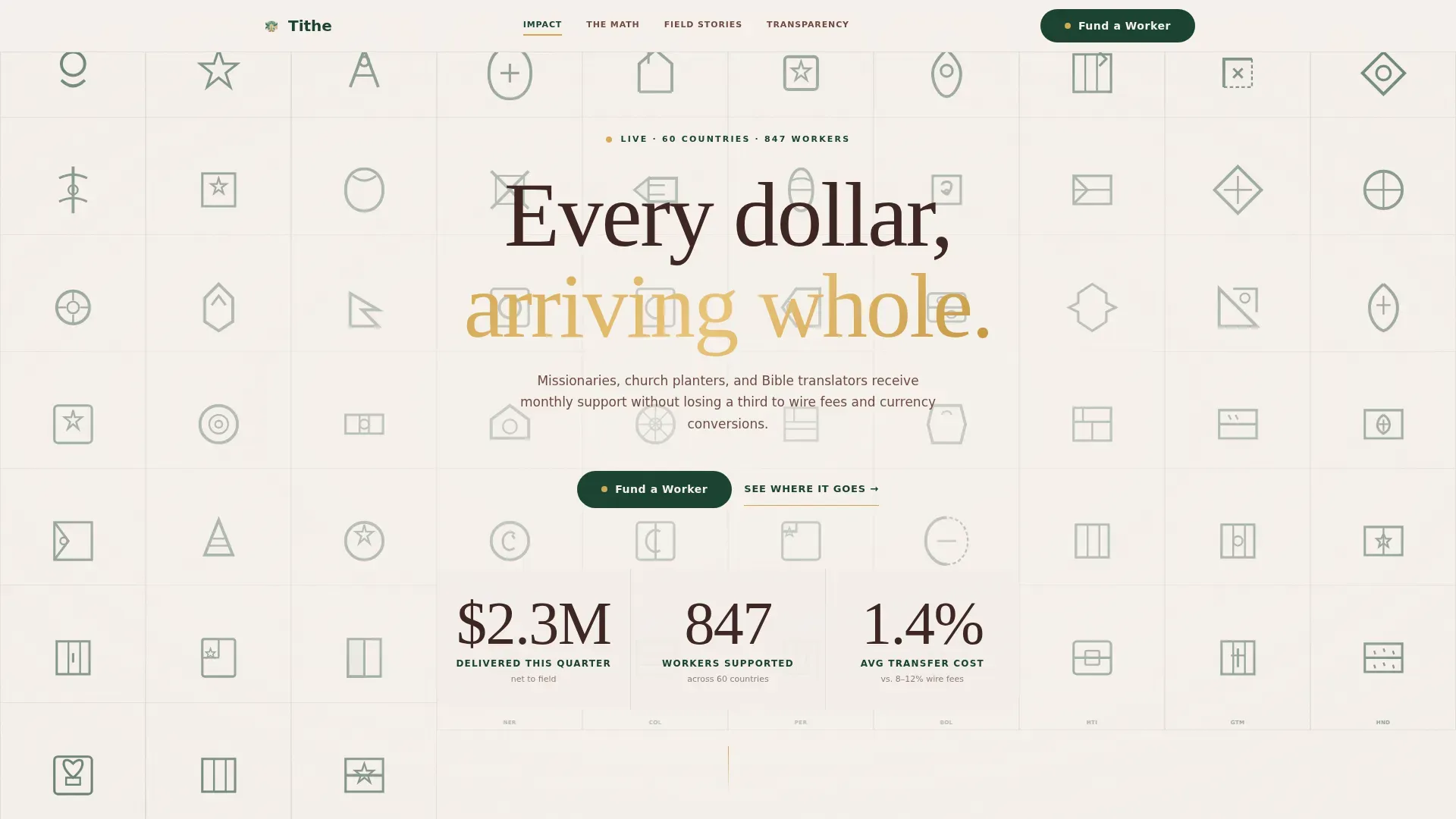
- An animated icon-grid header with live-style counters for dollars delivered, workers supported, and average transfer cost
- A fee-comparison table section and a named worker story section that together prove impact before presenting the giving module
- A searchable giving module with a worker directory, monthly or one-time selection, three suggested tiers, and a custom amount field
Feature list
Every feature listed here is grounded in the template brief. Nothing is speculative.
Animated Icon Grid Header
A full-viewport mosaic of sixty hand-drawn country icons tiles the page on load. Each icon is rendered in canopy green on mission-house white, resembling passport stamps. Three large counters tick upward over the grid, showing total dollars delivered, total workers supported, and average transfer cost in real time.
Stats-First Section Design
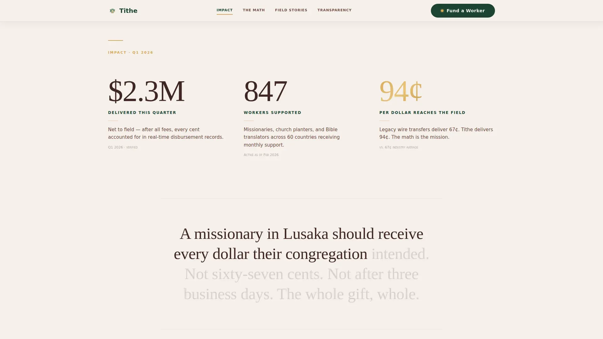
Each spoke section opens with a single large number before any explanatory text appears. This punch-then-breathe rhythm, arresting figure, then supporting narrative, is applied consistently across the impact stats, fee comparison, and worker story sections.
Fee Comparison Table
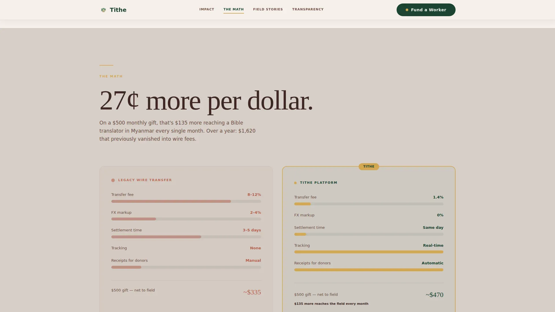
A side-by-side table contrasts legacy wire transfer costs against the platform's transfer cost. The value proposition, 94 cents of every dollar reaching the field versus roughly 67 cents through traditional channels, is displayed plainly, giving donors a clear mathematical reason to give through this platform.
Named Worker Story Section
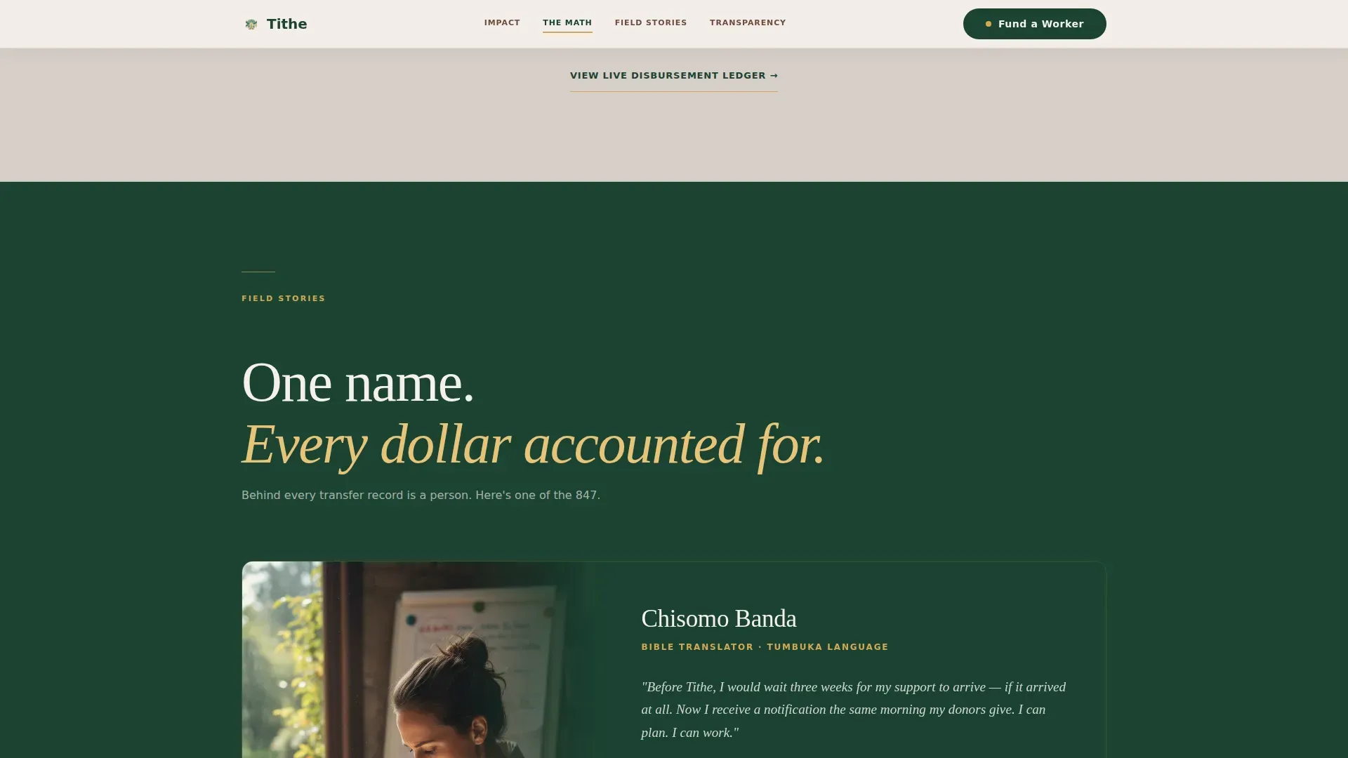
One named field worker is featured with a photo, location, and stated monthly funding need. This section anchors the aggregate data in a single human face, shifting the emotional register from statistics to personal accountability.
Searchable Giving Module
The Fund a Worker section includes a directory search, a toggle between monthly and one-time giving, three suggested tiers at $50, $150, and $500, and a custom amount entry field. Donors can find a specific worker and complete their gift without navigating away.
Transparency Ledger Path
A secondary call-to-action labeled "See Where It Goes" opens a disbursement ledger showing real disbursement records. This path is built for donors who want to verify the math independently before committing.
Page sections overview
| Section | Purpose |
|---|---|
| Hero Icon Grid | Display country reach and animate impact counters |
| Impact Stats Block | Lead with aggregate volume figures and supporting narrative |
| Fee Comparison Table | Show wire costs versus platform costs side by side |
| Worker Story Feature | Humanize data with one named field worker |
| Fund a Worker Module | Searchable giving directory with tier selection |
| Single-Row Footer | Close the page with a linear, minimal footer pattern |
Design & branding system
The visual identity follows a Directory and Discovery theme built on the Forest Trust color system. The palette is described in the brief as a well-worn field journal: leather-bound, coffee-stained, and trustworthy in the way only aged things are.
- Deep canopy green (#1B4332) anchors section backgrounds in alternating depths; sun-through-leaves gold (#D4A853) highlights active anchor-nav spokes and live figures
- Weathered mission-house white (#F5F0EB) provides breathing room between data-dense blocks; rich loam brown (#3E2723) is used for body text
- Typography pairs Fraunces, a display serif, for headings and large numbers, with DM Sans for all body copy
Mobile & speed optimization
The template is designed desktop-first to serve the megachurch missions board use case, where detailed data tables and the worker directory demand a wider viewport. Full mobile support is included so individual donors on phones are not turned away.
- Static sections are structured as Server Components to keep initial load lean
- The giving module is built as a Client Component, isolating interactivity to the section that needs it
- Counter animations, stamp stagger reveals, and scroll-linked word reveals use Intersection Observer to trigger only when visible
How this template helps you convert
The page is designed to earn the gift before asking for it. Every structural choice supports a donor moving forward with confidence.
- The icon grid and animated counters establish scale and credibility within the first seconds of the visit, before a donor reads a single paragraph.
- The fee-comparison table removes the most common objection, "how much actually gets there?", with a visible, specific answer mid-page.
- The pinned "Fund a Worker" anchor-nav button keeps the primary call to action reachable from any scroll position, reducing friction at the moment a donor is ready to give.
Other information about this template
This template is built for the cross-border commission niche within faith-based financial platforms. It is a strong fit for any organization operating in a global disbursement context where donor trust is the primary conversion barrier.
- The hub-and-spoke anchor navigation structure means donors can jump directly to the section most relevant to them, whether that is impact stats, fee proof, or the giving module
- Localization defaults are set to United States dollars, English language, and the United States date format, reflecting the primary donor audience described in the brief
- The template style is classified as Hub and Spoke with Anchor Navigation, and the header concept is an Icon Grid, making it distinct from portrait-led or video-hero fundraising templates
Theme
Directory & Discovery
Creative direction
Stats-First Impact
Color system
Forest Trust
Style
Hub & Spoke (Anchor Nav)
Direction
Donation/Fundraising
Page Sections
Animated Icon Grid Header
Stats-first Section Rhythm
Fee Comparison Table
Named Worker Story Section
Searchable Giving Module
Transparency Ledger Path
Related questions
Who is this template designed for?
Does the template include a giving module with worker search?
Can donors see how fees compare to traditional wire transfers?
Is this a multi-page template or a single landing page?
What typography and colors does this template use?