Expertly Curated Bookstore Landing Page Template
Shelf is a scroll-reveal landing page for an Asian-owned independent bookstore. Built on a Neo-Retro Citrus Burst palette, it walks visitors through a side-by-side comparison of algorithmic recommendations versus genuine human curation. Every section funnels toward a single click-through destination, with contextual calls-to-action and a secondary lead-capture banner for a monthly reading list.
by Rocket studio
Quick summary
Shelf is a single-page, scroll-driven landing page built for an Asian-owned independent bookstore. It contrasts the cold experience of algorithmic discovery with the warmth of hand-curated shelves. The Neo-Retro Citrus Burst color system makes every section feel like a sun-faded paperback cover. The goal is one clear action: get the visitor to browse the online storefront.
Who this template is for
This template is built for independent bookstore owners who want an online presence that actually reflects their curation philosophy. It works especially well for shops with a defined cultural identity and a loyal community of readers.
- Asian-owned bookstores looking for a landing page that matches their distinct editorial voice
- Small bookshop operators who want to drive click-through traffic to an existing online catalog
- Community-focused retail shops that run reading circles, staff picks programs, or curated recommendation lists
What problem this template solves
Most retail landing page templates are built for volume and velocity. They default to grid layouts, generic calls to action, and a visual language borrowed from big-box e-commerce. An independent bookstore rooted in cultural curation deserves something different.
- Visitors cannot tell the difference between a corporate storefront and a community shop from the design alone
- There is no visual contrast showing why human curation outperforms algorithmic recommendations
- Generic templates offer no narrative flow, so the emotional case for the bookstore never lands
What you get with this template
You get a fully designed, scroll-reveal landing page that builds its argument section by section. Each progressive reveal adds visual weight and emotional clarity before asking the visitor to act.
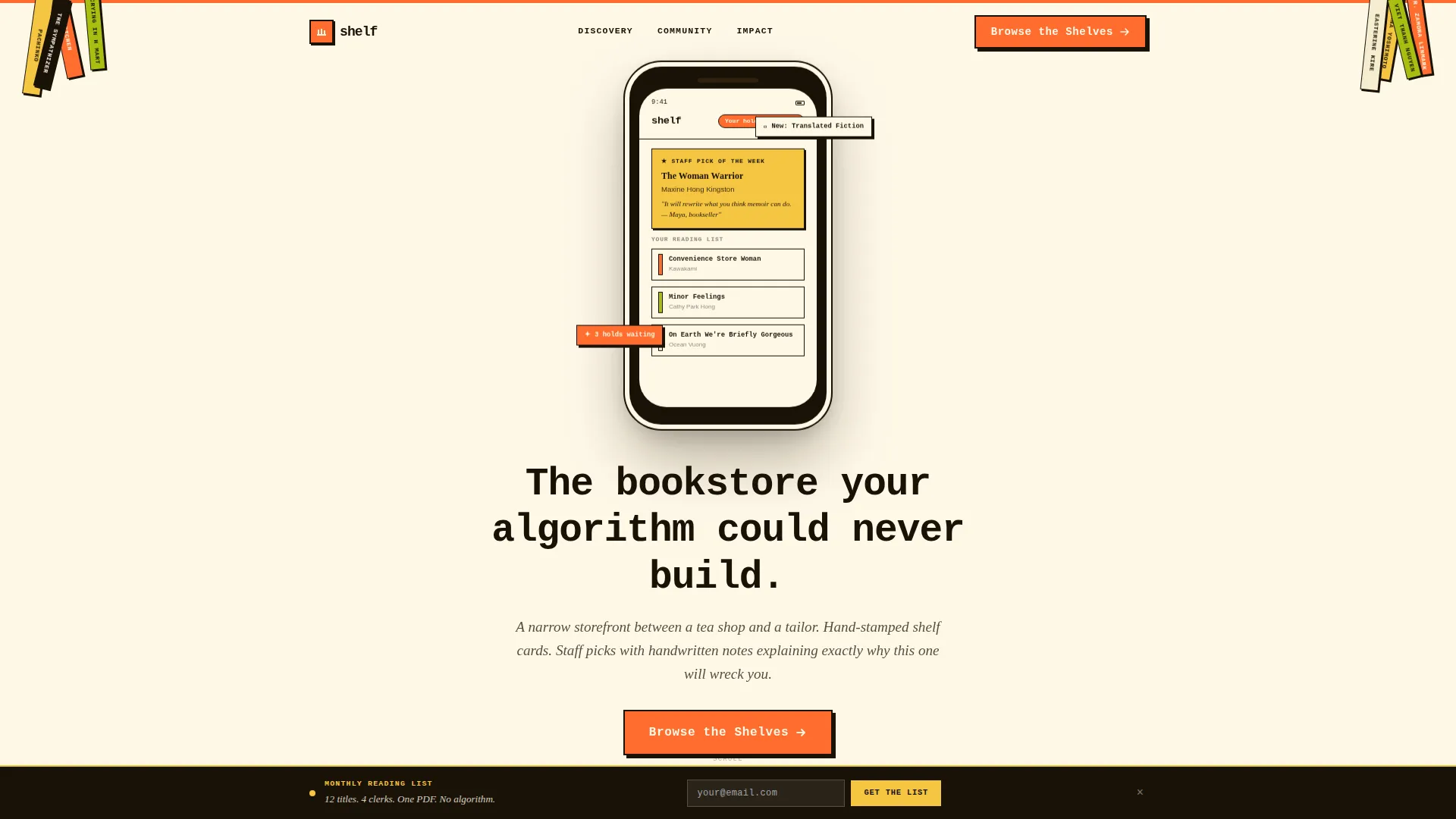
- A staged header featuring a stylized phone screen previewing the digital storefront mid-scroll
- Three comparison reveal sections contrasting algorithmic and curated reading experiences
- Multiple contextual "Browse the Shelves" calls to action and a sticky secondary lead-capture banner
Feature list
This template is built around a focused set of components that serve one purpose: earning the visitor's trust and then directing it toward a single action.
Scroll-Reveal Comparison Journey
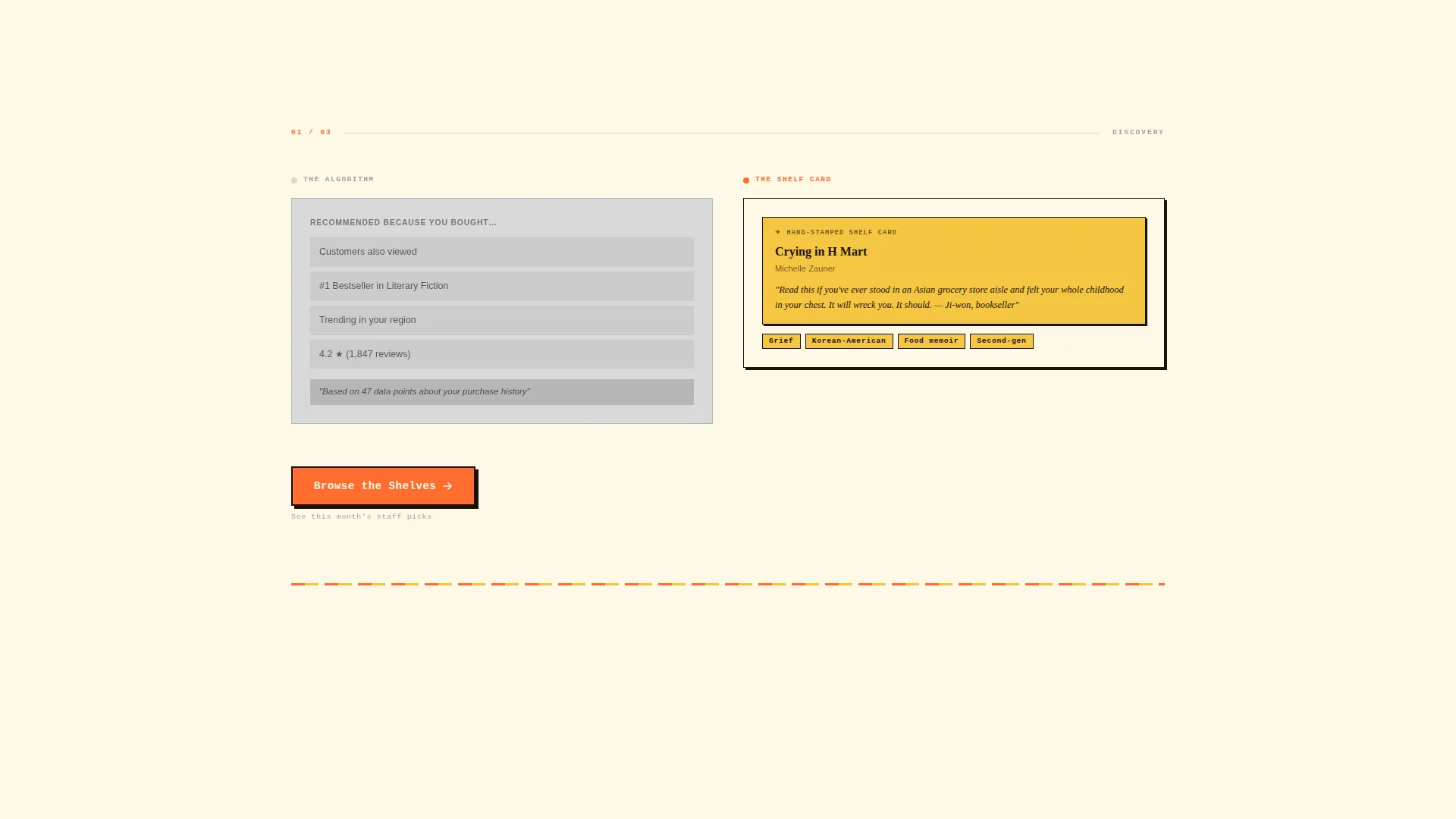
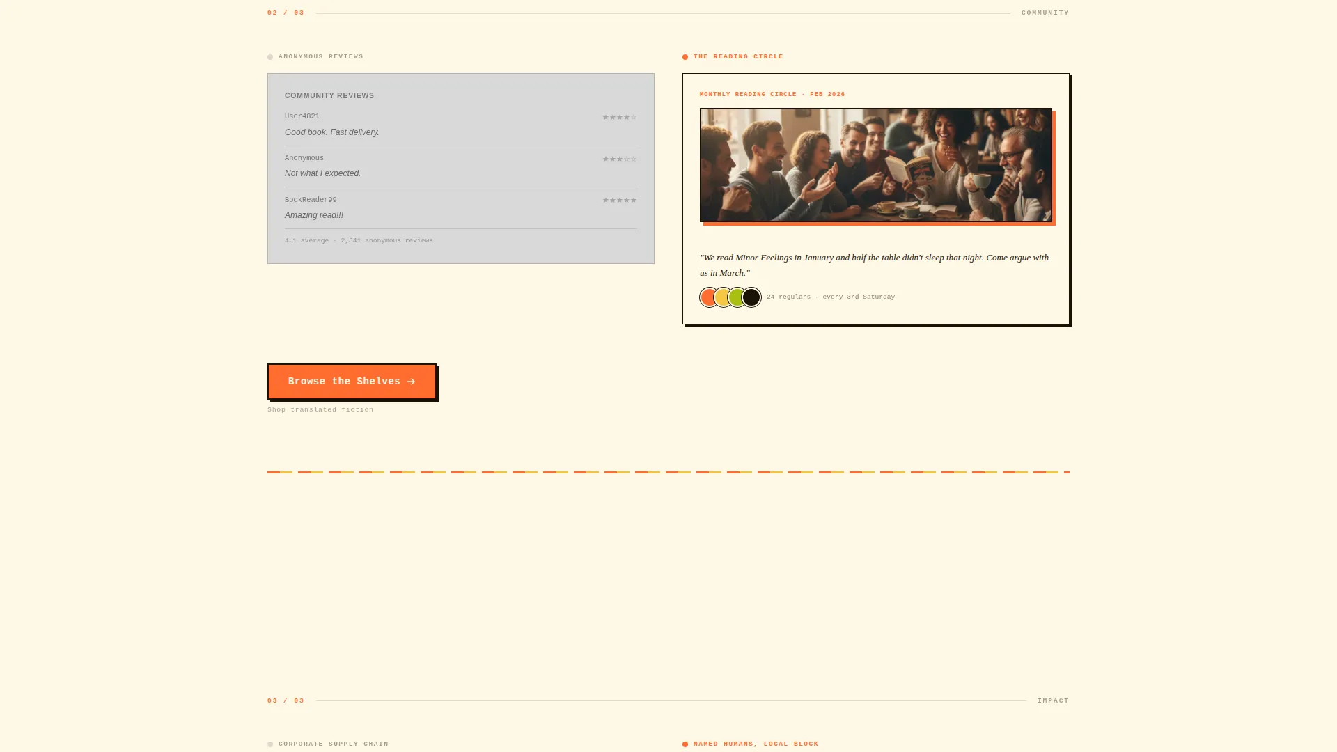
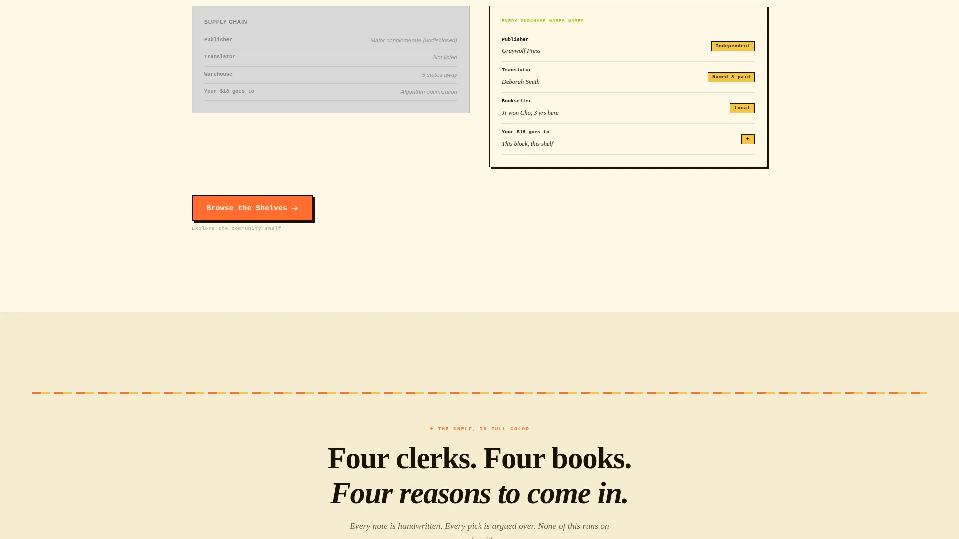
The page unfolds progressively as the visitor scrolls. Three side-by-side reveal sections contrast a grayscale algorithmic experience on the left with a full Citrus Burst curated experience on the right. The color gap widens with each reveal until both columns merge into one full-color finale.
App Store Preview Header
The header features a stylized phone screen floating over a warm newsprint cream background. It shows the bookstore's curated digital storefront mid-scroll, including a Staff Pick of the Week card, a reading-list carousel, and a notification badge. Illustrated book spines in tangerine and yuzu are scattered around the device.
Monospaced Serif Typewriter Headline
The hero headline types itself out in a monospaced serif font, reading: "The bookstore your algorithm could never build." This animation sets the editorial tone immediately and reinforces the human-versus-algorithm theme.
Contextual Repeat calls to action
The primary call-to-action, "Browse the Shelves," appears after the header and resurfaces after each comparison reveal. Each instance carries a different contextual subtitle, such as "See this month's staff picks," "Shop translated fiction," and "Explore the community shelf."
Sticky Lead-Capture Banner
A secondary sticky banner sits at the bottom of the page offering "Get the Reading List" for visitors who want the monthly PDF reading guide. It captures email leads without interrupting the main click-through flow.
Neo-Retro Citrus Burst Color System
The palette uses tangerine pulp, yuzu rind, warm newsprint cream, deep soy ink, and calamansi green as an accent. Cream dominates the reading surface. Tangerine and yuzu appear on badges, buttons, and section dividers styled like Risograph overprints.
Page sections overview
| Section | Purpose |
|---|---|
| Sticky Lead Banner | Captures email leads via "Get the Reading List" offer without blocking the main call to action flow |
| App Store Header | Introduces the bookstore brand through a stylized phone preview with animated headline |
| Primary call to action Block | Prompts the first "Browse the Shelves" click immediately below the header |
| Discovery Comparison | Contrasts algorithmic "Recommended because you bought" with a handwritten shelf card |
| Community Comparison | Contrasts anonymous star reviews with a photo of the monthly reading circle |
| Impact Comparison | Contrasts corporate supply chains with named independent publishers and translators |
| Full-Color Finale | Merges both columns into one saturated showcase of the store's own shelves |
| Repeat call to action Blocks | Resurfaces "Browse the Shelves" after each reveal with a contextual subtitle |
Design & branding system
The visual identity follows a Neo-Retro theme inspired by 1970s paperback cover design. Every color choice feels deliberate and specific, rooted in the warmth of analog print culture rather than the sterility of modern e-commerce templates.
- Core palette: tangerine pulp (#FF6D2E), yuzu rind (#F5C542), warm newsprint cream (#FFF8E7), deep soy ink (#1A1207), and calamansi green (#A8BF12) for interactive elements and hover states
- Typography uses a monospaced serif for the animated hero headline, reinforcing the editorial, hand-set feel of independent publishing
- Section dividers and badges are styled like Risograph overprints, giving the layout a tactile, layered quality that feels printed rather than rendered
Mobile & speed optimization
The landing page layout is designed with a vertical scroll flow that translates naturally to mobile viewports. Progressive reveals are paced for thumb-scrolling, and the sticky lead-capture banner remains accessible without overlapping key content.
- The single-destination call to action structure keeps navigation minimal, reducing decision friction on small screens
- Scattered book spine illustrations and the floating phone header are composed to reframe cleanly on narrower layouts
- The sticky banner at the bottom occupies a consistent fixed position so it never competes with primary call to action buttons mid-scroll
How this template helps you convert
The page is engineered around a single conversion path. Every design choice, reveal sequence, and copy moment pushes the visitor toward one click: the online storefront.
- The comparison journey builds the case section by section, so by the time the visitor reaches the finale, the emotional and rational argument for curated shopping is already made
- Contextual call to action subtitles reduce hesitation by telling the visitor exactly what they will find when they click, whether that is staff picks, translated fiction, or the community shelf
- The sticky lead-capture banner offers a lower-commitment entry point for visitors who are not ready to shop yet, turning a bounce into a future touchpoint
Other information about this template
This template is categorized under Retail and E-Commerce with a specific focus on Asian-owned business storefronts. The creative direction follows a Comparison Journey structure, which is well suited to businesses whose value proposition depends on contrast with a less personal alternative.
- The template style draws from Gallery and Detail presentation, making it adaptable for shops that want to highlight individual titles, authors, or curated collections
- The landing page direction is single-page and scroll-led, which means all traffic enters and exits through one focused experience with no internal navigation to distract
- The Intersection Match Score for this template is 9 out of 10, reflecting strong alignment between the Asian-owned retail niche and the Neo-Retro design language
Theme
Neo-Retro
Creative direction
Comparison Journey
Color system
Obsidian & Gold
Style
Gallery + Detail
Direction
Marketplace/Multi
Page Sections
Scroll-reveal Comparison Journey
App Store Preview Header
Typewriter Hero Headline
Contextual Repeat Ctas
Sticky Lead-capture Banner
Neo-retro Citrus Burst Palette
Related questions
Can I use this template if my bookstore does not have an existing online catalog?
Does the comparison journey work for other types of curated retail, not just bookstores?
How does the sticky lead-capture banner work?
Can I change the color palette or typography to match my brand?
Is this template suitable for a bookstore focused on a specific cultural community?



